- Главная
- Разное
- Дизайн
- Бизнес и предпринимательство
- Аналитика
- Образование
- Развлечения
- Красота и здоровье
- Финансы
- Государство
- Путешествия
- Спорт
- Недвижимость
- Армия
- Графика
- Культурология
- Еда и кулинария
- Лингвистика
- Английский язык
- Астрономия
- Алгебра
- Биология
- География
- Детские презентации
- Информатика
- История
- Литература
- Маркетинг
- Математика
- Медицина
- Менеджмент
- Музыка
- МХК
- Немецкий язык
- ОБЖ
- Обществознание
- Окружающий мир
- Педагогика
- Русский язык
- Технология
- Физика
- Философия
- Химия
- Шаблоны, картинки для презентаций
- Экология
- Экономика
- Юриспруденция
Descriptive statistics. Frequency distributions and their graphs. (Section 2.1) презентация
Содержание
- 1. Descriptive statistics. Frequency distributions and their graphs. (Section 2.1)
- 2. Frequency Distributions and Their Graphs Section 2.1
- 3. Frequency Distributions 102 124 108 86 103 82
- 4. Frequency Distributions Classes - the intervals
- 5. Frequency Distributions Midpoint - the sum
- 6. 78 90 102 114 126 3 5
- 7. 67 - 78 79 -
- 8. Frequency Histogram A bar
- 9. 1 2 6 . 5 1
- 10. Relative Frequency Histogram A
- 11. Relative Frequency Histogram Time on Phone minutes Relative frequency on vertical scale Relative frequency
- 12. Frequency Polygon A line
- 13. Frequency Polygon 9 8 7 6 5
- 14. Ogive Also called
- 15. Ogive An ogive reports the number
- 16. More Graphs and Displays Section 2.2
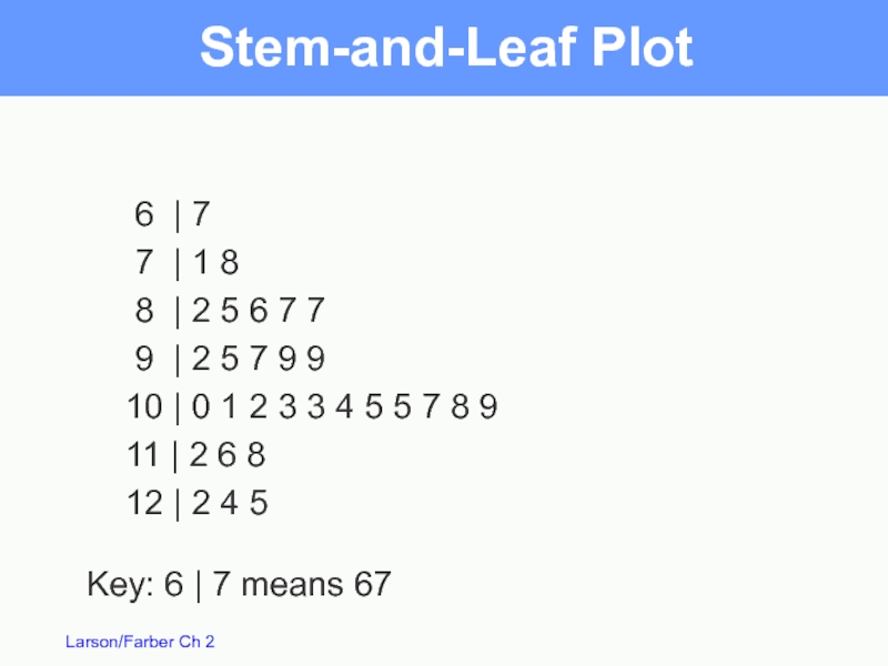
- 17. Stem-and-Leaf Plot 102 124 108 86 103 82
- 18. Stem-and-Leaf Plot 6 | 7
- 19. 6 | 7
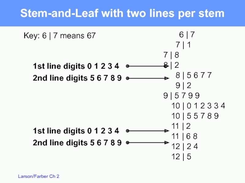
- 20. Stem-and-Leaf with two lines per stem
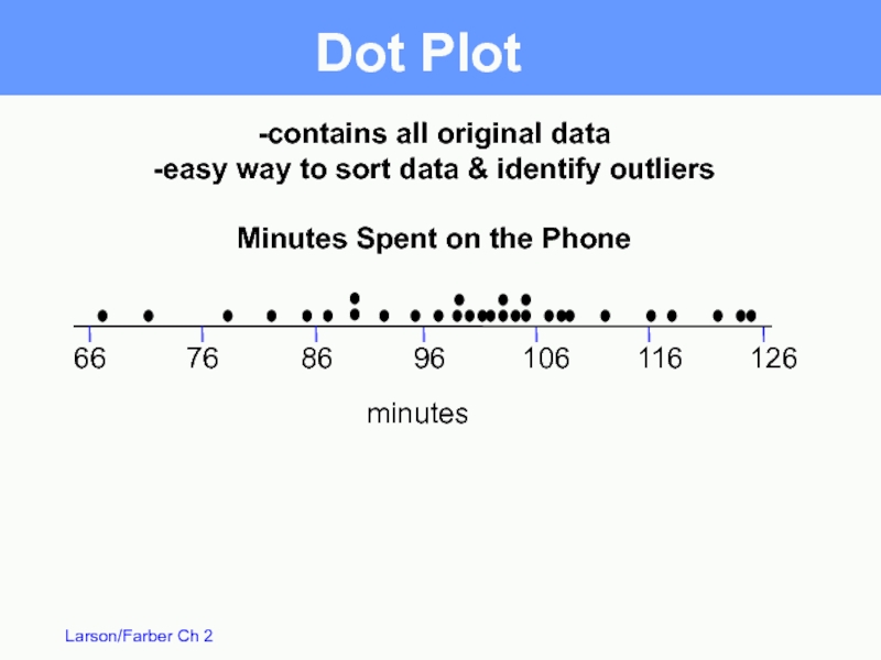
- 21. Dot Plot 66 76 86 96 106
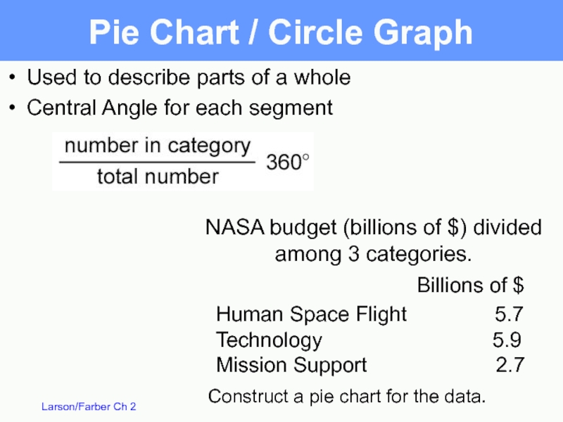
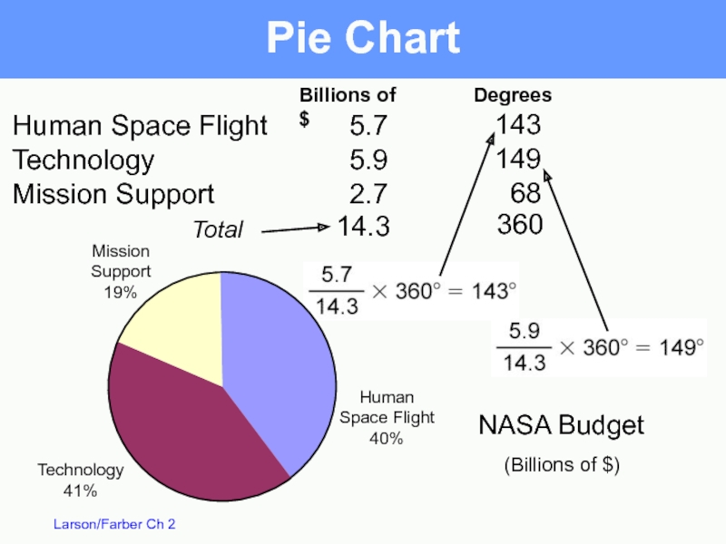
- 22. NASA budget (billions of $) divided among
- 23. Total Pie Chart Billions of $ Human
- 24. Pareto Chart -A vertical bar graph in
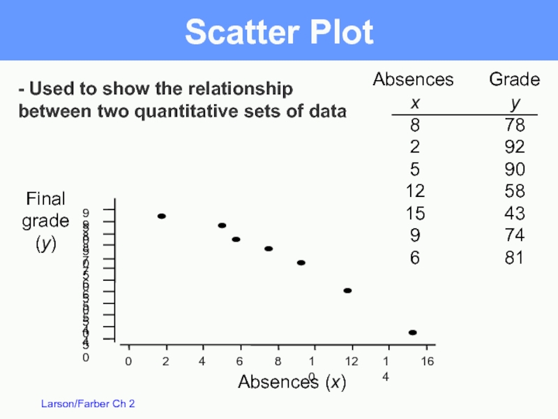
- 25. Scatter Plot Absences Grade
- 26. Time Series Chart / Line Graph
- 27. Measures of Central Tendency Section 2.3
- 28. Measures of Central Tendency Mean: The sum
- 29. 2 4 2 0
- 30. 0 2 2
- 31. Mode: The mode is
- 32. Median: Sort data in
- 33. Uniform Symmetric Skewed right positive
- 34. A weighted mean is the mean of
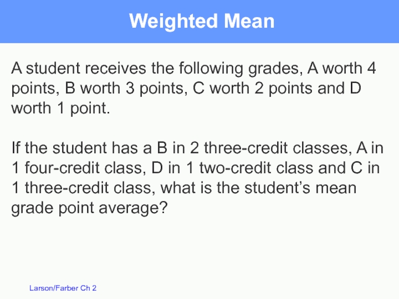
- 35. Weighted Mean A student receives the following
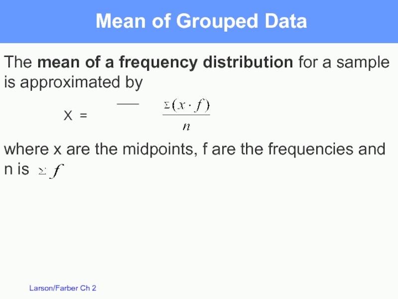
- 36. The mean of a frequency distribution for
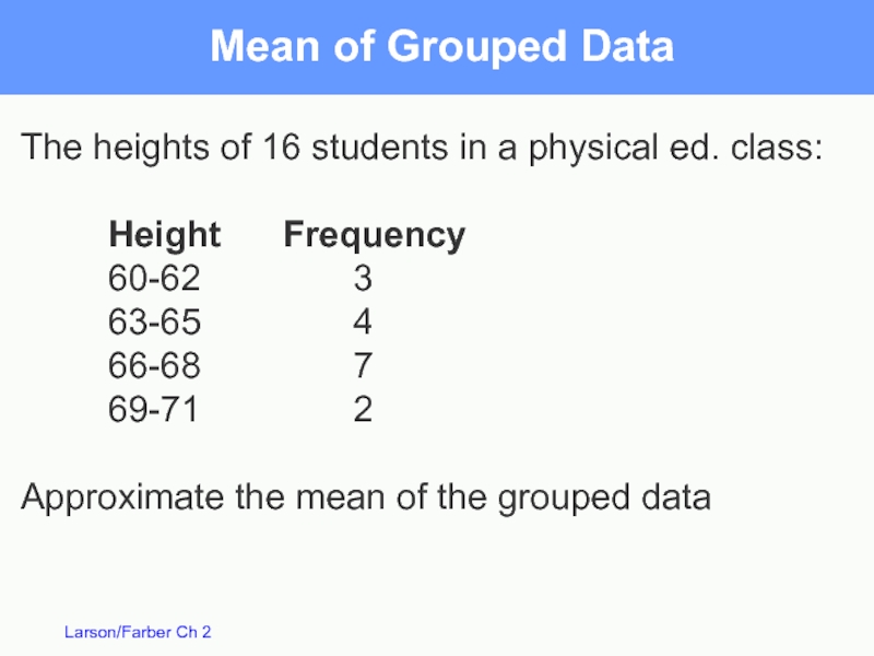
- 37. Mean of Grouped Data The heights of
- 38. Measures of Variation Section 2.4
- 39. Closing prices for two stocks were recorded
- 40. Closing prices for two stocks were recorded
- 41. Range for A = 67 – 56
- 42. The deviation for each value x is
- 43. – 5.5 – 5.5 – 4.5 –
- 44. Population Variance Sum of squares – 5.5
- 45. Population Standard Deviation Population Standard Deviation:
- 46. Sample Variance and Standard Deviation To
- 47. Interpreting Standard Deviation Standard deviation is a
- 48. Summary Range = Maximum value – Minimum value
- 49. Data with symmetric bell-shaped distribution have the
- 50. The mean value of homes on
- 51. The mean value of homes on a
- 52. Chebychev’s Theorem For k = 3, at
- 53. Chebychev’s Theorem The mean time in a
- 54. Chebychev’s Theorem The mean time in a
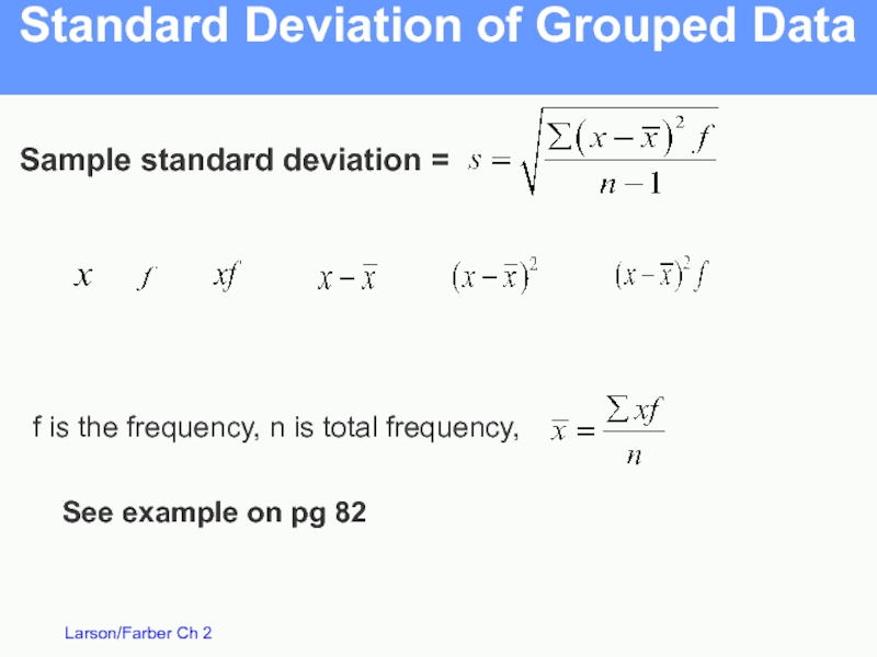
- 55. Standard Deviation of Grouped Data Sample standard
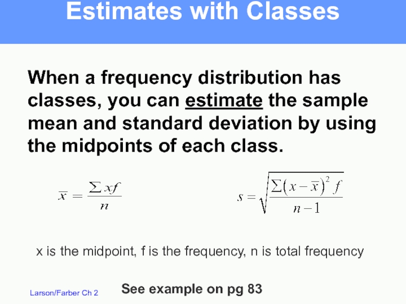
- 56. Estimates with Classes When a frequency distribution
- 57. Measures of Position Section 2.5
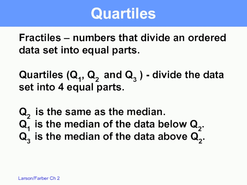
- 58. Fractiles – numbers that divide an ordered
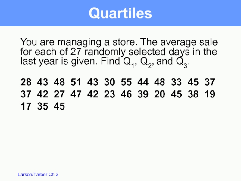
- 59. You are managing a store. The average
- 60. The data in ranked order (n =
- 61. Interquartile Range – the difference between the
- 62. Box and Whisker Plot 55 45 35
- 63. Percentiles Percentiles divide the data into 100
- 64. Percentiles 114.5 falls on or above 25
- 65. Standard Scores Standard score or z-score -
- 66. Standard Scores The test scores for a
- 67. (c) (a) (b) A value of x
- 68. Standard Scores When a distribution is approximately
Слайд 3Frequency Distributions
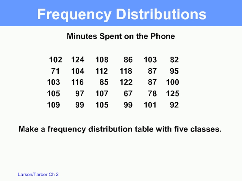
102 124 108 86 103 82
71 104 112 118 87 95
103 116 85 122 87
105 97 107 67 78 125
109 99 105 99 101 92
Make a frequency distribution table with five classes.
Minutes Spent on the Phone
Слайд 4Frequency Distributions
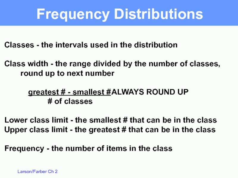
Classes - the intervals used in the distribution
Class width -
greatest # - smallest # ALWAYS ROUND UP
# of classes
Lower class limit - the smallest # that can be in the class
Upper class limit - the greatest # that can be in the class
Frequency - the number of items in the class
Слайд 5Frequency Distributions
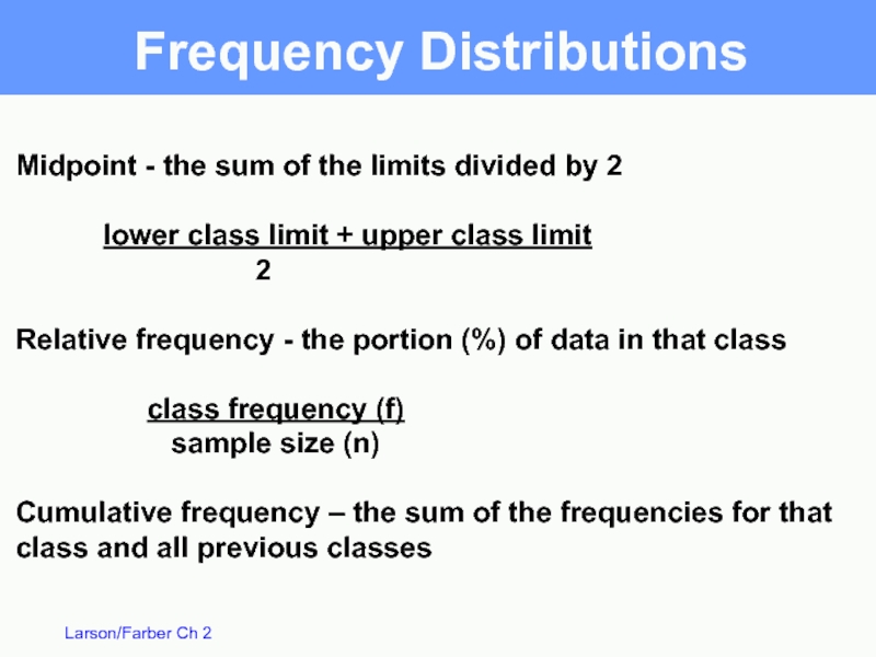
Midpoint - the sum of the limits divided by 2
lower
2
Relative frequency - the portion (%) of data in that class
class frequency (f)
sample size (n)
Cumulative frequency – the sum of the frequencies for that class and all previous classes
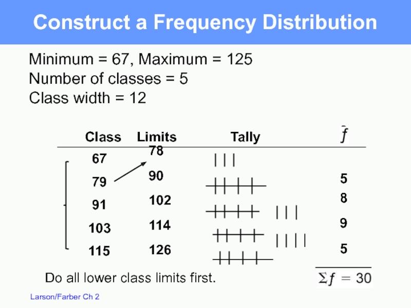
Слайд 678
90
102
114
126
3
5
8
9
5
67
79
91
103
115
Do all lower class limits first.
Construct a Frequency Distribution
Minimum = 67, Maximum = 125
Number of classes = 5
Class width = 12
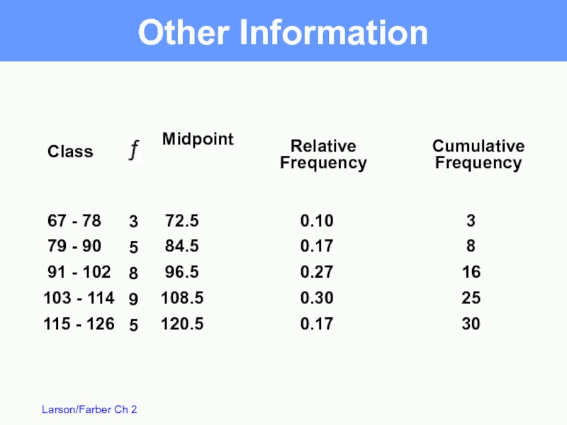
Слайд 7 67 - 78
79 - 90
91 - 102
103 -
115 - 126
3
5
8
9
5
Midpoint
Relative
Frequency
Class
72.5
84.5
96.5
108.5
120.5
0.10
0.17
0.27
0.30
0.17
3
8
16
25
30
Other Information
Cumulative
Frequency
Слайд 8
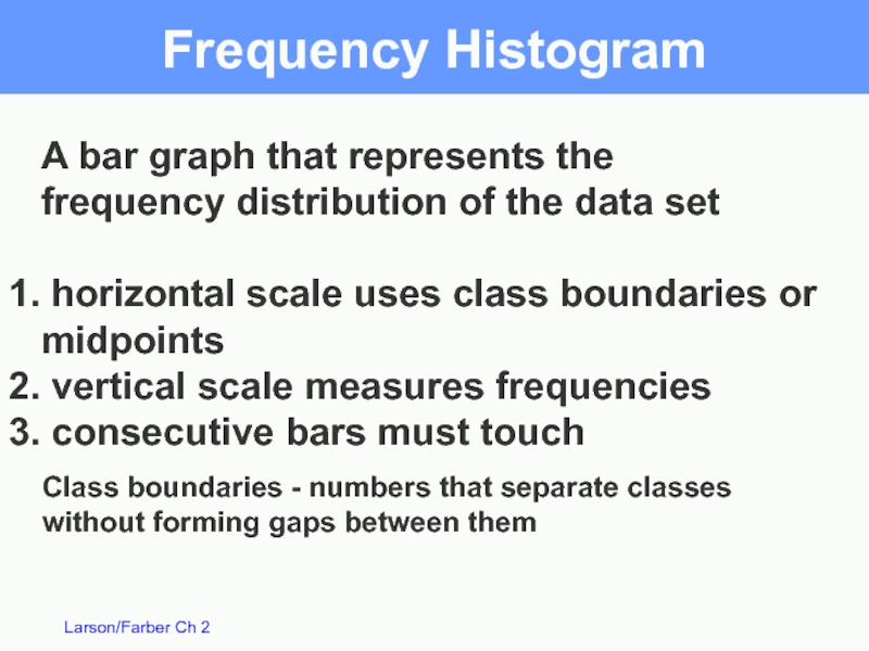
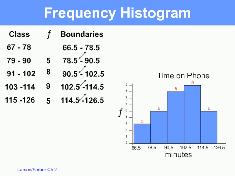
Frequency Histogram
A bar graph that represents the
frequency distribution of the
horizontal scale uses class boundaries or midpoints
vertical scale measures frequencies
consecutive bars must touch
Class boundaries - numbers that separate classes without forming gaps between them
Слайд 9
1
2
6
.
5
1
1
4
.
5
1
0
2
.
5
9
0
.
5
7
8
.
5
6
6
.
5
9
8
7
6
5
4
3
2
1
0
5
9
8
5
3
Boundaries
66.5 - 78.5
78.5 - 90.5
90.5 - 102.5
102.5
114.5 -126.5
Frequency Histogram
Time on Phone
minutes
Class
67 - 78
79 - 90
91 - 102
103 -114
115 -126
3
5
8
9
5
Слайд 10
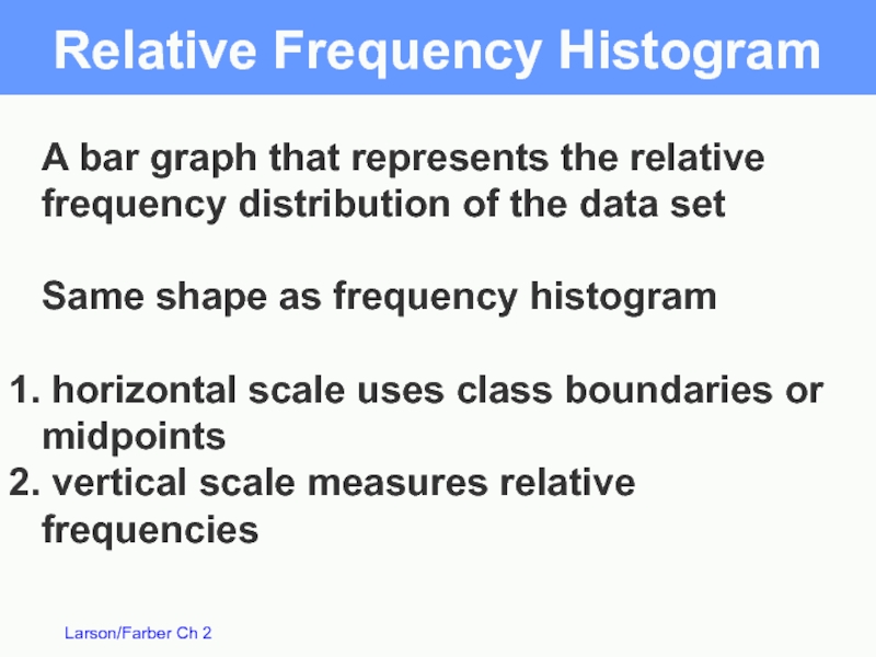
Relative Frequency Histogram
A bar graph that represents the relative
frequency distribution
Same shape as frequency histogram
horizontal scale uses class boundaries or midpoints
vertical scale measures relative frequencies
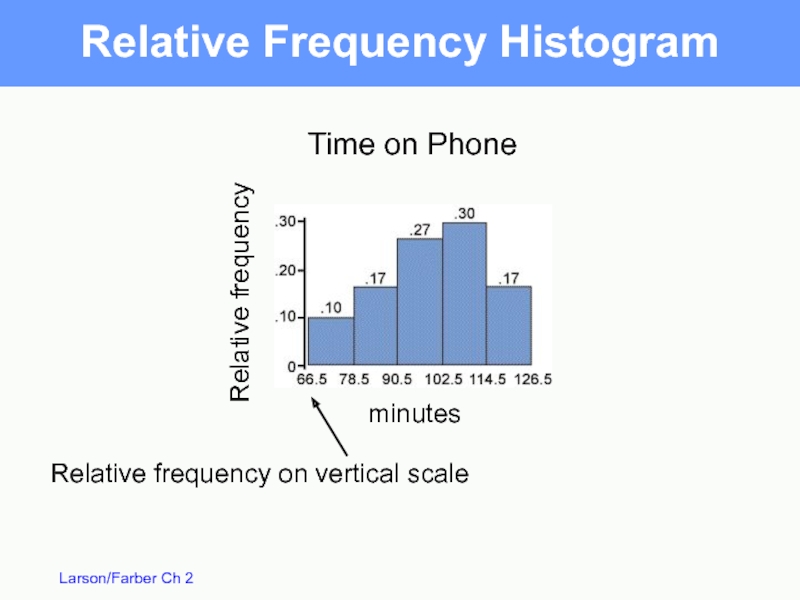
Слайд 11Relative Frequency Histogram
Time on Phone
minutes
Relative frequency on vertical scale
Relative frequency
Слайд 12
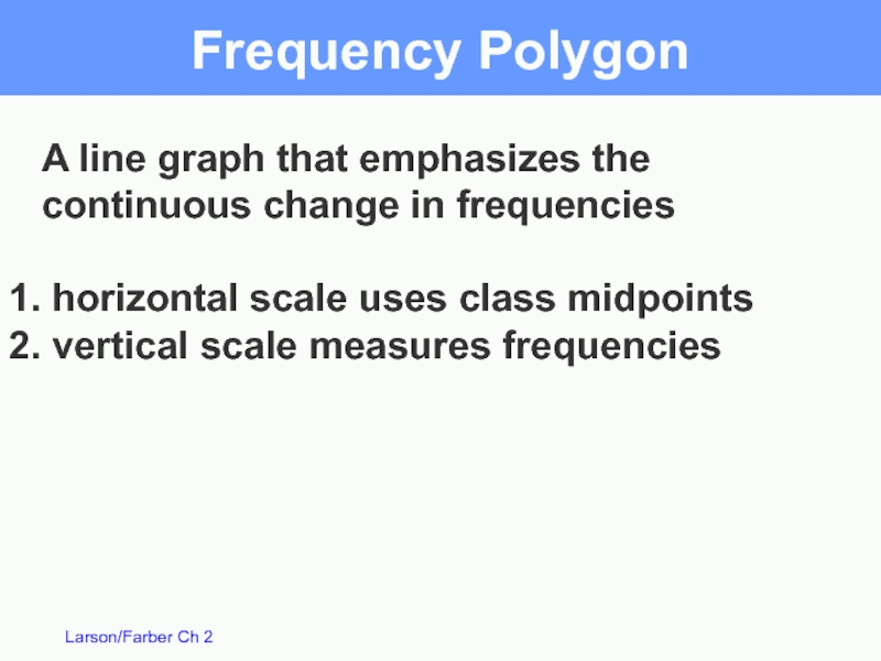
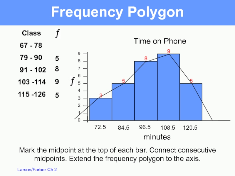
Frequency Polygon
A line graph that emphasizes the continuous change in frequencies
vertical scale measures frequencies
Слайд 13Frequency Polygon
9
8
7
6
5
4
3
2
1
0
5
9
8
5
3
Time on Phone
minutes
Class
67 - 78
79 -
91 - 102
103 -114
115 -126
3
5
8
9
5
72.5
84.5
96.5
108.5
120.5
Mark the midpoint at the top of each bar. Connect consecutive midpoints. Extend the frequency polygon to the axis.
Слайд 14
Ogive
Also called a cumulative frequency graph
A line graph that displays
horizontal scale uses upper boundaries
vertical scale measures cumulative frequencies
Слайд 15Ogive
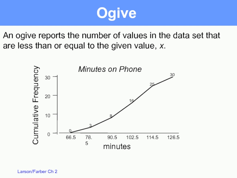
An ogive reports the number of values in the data set
are less than or equal to the given value, x.
Cumulative Frequency
minutes
Minutes on Phone
Слайд 17Stem-and-Leaf Plot
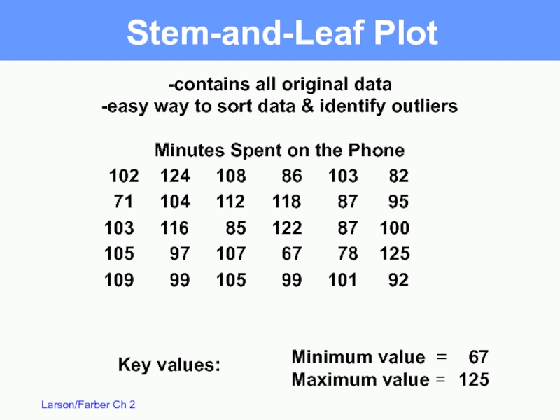
102 124 108 86 103 82
71 104 112 118 87 95
103 116 85 122 87
105 97 107 67 78 125
109 99 105 99 101 92
-contains all original data
-easy way to sort data & identify outliers
Minutes Spent on the Phone
Key values:
Minimum value =
Maximum value =
67
125
Слайд 18Stem-and-Leaf Plot
6 |
7 |
8 |
9 |
10 |
11
12 |
Lowest value is 67 and highest value is 125, so list stems from 6 to 12.
Never skip stems. You can have a stem with NO leaves.
Stem
Leaf
12 |
11 |
10 |
9 |
8 |
7 |
6 |
Stem
Leaf
Слайд 19 6 | 7
7 | 1
8 | 2 5 6 7 7
9 | 2 5 7 9 9
10 | 0 1 2 3 3 4 5 5 7 8 9
11 | 2 6 8
12 | 2 4 5
Stem-and-Leaf Plot
Key: 6 | 7 means 67
Слайд 20Stem-and-Leaf with two lines per stem
7 | 1
7 | 8
8 | 2
8 | 5 6 7 7
9 | 2
9 | 5 7 9 9
10 | 0 1 2 3 3 4
10 | 5 5 7 8 9
11 | 2
11 | 6 8
12 | 2 4
12 | 5
Key: 6 | 7 means 67
1st line digits 0 1 2 3 4
2nd line digits 5 6 7 8 9
1st line digits 0 1 2 3 4
2nd line digits 5 6 7 8 9
Слайд 21Dot Plot
66
76
86
96
106
116
126
-contains all original data
-easy way to sort data & identify
Minutes Spent on the Phone
minutes
Слайд 22NASA budget (billions of $) divided among 3 categories.
Pie Chart /
Used to describe parts of a whole
Central Angle for each segment
Construct a pie chart for the data.
Human Space Flight 5.7
Technology 5.9
Mission Support 2.7
Billions of $
Слайд 23Total
Pie Chart
Billions of $
Human Space Flight
5.7
Technology
5.9
Mission Support
2.7
14.3
Degrees
143
149
68
360
Mission
Support
19%
Technology
41%
Слайд 24Pareto Chart
-A vertical bar graph in which the height of the
-The bars are in order of
decreasing height
-See example on page 53
Слайд 25Scatter Plot
Absences
Grade
Absences (x)
x
8
2
5
12
15
9
6
y
78
92
90
58
43
74
81
Final
grade
(y)
- Used to show the relationship
between two quantitative
Слайд 26Time Series Chart / Line Graph
- Quantitative entries taken at regular
- See example on page 55
Слайд 28Measures of Central Tendency
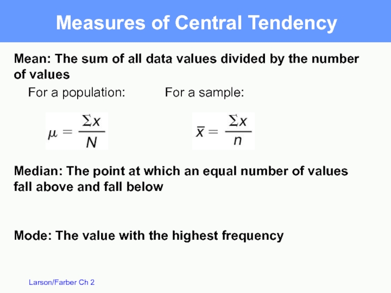
Mean: The sum of all data values divided
For a population: For a sample:
Median: The point at which an equal number of values fall above and fall below
Mode: The value with the highest frequency
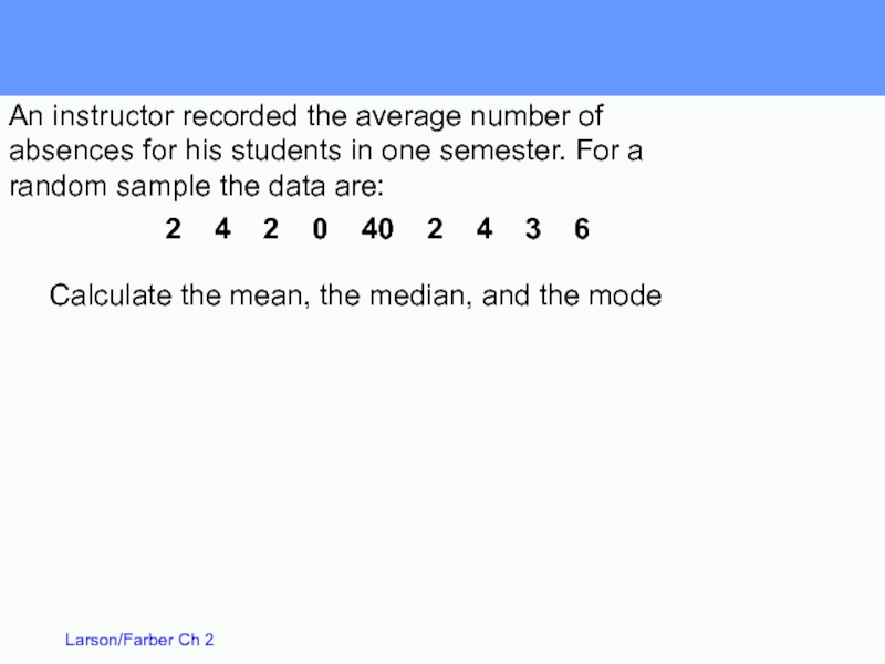
Слайд 292 4 2 0 40 2
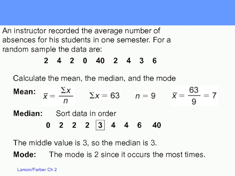
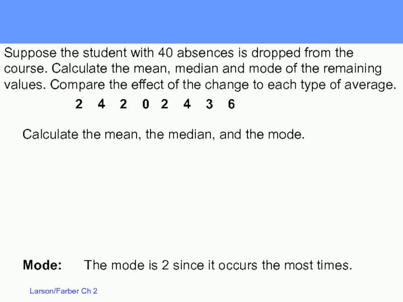
Calculate the mean, the median, and the mode
An instructor recorded the average number of absences for his students in one semester. For a random sample the data are:
Слайд 30
0 2 2 2 3
2 4 2 0 40 2 4 3 6
Calculate the mean, the median, and the mode
Mean:
Median: Sort data in order
The middle value is 3, so the median is 3.
Mode: The mode is 2 since it occurs the most times.
An instructor recorded the average number of absences for his students in one semester. For a random sample the data are:
Слайд 31
Mode: The mode is 2 since it occurs the
Calculate the mean, the median, and the mode.
2 4 2 0 2 4 3 6
Suppose the student with 40 absences is dropped from the course. Calculate the mean, median and mode of the remaining values. Compare the effect of the change to each type of average.
Слайд 32
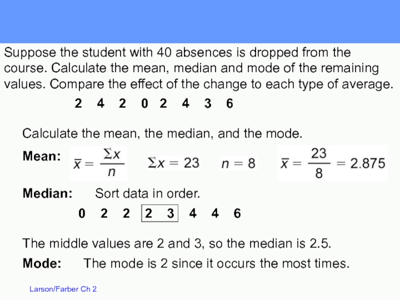
Median: Sort data in order.
Mode: The mode
The middle values are 2 and 3, so the median is 2.5.
0 2 2 2 3 4 4 6
Calculate the mean, the median, and the mode.
Mean:
2 4 2 0 2 4 3 6
Suppose the student with 40 absences is dropped from the course. Calculate the mean, median and mode of the remaining values. Compare the effect of the change to each type of average.
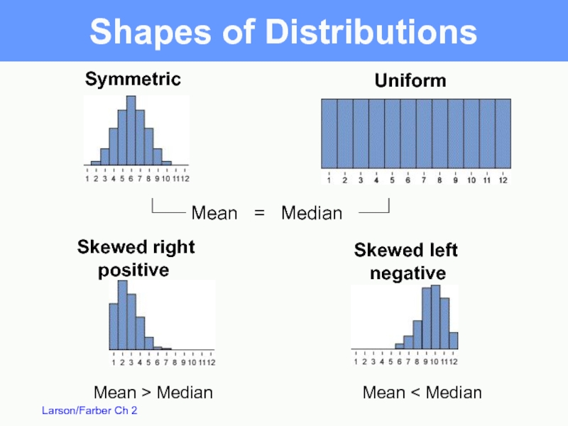
Слайд 33Uniform
Symmetric
Skewed right
positive
Skewed left
negative
Mean =
Mean > Median
Mean < Median
Shapes of Distributions
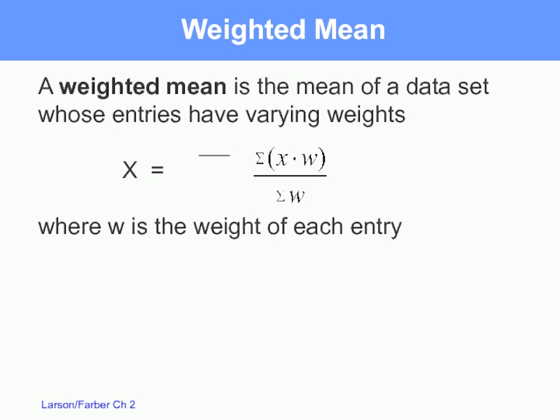
Слайд 34A weighted mean is the mean of a data set whose
X =
where w is the weight of each entry
Weighted Mean
Слайд 35Weighted Mean
A student receives the following grades, A worth 4 points,
If the student has a B in 2 three-credit classes, A in 1 four-credit class, D in 1 two-credit class and C in 1 three-credit class, what is the student’s mean grade point average?
Слайд 36The mean of a frequency distribution for a sample is approximated
X =
where x are the midpoints, f are the frequencies and n is
Mean of Grouped Data
Слайд 37Mean of Grouped Data
The heights of 16 students in a physical
Height Frequency
60-62 3
63-65 4
66-68 7
69-71 2
Approximate the mean of the grouped data
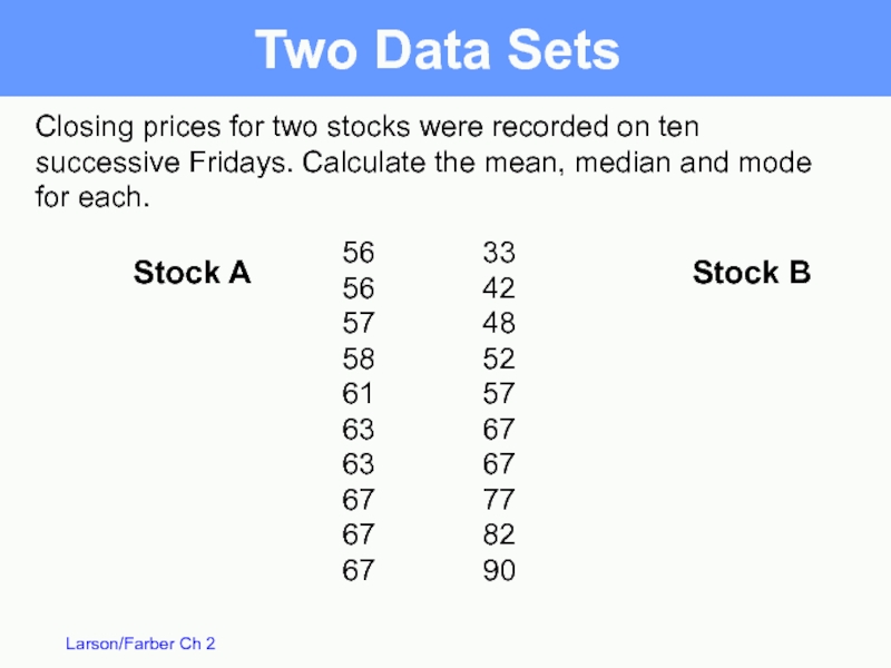
Слайд 39Closing prices for two stocks were recorded on ten successive Fridays.
56 33
56 42
57 48
58 52
61 57
63 67
63 67
67 77
67 82
67 90
Stock A
Stock B
Two Data Sets
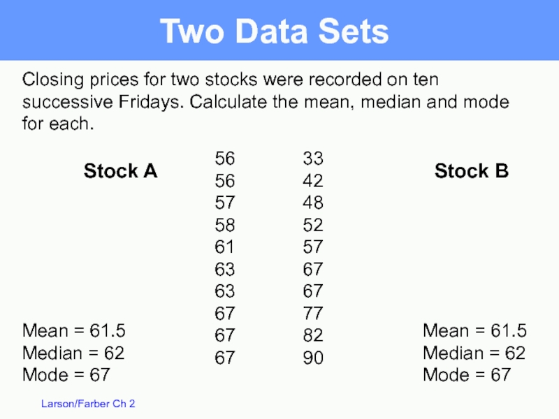
Слайд 40Closing prices for two stocks were recorded on ten successive Fridays.
Mean = 61.5
Median = 62
Mode = 67
Mean = 61.5
Median = 62
Mode = 67
56 33
56 42
57 48
58 52
61 57
63 67
63 67
67 77
67 82
67 90
Stock A
Stock B
Two Data Sets
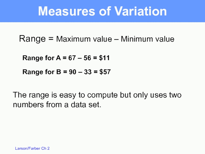
Слайд 41Range for A = 67 – 56 = $11
Range = Maximum
Range for B = 90 – 33 = $57
The range is easy to compute but only uses two numbers from a data set.
Measures of Variation
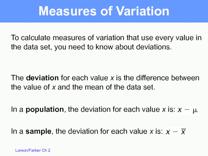
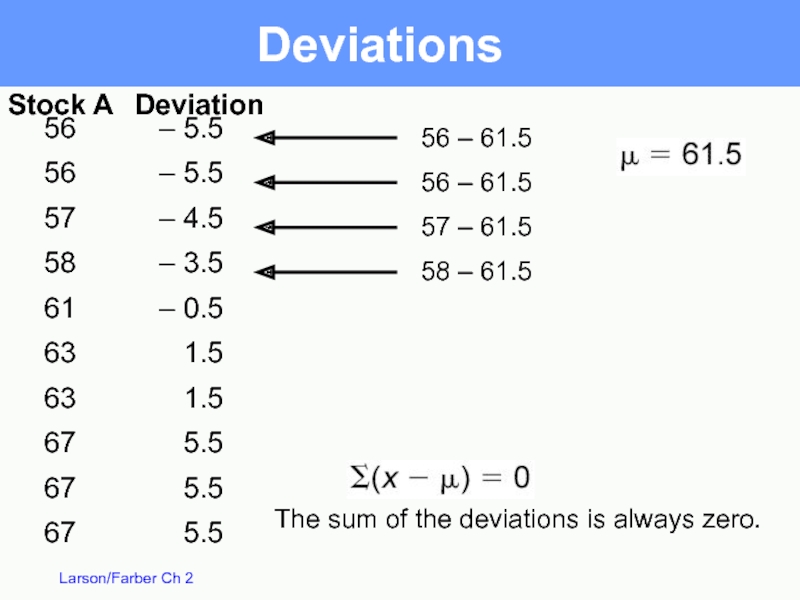
Слайд 42The deviation for each value x is the difference between the
In a population, the deviation for each value x is:
Measures of Variation
To calculate measures of variation that use every value in the data set, you need to know about deviations.
In a sample, the deviation for each value x is:
Слайд 43– 5.5
– 5.5
– 4.5
– 3.5
– 0.5
1.5
1.5
5.5
5.5
5.5
56
56
57
58
61
63
63
67
67
67
Deviations
56 – 61.5
56 – 61.5
57 –
58 – 61.5
Stock A
Deviation
The sum of the deviations is always zero.
Слайд 44Population Variance
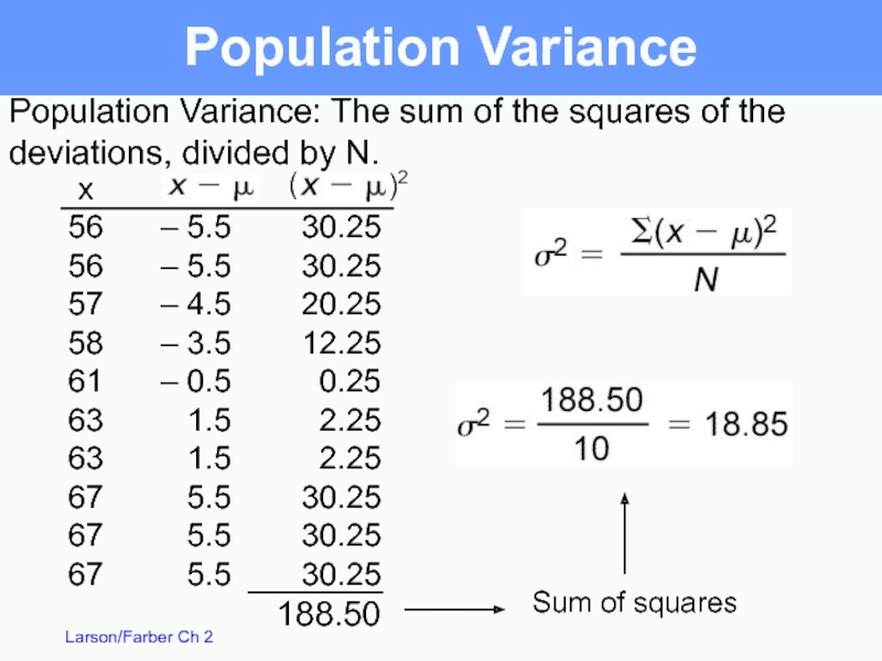
Sum of squares
– 5.5
– 5.5
– 4.5
– 3.5
– 0.5
1.5
1.5
5.5
5.5
5.5
x
56
56
57
58
61
63
63
67
67
67
30.25
30.25
20.25
12.25
0.25
2.25
2.25
30.25
30.25
30.25
188.50
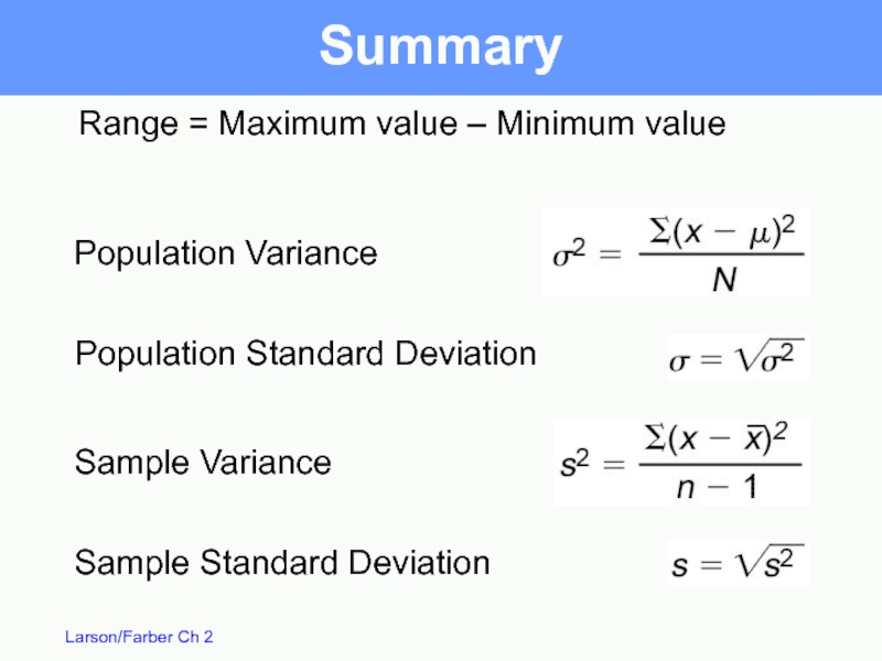
Population Variance:
deviations, divided by N.
(
)2
Слайд 45Population Standard Deviation
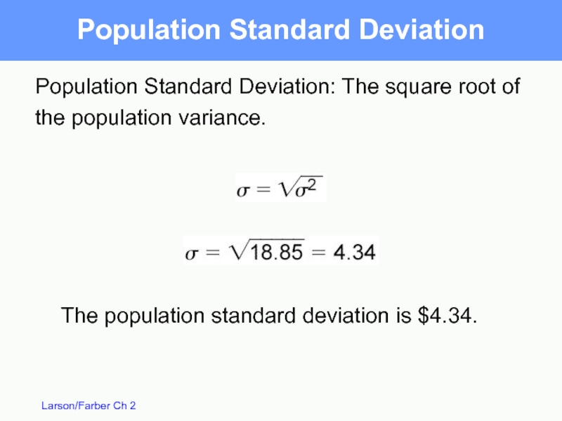
Population Standard Deviation: The square root of the
The population standard deviation is $4.34.
Слайд 46Sample Variance and Standard Deviation
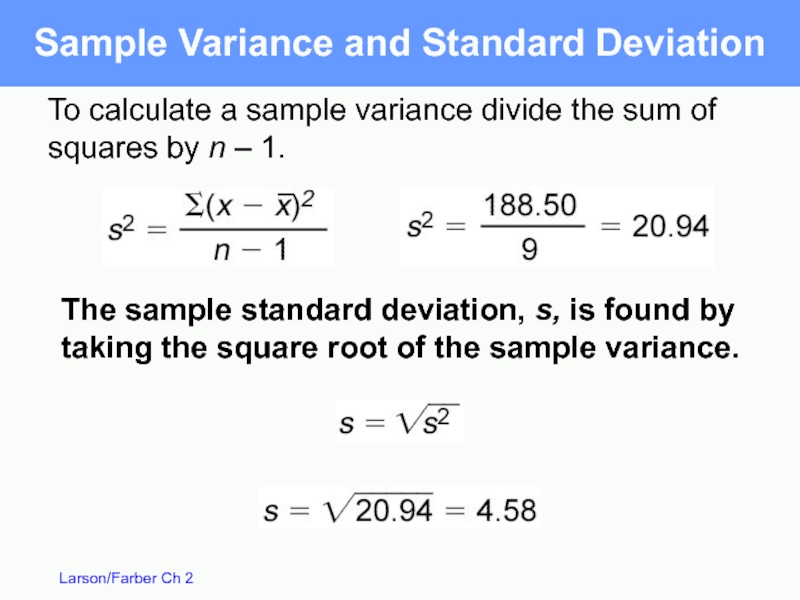
To calculate a sample variance divide
The sample standard deviation, s, is found by taking the square root of the sample variance.
Слайд 47Interpreting Standard Deviation
Standard deviation is a measure of the typical amount
The more the entries are spread out, the greater the standard deviation.
The closer the entries are together, the smaller the standard deviation.
When all data values are equal, the standard deviation is 0.
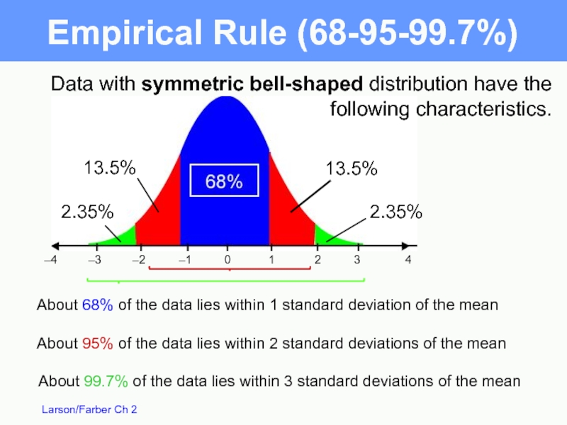
Слайд 49Data with symmetric bell-shaped distribution have the following characteristics.
About 68% of
About 99.7% of the data lies within 3 standard deviations of the mean
About 95% of the data lies within 2 standard deviations of the mean
–4
–3
–2
–1
0
1
2
3
4
Empirical Rule (68-95-99.7%)
13.5%
13.5%
2.35%
2.35%
Слайд 50
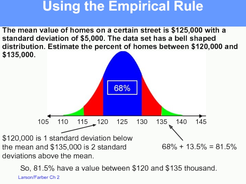
The mean value of homes on a certain street is $125,000
The data set has a bell shaped distribution.
Estimate the percent of homes between $120,000 and $135,000.
Using the Empirical Rule
Слайд 51The mean value of homes on a certain street is $125,000
Using the Empirical Rule
$120,000 is 1 standard deviation below
the mean and $135,000 is 2 standard
deviations above the mean.
68% + 13.5% = 81.5%
So, 81.5% have a value between $120 and $135 thousand.
Слайд 52Chebychev’s Theorem
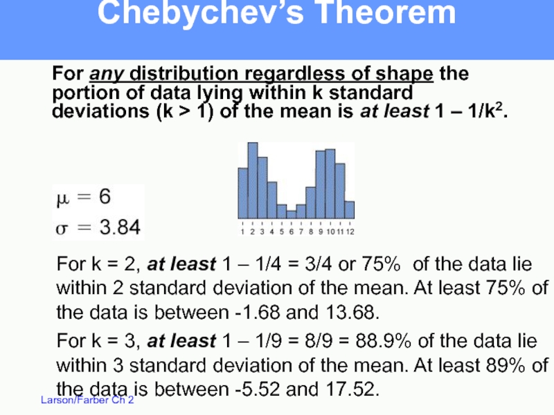
For k = 3, at least 1 – 1/9 =
For any distribution regardless of shape the portion of data lying within k standard deviations (k > 1) of the mean is at least 1 – 1/k2.
For k = 2, at least 1 – 1/4 = 3/4 or 75% of the data lie
within 2 standard deviation of the mean. At least 75% of the data is between -1.68 and 13.68.
Слайд 53Chebychev’s Theorem
The mean time in a women’s 400-meter dash is 52.4
Слайд 54Chebychev’s Theorem
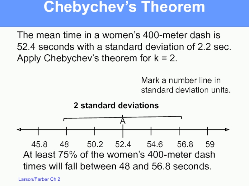
The mean time in a women’s 400-meter dash is 52.4
52.4
54.6
56.8
59
50.2
48
45.8
2 standard deviations
At least 75% of the women’s 400-meter dash times will fall between 48 and 56.8 seconds.
Mark a number line in
standard deviation units.
A
Слайд 55Standard Deviation of Grouped Data
Sample standard deviation =
See example on pg 82
f is the frequency, n is total frequency,
Слайд 56Estimates with Classes
When a frequency distribution has classes, you can estimate
x is the midpoint, f is the frequency, n is total frequency
See example on pg 83
Слайд 58Fractiles – numbers that divide an ordered data set into equal
Quartiles (Q1, Q2 and Q3 ) - divide the data set into 4 equal parts.
Q2 is the same as the median.
Q1 is the median of the data below Q2.
Q3 is the median of the data above Q2.
Quartiles
Слайд 59You are managing a store. The average sale for each of
28 43 48 51 43 30 55 44 48 33 45 37 37 42 27 47 42 23 46 39 20 45 38 19 17 35 45
Quartiles
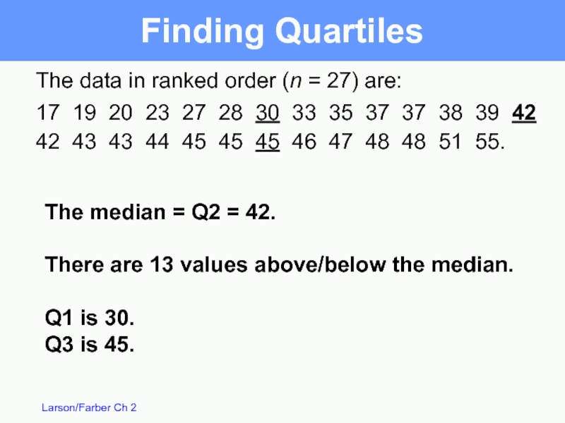
Слайд 60The data in ranked order (n = 27) are:
17 19 20
42 43 43 44 45 45 45 46 47 48 48 51 55.
The median = Q2 = 42.
There are 13 values above/below the median.
Q1 is 30.
Q3 is 45.
Finding Quartiles
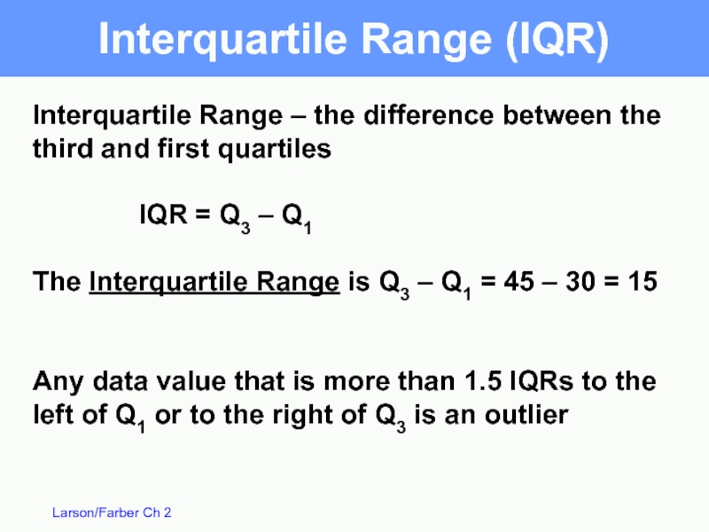
Слайд 61Interquartile Range – the difference between the third and first quartiles
IQR
The Interquartile Range is Q3 – Q1 = 45 – 30 = 15
Any data value that is more than 1.5 IQRs to the left of Q1 or to the right of Q3 is an outlier
Interquartile Range (IQR)
Слайд 62Box and Whisker Plot
55
45
35
25
15
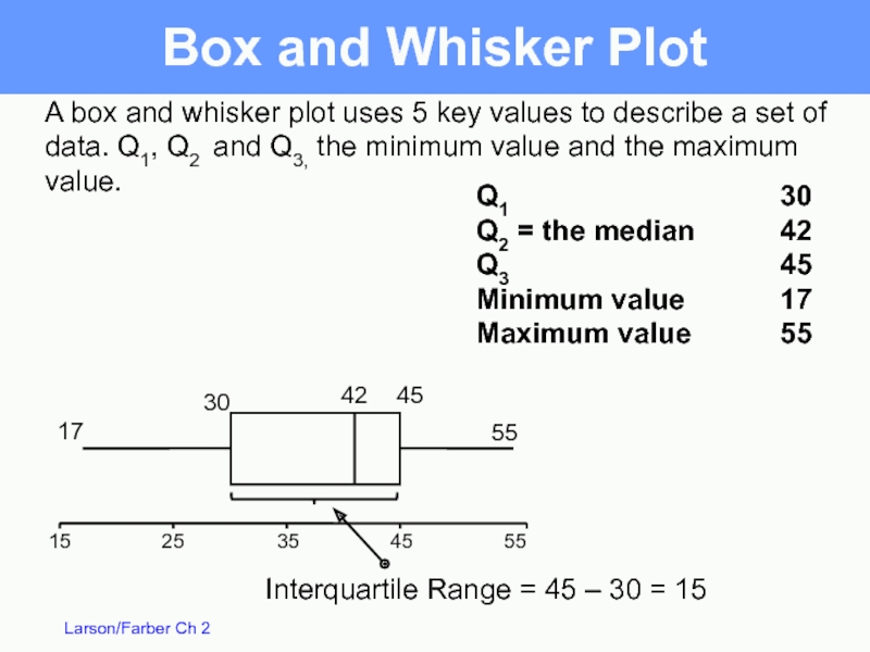
A box and whisker plot uses 5 key
Q1
Q2 = the median
Q3
Minimum value
Maximum value
30
42
45
17
55
42
45
30
17
55
Interquartile Range = 45 – 30 = 15
Слайд 63Percentiles
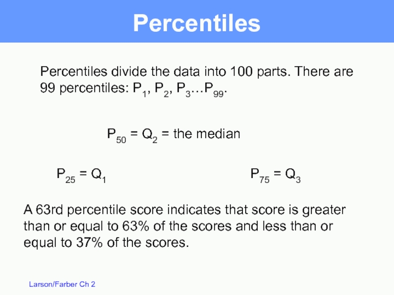
Percentiles divide the data into 100 parts. There are 99 percentiles:
A 63rd percentile score indicates that score is greater than or equal to 63% of the scores and less than or equal to 37% of the scores.
P50 = Q2 = the median
P25 = Q1
P75 = Q3
Слайд 64Percentiles
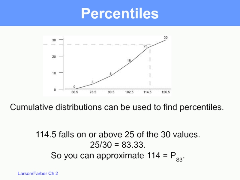
114.5 falls on or above 25 of the 30 values.
25/30
So you can approximate 114 = P83.
Cumulative distributions can be used to find percentiles.
Слайд 65Standard Scores
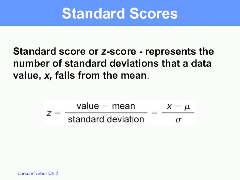
Standard score or z-score - represents the number of standard
Слайд 66Standard Scores
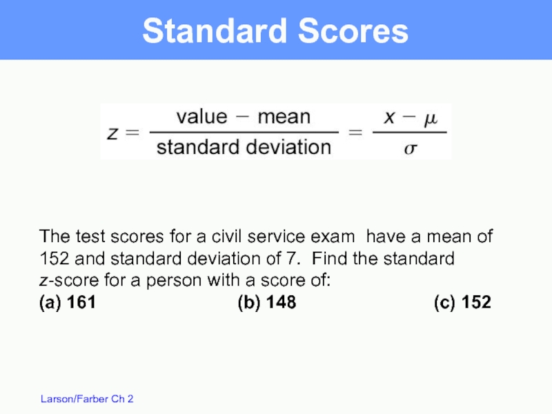
The test scores for a civil service exam have a
(a) 161 (b) 148 (c) 152
Слайд 67(c)
(a)
(b)
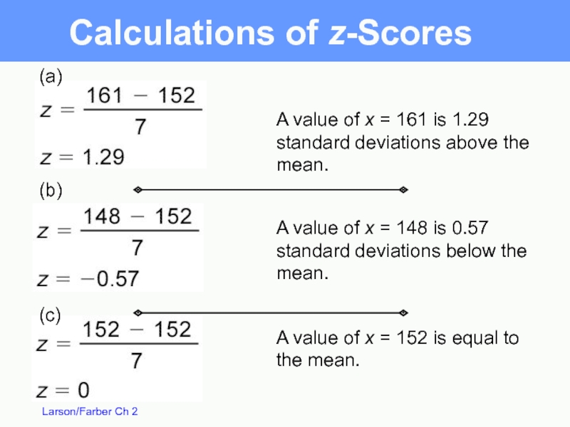
A value of x = 161 is 1.29 standard deviations above
A value of x = 148 is 0.57 standard deviations below the mean.
A value of x = 152 is equal to the mean.
Calculations of z-Scores
Слайд 68Standard Scores
When a distribution is approximately bell shaped, about 95% of
is transformed to z-scores, about 95% of the
z-scores should fall between -2 and 2.
A z-score outside of this range is considered unusual and a z-score less than -3 or greater than 3 would be very unusual.
