- Главная
- Разное
- Дизайн
- Бизнес и предпринимательство
- Аналитика
- Образование
- Развлечения
- Красота и здоровье
- Финансы
- Государство
- Путешествия
- Спорт
- Недвижимость
- Армия
- Графика
- Культурология
- Еда и кулинария
- Лингвистика
- Английский язык
- Астрономия
- Алгебра
- Биология
- География
- Детские презентации
- Информатика
- История
- Литература
- Маркетинг
- Математика
- Медицина
- Менеджмент
- Музыка
- МХК
- Немецкий язык
- ОБЖ
- Обществознание
- Окружающий мир
- Педагогика
- Русский язык
- Технология
- Физика
- Философия
- Химия
- Шаблоны, картинки для презентаций
- Экология
- Экономика
- Юриспруденция
Top 10 Usability Guidelines for Blogging презентация
Содержание
- 1. Top 10 Usability Guidelines for Blogging
- 2. Brian Sullivan. @BrianKSullivan @bigdesign Hi, my name is #UXblog
- 5. What is Usability?
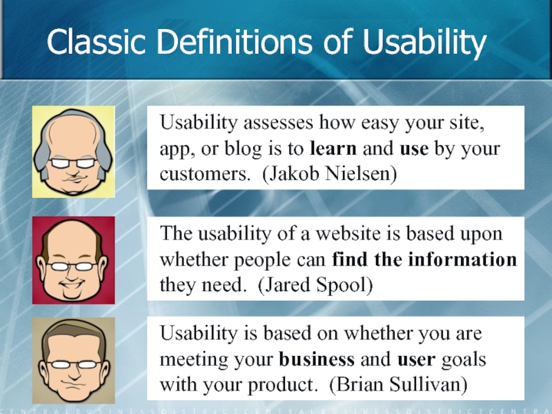
- 6. Classic Definitions of Usability Usability assesses how
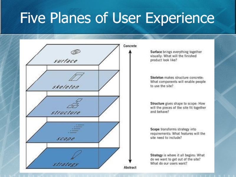
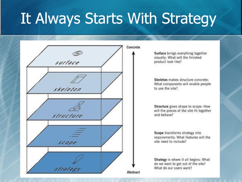
- 7. Five Planes of User Experience
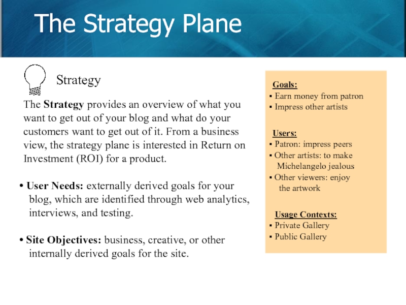
- 8. The Strategy provides an overview of
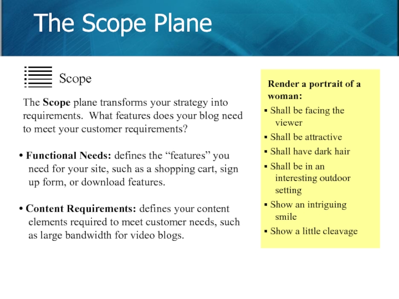
- 9. The Scope plane transforms your strategy
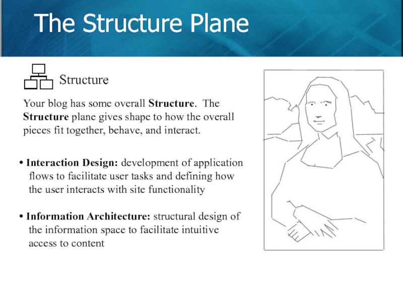
- 10. Your blog has some overall Structure.
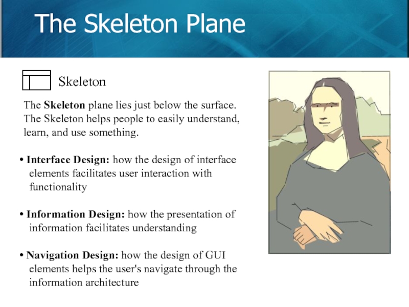
- 11. The Skeleton plane lies just below
- 12. As its name suggests, the Surface
- 13. Good Blogs Require Thinking We’ll re-visit each of the planes in the next hour.
- 14. Nielsen’s 10 Heuristic Principles Slide
- 15. Top 10 Usability Issues for Blogs
- 16. Brian’s Top 10 List for Blogs
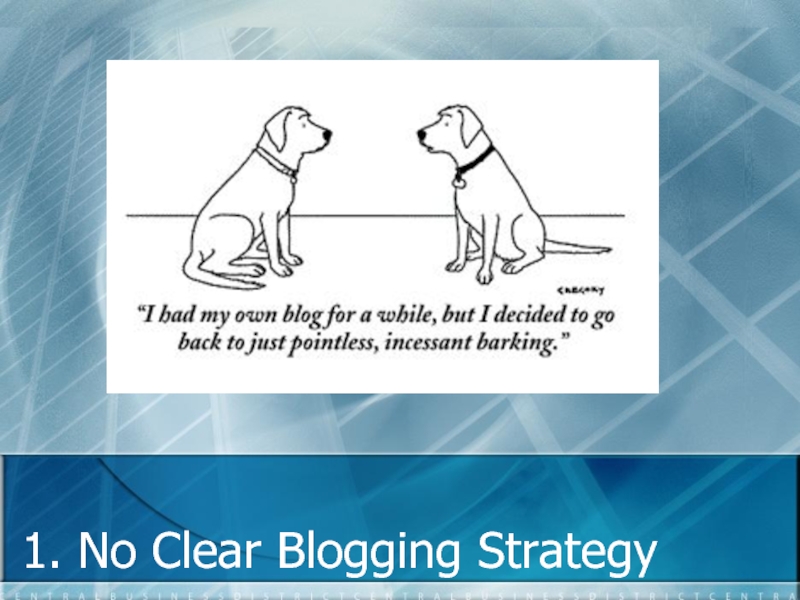
- 17. 1. No Clear Blogging Strategy
- 18. It Always Starts With Strategy
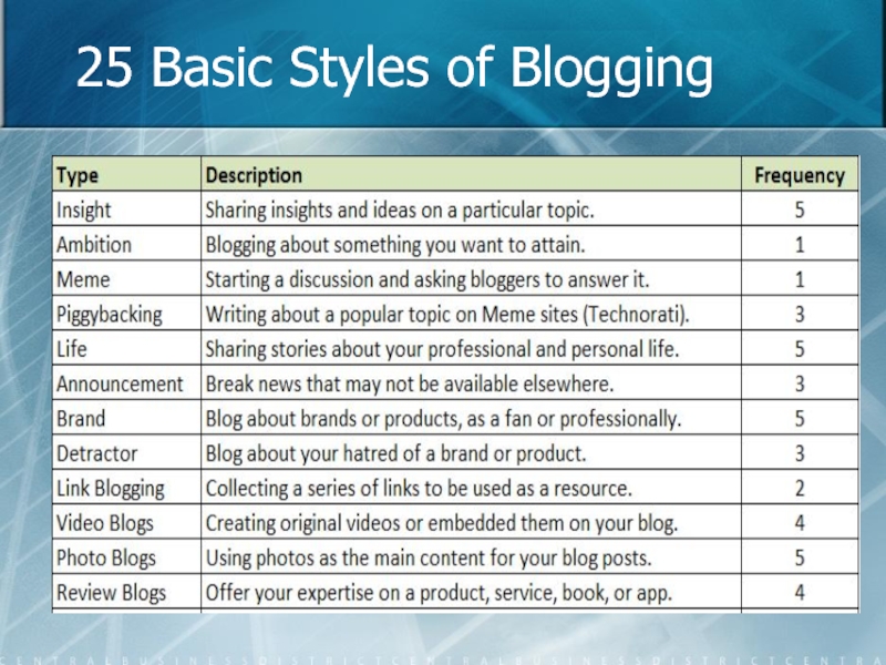
- 19. 25 Basic Styles of Blogging
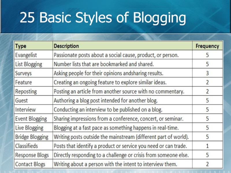
- 20. 25 Basic Styles of Blogging
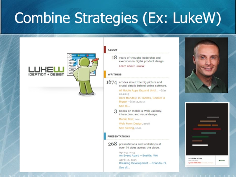
- 21. Combine Strategies (Ex: LukeW)
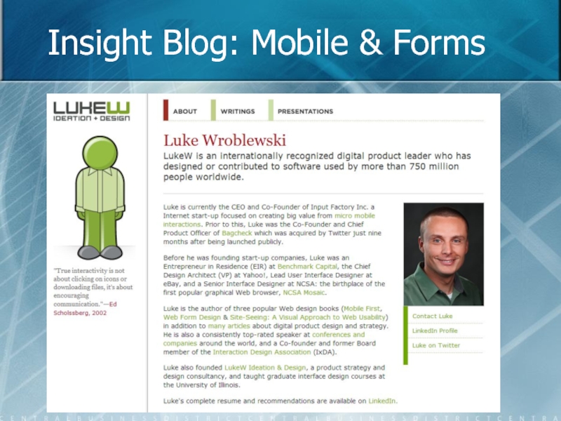
- 22. Insight Blog: Mobile & Forms
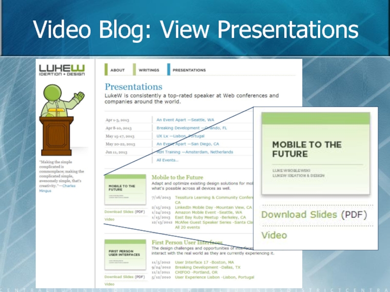
- 23. Video Blog: View Presentations
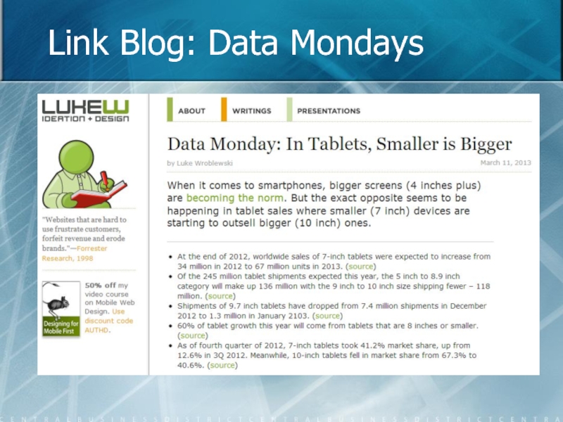
- 24. Link Blog: Data Mondays
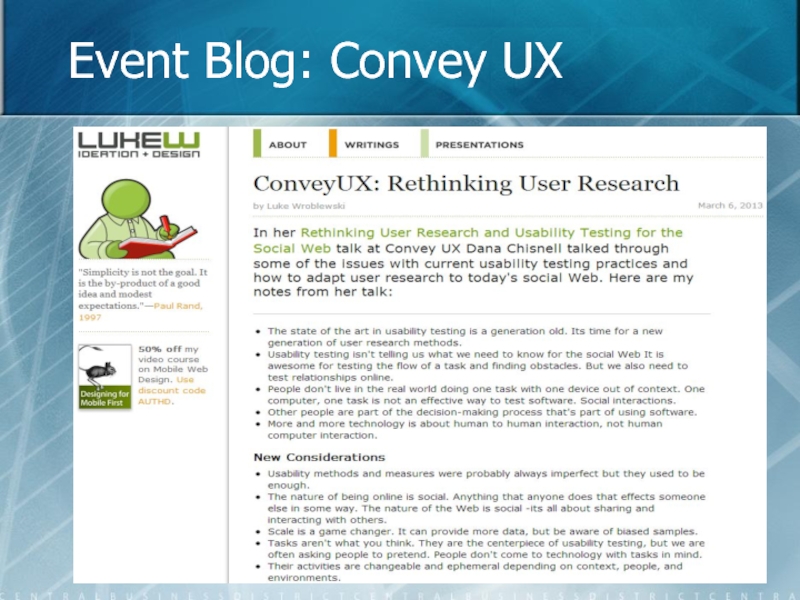
- 25. Event Blog: Convey UX
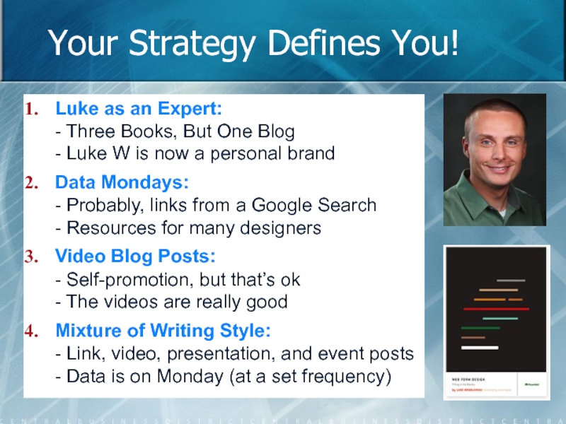
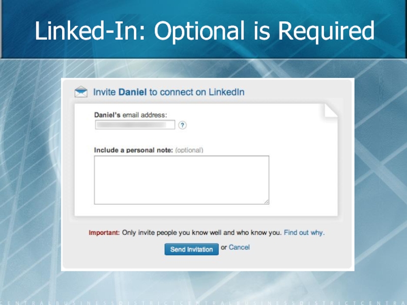
- 26. Your Strategy Defines You! Luke
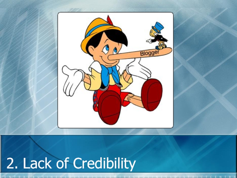
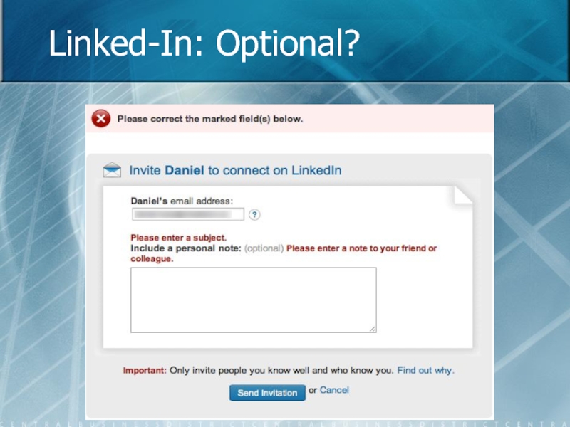
- 27. 2. Lack of Credibility
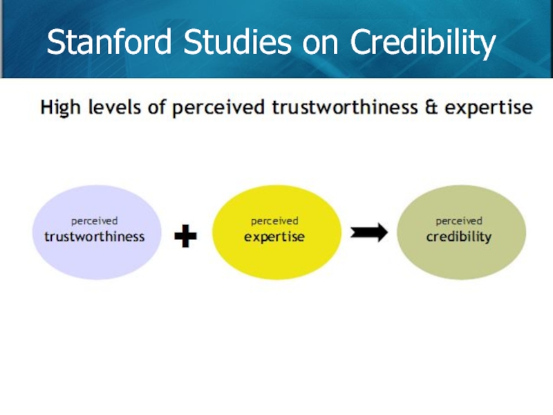
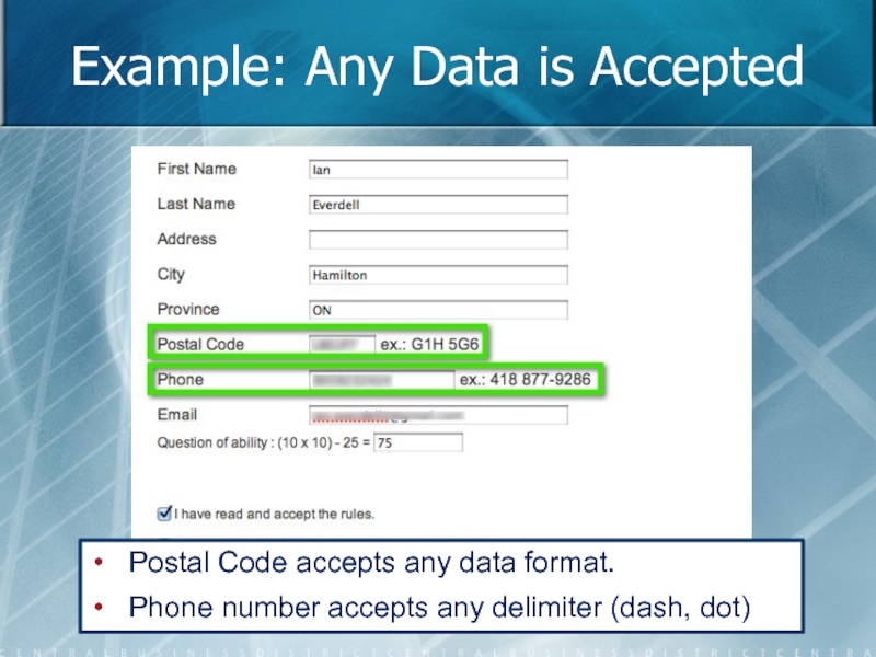
- 28. Four Types of Web Credibility Presumed Credibility:
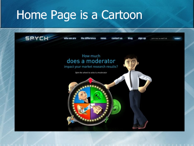
- 29. Home Page is a Cartoon
- 30. Great People, Poor Blog
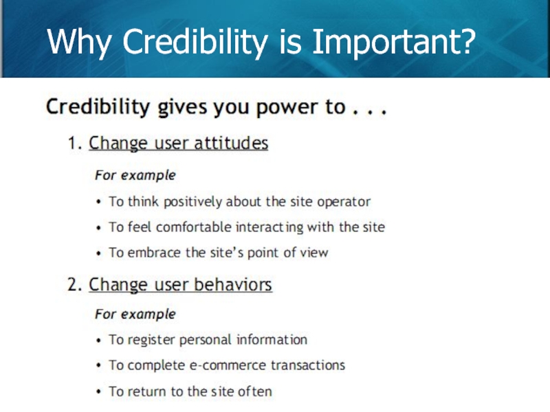
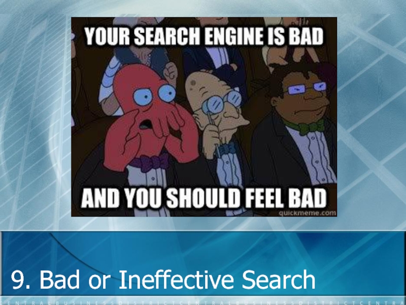
- 31. Why Credibility is Important?
- 32. Stanford Studies on Credibility
- 33. One Factor Damages It All
- 34. Ways to Add Credibility Make your site
- 35. 3. Poorly Written Headlines
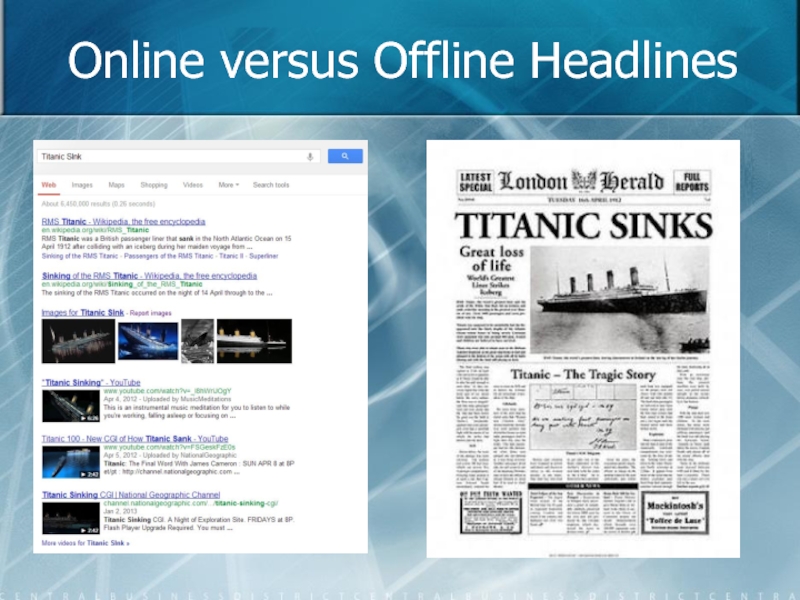
- 36. Online versus Offline Headlines
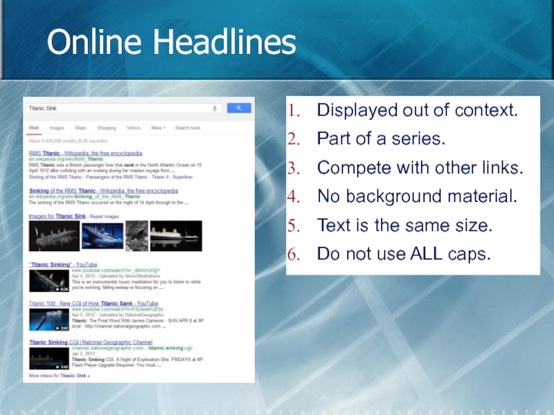
- 37. Online Headlines Displayed out of context. Part
- 38. Offline Headlines Displayed with context. Surrounding data:
- 39. 40-60 Characters per Headline
- 40. Headlines: Writing Assignments Treat headlines as their own writing assignment!
- 41. Guidelines for Headlines Short abstracts of your
- 42. 4. Using One Navigation Scheme
- 43. Most Blogs are Time-Based
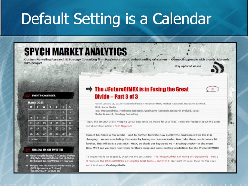
- 44. Default Setting is a Calendar
- 45. Use Pages, Categories, & Tags Pages to
- 46. Guidelines for Navigation Timelines are only one
- 47. 5. Writing Ineffective Content
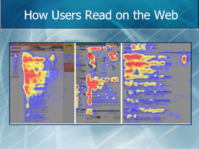
- 48. How Users Read on the Web
- 49. Implications of the F Pattern Customers will
- 50. The Scent of Information
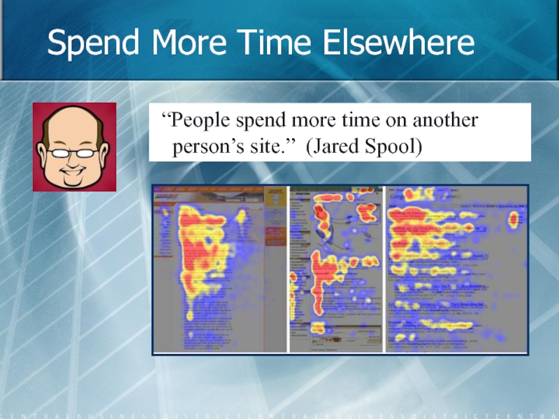
- 51. Spend More Time Elsewhere “People spend more
- 52. Guidelines for Content Usability Use clear, simple
- 53. Guidelines for Content Usability Use descriptive sub-headings:
- 54. Guidelines for Content Usability Use lists for
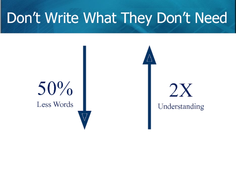
- 55. Don’t Write What They Don’t Need 50% Less Words 2X Understanding
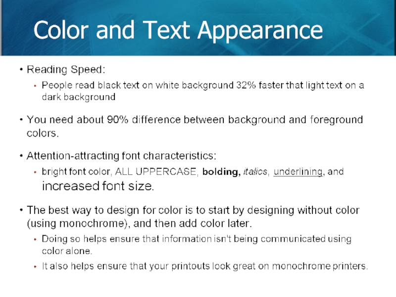
- 56. Color and Text Appearance
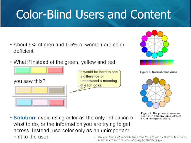
- 57. Color-Blind Users and Content
- 58. 6. Infrequent or Irregular Updates
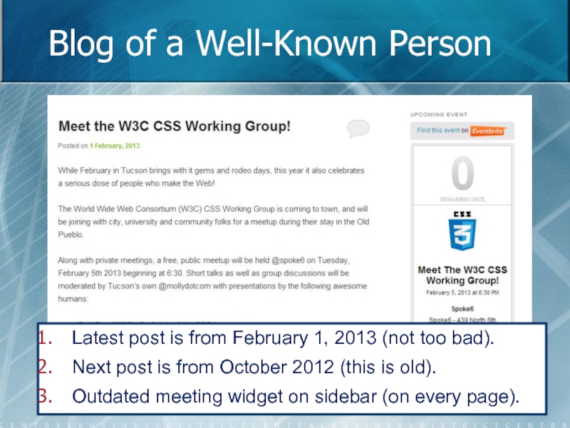
- 59. Blog of a Well-Known Person Latest post
- 60. Infrequent Schedules Hurt Fans Without new content,
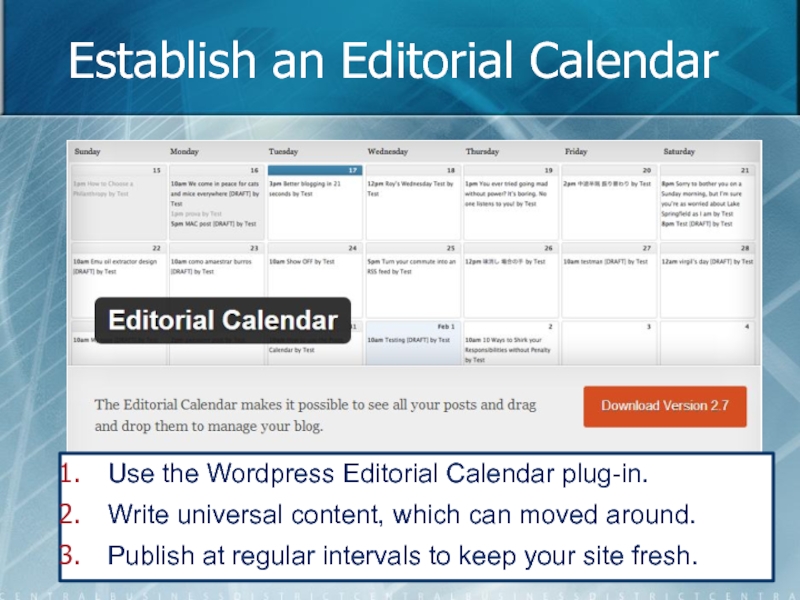
- 61. Establish an Editorial Calendar Use the Wordpress
- 62. Let Users Know of Expiring Content Use
- 63. Do You Know When to Publish? Lowest
- 64. 7. Classic Hits are Buried CLASSIC TODAY HITS
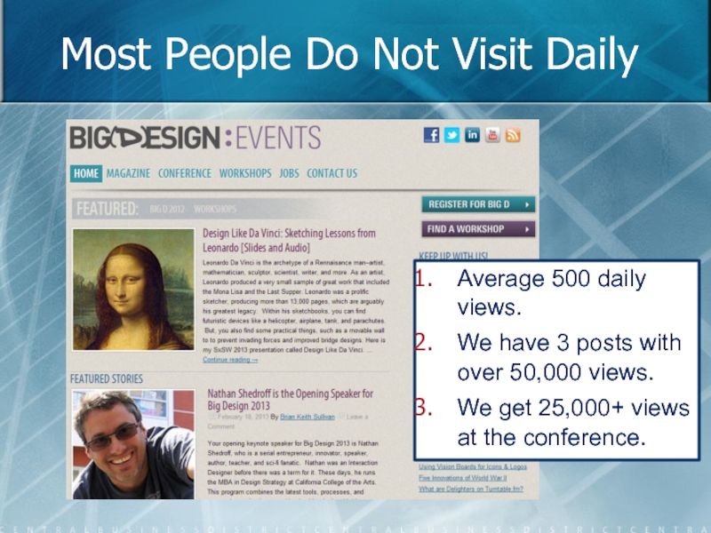
- 65. Most People Do Not Visit Daily Average
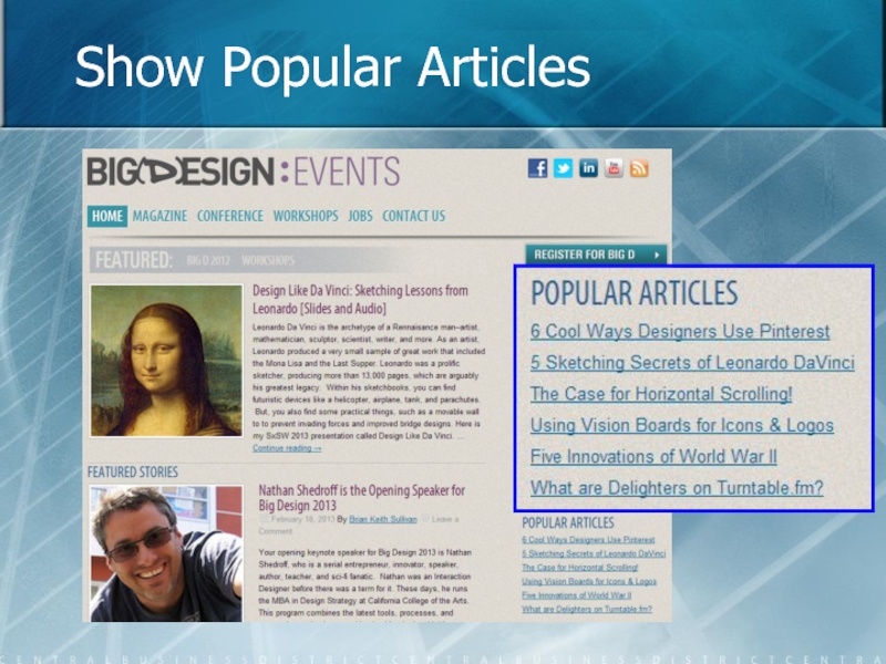
- 66. Show Popular Articles
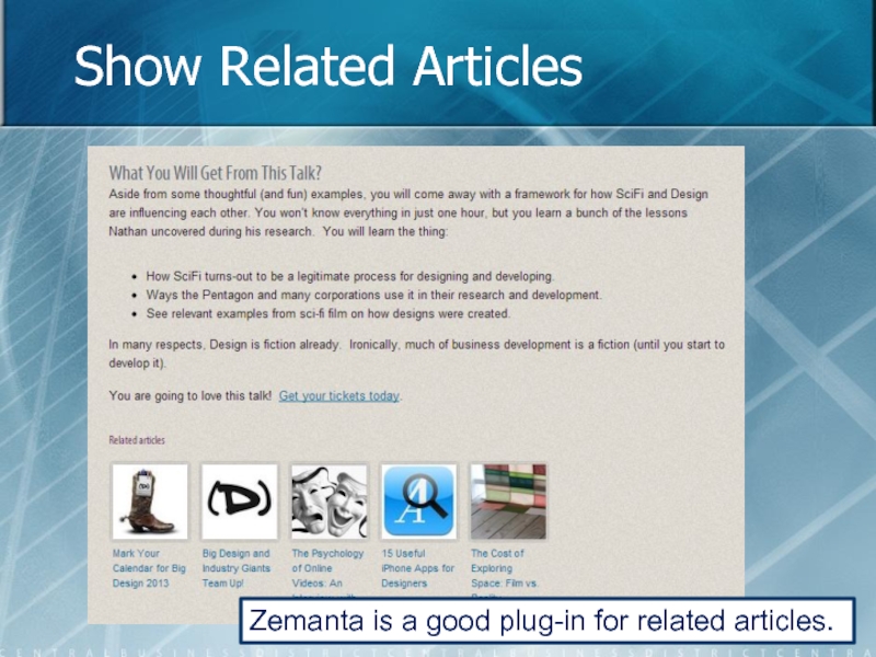
- 67. Show Related Articles Zemanta is a good plug-in for related articles.
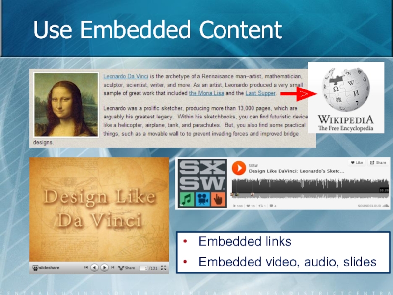
- 68. Use Embedded Content Embedded links Embedded video, audio, slides
- 69. Guidelines for Past Hits Don’t relegate past
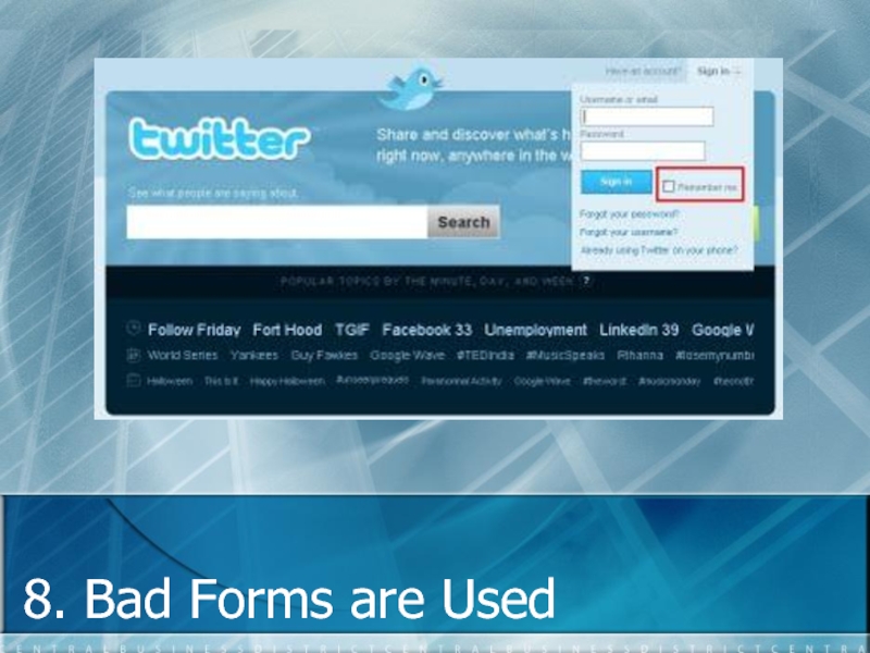
- 70. 8. Bad Forms are Used
- 71. The Tool is Good, Usage is Bad
- 72. Linked-In: Optional is Required
- 73. Linked-In: Optional?
- 74. Example: Any Data is Accepted Postal Code
- 75. 10 Rules for Good Forms Use a
- 76. 10 Rules for Good Forms Use a
- 77. 9. Bad or Ineffective Search
- 78. Search Helps Small Sites Compete Big sites get more traffic, but niche sites can dominate.
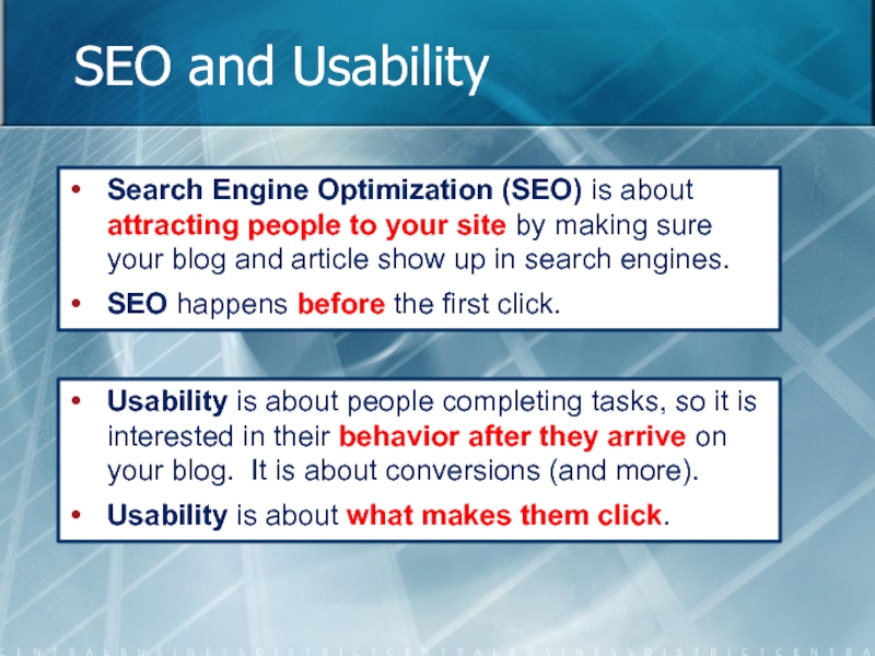
- 79. SEO and Usability Search Engine Optimization (SEO)
- 80. The Importance of Search If your
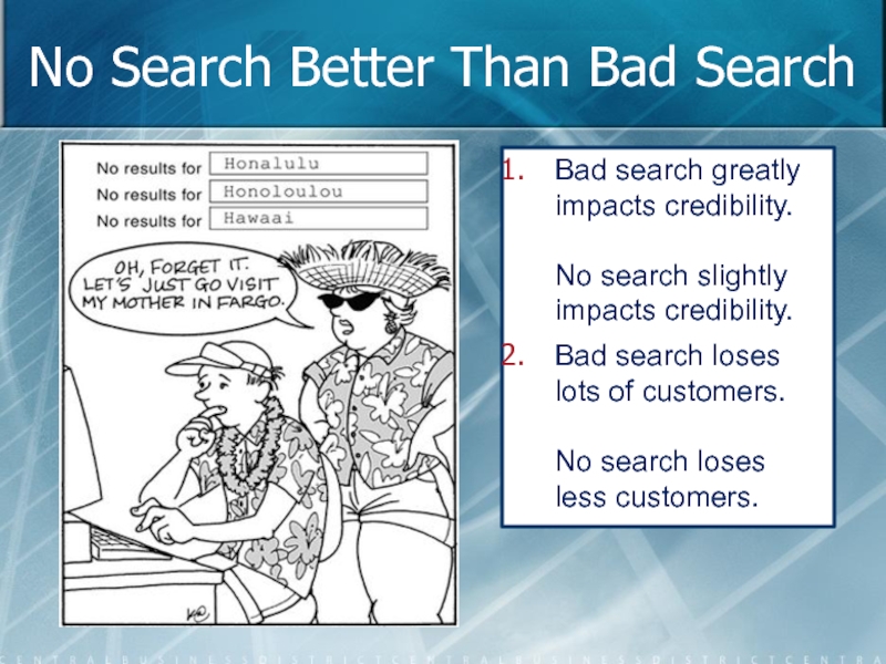
- 81. No Search Better Than Bad Search Bad
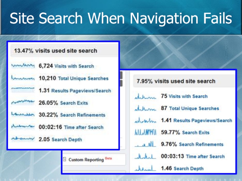
- 82. Site Search When Navigation Fails
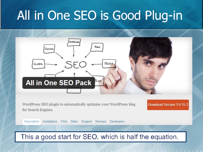
- 83. All in One SEO is Good Plug-in
- 84. Guidelines for Site Search Make it a
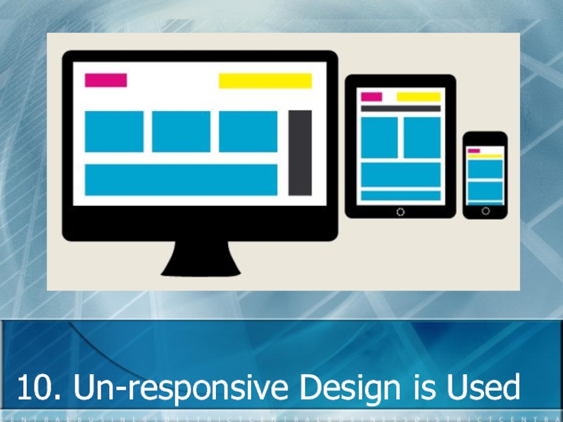
- 85. 10. Un-responsive Design is Used
- 86. We live in a Post-PC Era
- 87. Tablet Sales Rapidly Increasing In
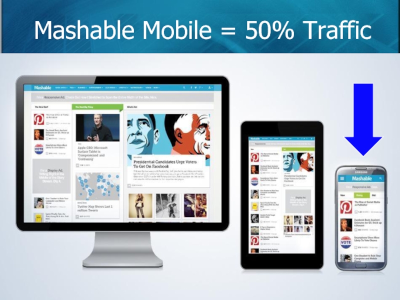
- 88. Mashable Mobile = 50% Traffic
- 89. More Phones than Toothbrushes
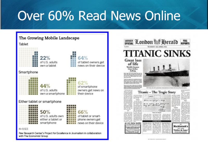
- 90. Over 60% Read News Online
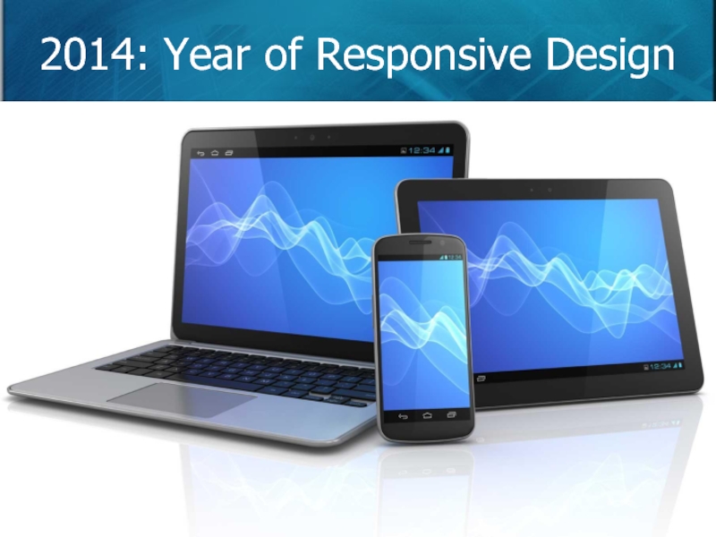
- 91. 2014: Year of Responsive Design
- 92. What is Responsive Design? “In simple
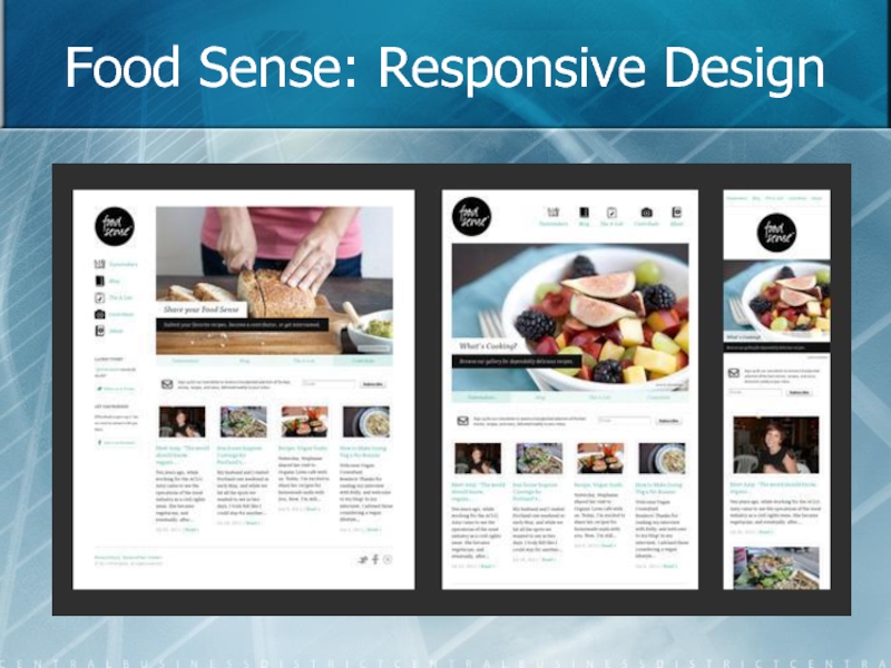
- 93. Food Sense: Responsive Design
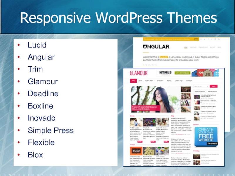
- 94. Responsive WordPress Themes Lucid Angular Trim Glamour Deadline Boxline Inovado Simple Press Flexible Blox
- 95. Brian’s Top 10 List for Blogs
- 96. Thanks!!!
Слайд 6Classic Definitions of Usability
Usability assesses how easy your site, app, or
The usability of a website is based upon whether people can find the information they need. (Jared Spool)
Usability is based on whether you are meeting your business and user goals with your product. (Brian Sullivan)
Слайд 8
The Strategy provides an overview of what you want to get
User Needs: externally derived goals for your blog, which are identified through web analytics, interviews, and testing.
Site Objectives: business, creative, or other internally derived goals for the site.
The Strategy Plane
Слайд 9
The Scope plane transforms your strategy into requirements. What features does
Functional Needs: defines the “features” you need for your site, such as a shopping cart, sign up form, or download features.
Content Requirements: defines your content elements required to meet customer needs, such as large bandwidth for video blogs.
The Scope Plane
Слайд 10
Your blog has some overall Structure. The Structure plane gives shape
Interaction Design: development of application flows to facilitate user tasks and defining how the user interacts with site functionality
Information Architecture: structural design of the information space to facilitate intuitive access to content
The Structure Plane
Слайд 11
The Skeleton plane lies just below the surface. The Skeleton helps
Interface Design: how the design of interface elements facilitates user interaction with functionality
Information Design: how the presentation of information facilitates understanding
Navigation Design: how the design of GUI elements helps the user's navigate through the information architecture
The Skeleton Plane
Слайд 12
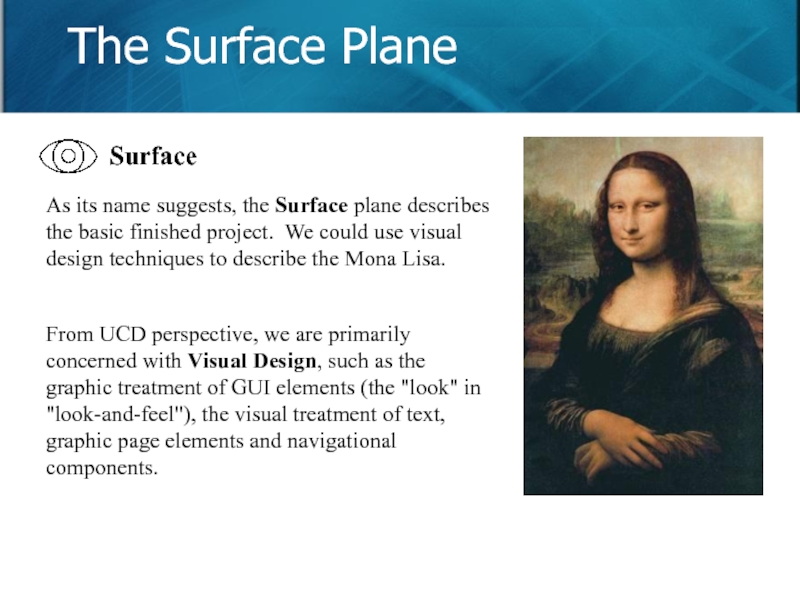
As its name suggests, the Surface plane describes the basic finished
From UCD perspective, we are primarily concerned with Visual Design, such as the graphic treatment of GUI elements (the "look" in "look-and-feel"), the visual treatment of text, graphic page elements and navigational components.
The Surface Plane
Слайд 14
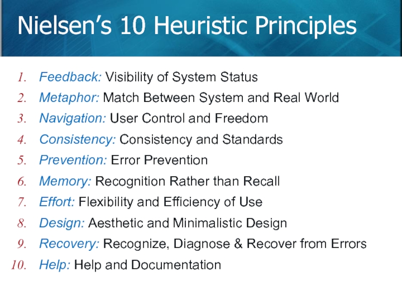
Nielsen’s 10 Heuristic Principles
Slide
Feedback: Visibility of System Status
Metaphor: Match
Navigation: User Control and Freedom
Consistency: Consistency and Standards
Prevention: Error Prevention
Memory: Recognition Rather than Recall
Effort: Flexibility and Efficiency of Use
Design: Aesthetic and Minimalistic Design
Recovery: Recognize, Diagnose & Recover from Errors
Help: Help and Documentation
Слайд 16
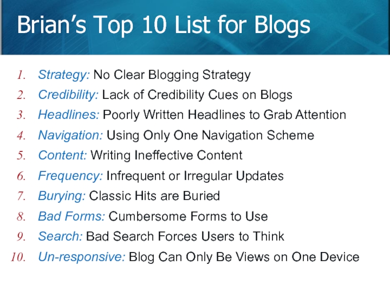
Brian’s Top 10 List for Blogs
Slide
Strategy: No Clear Blogging
Credibility: Lack of Credibility Cues on Blogs
Headlines: Poorly Written Headlines to Grab Attention
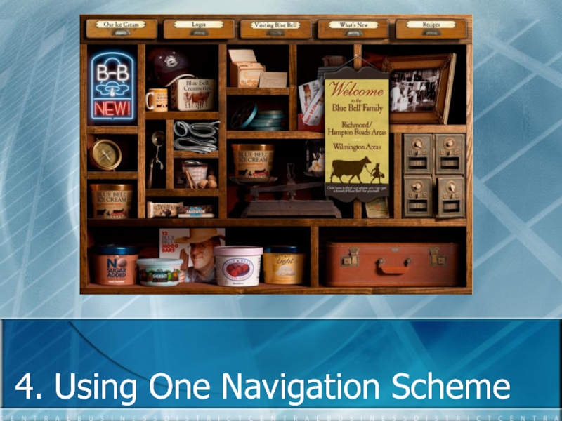
Navigation: Using Only One Navigation Scheme
Content: Writing Ineffective Content
Frequency: Infrequent or Irregular Updates
Burying: Classic Hits are Buried
Bad Forms: Cumbersome Forms to Use
Search: Bad Search Forces Users to Think
Un-responsive: Blog Can Only Be Views on One Device
Слайд 26Your Strategy Defines You!
Luke as an Expert:
- Three Books, But One
Data Mondays: - Probably, links from a Google Search - Resources for many designers
Video Blog Posts: - Self-promotion, but that’s ok - The videos are really good
Mixture of Writing Style: - Link, video, presentation, and event posts - Data is on Monday (at a set frequency)
Слайд 28Four Types of Web Credibility
Presumed Credibility: You already have heard of
Reputed Credibility: You have heard of this person or site from someone you trust. (Ex: Your friend likes it.)
Surface Credibility: You like how something looks on a casual inspection. (Ex: Looks good vs looks confusing.)
Earned Credibility: You know it is credible from your personal experience. (Ex: Good customer service.)
Слайд 34Ways to Add Credibility
Make your site look professional (surface credibility).
Make it
Show there’s person behind the site (name, picture, bio).
Highlight your expertise (credentials, organizations).
Make it easy to contact you (email, social, phone).
Keep your content fresh (old content is not trusted).
Restrain from marketing (reduce ads, offers).
Avoid errors (broken links, spelling) impact credibility.
Use simple, plain language for people to understand.
Use testimonials and case studies (reputed credibility).
Слайд 37Online Headlines
Displayed out of context.
Part of a series.
Compete with other links.
No
Text is the same size.
Do not use ALL caps.
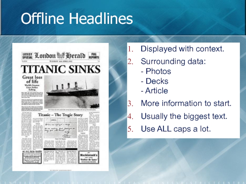
Слайд 38Offline Headlines
Displayed with context.
Surrounding data:
- Photos
- Decks
- Article
More information to start.
Usually
Use ALL caps a lot.
Слайд 41Guidelines for Headlines
Short abstracts of your article.
No teasers to entice people.
Written in plain language. No cute or clever puns.
Skip leading words like “The”, “A”, or “An”.
Do not use the same verbs each time (to differentiate).
Make the first word an information carrying one. (Ex: Titanic Sinks, Design Like Da Vinci.)
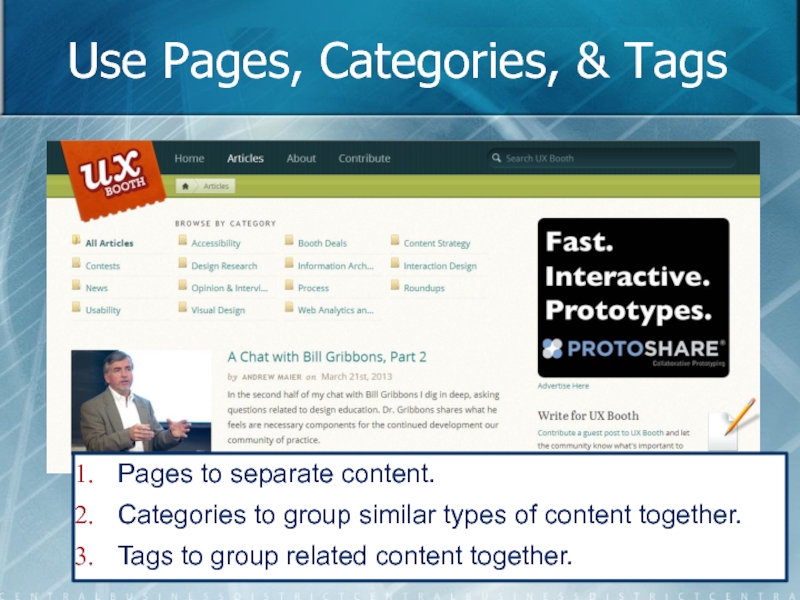
Слайд 45Use Pages, Categories, & Tags
Pages to separate content.
Categories to group similar
Tags to group related content together.
Слайд 46Guidelines for Navigation
Timelines are only one method to organize content.
Provide more
Use pages, categories, and tags to group content.
Avoid the mistake of tagging to all your categories.
Categories must be sufficiently detailed to reduce posts.
10-20 categories are usually enough for any subject.
Highlight each category’s most recent articles and the most popular ones.
Слайд 49Implications of the F Pattern
Customers will not read your text thoroughly.
They
Use inverted pyramid style for writing.
First two paragraphs must state most important info.
Use information carrying words for headings, paragraphs, and lists—people can easily scan them on the left.
Most people scan the first two words of every line.
Слайд 52Guidelines for Content Usability
Use clear, simple language.
“We won the award.” vs
Limit each paragraph to one idea: - Easier to scan - Get the general sense of what is coming - Move to the next idea (or paragraph)
Front-load your content (put the conclusion first): - Quickly scan the opening sentence. - First sentence is usually read (again, F pattern)
Слайд 53Guidelines for Content Usability
Use descriptive sub-headings:
- Breaks up the page
- Shows
Use font differences sparingly: - Harder to read with competing fonts - Decrease your credibility
Use descriptive links: - “Click Here” is rude - Descriptive links support your article, too
Слайд 54Guidelines for Content Usability
Use lists for scannability:
- Less intimidating
- Information chunking
-
Left-align text: - Easier to read - Blockquotes add credibility, but decrease reading speed
Слайд 59Blog of a Well-Known Person
Latest post is from February 1, 2013
Next post is from October 2012 (this is old).
Outdated meeting widget on sidebar (on every page).
Слайд 60Infrequent Schedules Hurt Fans
Without new content, you risk losing your fans,
Слайд 61Establish an Editorial Calendar
Use the Wordpress Editorial Calendar plug-in.
Write universal content,
Publish at regular intervals to keep your site fresh.
Слайд 62Let Users Know of Expiring Content
Use the Wordpress Content Scheduler plug-in.
Provides
Change when content expires, too.
Слайд 63Do You Know When to Publish?
Lowest readership is on Saturdays.
Mondays and
Dips on Fridays (most of the time).
Слайд 65Most People Do Not Visit Daily
Average 500 daily views.
We have 3
We get 25,000+ views at the conference.
Слайд 69Guidelines for Past Hits
Don’t relegate past hits to your archive.
Revisit past
Embed links, video, or audio in newer articles.
Use a Popular Articles list on the Home page.
Embed related links using a plug-in like Zemanta.
Do not assume that people visit everyday.
Compile lists of past articles (ex: SEO 101, Top 10 List).
Слайд 71The Tool is Good, Usage is Bad
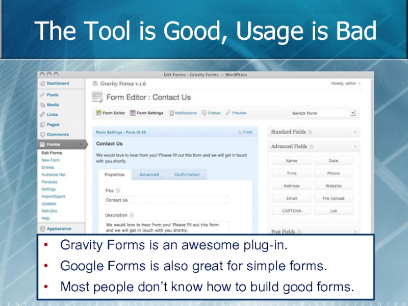
Gravity Forms is an awesome
Google Forms is also great for simple forms.
Most people don’t know how to build good forms.
Слайд 74Example: Any Data is Accepted
Postal Code accepts any data format.
Phone number
Слайд 7510 Rules for Good Forms
Use a simple, vertical layout with labels
If vertically aligned labels are not possible, make them bold and left-aligned.
If you put more than one field on a row (e.g. first and last name) make them look like a single piece of information.
Emphasize section headings (via color or shading) if you want people to read them.
Only ask for required information. Identify optional fields rather than required fields (don't use asterisks).
Слайд 7610 Rules for Good Forms
Use a single input field for numbers
Avoid displaying unnecessary information and make sure important information stands out.
Real time feedback may be distracting — good implementation is key.
Place instructions to the side of the field.
For multi-page forms tell users how many steps remain before completion.
Слайд 79SEO and Usability
Search Engine Optimization (SEO) is about attracting people to
SEO happens before the first click.
Usability is about people completing tasks, so it is interested in their behavior after they arrive on your blog. It is about conversions (and more).
Usability is about what makes them click.
Слайд 80
The Importance of Search
If your website is difficult to use, customers
If they get lost in your website, customers leave.
If a customer can’t FIND your product, they can’t BUY it. …. Then, they leave!
About 60% of people are search-dominant (1st step).
Слайд 81No Search Better Than Bad Search
Bad search greatly impacts credibility.
No search
Bad search loses lots of customers. No search loses less customers.
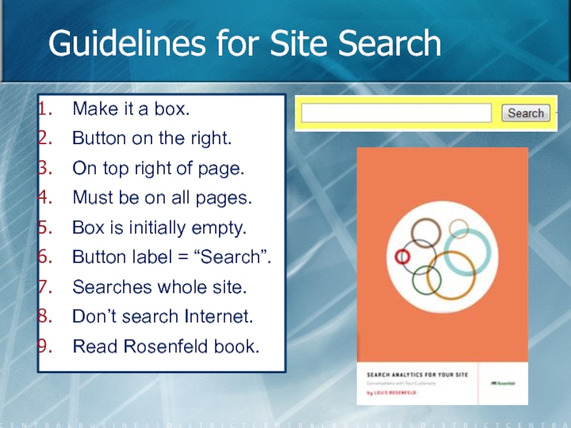
Слайд 84Guidelines for Site Search
Make it a box.
Button on the right.
On top
Must be on all pages.
Box is initially empty.
Button label = “Search”.
Searches whole site.
Don’t search Internet.
Read Rosenfeld book.
Слайд 92What is Responsive Design?
“In simple terms, a responsive
design uses
Слайд 94Responsive WordPress Themes
Lucid
Angular
Trim
Glamour
Deadline
Boxline
Inovado
Simple Press
Flexible
Blox
Слайд 95
Brian’s Top 10 List for Blogs
Slide
Strategy: No Clear Blogging
Credibility: Lack of Credibility Cues on Blogs
Headlines: Poorly Written Headlines to Grab Attention
Navigation: Using Only One Navigation Scheme
Content: Writing Ineffective Content
Frequency: Infrequent or Irregular Updates
Burying: Classic Hits are Buried
Bad Forms: Cumbersome Forms to Use
Search: Bad Search Forces Users to Think
Un-responsive: Blog Can Only Be Views on One Device
