- Главная
- Разное
- Дизайн
- Бизнес и предпринимательство
- Аналитика
- Образование
- Развлечения
- Красота и здоровье
- Финансы
- Государство
- Путешествия
- Спорт
- Недвижимость
- Армия
- Графика
- Культурология
- Еда и кулинария
- Лингвистика
- Английский язык
- Астрономия
- Алгебра
- Биология
- География
- Детские презентации
- Информатика
- История
- Литература
- Маркетинг
- Математика
- Медицина
- Менеджмент
- Музыка
- МХК
- Немецкий язык
- ОБЖ
- Обществознание
- Окружающий мир
- Педагогика
- Русский язык
- Технология
- Физика
- Философия
- Химия
- Шаблоны, картинки для презентаций
- Экология
- Экономика
- Юриспруденция
Store Layout, Design, and Visual Merchandising презентация
Содержание
- 1. Store Layout, Design, and Visual Merchandising
- 2. First discussion will be about store design
- 3. There are five store design objectives… Implement
- 4. The primary store design objective is to
- 5. When customers consistently have rewarding experiences when
- 6. Store design provides utilitarian benefits when it
- 7. Store design provides hedonic benefits by offering
- 8. A third design objective is to increase
- 9. What they see is affected by
- 10. The fourth design objective is to control
- 11. However, the design prevents sales associates from
- 12. Store design or redesign decisions must comply
- 13. Stores built after 1993 must be fully
- 14. However, providing for wider aisles and more
- 15. Provide 32-inch-wide pathways in the main aisle,
- 16. Three elements in the design of stores are… Layout Signage Feature areas Store Design Elements
- 17. Retailers use three general types of store layout designs: Grid Racetrack Free form Layouts
- 18. The grid layout has parallel aisles with
- 19. The grid layout is also cost efficient.
- 21. The racetrack layout, also known as a
- 22. Low fixtures are used so that customers
- 23. Racetrack Layout
- 24. A free-form layout, also known as boutique
- 25. Customers aren’t naturally drawn around the store,
- 26. Free-Form Layout
- 27. Signage and graphics help customers locate specific
- 28. Smaller signs are used to identify sale
- 29. 1. Category Signage – used within a
- 30. 2. Promotional Signage – This signage describes
- 31. 3. Point-of-sale Signage - are placed near
- 32. Digital signage includes signs whose visual content
- 33. Digital signage also offers the opportunity to
- 34. In addition to using layout and signage,
- 35. Windows – window displays draw customers into
- 36. Freestanding displays – are fixtures or mannequins
- 37. Dressing rooms – are critical space in
- 38. Some factors that retailers consider when deciding
- 39. A simple rule of thumb for allocating
- 40. Inventory turnover affects space allocations in two
- 41. The physical limitations of the store and
- 42. As discussed previously, the store, layout, signage,
- 43. Impulse merchandise or products are purchased without
- 44. Demand merchandise and promotional merchandise are often
- 45. Some merchandise categories involve a buying process
- 46. Retailers often put complementary categories next to
- 47. Retailers use a variety of rules to
- 48. A planogram is a diagram that shows
- 49. Virtual-store stimulations are another tool used to
- 50. Another research method used to assess customer
- 51. Visual merchandising is the presentation of a
- 52. The primary purposes of fixtures are to
- 53. Straight rack fixture – consists of a
- 54. Some presentation techniques are idea-oriented, item and
- 55. Idea-oriented presentation – a method of presenting
- 56. Vertical merchandising – merchandise is presented vertically
- 57. To provide a rewarding shopping experience, retailers
- 58. Good lighting in a store involves more
- 59. A good lighting system helps create a
- 60. Traditionally, U.S. specialty and department stores have
- 61. As the price of energy soars and
- 62. The creative use of color can enhance
- 63. Like color and lighting, music can either
- 64. Smell has a large impact on customer’s
- 65. A good store design allows shoppers to
- 66. It is important to visually reassure customers
- 67. As an architect for retail space, you
- 68. Go to your favorite multichannel retailer’s Internet
- 69. Go into the physical store location of
- 70. How can signage and graphics help both
- 71. What are they different types of design
- 72. What are the pros and cons for
Слайд 2First discussion will be about store design objectives.
Next, the elements of
Then the decisions about how much space to allocate to different merchandise categories and departments and where they should be located in the store.
Concluding with how retailers use color, lighting, and music to enhance the customer’s shopping experience.
What will be discussed…
Слайд 3There are five store design objectives…
Implement the retailer’s strategy
Build loyalty by
Increase sales on a visit
Control costs
Meet legal requirements
Store Design Objectives
Слайд 4The primary store design objective is to implement the retailer’s strategy.
Example: McDonald’s
Implement Retail Strategy
Слайд 5When customers consistently have rewarding experiences when patronizing a retailer’s store
Build Loyalty
Слайд 6Store design provides utilitarian benefits when it enables customers to locate
Example: Whole Food stores
Utilitarian Benefits
Слайд 7Store design provides hedonic benefits by offering customers an entertaining and
Example: Cabela’s
Hedonic Benefits
Слайд 8A third design objective is to increase sales made to customers
Increase Sales on a Visit
Слайд 9
What they see is affected by the store layout and how
Increase Sales on a Visit Cont…
Слайд 10The fourth design objective is to control the cost of implementing
Control Cost
Слайд 11However, the design prevents sales associates from observing and covering adjacent
Control Cost Cont…
Слайд 12Store design or redesign decisions must comply with the 1990 Americans
Legal Considerations
Слайд 13Stores built after 1993 must be fully accessible. The act also
Legal Considerations Cont…
Слайд 14However, providing for wider aisles and more space around fixtures can
Legal Considerations Cont…
Слайд 15Provide 32-inch-wide pathways in the main aisle, to bathrooms, dressing rooms,
Lower most cash wraps and fixtures so they can be reached by a person in a wheelchair
Make bathrooms and dressing rooms fully accessible
ADA Requirements
Слайд 18The grid layout has parallel aisles with merchandise on shelves on
Grid Layout
Слайд 19The grid layout is also cost efficient. There’s less wasted space
Grid Layout Cont…
Слайд 21The racetrack layout, also known as a loop, is a store
Racetrack Layout
Слайд 22Low fixtures are used so that customers can see merchandise beyond
Racetrack Layout Cont…
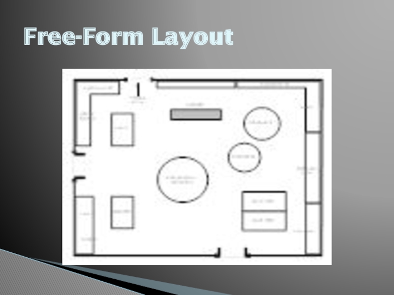
Слайд 24A free-form layout, also known as boutique layout, arranges fixtures and
Free-Form Layout
Слайд 25Customers aren’t naturally drawn around the store, and personal selling becomes
Free-Form Layout Cont…
Слайд 27Signage and graphics help customers locate specific products and departments, provide
Signage and Graphics
Слайд 28Smaller signs are used to identify sale items and provide more
Signage and Graphics Cont…
Слайд 291. Category Signage – used within a particular department or sector
Different Types of Signs…
Слайд 302. Promotional Signage – This signage describes special offers and may
Different Types of Signs…
Слайд 313. Point-of-sale Signage - are placed near the merchandise they refer
Different Types of Signs…
Слайд 32Digital signage includes signs whose visual content is delivered digitally through
Digital Signage
Слайд 33Digital signage also offers the opportunity to enhance a store’s environment
Digital Signage Cont…
Слайд 34In addition to using layout and signage, retailers can guide customers
Feature Areas
Слайд 35Windows – window displays draw customers into the store and provide
Entrances – the first impression caused by the entry area affects the customer’s image of the store. Department stores typically have the cosmetics and fragrance categories at the main entrance because they are visually appealing.
Слайд 36Freestanding displays – are fixtures or mannequins that are located on
End caps – are displays located at the end of an aisle in stores using a grid layout.
Promotional aisle or area – is a space used to display merchandise that is being promoted.
Walls – because retail floor space is often limited, retailers utilize wall space as much as possible.
Слайд 37Dressing rooms – are critical space in which customers decide whether
Cash wraps – also known as point-of-purchase (POP) counters or checkout areas, are places in the store where customers can purchase merchandise. Retailers often use these areas to display impulse items.
Слайд 38Some factors that retailers consider when deciding how much floor or
Space Allocated to Merchandise
Categories
Слайд 39A simple rule of thumb for allocating space is to allocate
Space Productivity
Слайд 40Inventory turnover affects space allocations in two ways. First, both inventory
Inventory Turnover
Слайд 41The physical limitations of the store and its fixtures affect space
Display Considerations
Слайд 42As discussed previously, the store, layout, signage, and feature areas can
Location of Merchandise Categories
and Design Elements
Слайд 43Impulse merchandise or products are purchased without planning, such as fragrances
Impulse Merchandise
Слайд 44Demand merchandise and promotional merchandise are often placed in the back
Demand Merchandise
Слайд 45Some merchandise categories involve a buying process that is best accomplished
Special Merchandise
Слайд 46Retailers often put complementary categories next to each other to encourage
Category Adjacencies
Слайд 47Retailers use a variety of rules to locate specific SKU’s within
Location of Merchandise within
a Category
Слайд 48A planogram is a diagram that shows how and where specific
Planograms
Слайд 49Virtual-store stimulations are another tool used to determine the effects of
Virtual-Store Stimulation
Слайд 50Another research method used to assess customer reactions to planograms involves
Videotaping Consumers
Слайд 51Visual merchandising is the presentation of a store and its merchandise
Visual Merchandising
Слайд 52The primary purposes of fixtures are to efficiently hold and display
Fixtures
Слайд 53Straight rack fixture – consists of a long pipe balanced between
Rounder – also known as a bulk fixture or capacity fixture, is a round fixture that sits on a pedestal.
Four-way fixture – also known as a feature fixture, has two crossbars that sit perpendicular on a pedestal.
Gondolas – are extremely versatile. They’re used in grocery and discount stores.
Слайд 54Some presentation techniques are idea-oriented, item and size, color, price lining,
Presentation Techniques
Слайд 55Idea-oriented presentation – a method of presenting merchandise based on a
Item and size presentation – probably the most common technique of organizing stock is by style or item.
Color presentation – a bold merchandising technique is organizing by color.
Price lining – occurs when retailers offer a limited number of predetermined price points and/or price categories within another classification.
Слайд 56Vertical merchandising – merchandise is presented vertically using walls and high
Tonnage merchandising – is a display technique in which large quantities of merchandise are displayed together.
Frontal presentation – a method of displaying merchandise in which the retailer exposes as much of the product as possible to catch the customer’s eye.
Слайд 57To provide a rewarding shopping experience, retailers go beyond presenting appealing
Creating an Appealing Store
Atmosphere
Слайд 58Good lighting in a store involves more than simply illuminating space.
Lighting
Слайд 59A good lighting system helps create a sense of excitement in
Highlighting Merchandise
Слайд 60Traditionally, U.S. specialty and department stores have employed incandescent lighting sources
Mood Creation
Слайд 61As the price of energy soars and retailers and their customers
Energy-Efficient Lighting
Слайд 62The creative use of color can enhance a retailer’s image and
Color
Слайд 63Like color and lighting, music can either add to or detract
Music
Слайд 64Smell has a large impact on customer’s mood and emotions. Scent,
Scent
Слайд 65A good store design allows shoppers to move freely, unencumbered by
When a store is properly designed, customers should be able to find what they are looking for easily.
Stores are designed so that customers can easily view the merchandise and read the signs.
Conclusion
Слайд 66It is important to visually reassure customers that they’re going to
Conclusion Cont…
Слайд 67As an architect for retail space, you are responsible for Americans
Assignment 1
Слайд 68Go to your favorite multichannel retailer’s Internet site. Evaluate its degree
Assignment 2
Слайд 69Go into the physical store location of a retailer of your
Assignment 3
Слайд 70How can signage and graphics help both customers and retailers? Consider
Assignment 4
Слайд 71What are they different types of design that can be used
Assignment 5
Слайд 72What are the pros and cons for both centralized cash wraps
Assignment 6
