- Главная
- Разное
- Дизайн
- Бизнес и предпринимательство
- Аналитика
- Образование
- Развлечения
- Красота и здоровье
- Финансы
- Государство
- Путешествия
- Спорт
- Недвижимость
- Армия
- Графика
- Культурология
- Еда и кулинария
- Лингвистика
- Английский язык
- Астрономия
- Алгебра
- Биология
- География
- Детские презентации
- Информатика
- История
- Литература
- Маркетинг
- Математика
- Медицина
- Менеджмент
- Музыка
- МХК
- Немецкий язык
- ОБЖ
- Обществознание
- Окружающий мир
- Педагогика
- Русский язык
- Технология
- Физика
- Философия
- Химия
- Шаблоны, картинки для презентаций
- Экология
- Экономика
- Юриспруденция
Usability Heuristics and Design Guidelines. Human Computer Interaction and Communication. (Part 2) презентация
Содержание
- 1. Usability Heuristics and Design Guidelines. Human Computer Interaction and Communication. (Part 2)
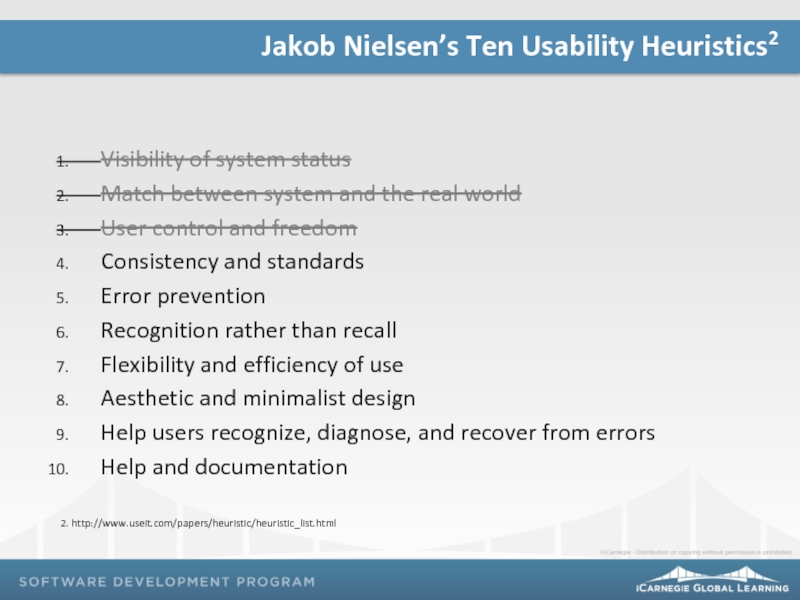
- 2. Jakob Nielsen’s Ten Usability Heuristics Reflection Topics and Agenda
- 3. Course Progress Project 01: World Food
- 4. Visibility of system status Match between
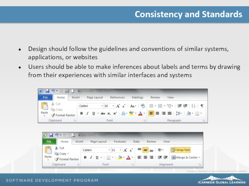
- 5. Design should follow the guidelines and
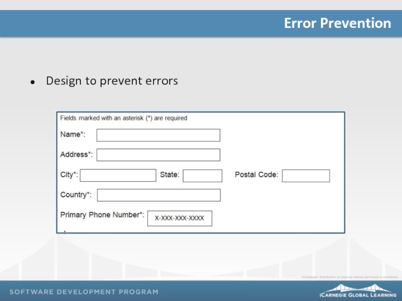
- 6. Design to prevent errors Error Prevention
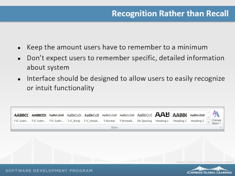
- 7. Keep the amount users have to
- 8. Design should accommodate both experienced and inexperienced users Flexibility and Efficiency of Use
- 9. Design should include only relevant, minimally
- 10. Use plain language to indicate problem
- 11. Documentation should be: Helpful and relevant
- 12. What have you learned from checking
- 13. Project 02: Due on Class 30
Слайд 1Usability Heuristics and Design Guidelines, Part II
Human Computer Interaction and Communication
Слайд 3
Course Progress
Project 01: World Food Initiative Website
Project 02: Auto Rental
Project 03: Usability Testing
Слайд 4
Visibility of system status
Match between system and the real world
User control
Consistency and standards
Error prevention
Recognition rather than recall
Flexibility and efficiency of use
Aesthetic and minimalist design
Help users recognize, diagnose, and recover from errors
Help and documentation
2. http://www.useit.com/papers/heuristic/heuristic_list.html
Jakob Nielsen’s Ten Usability Heuristics2
Слайд 5
Design should follow the guidelines and conventions of similar systems, applications,
Users should be able to make inferences about labels and terms by drawing from their experiences with similar interfaces and systems
Consistency and Standards
Слайд 7
Keep the amount users have to remember to a minimum
Don’t expect
Interface should be designed to allow users to easily recognize or intuit functionality
Recognition Rather than Recall
Слайд 8
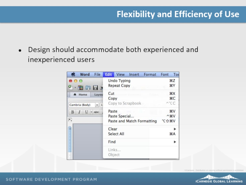
Design should accommodate both experienced and inexperienced users
Flexibility and Efficiency of
Слайд 9
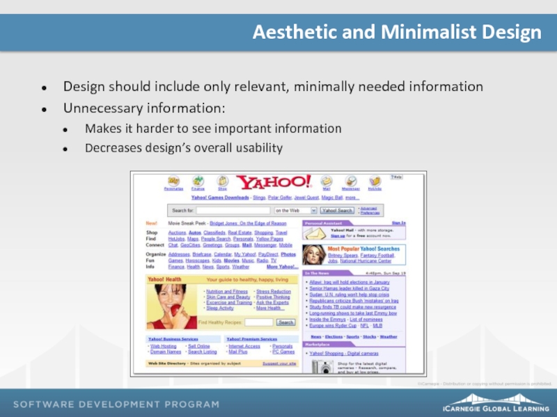
Design should include only relevant, minimally needed information
Unnecessary information:
Makes it harder
Decreases design’s overall usability
Aesthetic and Minimalist Design
Слайд 10
Use plain language to indicate problem and suggest solution
Error messages should:
Be
Be meaningful to the user
Provide immediate feedback and specific guidance on how to recover from the error
Help Users Recognize, Diagnose, and Recover from Errors
Слайд 11
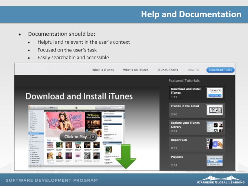
Documentation should be:
Helpful and relevant in the user’s context
Focused on the
Easily searchable and accessible
Help and Documentation
Слайд 12
What have you learned from checking your design against all ten
Exercise Reflection
Слайд 13
Project 02: Due on Class 30
Due by 8 p.m. via the
Assessment 07: Class 28
Mid-Semester Assessment 02: Class 30
Remember…


