WOMEN IN BLACK (2012), PARANORMAL ACTIVITY (2015) INSIDIOUUS (2015) and ANNABELLE(2014)
- Главная
- Разное
- Дизайн
- Бизнес и предпринимательство
- Аналитика
- Образование
- Развлечения
- Красота и здоровье
- Финансы
- Государство
- Путешествия
- Спорт
- Недвижимость
- Армия
- Графика
- Культурология
- Еда и кулинария
- Лингвистика
- Английский язык
- Астрономия
- Алгебра
- Биология
- География
- Детские презентации
- Информатика
- История
- Литература
- Маркетинг
- Математика
- Медицина
- Менеджмент
- Музыка
- МХК
- Немецкий язык
- ОБЖ
- Обществознание
- Окружающий мир
- Педагогика
- Русский язык
- Технология
- Физика
- Философия
- Химия
- Шаблоны, картинки для презентаций
- Экология
- Экономика
- Юриспруденция
GENERIC CONVENTIONS OF HORROR MOVIE HOMEPAGES HORROR MOVIE – HOMEPAGE ANALYSIS. INCLUDING: THE WOMEN IN BLACK (2012), PARANORMAL ACTIVITY (2015) INSIDIOUUS (2015) and ANNABELLE(2014) презентация
Содержание
- 1. GENERIC CONVENTIONS OF HORROR MOVIE HOMEPAGES HORROR MOVIE – HOMEPAGE ANALYSIS. INCLUDING: THE WOMEN IN BLACK (2012), PARANORMAL ACTIVITY (2015) INSIDIOUUS (2015) and ANNABELLE(2014)
- 2. HOMEPAGE ANALYSIS THE WOMEN IN BLACK (2012)
- 3. HOMEPAGE ANALYSIS THE WOMEN IN
- 4. HOMEPAGE ANALYSIS PARANORMAL ACTIVITY (2015)
- 5. HOMEPAGE ANALYSIS PARANORMAL ACTIVITY(2015) From
- 6. HOMEPAGE ANALYSIS INSIDIOUUS (2015)
- 7. HOMEPAGE ANALYSIS INSIDIOUS (2015) On
- 8. HOMEPAGE ANALYSIS ANNABELLE(2014)
- 9. HOMEPAGE ANALYSIS INSIDIOUS (2015) As
Слайд 3
HOMEPAGE ANALYSIS
THE WOMEN IN BLACK (2012)
All these films that I will
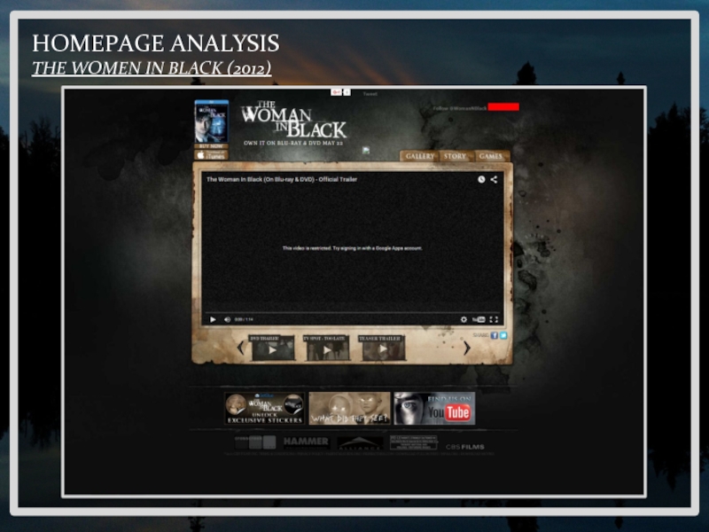
be exploring in depth have made website homepages to excite audiences and let them know more about the film. As audiences first approach the website they are greeted with one of the trailers that was released for the film. Below the first trailer is a group of other trailers that can be viewed by the audience. The technique that this website homepage has used is very simple yet effective. This is because the film website is not messing around and getting straight to the point with the audience invited in with the horror movie trailer. This is a technique that we as a group could take forward because as a group we want to invite our audience straight into the website. With this trailer, people who have stumbled across the website will get a good idea of what the film is like based on the trailer that is given at the start.
Continuing on with the homepage, I notice that there are three small buttons in the right hand corner, these three buttons allow the audience to get more of an idea about the film, by the use of these buttons, audiences can click on the buttons and see more information about the film through text or images. This is a cleaver technique that should be taken toward when creating our own horror movie homepages. This is because it will give audiences the chance to find out more information about the film. However, we will not want to give away too much information, this is because if our audience find out about the film, then there is less chance that they will see the film because they know too much about the film before it is released to cinemas worldwide.
Finally, towards the bottom of the page there is a load of production text for the film, this has been used by many other film companies because they are promoting the film and the film company at the same time. These production companies are found at the bottom of the page because they can across as not important. However, this sometimes interest audiences because it gives them more information about the film.
Слайд 5
HOMEPAGE ANALYSIS
PARANORMAL ACTIVITY(2015)
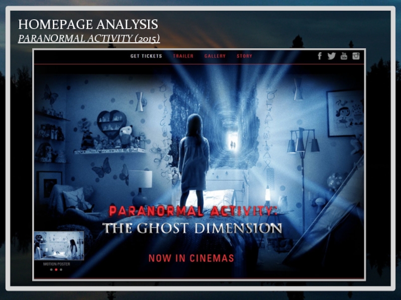
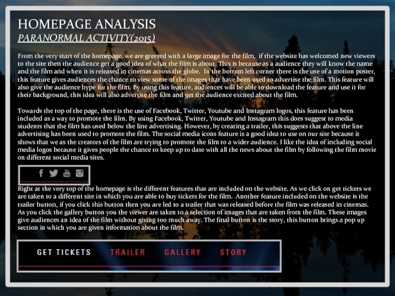
From the very start of the homepage, we are
greeted with a large image for the film, if the website has welcomed new viewers to the site then the audience get a good idea of what the film is about. This is because as a audience they will know the name and the film and when it is released in cinemas across the globe. In the bottom left corner there is the use of a motion poster, this feature gives audiences the chance to view some of the images that have been used to advertise the film. This feature will also give the audience hype for the film. By using this feature, audiences will be able to download the feature and use it for their background, this idea will also advertise the film and get the audience excited about the film.
Towards the top of the page, there is the use of Facebook, Twitter, Youtube and Instagram logos, this feature has been included as a way to promote the film. By using Facebook, Twitter, Youtube and Instagram this does suggest to media students that the film has used below the line advertising. However, by creating a trailer, this suggests that above the line advertising has been used to promote the film. The social media icons feature is a good idea to use on our site because it shows that we as the creators of the film are trying to promote the film to a wider audience. I like the idea of including social media logos because it gives people the chance to keep up to date with all the news about the film by following the film movie on different social media sites.
Right at the very top of the homepage is the different features that are included on the website. As we click on get tickets we are taken to a different site in which you are able to buy tickets for the film. Another feature included on the website is the trailer button, if you click this button then you are led to a trailer that was released before the film was released in cinemas. As you click the gallery button you the viewer are taken to a selection of images that are taken from the film. These images give audiences an idea of the film without giving too much away. The final button is the story, this button brings a pop up section in which you are given information about the film.
Слайд 7
HOMEPAGE ANALYSIS
INSIDIOUS (2015)
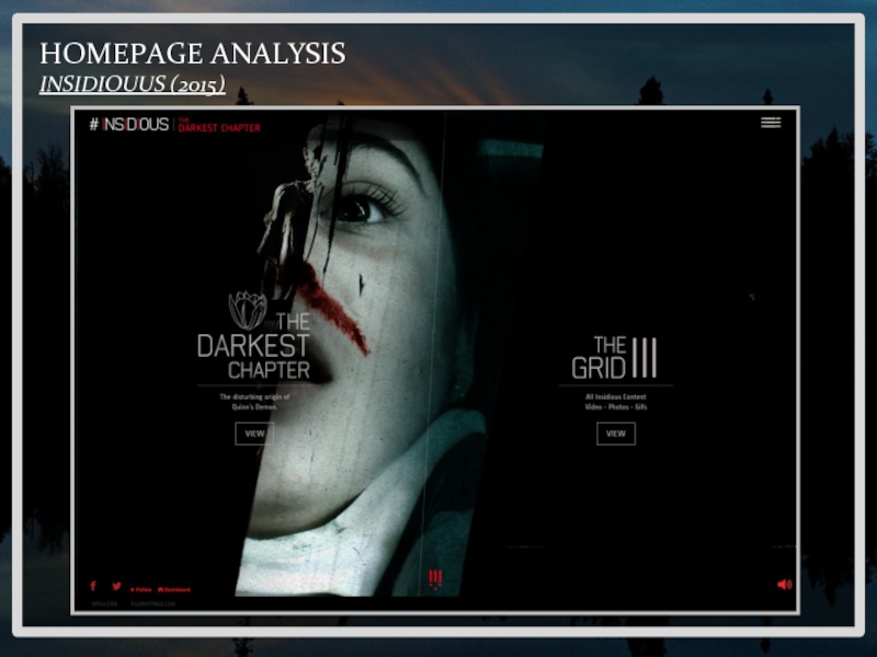
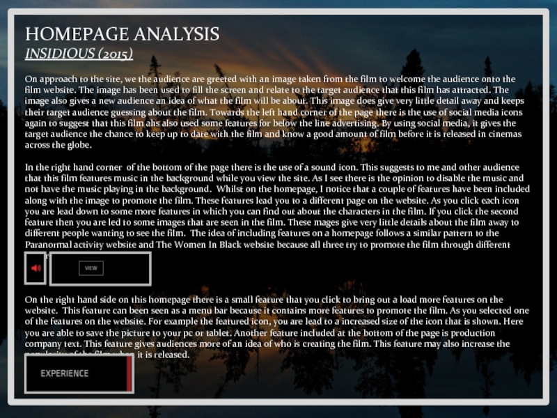
On approach to the site, we the audience are
greeted with an image taken from the film to welcome the audience onto the film website. The image has been used to fill the screen and relate to the target audience that this film has attracted. The image also gives a new audience an idea of what the film will be about. This image does give very little detail away and keeps their target audience guessing about the film. Towards the left hand corner of the page there is the use of social media icons again to suggest that this film ahs also used some features for below the line advertising. By using social media, it gives the target audience the chance to keep up to date with the film and know a good amount of film before it is released in cinemas across the globe.
In the right hand corner of the bottom of the page there is the use of a sound icon. This suggests to me and other audience that this film features music in the background while you view the site. As I see there is the opinion to disable the music and not have the music playing in the background. Whilst on the homepage, I notice that a couple of features have been included along with the image to promote the film. These features lead you to a different page on the website. As you click each icon you are lead down to some more features in which you can find out about the characters in the film. If you click the second feature then you are led to some images that are seen in the film. These mages give very little details about the film away to different people wanting to see the film. The idea of including features on a homepage follows a similar pattern to the Paranormal activity website and The Women In Black website because all three try to promote the film through different features.
On the right hand side on this homepage there is a small feature that you click to bring out a load more features on the website. This feature can been seen as a menu bar because it contains more features to promote the film. As you selected one of the features on the website. For example the featured icon, you are lead to a increased size of the icon that is shown. Here you are able to save the picture to your pc or tablet. Another feature included at the bottom of the page is production company text. This feature gives audiences more of an idea of who is creating the film. This feature may also increase the popularity of the film when it is released.
Слайд 9
HOMEPAGE ANALYSIS
INSIDIOUS (2015)
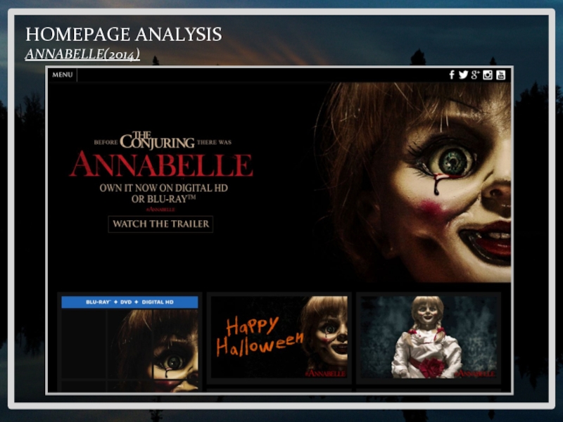
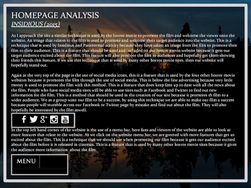
As I approach the site a similar technique is
used by the horror movie to promote the film and welcome the viewer onto the website. An image that relates to the film is used to promote and welcome their target audience into the website. This is a technique that is used by Insidious and Paranormal activity because they have taken an image from the film to promote their film to their audience. This is a feature that should be used and included on our horror movie website because it gets our target audience excited about the film. This feature will also promote the film to audiences and hopefully get them showing their friends this feature. If we use this technique that is used by many other horror movie sites, then our website will hopefully stand out.
Again at the very top of the page is the use of social media icons, this is a feature that is used by the four other horror movie websites because it promotes the film through the use of social media. This is below the line advertising because very little money is used to promote the film with this method. This is a feature that does keep fans up to date with all the news about the film. People who have social media sites will be able to use sites such as Facebook and Twitter to find out new information for the film. This is a method that should be used in the creation of our site because it promotes th film to a wider audience. We as a group want our film to be a success, by using this technique we are able to make our film a success because people will stumble across our Facebook or Twitter page by mistake and find out about the film. They will also hopefully be interested by the film aswell.
In the top left hand corner of the website is the use of a menu bar, here fans and viewers of the website are able to look at more features that relate to the website. As we click on the website menu bar, we are greeted with more features that get us excited about the film. This is a technique that we should use when promoting our film because it gets our audience excited about the film before it is released in cinemas. This is a feature that is used by many other horror movie sites because it gives the audience more information about the film.
