- Главная
- Разное
- Дизайн
- Бизнес и предпринимательство
- Аналитика
- Образование
- Развлечения
- Красота и здоровье
- Финансы
- Государство
- Путешествия
- Спорт
- Недвижимость
- Армия
- Графика
- Культурология
- Еда и кулинария
- Лингвистика
- Английский язык
- Астрономия
- Алгебра
- Биология
- География
- Детские презентации
- Информатика
- История
- Литература
- Маркетинг
- Математика
- Медицина
- Менеджмент
- Музыка
- МХК
- Немецкий язык
- ОБЖ
- Обществознание
- Окружающий мир
- Педагогика
- Русский язык
- Технология
- Физика
- Философия
- Химия
- Шаблоны, картинки для презентаций
- Экология
- Экономика
- Юриспруденция
Starbucks. At the brand’s core is the Starbucks siren презентация
Содержание
- 1. Starbucks. At the brand’s core is the Starbucks siren
- 2. At the brand’s core is the Starbucks
- 3. THE CHALLENGES FACED
- 4. “Starbucks wanted the new logo and visual
- 5. THE PROCESS
- 6. Each visual approach included direction for logo
- 7. HOW THE LOGO AND PACKAGING HAVE EVOLVED
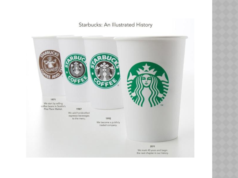
- 8. In 1986, Howard Schultz started his own
- 9. The Starbucks siren remained, but was cleaned
- 10. In 2008, Starbucks attempted to take a
- 11. WHERE THEY’RE AT TODAY
- 12. In 2011, Starbucks introduced a new identity,
- 13. Today, the coffeehouse offers much more than

Слайд 2At the brand’s core is the Starbucks siren. The bare-breasted, two-tailed
mermaid, or siren, is intended to be as seductive as the coffee itself. It is based on an old sixteenth-century Norse woodcut.


Слайд 4“Starbucks wanted the new logo and visual identity system to say
as much about its future as it did about its past. Past the logo, they wanted a program that afforded them the freedom and flexibility to explore new product, regional and experience opportunities, while keeping them in step with their current and future customers.”


Слайд 6Each visual approach included direction for logo usage, pattern, graphic, typography,
illustration, imagery, color, form, material, layout and language.


Слайд 8In 1986, Howard Schultz started his own company, called Il Giornale.
Their original logo still serves as inspiration in Starbucks’ logo today.

Слайд 9The Starbucks siren remained, but was cleaned up, made more contemporary,
and featured in front of a black background, allowing it to jump to the forefront.

Слайд 10In 2008, Starbucks attempted to take a leap into the future,
but instead, fell further into the past.


Слайд 12In 2011, Starbucks introduced a new identity, branding, and logo, going
back to their original green success.

Слайд 13Today, the coffeehouse offers much more than just coffee. Their teas,
handcrafted beverages, ice creams, fresh food, packaged goods, consumer products, and merchandise have amassed a multi-billion dollar empire.