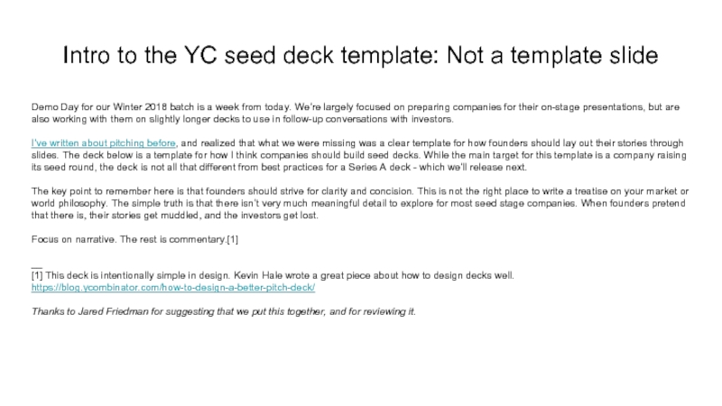
Day for our Winter 2018 batch is a week from today. We’re largely focused on preparing companies for their on-stage presentations, but are also working with them on slightly longer decks to use in follow-up conversations with investors.
I’ve written about pitching before, and realized that what we were missing was a clear template for how founders should lay out their stories through slides. The deck below is a template for how I think companies should build seed decks. While the main target for this template is a company raising its seed round, the deck is not all that different from best practices for a Series A deck - which we’ll release next.
The key point to remember here is that founders should strive for clarity and concision. This is not the right place to write a treatise on your market or world philosophy. The simple truth is that there isn’t very much meaningful detail to explore for most seed stage companies. When founders pretend that there is, their stories get muddled, and the investors get lost.
Focus on narrative. The rest is commentary.[1]
__
[1] This deck is intentionally simple in design. Kevin Hale wrote a great piece about how to design decks well. https://blog.ycombinator.com/how-to-design-a-better-pitch-deck/
Thanks to Jared Friedman for suggesting that we put this together, and for reviewing it.
- Главная
- Разное
- Дизайн
- Бизнес и предпринимательство
- Аналитика
- Образование
- Развлечения
- Красота и здоровье
- Финансы
- Государство
- Путешествия
- Спорт
- Недвижимость
- Армия
- Графика
- Культурология
- Еда и кулинария
- Лингвистика
- Английский язык
- Астрономия
- Алгебра
- Биология
- География
- Детские презентации
- Информатика
- История
- Литература
- Маркетинг
- Математика
- Медицина
- Менеджмент
- Музыка
- МХК
- Немецкий язык
- ОБЖ
- Обществознание
- Окружающий мир
- Педагогика
- Русский язык
- Технология
- Физика
- Философия
- Химия
- Шаблоны, картинки для презентаций
- Экология
- Экономика
- Юриспруденция
Intro to the YC seed deck template: Not a template slide презентация
Содержание
- 1. Intro to the YC seed deck template: Not a template slide
- 2. Seed deck template, Inc. A template that tells you how to build a seed deck
- 3. Founders build bad seed decks This wastes
- 4. Our template solves this problem It’s fast
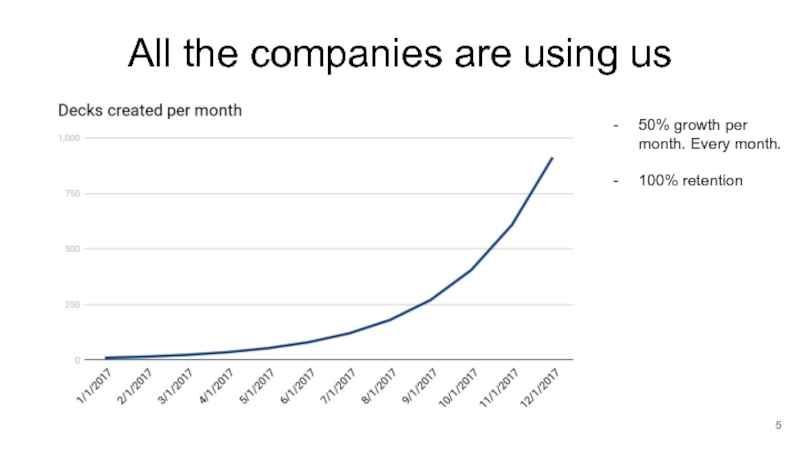
- 5. All the companies are using us 50% growth per month. Every month. 100% retention
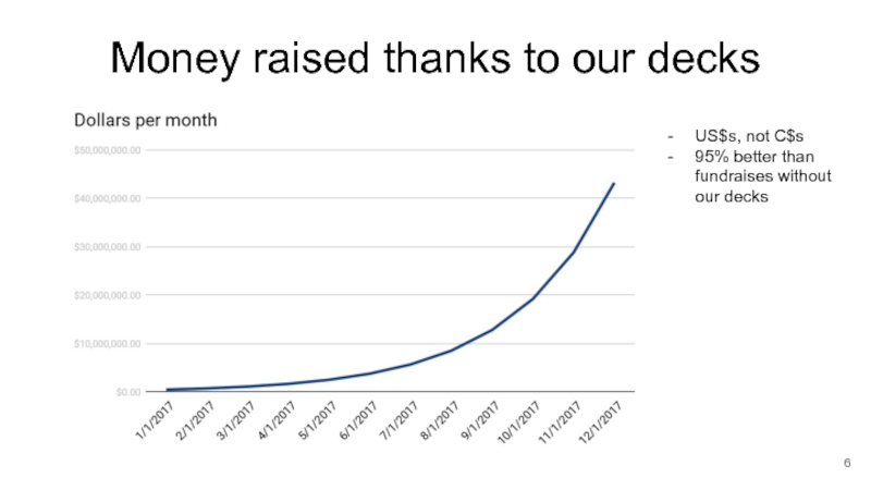
- 6. Money raised thanks to our decks US$s,
- 7. Our decks work because of science Time
- 8. We make money on every deck 5%
- 9. Future growth There are 1000 slide decks
- 10. Team CTO with lots of experience CEO
- 11. What we need $1.5m This is for
Слайд 3Founders build bad seed decks
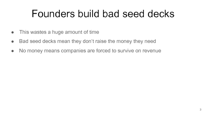
This wastes a huge amount of time
Bad
seed decks mean they don’t raise the money they need
No money means companies are forced to survive on revenue
No money means companies are forced to survive on revenue
Слайд 4Our template solves this problem
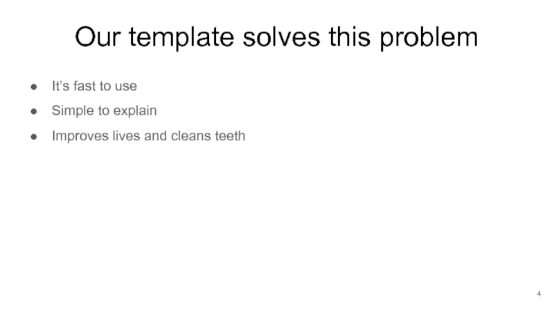
It’s fast to use
Simple to explain
Improves lives
and cleans teeth
Слайд 7Our decks work because of science
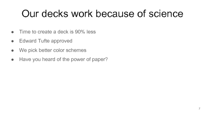
Time to create a deck is
90% less
Edward Tufte approved
We pick better color schemes
Have you heard of the power of paper?
Edward Tufte approved
We pick better color schemes
Have you heard of the power of paper?
Слайд 8We make money on every deck
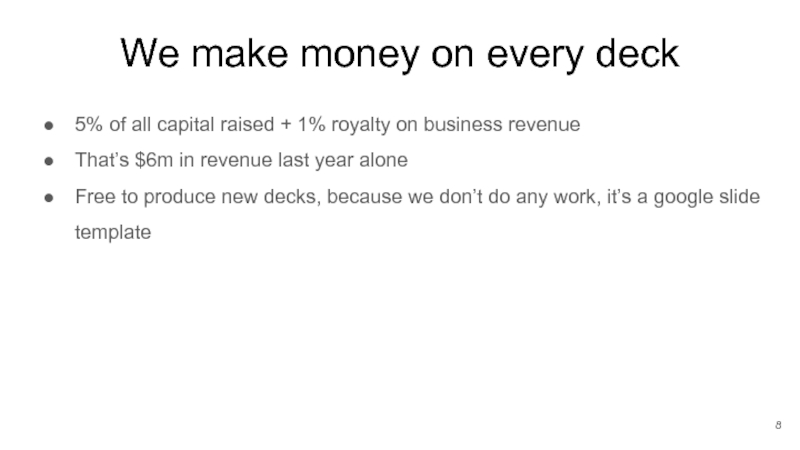
5% of all capital raised +
1% royalty on business revenue
That’s $6m in revenue last year alone
Free to produce new decks, because we don’t do any work, it’s a google slide template
That’s $6m in revenue last year alone
Free to produce new decks, because we don’t do any work, it’s a google slide template
Слайд 9Future growth
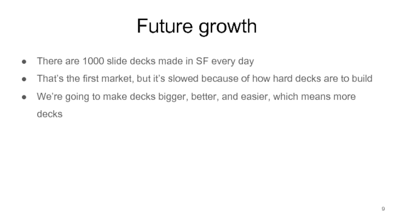
There are 1000 slide decks made in SF every day
That’s
the first market, but it’s slowed because of how hard decks are to build
We’re going to make decks bigger, better, and easier, which means more decks
We’re going to make decks bigger, better, and easier, which means more decks
Слайд 11What we need
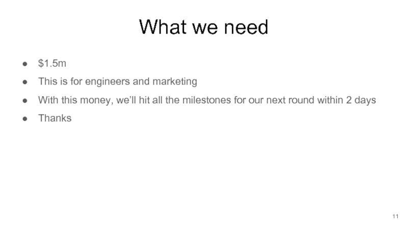
$1.5m
This is for engineers and marketing
With this money, we’ll
hit all the milestones for our next round within 2 days
Thanks
Thanks
