- Главная
- Разное
- Дизайн
- Бизнес и предпринимательство
- Аналитика
- Образование
- Развлечения
- Красота и здоровье
- Финансы
- Государство
- Путешествия
- Спорт
- Недвижимость
- Армия
- Графика
- Культурология
- Еда и кулинария
- Лингвистика
- Английский язык
- Астрономия
- Алгебра
- Биология
- География
- Детские презентации
- Информатика
- История
- Литература
- Маркетинг
- Математика
- Медицина
- Менеджмент
- Музыка
- МХК
- Немецкий язык
- ОБЖ
- Обществознание
- Окружающий мир
- Педагогика
- Русский язык
- Технология
- Физика
- Философия
- Химия
- Шаблоны, картинки для презентаций
- Экология
- Экономика
- Юриспруденция
Best Practices: Designing a Content Hub презентация
Содержание
- 1. Best Practices: Designing a Content Hub
- 2. Welcome! NewsCred’s Strategy Team helps brands build
- 3. Introduction A content hub is a
- 4. Contents Content Hub Form Branding Colors
- 5. Form : Content Hub Function : Content
- 6. Content Hub Branding Determine the amount
- 7. Content Hub Colors Determine a color
- 8. Content Hub Typography You will need
- 9. Content Hub Grid System #THINKCONTENT
- 10. Content Hub Background Most of the
- 11. Content Hub Content The articles themselves
- 12. Content Hub Content - Lead Articles
- 13. Content Hub Content - Organize
- 14. Content Hub Content - Card Design
- 15. Content Hub Content - Information and Groupings
- 16. Content Hub Content - Sponsored Content and
- 17. Form : Content Hub Function : Content
- 18. Content Hub Navigation You now have
- 19. Content Hub Navigation #THINKCONTENT Another popular
- 20. Content Hub Scrolling You will also
- 21. Content Hub Sticky Features In both
- 22. Content Hub Interactions Interactions on your main
- 23. Content Hub Organization There are multiple elements
- 24. Content Hub Calls-to-Action Among your content cards,
- 25. Content Hub Extra Features Some features on
- 26. Form : Content Hub Function : Content
- 27. Article Branding The branding of your
- 28. Article Colors Similar to branding, the
- 29. Article Typography The design of your
- 30. Article Grid System #THINKCONTENT Keep
- 31. Article Background Similar to your hub,
- 32. Article Content There should be more
- 33. Form : Content Hub Function : Content
- 34. Article Navigation The main purpose of
- 35. Article Scrolling The scrolling on the
- 36. Article Sticky Features Sticky features are
- 37. Article Interactions The article page is a
- 38. Article Organization Although the focus of the
- 39. Article Calls-to-Action CTAs on your article page
- 40. Article Extra Features On the article page,
- 41. Designing a Content Hub Conclusion The design
- 42. Our team of strategists can help your
- 43. Thank you! Ready to create amazing content?
Слайд 2Welcome!
NewsCred’s Strategy Team helps brands build and hone their content strategies,
Our guides aim to educate marketers on trends, opportunities, and content strategies that best-in-class brands are utilizing to engage their audiences. In this guide, we’ll take a look at the best practices for designing a content hub, covering both stylistic choices and user experience.
Interested in learning more? We’d love to hear from you! Feel free to reach out at strategy@newscred.com.
- Dan Rudy, Strategy Team Designer, NewsCred
#THINKCONTENT
Слайд 3Introduction
A content hub is a valuable way of interacting with
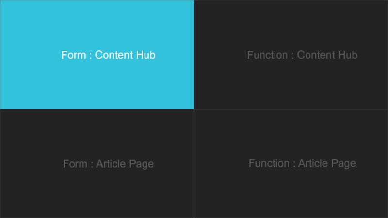
This isn’t an easy task, but one that will be simplified and attainable after reading this guide. The guide is split into four sections, two dealing with your main hub page and two dealing with your specific article page. For both page types the guide is split into a form and function section. Form being your most basic layout, the pieces you need for the page and how to handle them stylistically. Function guides you through how a user will experience each page and the added elements to help improve this experience.
Each suggestion is analyzed on its own page and is accompanied by a screenshot of a site that demonstrates the topic. If you want to explore the entirety of the site, you can click the magnifying glass in the upper left corner of the screenshot to launch the full site on your browser.
#THINKCONTENT
Click this icon on the following pages to visit our favorite content hub examples.
Слайд 4Contents
Content Hub
Form
Branding
Colors
Typography
Grid System
Background
Content
Function
Navigation
Scrolling
Sticky Features
Interactions
Organization
Calls-to-Action
Extra Features
#THINKCONTENT
Article
Form
Branding
Colors
Typography
Grid System
Background
Content
Function
Navigation
Scrolling
Sticky Features
Interactions
Organization
Calls-to-Action
Extra Features
Слайд 6Content Hub Branding
Determine the amount of your company’s branding that will
Do you want your content hub to be associated with your company, or exist as a unique source of content?
If your content hub is to be associated with your company start your design with your brand’s guidelines. Follow through the rest of the design process keeping in mind your brands colors, fonts, and main site’s styling.
If your content hub is a stand-alone site then move forward with a unique brand and design system.
#THINKCONTENT
Слайд 7Content Hub Colors
Determine a color palette for your content hub that
Pick a primary color that will be used most often, and multiple accent colors that complement it.
Many sites provide color themes or can help determine what accent colors will look best with your primary choice.
https://color.adobe.com/create/color-wheel/
For a cleaner look, choose tints/ shades of your primary color as your accents.
Color will play an important role in the design of your hub as it will help to accomplish a number of things without making your hub too busy.
Break up the monotony of a page
Add type hierarchy
Organize (color-code) different article types
#THINKCONTENT
Слайд 8Content Hub Typography
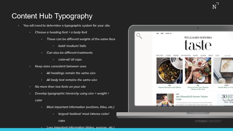
You will need to determine a typographic system for
Choose a heading font + a body font
These can be different weights of the same face
bold/ medium/ italic
Can also be different treatments
colored/ all caps
Keep sizes consistent between uses
All headings remain the same size
All body text remains the same size
No more than two fonts on your site
Develop typographic hierarchy using size + weight + color
Most important information (sections, titles, etc.)
largest/ boldest/ most intense color/ caps
Less important information (dates, sources, etc.)
small/ light/ dull color/ lowercase
#THINKCONTENT
Слайд 9Content Hub Grid System
#THINKCONTENT
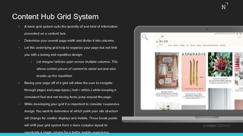
A basic grid system suits the quantity of
Determine your overall page width and divide it into columns.
Let this underlying grid help to organize your page but not limit you with a boring and repetitive design.
Let images/ articles span across multiple columns. This allows certain pieces of content to stand out and also breaks up the repetition.
Basing your page off of a grid will allow the user to navigate through pages and page types ( hub > article ) while keeping a consistent feel and not having items jump around the page.
While developing your grid it is important to consider responsive design. You want to determine at which point your site structure will change for smaller displays and mobile. These break points will shift your grid system from a more complex layout to eventually a single column for a better mobile experience.
Слайд 10Content Hub Background
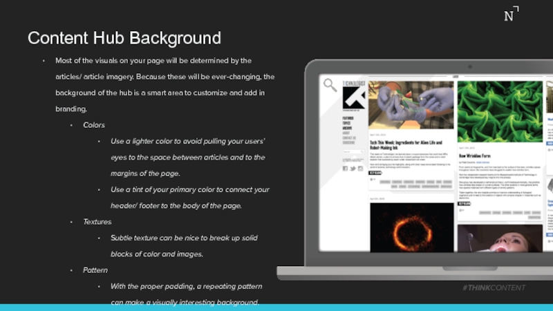
Most of the visuals on your page will be
Colors
Use a lighter color to avoid pulling your users’ eyes to the space between articles and to the margins of the page.
Use a tint of your primary color to connect your header/ footer to the body of the page.
Textures
Subtle texture can be nice to break up solid blocks of color and images.
Pattern
With the proper padding, a repeating pattern can make a visually interesting background.
#THINKCONTENT
Слайд 11Content Hub Content
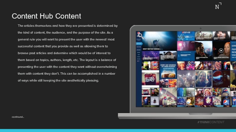
The articles themselves and how they are presented is
#THINKCONTENT
continued…
Слайд 12Content Hub Content - Lead Articles
#THINKCONTENT
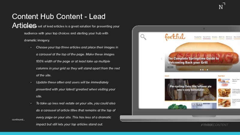
Having a set of lead articles
Choose your top three articles and place their images in a carousel at the top of the page. Make these images 100% width of the page or at least take up multiple columns in your grid so they will stand apart from the rest of the site.
Update these often and users will be immediately presented with your latest/ greatest when visiting your site.
To take up less real estate on your site, you could also do a carousel of article titles that remains at the top of every page on your site. This has less of a dramatic impact but still lets your top articles stand out.
continued…
Слайд 13Content Hub Content - Organize
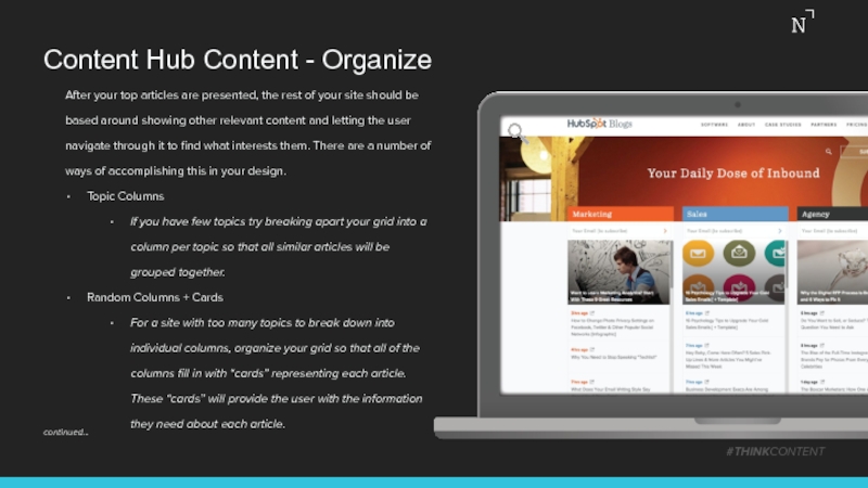
After your top articles are presented,
Topic Columns
If you have few topics try breaking apart your grid into a column per topic so that all similar articles will be grouped together.
Random Columns + Cards
For a site with too many topics to break down into individual columns, organize your grid so that all of the columns fill in with “cards” representing each article. These “cards” will provide the user with the information they need about each article.
#THINKCONTENT
continued…
Слайд 14Content Hub Content - Card Design
#THINKCONTENT
Imagery
For each card choose an image
Try using an animation to catch a user’s attention when applicable.
Information
The article information can be presented directly on top of the image (if the image is edited to be dark enough that white text is legible), on top of the image as a roll-over (it darkens the image and appears as the user interacts), on top of the image in a colored box, or in an area below the image for definite legibility with an unaltered photo.
continued…
Слайд 15Content Hub Content - Information and Groupings
Article Information
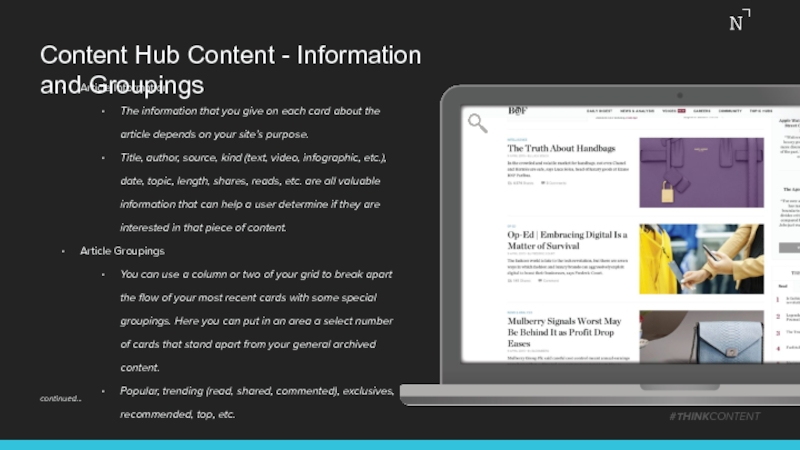
The information that you
Title, author, source, kind (text, video, infographic, etc.), date, topic, length, shares, reads, etc. are all valuable information that can help a user determine if they are interested in that piece of content.
Article Groupings
You can use a column or two of your grid to break apart the flow of your most recent cards with some special groupings. Here you can put in an area a select number of cards that stand apart from your general archived content.
Popular, trending (read, shared, commented), exclusives, recommended, top, etc.
#THINKCONTENT
continued…
Слайд 16Content Hub Content - Sponsored Content and Ads
#THINKCONTENT
Article Groupings (continued)
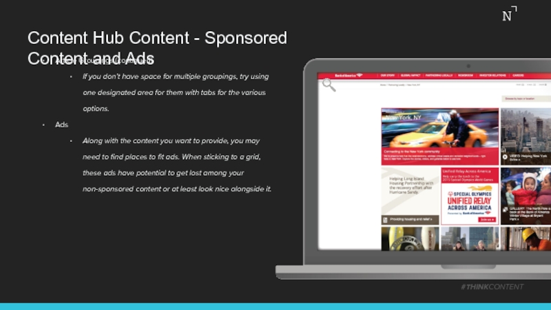
If you
Ads
Along with the content you want to provide, you may need to find places to fit ads. When sticking to a grid, these ads have potential to get lost among your non-sponsored content or at least look nice alongside it.
Слайд 18Content Hub Navigation
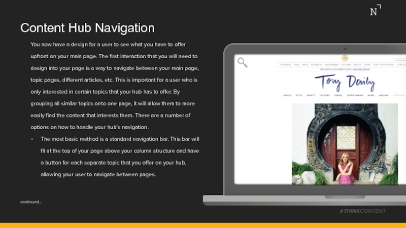
You now have a design for a user to
The most basic method is a standard navigation bar. This bar will fit at the top of your page above your column structure and have a button for each separate topic that you offer on your hub, allowing your user to navigate between pages.
#THINKCONTENT
continued…
Слайд 19Content Hub Navigation
#THINKCONTENT
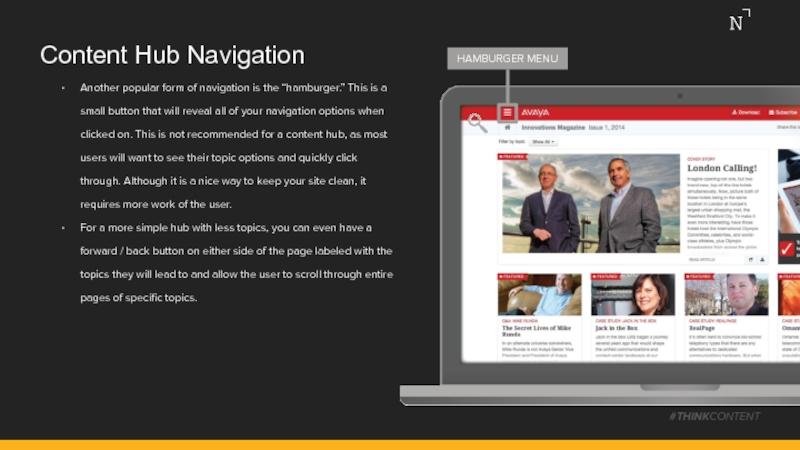
Another popular form of navigation is the “hamburger.” This
For a more simple hub with less topics, you can even have a forward / back button on either side of the page labeled with the topics they will lead to and allow the user to scroll through entire pages of specific topics.
HAMBURGER MENU
Слайд 20Content Hub Scrolling
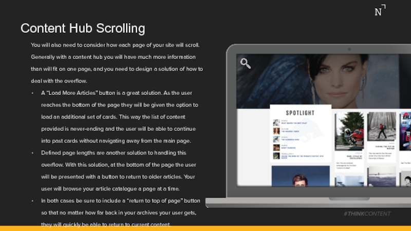
You will also need to consider how each page
A “Load More Articles” button is a great solution. As the user reaches the bottom of the page they will be given the option to load an additional set of cards. This way the list of content provided is never-ending and the user will be able to continue into past cards without navigating away from the main page.
Defined page lengths are another solution to handling this overflow. With this solution, at the bottom of the page the user will be presented with a button to return to older articles. Your user will browse your article catalogue a page at a time.
In both cases be sure to include a “return to top of page” button so that no matter how far back in your archives your user gets, they will quickly be able to return to current content.
#THINKCONTENT
Слайд 21Content Hub Sticky Features
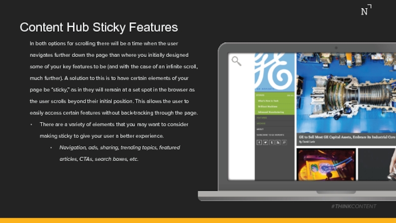
In both options for scrolling there will be
There are a variety of elements that you may want to consider making sticky to give your user a better experience.
Navigation, ads, sharing, trending topics, featured articles, CTAs, search boxes, etc.
#THINKCONTENT
Слайд 22Content Hub Interactions
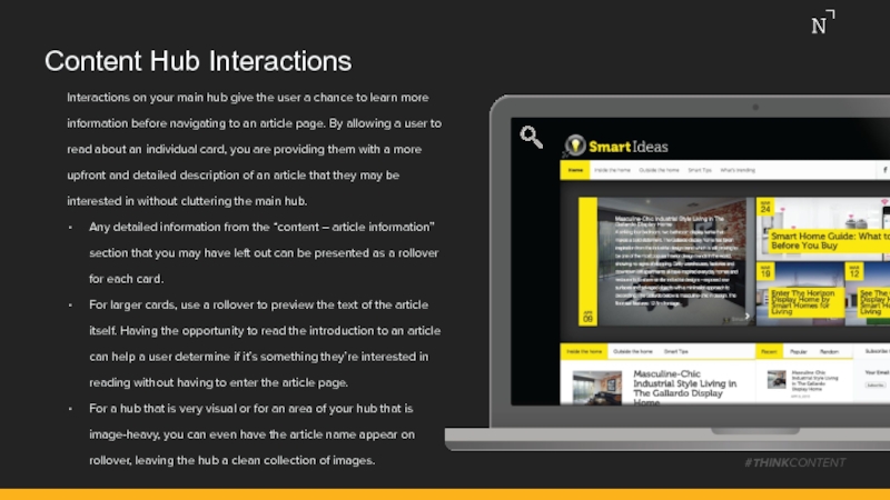
Interactions on your main hub give the user a
Any detailed information from the “content – article information” section that you may have left out can be presented as a rollover for each card.
For larger cards, use a rollover to preview the text of the article itself. Having the opportunity to read the introduction to an article can help a user determine if it’s something they’re interested in reading without having to enter the article page.
For a hub that is very visual or for an area of your hub that is image-heavy, you can even have the article name appear on rollover, leaving the hub a clean collection of images.
#THINKCONTENT
Слайд 23Content Hub Organization
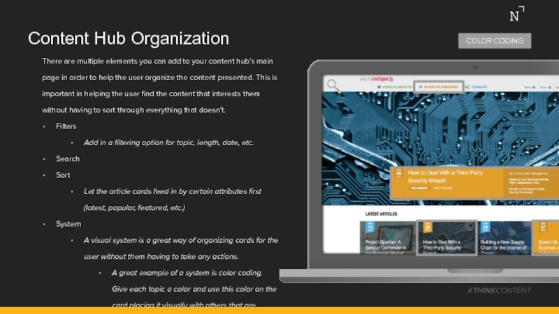
There are multiple elements you can add to your
Filters
Add in a filtering option for topic, length, date, etc.
Search
Sort
Let the article cards feed in by certain attributes first (latest, popular, featured, etc.)
System
A visual system is a great way of organizing cards for the user without them having to take any actions.
A great example of a system is color coding. Give each topic a color and use this color on the card placing it visually with others that are similar.
#THINKCONTENT
COLOR CODING
Слайд 24Content Hub Calls-to-Action
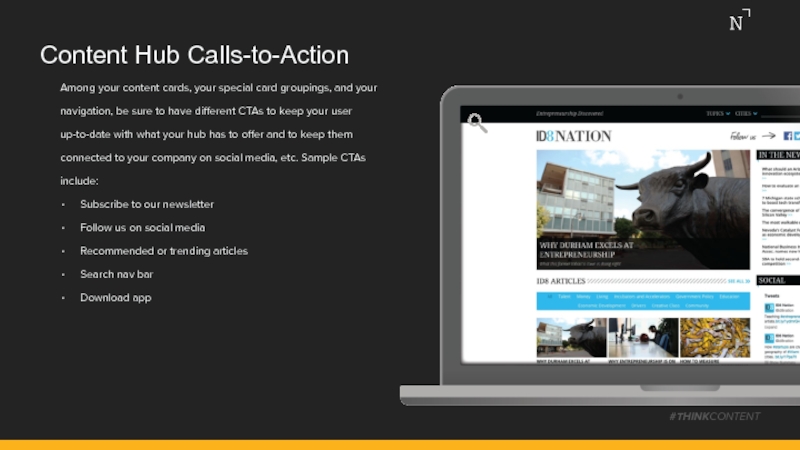
Among your content cards, your special card groupings, and
Subscribe to our newsletter
Follow us on social media
Recommended or trending articles
Search nav bar
Download app
#THINKCONTENT
Слайд 25Content Hub Extra Features
Some features on your site can be used
“Sites we like” is a nice way of steering your users to other hubs or sites that complement your own, as well as promote general good will.
Different social feeds can give your users an insight into other areas of your company beyond the hub, and also promotes them following you on these networks. An ever-changing feed box in your grid can break up the cards and add an interesting element.
A poll is a fun way of gathering data and allowing users to interact with the hub / other users.
A “Top Contributors” section is a great way of connecting the user to the author whose work they are reading. It can also be a nice way of letting a user find other articles written by the same contributor.
#THINKCONTENT
Слайд 27Article Branding
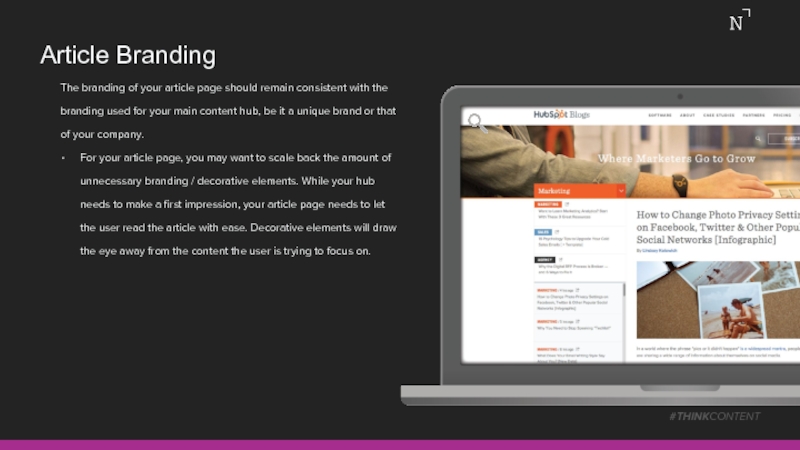
The branding of your article page should remain consistent with
For your article page, you may want to scale back the amount of unnecessary branding / decorative elements. While your hub needs to make a first impression, your article page needs to let the user read the article with ease. Decorative elements will draw the eye away from the content the user is trying to focus on.
#THINKCONTENT
Слайд 28Article Colors
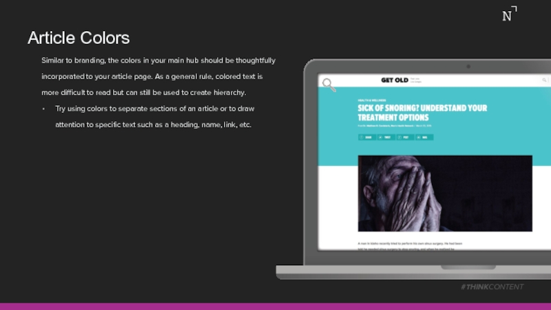
Similar to branding, the colors in your main hub should
Try using colors to separate sections of an article or to draw attention to specific text such as a heading, name, link, etc.
#THINKCONTENT
Слайд 29Article Typography
The design of your article typography differs from your front
First, determine the number of columns from your initial grid that will have your body copy placed into it. This will affect the rest of your article layout.
Type size should be selected to balance legibility and the amount of scrolling the user will need to do. As a general rule, size for a screen should be slightly larger than what you would use for print work. Somewhere in the range of 12pt – 16pt. This will be further determined by your line length.
Line length will also play a large factor in font size and the overall legibility of an article. Each line should have between 45 and 70 characters in it. This helps a user keep their focus while not interrupting their flow with too many line breaks.
#THINKCONTENT
Слайд 30Article Grid System
#THINKCONTENT
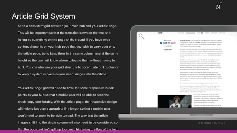
Keep a consistent grid between your main hub and
Your article page grid will need to have the same responsive break points as your hub so that a mobile user will be able to read the article copy comfortably. With the article page, the responsive design will help to keep an appropriate line length so that a mobile user won’t need to zoom to be able to read. The way that the article images shift into the single column will also need to be considered so that the body text isn’t split up too much hindering the flow of the text.
Слайд 31Article Background
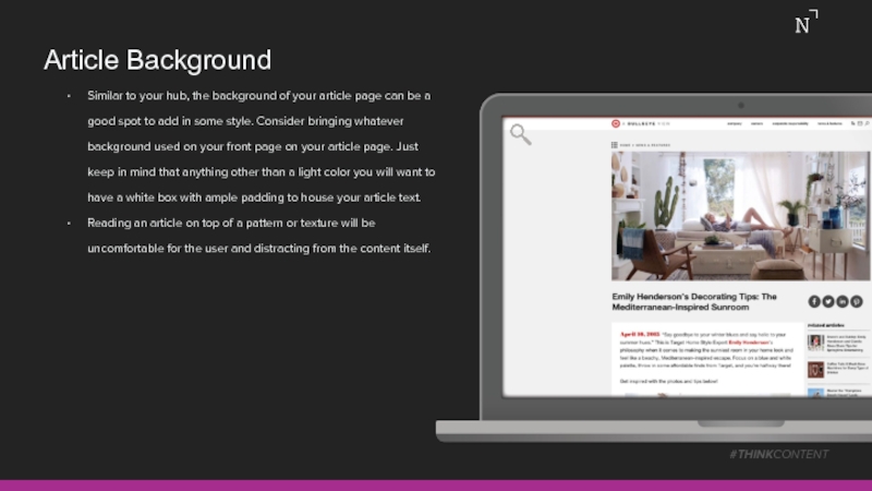
Similar to your hub, the background of your article page
Reading an article on top of a pattern or texture will be uncomfortable for the user and distracting from the content itself.
#THINKCONTENT
Слайд 32Article Content
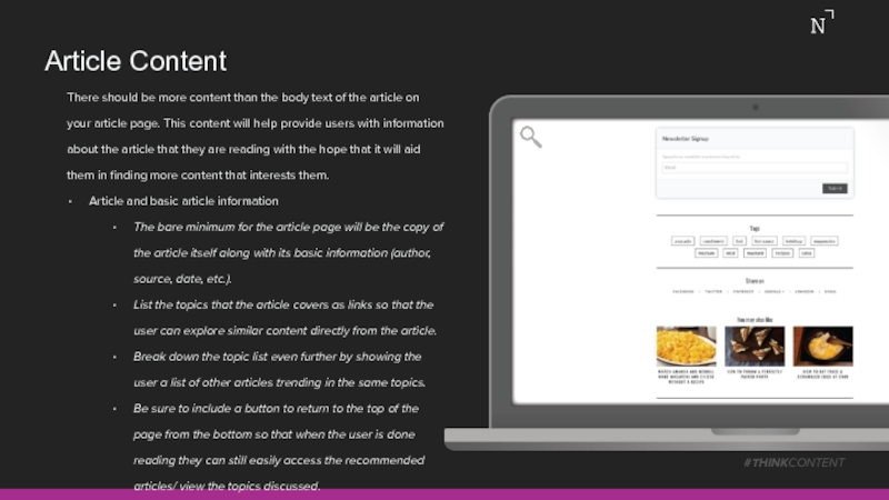
There should be more content than the body text of
Article and basic article information
The bare minimum for the article page will be the copy of the article itself along with its basic information (author, source, date, etc.).
List the topics that the article covers as links so that the user can explore similar content directly from the article.
Break down the topic list even further by showing the user a list of other articles trending in the same topics.
Be sure to include a button to return to the top of the page from the bottom so that when the user is done reading they can still easily access the recommended articles/ view the topics discussed.
#THINKCONTENT
Слайд 34Article Navigation
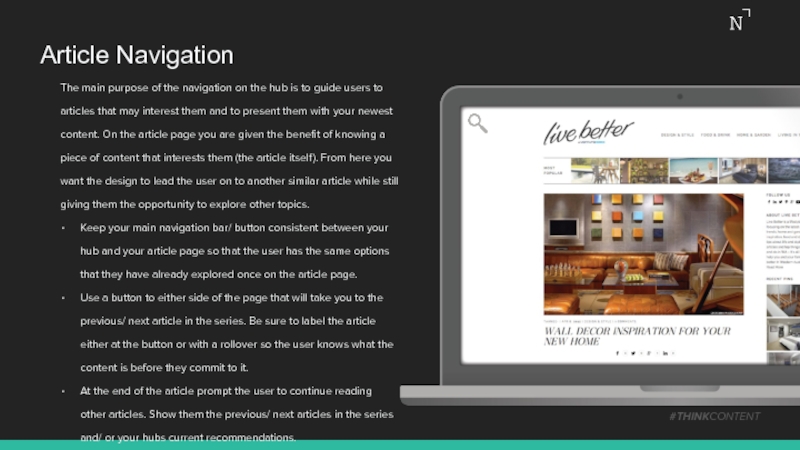
The main purpose of the navigation on the hub is
Keep your main navigation bar/ button consistent between your hub and your article page so that the user has the same options that they have already explored once on the article page.
Use a button to either side of the page that will take you to the previous/ next article in the series. Be sure to label the article either at the button or with a rollover so the user knows what the content is before they commit to it.
At the end of the article prompt the user to continue reading other articles. Show them the previous/ next articles in the series and/ or your hubs current recommendations.
#THINKCONTENT
Слайд 35Article Scrolling
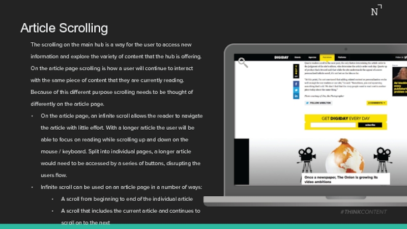
The scrolling on the main hub is a way for
On the article page, an infinite scroll allows the reader to navigate the article with little effort. With a longer article the user will be able to focus on reading while scrolling up and down on the mouse / keyboard. Split into individual pages, a longer article would need to be accessed by a series of buttons, disrupting the users flow.
Infinite scroll can be used on an article page in a number of ways:
A scroll from beginning to end of the individual article
A scroll that includes the current article and continues to scroll on to the next
A scroll through multiple articles in one series/ topic
#THINKCONTENT
Слайд 36Article Sticky Features
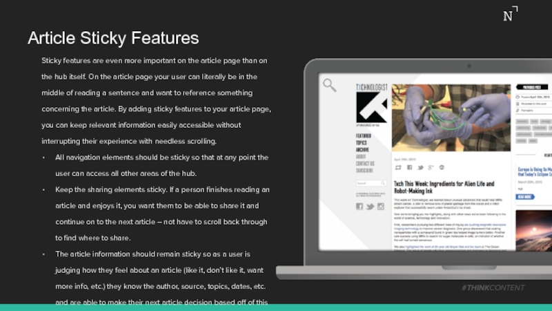
Sticky features are even more important on the article
All navigation elements should be sticky so that at any point the user can access all other areas of the hub.
Keep the sharing elements sticky. If a person finishes reading an article and enjoys it, you want them to be able to share it and continue on to the next article – not have to scroll back through to find where to share.
The article information should remain sticky so as a user is judging how they feel about an article (like it, don’t like it, want more info, etc.) they know the author, source, topics, dates, etc. and are able to make their next article decision based off of this information.
#THINKCONTENT
Слайд 37Article Interactions
The article page is a great opportunity to use rollovers
Other recommended articles can have only a small amount of information provided about them on the article page. When the user decides to move on to another article, they can use rollovers to reveal more information and explore their options.
Links in the article copy can provide the user with a chance to learn more about a topic, make a purchase, etc.
#THINKCONTENT
Слайд 38Article Organization
Although the focus of the article page is to present
Consider making one of your “suggested article” groupings have multiple tabs so the user can explore a variety without taking up too much real estate.
Keep your search box on the article page so the user can access all of the content you have on a topic right from the article itself.
Try tagging your articles with specific sub-topics. Show these tags at the bottom of the article body so that the user can easily continue to another article that interests them. These sub-topics can be more specific than your navigation and presenting them at the bottom of an article gives the user an opportunity to continue exploring a subject that they were just reading about.
#THINKCONTENT
Слайд 39Article Calls-to-Action
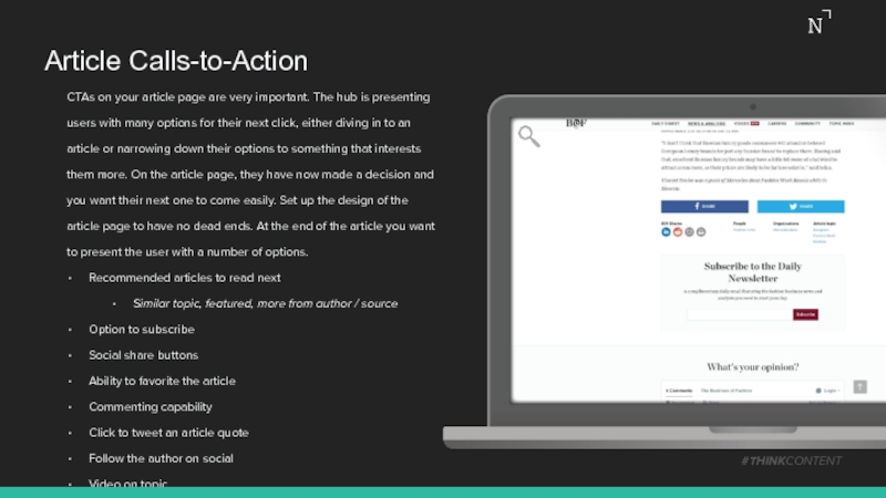
CTAs on your article page are very important. The hub
Recommended articles to read next
Similar topic, featured, more from author / source
Option to subscribe
Social share buttons
Ability to favorite the article
Commenting capability
Click to tweet an article quote
Follow the author on social
Video on topic
#THINKCONTENT
Слайд 40Article Extra Features
On the article page, keep the extras to a
#THINKCONTENT
Слайд 41Designing a Content Hub Conclusion
The design of a content hub can
Thankfully, there are plenty of examples of sites that not only handle and organize the content well, but look and function great while doing it. Despite these sites all offering different content and serving different purposes to their users, they all follow general, technical design principles which allow them to be so successful.
Understanding these ideas and breaking them down into what elements work best for the type of user experience you’re looking for is an easy way to create your own powerful, branded hub.
#THINKCONTENT
Слайд 42Our team of strategists can help your brand build a marketing
From ongoing support and program management, to customized strategy sessions and workshops, we’ll set your brand up for success.
#THINKCONTENT
Want to learn more?
Strategy@NewsCred.com
Слайд 43Thank you!
Ready to create amazing content? Contact NewsCred for a free
NewsCred.com • Sales@NewsCred.com • +1 (212) 989 4100 • @newscred
#THINKCONTENT


