- Главная
- Разное
- Дизайн
- Бизнес и предпринимательство
- Аналитика
- Образование
- Развлечения
- Красота и здоровье
- Финансы
- Государство
- Путешествия
- Спорт
- Недвижимость
- Армия
- Графика
- Культурология
- Еда и кулинария
- Лингвистика
- Английский язык
- Астрономия
- Алгебра
- Биология
- География
- Детские презентации
- Информатика
- История
- Литература
- Маркетинг
- Математика
- Медицина
- Менеджмент
- Музыка
- МХК
- Немецкий язык
- ОБЖ
- Обществознание
- Окружающий мир
- Педагогика
- Русский язык
- Технология
- Физика
- Философия
- Химия
- Шаблоны, картинки для презентаций
- Экология
- Экономика
- Юриспруденция
Technical Analysis презентация
Содержание
- 1. Technical Analysis
- 2. 1.GENERAL PRINCIPLES AND ASSUMPTIONS Technical analysis is
- 3. Another tenet of technical analysis is that
- 4. 2.TECHNICAL ANALYSIS TOOLS The primary tools
- 5. 2.1.1 Line Chart Line charts are familiar
- 6. 2.1.2 Bar Chart A bar chart, in
- 7. 2.1.3 Candlestick Chart Candlestick charts trace their
- 8. 2.1.4 Point and Figure Chart Point and
- 9. Volume, Time Intervals Volume is used to
- 10. Relative Strength Analysis Relative strength analysis is
- 11. TREND The concept of a trend is
- 12. CHART PATTERNS Chart patterns are formations that
- 13. Head and shoulders pattern Volume is an
- 14. Inverse Head and Shoulders The head and
- 15. Setting Price Targets with Head and Shoulders
- 16. Double Tops A double top is when
- 17. Double bottoms Double bottoms are formed when
- 18. The reason of Double Tops and Bottoms
- 19. Triple Tops and Bottoms Triple tops consist
- 20. Continuation Patterns Continuation patterns indicate that a
- 21. Ascending triangles An ascending triangle typically forms
- 22. Descending triangles Descending triangle will form in
- 23. Symmetrical triangles In a symmetrical triangle, the
- 24. Rectangle Pattern The horizontal resistance line that
- 25. Flags and Pennants Flags and pennants are
- 26. 2.2 Technical Indicators The technical analyst uses
- 27. 2.2.1.1 Moving Average A moving average is
- 28. 2.2.1.2 Bollinger Bands Bollinger Bands consist of
- 29. 2.2.2 Momentum Oscillators One of the key
- 30. 2.2.2.1 Momentum or Rate of Change Oscillator
- 31. 2.2.2.2Relative Strength Index The index construction forces
- 32. 2.2.2.3 Stochastic Oscillator The stochastic oscillator is
- 33. 2.2.2.4 Moving-Average Convergence/Divergence Oscillator The MACD is
- 34. 2.2.3 Sentiment Indicators Sentiment indicators attempt to
- 35. 2.2.3.2 Calculated Statistical Indices The other category
- 36. Margin debt and Short interest Margin
- 37. 2.2.4 Flow-of-Funds Indicators Flow-of-funds indicators help technicians
- 38. Margin debt is also
- 39. Putting more shares on the
- 40. INTERMARKET ANALYSIS Intermarket analysis is based on
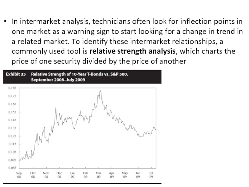
- 41. In intermarket analysis, technicians often look
Слайд 21.GENERAL PRINCIPLES AND ASSUMPTIONS
Technical analysis is a form of security analysis
Technical analysis can be used for any freely traded security in the global market and is used on a wide range of financial instruments, such as equities, bonds, commodity futures, and currency futures.
Technical analysis is the study of market trends or patterns and relies on recognition of patterns that have worked in the past in an attempt to predict future security prices. Technicians believe that market trends and patterns repeat themselves and are somewhat predictable because human behaviour tends to repeat itself and is somewhat predictable.
The usefulness of technical analysis is diminished by any constraints on the security being freely traded, by large outside manipulation of the market, and in illiquid markets.
Слайд 3Another tenet of technical analysis is that the market brings together
Technical analysis relies on knowledgeable market participants putting this knowledge to work in the market and thereby influencing prices and volume.
Technical analysis and fundamental analysis are equally useful and valid, but they approach the market in different ways. Technical analysis focuses solely on analysing markets and the trading of financial instruments, whereas fundamental analysis is a much wider ranging field encompassing financial and economic analysis as well as analysis of societal and political trends.
Technical analysis relies primarily on information gathered from market participants that is expressed through the interaction of price and volume. Fundamental analysis relies on information that is external to the market in an attempt to evaluate a security’s value relative to its current price.
Слайд 42.TECHNICAL ANALYSIS TOOLS
The primary tools used in technical analysis are charts
Charts provide information about past price behavior and provide a basis for inferences about likely future price behavior. Various types of charts can be useful in studying the markets: line charts, bar charts, candlestick charts, and point and figure charts.
2.1 CHARTS
Слайд 52.1.1 Line Chart
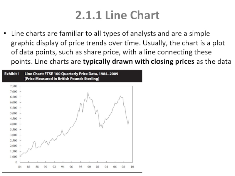
Line charts are familiar to all types of analysts
Слайд 62.1.2 Bar Chart
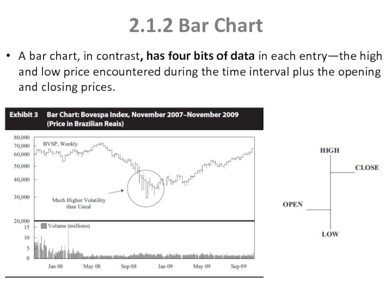
A bar chart, in contrast, has four bits of
Слайд 72.1.3 Candlestick Chart
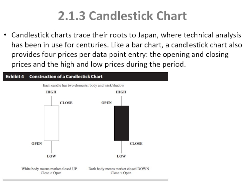
Candlestick charts trace their roots to Japan, where technical
Слайд 82.1.4 Point and Figure Chart
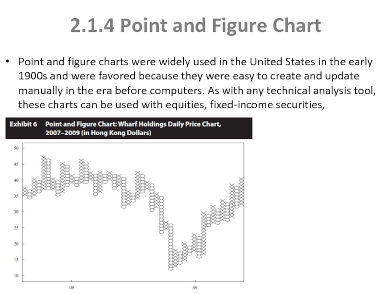
Point and figure charts were widely used
Слайд 9Volume, Time Intervals
Volume is used to assess the strength or conviction
Most of the chart examples in this reading are daily price charts in that they show the price and volume on a daily basis. For short-term trading, the analyst can create charts with one minute or shorter intervals. For long-term investing, the analyst can use weekly, monthly, or even annual intervals.
Слайд 10Relative Strength Analysis
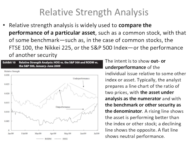
Relative strength analysis is widely used to compare the
The intent is to show out- or underperformance of the
individual issue relative to some other index or asset. Typically, the analyst prepares a line chart of the ratio of two prices, with the asset under analysis as the numerator and with the benchmark or other security as the denominator. A rising line shows the asset is performing better than the index or other stock; a declining line shows the opposite. A flat line shows neutral performance.
Слайд 11TREND
The concept of a trend is perhaps the most important aspect
An uptrend for a security is when the price goes to higher highs and higher lows.
A downtrend is when a security makes lower lows and lower highs.
Two concepts related to trend are support and resistance. Support is defined as a low price range in which buying activity is sufficient to stop the decline in price. It is the opposite of resistance, which is a price range in which selling is sufficient to stop the rise in price.
A key tenet of support and resistance as a part of technical analysis is the change in polarity principle, which states that once a support level is breached, it becomes a resistance level.
Слайд 12CHART PATTERNS
Chart patterns are formations that appear in price charts that
Chart patterns can be divided into two categories: reversal patterns and continuation patterns.
Reversal patterns signal the end of a trend. Common reversal patterns are the head and shoulders, the inverse head and shoulders, double tops and bottoms, and triple tops and bottoms.
Reversal Patterns
Слайд 13Head and shoulders pattern
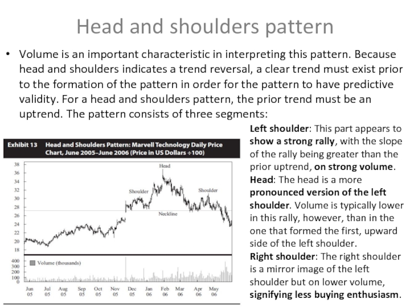
Volume is an important characteristic in interpreting this
Left shoulder: This part appears to show a strong rally, with the slope of the rally being greater than the prior uptrend, on strong volume.
Head: The head is a more pronounced version of the left shoulder. Volume is typically lower in this rally, however, than in the one that formed the first, upward side of the left shoulder.
Right shoulder: The right shoulder is a mirror image of the left shoulder but on lower volume, signifying less buying enthusiasm.
Слайд 14Inverse Head and Shoulders
The head and shoulders pattern can also form
Left shoulder: This shoulder appears to show a strong decline, with the slope of the decline greater than the prior downtrend, on strong volume. The rally then reverses back to the price level where it started, forming a V pattern, but on lower volume.
Head: The head is a more pronounced version of the left shoulder.
Right shoulder: The right shoulder is roughly a mirror image of the left shoulder but on lower volume, signifying less selling enthusiasm
Слайд 15Setting Price Targets with Head and Shoulders Patterns
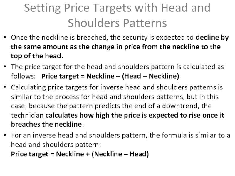
Once the neckline is
The price target for the head and shoulders pattern is calculated as follows: Price target = Neckline – (Head – Neckline)
Calculating price targets for inverse head and shoulders patterns is similar to the process for head and shoulders patterns, but in this case, because the pattern predicts the end of a downtrend, the technician calculates how high the price is expected to rise once it breaches the neckline.
For an inverse head and shoulders pattern, the formula is similar to a head and shoulders pattern: Price target = Neckline + (Neckline – Head)
Слайд 16Double Tops
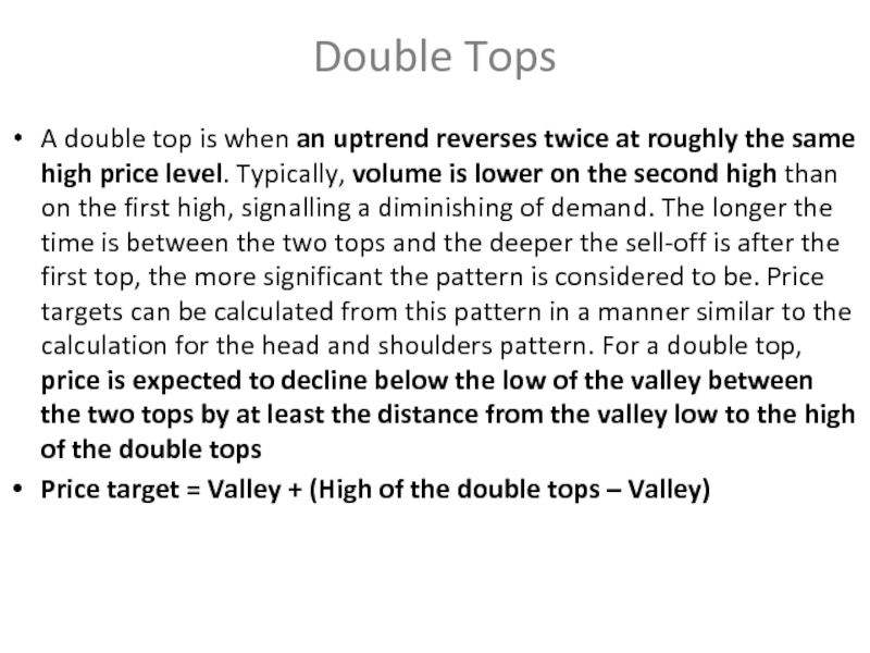
A double top is when an uptrend reverses twice at
Price target = Valley + (High of the double tops – Valley)
Слайд 17Double bottoms
Double bottoms are formed when the price reaches a low,
Слайд 18The reason of Double Tops and Bottoms patterns
For an uptrend, a
With double bottoms, if a security ceases to decline at the same price point on two separate occasions, the analyst can conclude that the market consensus is that at that price point, the security is now cheap enough that it is an attractive investment.
Слайд 19Triple Tops and Bottoms
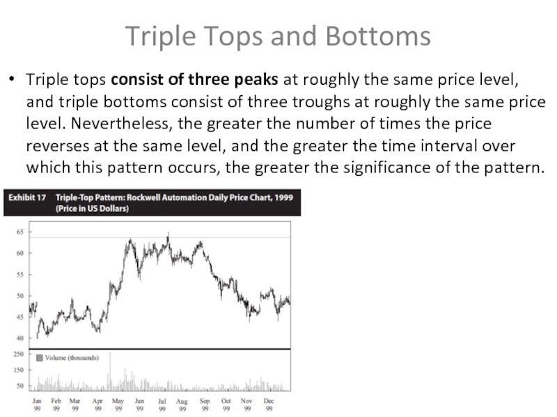
Triple tops consist of three peaks at roughly
Слайд 20Continuation Patterns
Continuation patterns indicate that a market trend in place prior
Triangle patterns are a type of continuation pattern. They come in three forms, symmetrical triangles, ascending triangles, and descending triangles. A triangle pattern forms as the range between high and low prices narrows, visually forming a triangle.
Triangle patterns
Слайд 21Ascending triangles
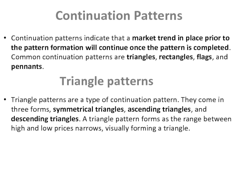
An ascending triangle typically forms in an uptrend. The horizontal
Слайд 22Descending triangles
Descending triangle will form in a downtrend. At some point
Слайд 23Symmetrical triangles
In a symmetrical triangle, the trendline formed by the highs
What this triangle indicates is that buyers are becoming more bullish while, simultaneously, sellers are becoming more bearish, so they are moving toward a point of consensus.
Because the sellers are often dominated by long investors exiting positions the pressure to sell diminishes once the sellers have sold the security. Thus, the pattern ends in the same direction as the trend that preceded it, either uptrend or downtrend.
Слайд 24Rectangle Pattern
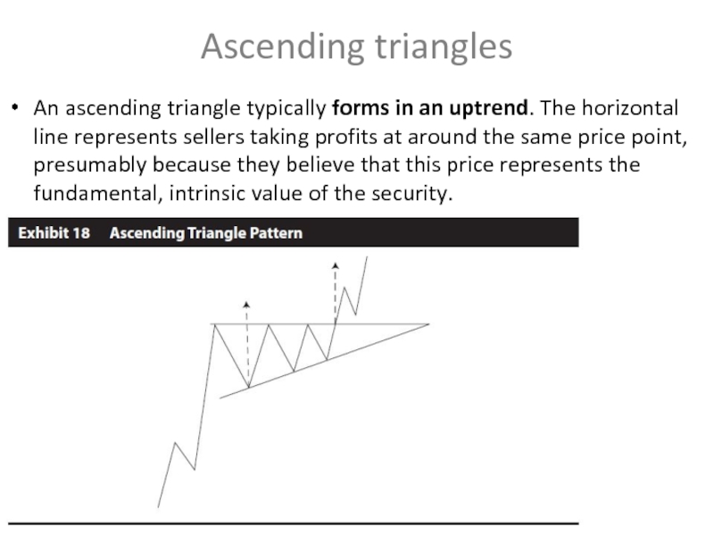
The horizontal resistance line that forms the top of the
Слайд 25Flags and Pennants
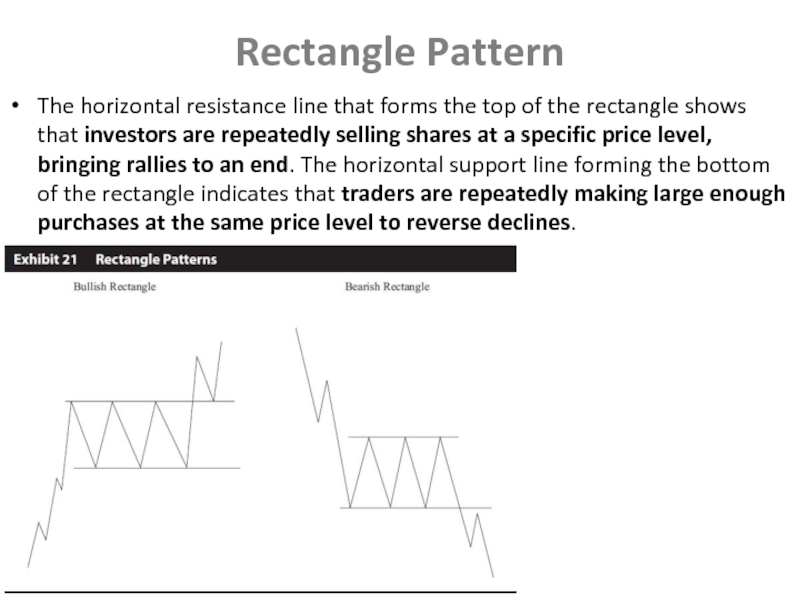
Flags and pennants are considered minor continuation patterns because
The expectation for both flags and pennants is that the trend will continue after the pattern in the same direction it was going prior to the pattern. The price is expected to change by at least the same amount as the price change from the start of the trend to the formation of the flag or pennant.
Слайд 262.2 Technical Indicators
The technical analyst uses a variety of technical indicators
Price-based indicators somehow incorporate information contained in the current and past history of market prices. Indicators of this type range from simple (e.g., a moving average) to complex (e.g., a stochastic oscillator).
2.2.1 Price-Based Indicators
Слайд 272.2.1.1 Moving Average
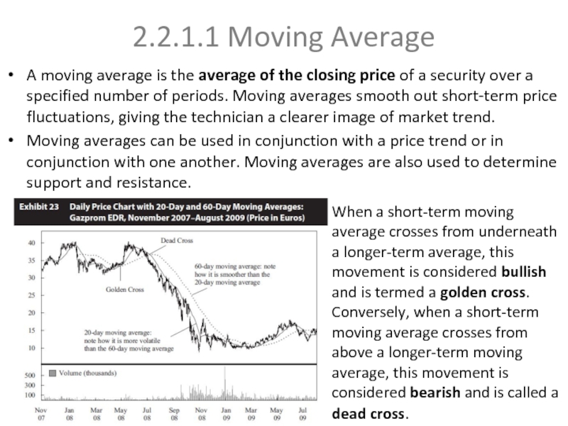
A moving average is the average of the closing
Moving averages can be used in conjunction with a price trend or in conjunction with one another. Moving averages are also used to determine support and resistance.
When a short-term moving average crosses from underneath a longer-term average, this movement is considered bullish and is termed a golden cross. Conversely, when a short-term moving average crosses from above a longer-term moving average, this movement is considered bearish and is called a dead cross.
Слайд 282.2.1.2 Bollinger Bands
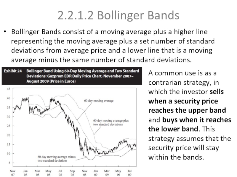
Bollinger Bands consist of a moving average plus a
A common use is as a contrarian strategy, in which the investor sells when a security price reaches the upper band and buys when it reaches the lower band. This strategy assumes that the security price will stay within the bands.
Слайд 292.2.2 Momentum Oscillators
One of the key challenges in using indicators overlaid
Technicians also look for convergence or divergence between oscillators and price. Convergence is when the oscillator moves in the same manner as the security being analysed, and divergence is when the oscillator moves differently from the security.
Momentum oscillators should be used in conjunction with an understanding of the existing market (price) trend. Oscillators alert a trader to overbought or oversold conditions. In an overbought condition, market sentiment is unsustainably bullish. In an oversold condition, market sentiment is unsustainably bearish. In other words, the oscillator range must be considered separately for every security.
Слайд 302.2.2.1 Momentum or Rate of Change Oscillator
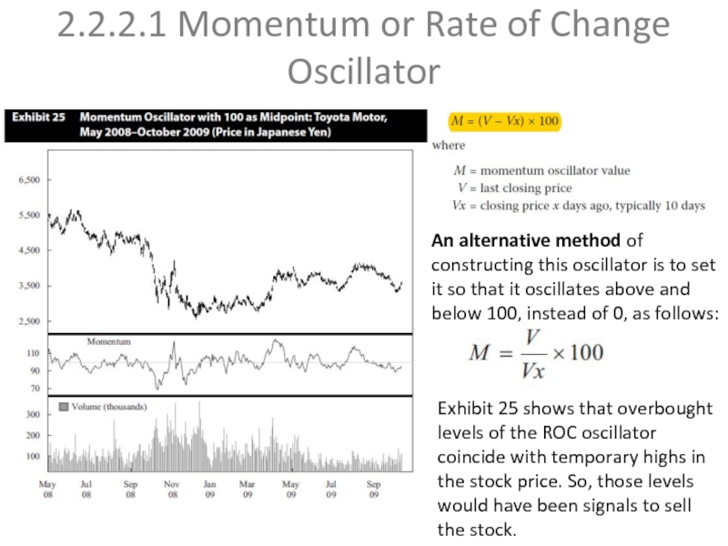
An alternative method of constructing
Exhibit 25 shows that overbought levels of the ROC oscillator coincide with temporary highs in the stock price. So, those levels would have been signals to sell the stock.
Слайд 312.2.2.2Relative Strength Index
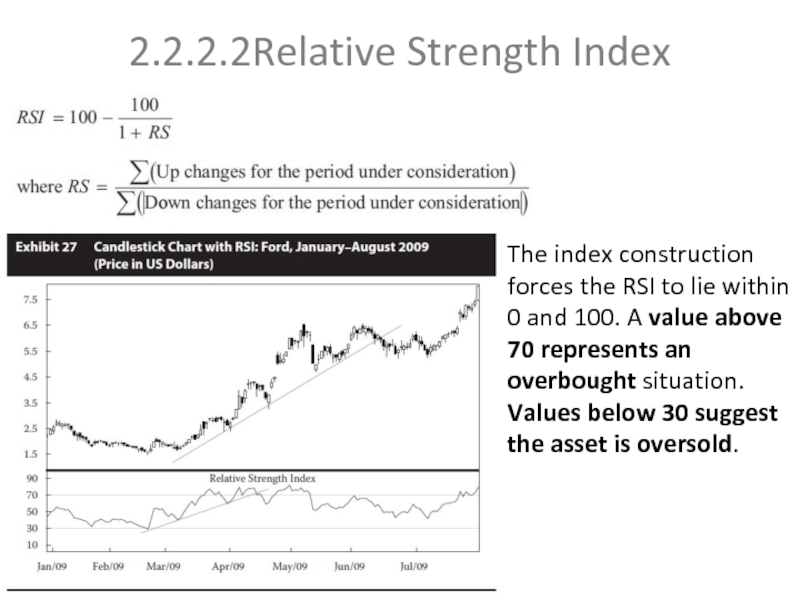
The index construction forces the RSI to lie within
Слайд 322.2.2.3 Stochastic Oscillator
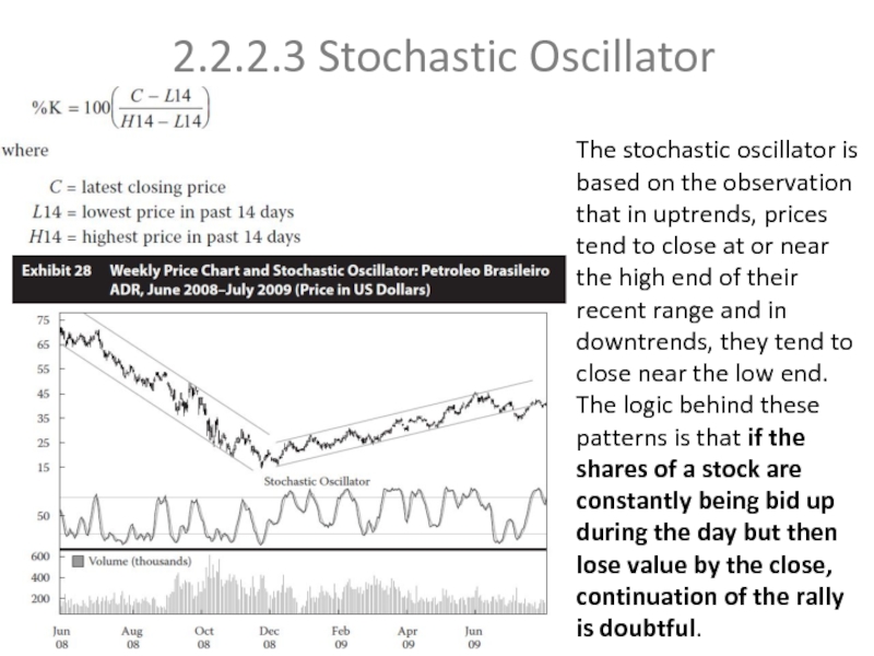
The stochastic oscillator is based on the observation that
Слайд 332.2.2.4 Moving-Average Convergence/Divergence Oscillator
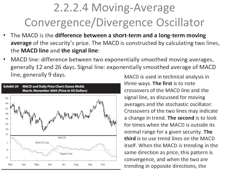
The MACD is the difference between a short-term
MACD line: difference between two exponentially smoothed moving averages, generally 12 and 26 days. Signal line: exponentially smoothed average of MACD line, generally 9 days.
MACD is used in technical analysis in three ways. The first is to note crossovers of the MACD line and the signal line, as discussed for moving averages and the stochastic oscillator. Crossovers of the two lines may indicate a change in trend. The second is to look for times when the MACD is outside its normal range for a given security. The third is to use trend lines on the MACD itself. When the MACD is trending in the same direction as price, this pattern is convergence, and when the two are trending in opposite directions, the pattern is divergence.
Слайд 342.2.3 Sentiment Indicators
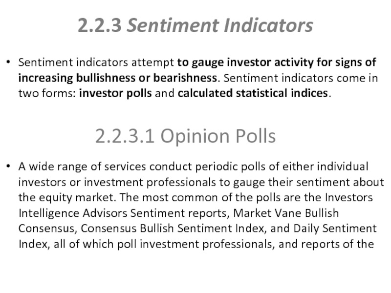
Sentiment indicators attempt to gauge investor activity for signs
A wide range of services conduct periodic polls of either individual investors or investment professionals to gauge their sentiment about the equity market. The most common of the polls are the Investors Intelligence Advisors Sentiment reports, Market Vane Bullish Consensus, Consensus Bullish Sentiment Index, and Daily Sentiment Index, all of which poll investment professionals, and reports of the
2.2.3.1 Opinion Polls
Слайд 352.2.3.2 Calculated Statistical Indices
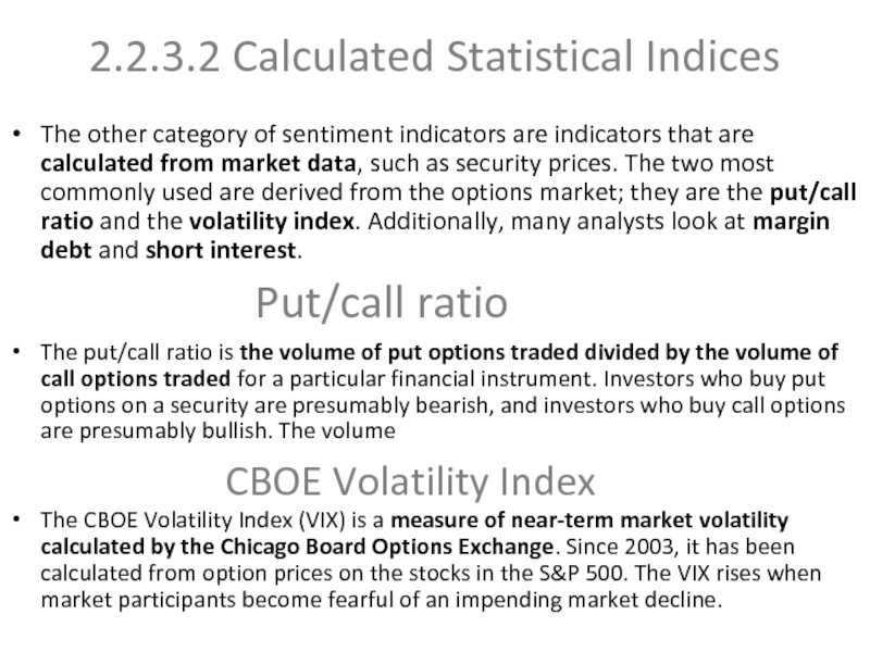
The other category of sentiment indicators are indicators
The put/call ratio is the volume of put options traded divided by the volume of call options traded for a particular financial instrument. Investors who buy put options on a security are presumably bearish, and investors who buy call options are presumably bullish. The volume
The CBOE Volatility Index (VIX) is a measure of near-term market volatility calculated by the Chicago Board Options Exchange. Since 2003, it has been calculated from option prices on the stocks in the S&P 500. The VIX rises when market participants become fearful of an impending market decline.
Put/call ratio
CBOE Volatility Index
Слайд 36Margin debt and Short interest
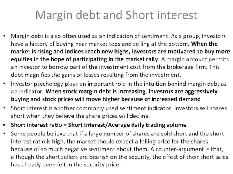
Margin debt is also often used
Investor psychology plays an important role in the intuition behind margin debt as an indicator. When stock margin debt is increasing, investors are aggressively buying and stock prices will move higher because of increased demand
Short interest is another commonly used sentiment indicator. Investors sell shares short when they believe the share prices will decline.
Short interest ratio = Short interest/Average daily trading volume
Some people believe that if a large number of shares are sold short and the short interest ratio is high, the market should expect a falling price for the shares because of so much negative sentiment about them. A counter-argument is that, although the short sellers are bearish on the security, the effect of their short sales has already been felt in the security price.
Слайд 372.2.4 Flow-of-Funds Indicators
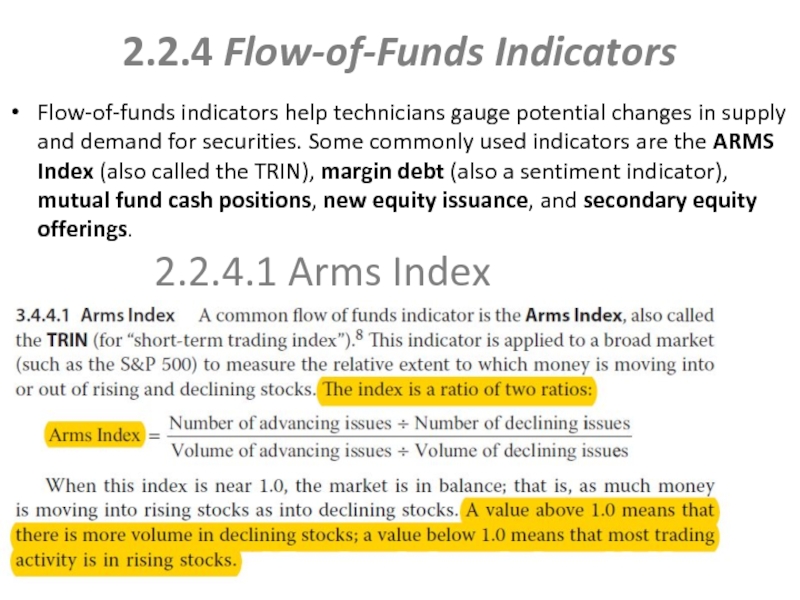
Flow-of-funds indicators help technicians gauge potential changes in supply
2.2.4.1 Arms Index
Слайд 38
Margin debt is also widely used as a flow-of-funds indicator because
Mutual funds hold a substantial proportion of all investable assets. Some analysts use the percentage of mutual fund assets held in cash as a predictor of market direction. It is called the “mutual fund cash position indicator”.
During a bull market, the manager wants to buy shares as quickly as possible to avoid having a cash “drag” hurt the fund’s performance. If prices are trending lower, however, the manager may hold funds in cash to improve the fund’s performance.
An analyst’s initial intuition might be that when cash is relatively low, fund managers are bullish and anticipate rising prices, but when fund managers are bearish, they conserve cash to wait for lower prices.
2.2.4.2 Margin Debt
2.2.4.3 Mutual Fund Cash Position
Слайд 39
Putting more shares on the market increases the aggregate supply of
Technicians also monitor secondary offerings to gauge potential changes in the supply of equities. Although secondary offerings do not increase the supply of shares, because existing shares are sold by insiders to the general public, they do increase the supply available for trading or the float. So, from a market perspective, secondary offerings of shares have the potential to change the supply-and-demand equation as much as IPOs do.
2.2.4.4 New Equity Issuance
2.2.4.5 Secondary Offerings
Слайд 40INTERMARKET ANALYSIS
Intermarket analysis is based on the principle that all markets
Stock prices are affected by bond prices. High bond prices are a positive for stock prices since this means low interest rates. Lower interest rates benefit companies with lower borrowing costs and lead to higher equity valuations in the calculation of intrinsic value using discounted cash flow analysis in fundamental analysis. Thus rising bond prices are a positive for stock prices, and declining bond prices are a bearish indicator.
Bond prices impact commodity prices. Bond prices move inversely to interest rates. Interest rates move in proportion to expectations to future prices of commodities or inflation. So declining bond prices are a signal of possible rising commodity prices.
Currencies impact commodity prices. Most commodity trading is denominated in US dollars and so prices are commonly quoted in US dollars. As a result, a strong dollar results in lower commodity prices and vice versa.
