- Главная
- Разное
- Дизайн
- Бизнес и предпринимательство
- Аналитика
- Образование
- Развлечения
- Красота и здоровье
- Финансы
- Государство
- Путешествия
- Спорт
- Недвижимость
- Армия
- Графика
- Культурология
- Еда и кулинария
- Лингвистика
- Английский язык
- Астрономия
- Алгебра
- Биология
- География
- Детские презентации
- Информатика
- История
- Литература
- Маркетинг
- Математика
- Медицина
- Менеджмент
- Музыка
- МХК
- Немецкий язык
- ОБЖ
- Обществознание
- Окружающий мир
- Педагогика
- Русский язык
- Технология
- Физика
- Философия
- Химия
- Шаблоны, картинки для презентаций
- Экология
- Экономика
- Юриспруденция
Writing great alt text презентация
Содержание
- 1. Writing great alt text
- 2. The basics Alt means alternative
- 3. Alt text is... A principle of accessibility
- 4. Alt text is... A requirement for accessibility
- 5. Alt text is... Code. Specifically, an attribute in the image element
- 6. Alt text is... Part of appealing to
- 7. Because technology needs it Screen readers (and
- 8. Because people need it People who use
- 9. The problem Why are we (still) talking about alt text?
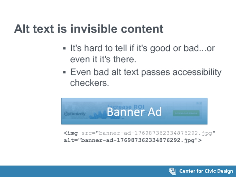
- 10. Alt text is invisible content It's hard
- 11. Is it code or content? Who "owns"
- 12. The tools don't help It's no fun
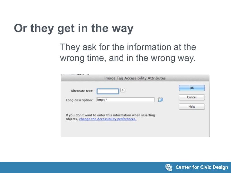
- 13. Or they get in the way They
- 14. The usual rules A simple way to decide how to write alt text
- 15. The simplest guideline Start with this question:
- 16. If the image contains Text Repeat the
- 17. A simple decision tree What is
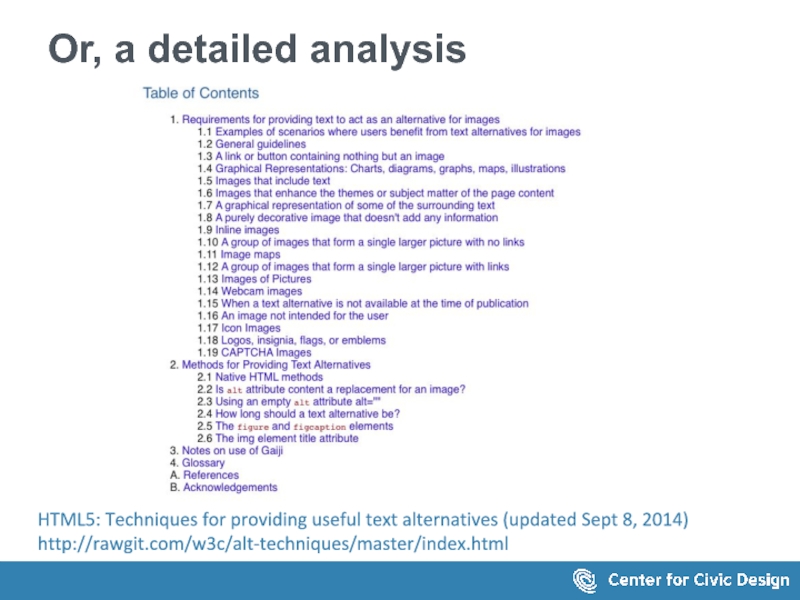
- 18. Or, a detailed analysis HTML5: Techniques
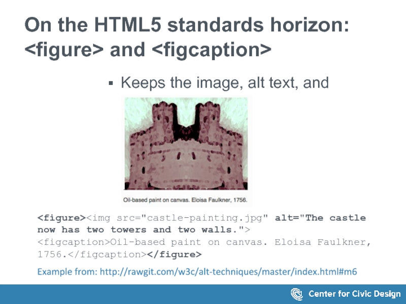
- 19. On the HTML5 standards horizon: and
- 20. A writer's approach Start with a content strategy
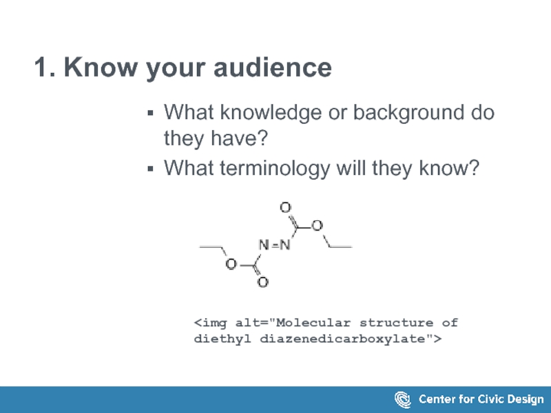
- 21. 1. Know your audience What knowledge or
- 22. 2. Context, not just rules What is
- 23. 3. Create a consistent 'voice' Make the
- 24. Consider the fox What should the alt
- 25. What if we see it on this
- 26. Or on this one The
- 27. Examples...examples...and more examples
- 28. Get the basics right Repeat the text
- 29. Get the basics right Identify the target
- 30. Don't create noise When images are used
- 31. Don't hide meaningful images Is a profile
- 32. Make captions and alt text work together
- 33. Don't hide information in the alt text
- 34. Don't just repeat the same text Caption
- 35. Consider the surrounding text The caption: “Figure
- 36. When the text is long... Put the
- 37. When the information is in a
- 38. When the text is in an infographic..
- 39. Workflow Make alt text part of the writing process
- 40. How long should alt text be? No
- 41. Keep it short Focus on the important
- 42. Be consistent Each image, each page, each
- 43. Write the text, caption, alt text together
- 44. This is change! Admit it Embrace
- 45. Make the web a better place. Write some (great) alt text today!
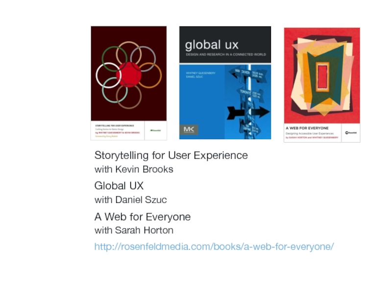
- 46. Storytelling for User Experience with Kevin Brooks
- 47. Get in touch! Whitney Quesenbery whitneyq@civicdesign.org @whitneyq http://civicdesign.org @civicdesign
- 48. Thank you.
Слайд 1Writing great alt text
Whitney Quesenbery
Center for Civic Design
@civicdesign | @whitneyq
Environments for
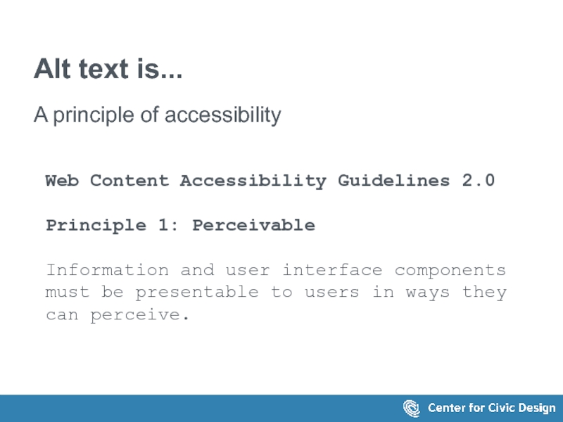
Слайд 3Alt text is...
A principle of accessibility
Web Content Accessibility Guidelines 2.0
Principle 1:
Information and user interface components must be presentable to users in ways they can perceive.
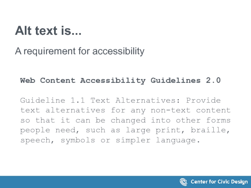
Слайд 4Alt text is...
A requirement for accessibility
Web Content Accessibility Guidelines 2.0
Guideline 1.1
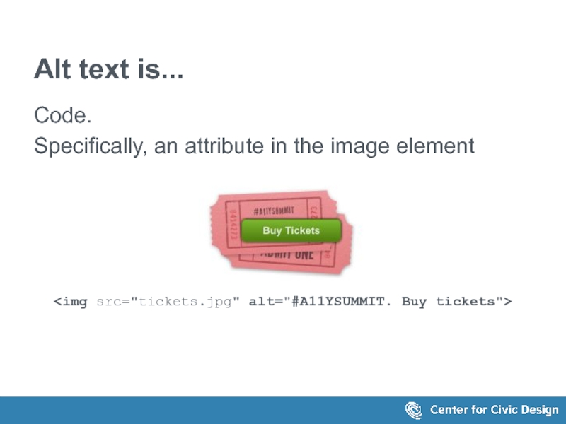
Слайд 5Alt text is...
Code.
Specifically, an attribute in the image element
Слайд 6Alt text is...
Part of appealing to all senses.
Images – alternative text
Video – captions and video descriptions action
Audio - transcripts
An accessible UX principle:
Accessible Media: Appeal to all Senses
A Web for Everyone by Sarah Horton and Whitney Quesenbery
http://rosenfeldmedia.com/books/a-web-for-everyone/
Слайд 7Because technology needs it
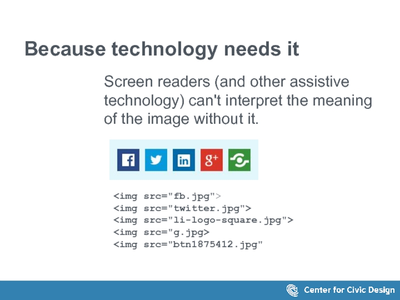
Screen readers (and other assistive technology) can't interpret


Слайд 8Because people need it
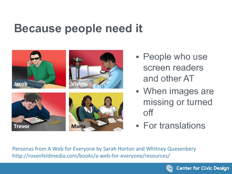
People who use screen readers and other AT
When
For translations
Personas from A Web for Everyone by Sarah Horton and Whitney Quesenbery
http://rosenfeldmedia.com/books/a-web-for-everyone/resources/
Слайд 10Alt text is invisible content
It's hard to tell if it's good
Even bad alt text passes accessibility checkers.

Слайд 12The tools don't help
It's no fun to
find each image
click open the
navigate to the right page
to enter the alt text
over and over and over for each image
Слайд 15The simplest guideline
Start with this question:
What information does this image add?
Does
What kind of information is it?
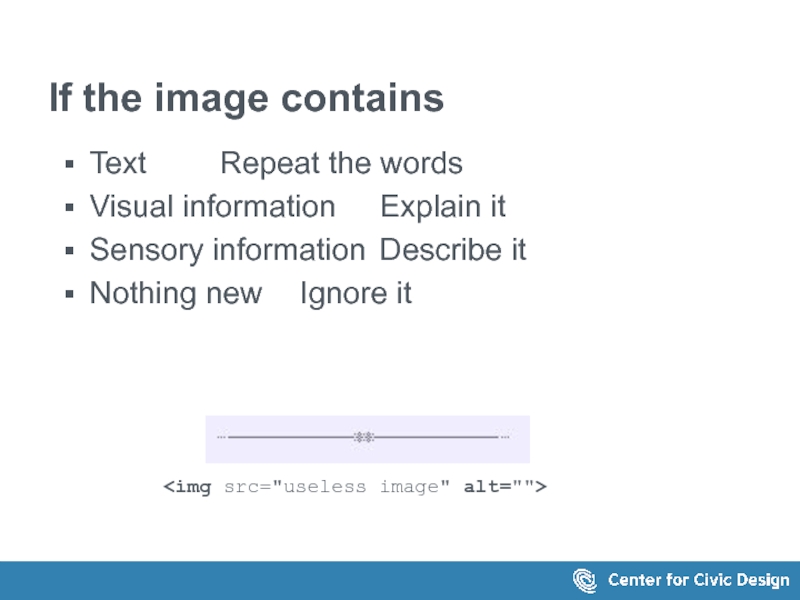
Слайд 16If the image contains
Text Repeat the words
Visual information Explain it
Sensory
Nothing new Ignore it
Слайд 17A simple decision tree
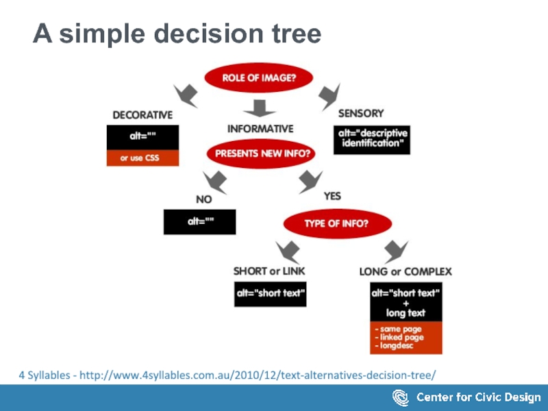
What is the role of the image?
Decorative? Use
Sensory? Write a descriptive identificaation
Informative?
No new info? Use null alt text
Simple or a link? Write short alt text
Complex image? Create long text
Section of the same page
Linked page
Longdesc
4 Syllables - http://www.4syllables.com.au/2010/12/text-alternatives-decision-tree/
Слайд 18Or, a detailed analysis
HTML5: Techniques for providing useful text alternatives (updated
Слайд 19On the HTML5 standards horizon:
and
Keeps the image, alt text,

Example from: http://rawgit.com/w3c/alt-techniques/master/index.html#m6
Слайд 211. Know your audience
What knowledge or background do they have?
What terminology
Слайд 222. Context, not just rules
What is the reader's goal?
How does the
What other information is around the image?
Слайд 233. Create a consistent 'voice'
Make the alt text part of the
Functional?
Descriptive?
Emotional?
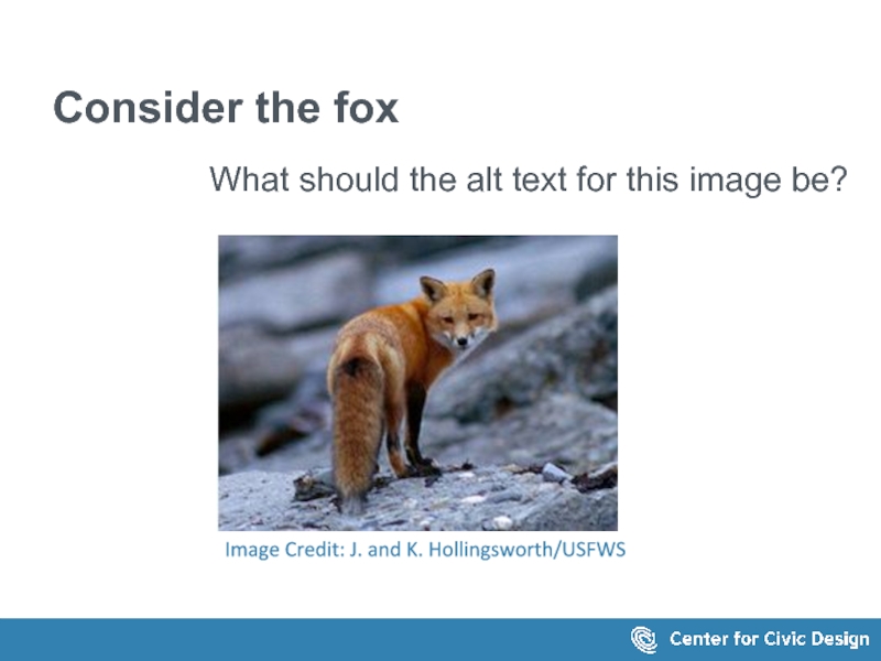
Слайд 24Consider the fox
What should the alt text for this image be?
Image
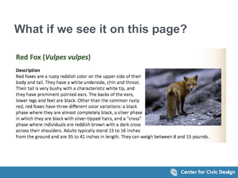
Слайд 25What if we see it on this page?
The text on page
Red Fox (Vulpes vulpes)
Description
Red foxes are a rusty reddish color on the upper side of their body and tail. They have a white underside, chin and throat. Their tail is very bushy with a characteristic white tip, and they have prominent pointed ears. The backs of the ears, lower legs and feet are black. Other than the common rusty red, red foxes have three different color variations: a black phase where they are almost completely black, a silver phase in which they are black with silver-tipped hairs, and a "cross" phase where individuals are reddish brown with a dark cross across their shoulders. Adults typically stand 15 to 16 inches from the ground and are 35 to 41 inches in length. They can weigh between 8 and 15 pounds.
Слайд 26Or on this one
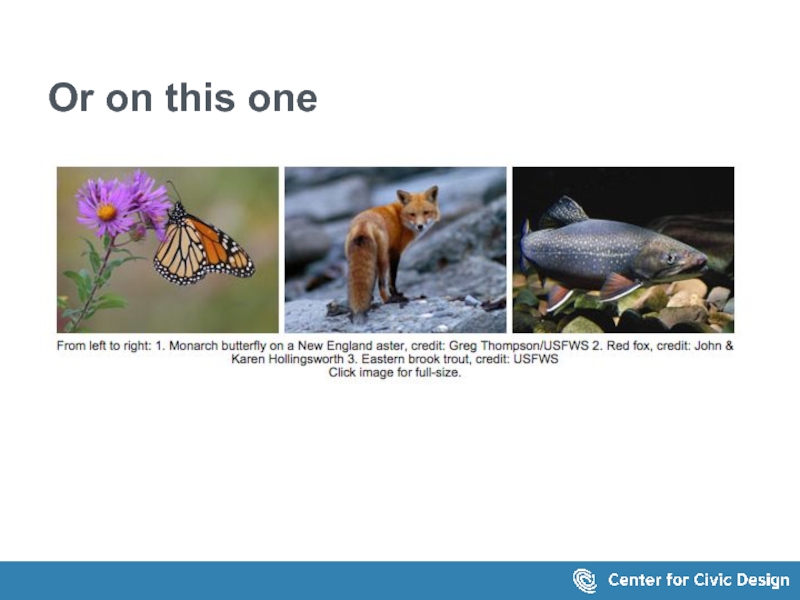
The screen shows 3 images with this
From left to right: 1. Monarch butterfly on a New England aster, credit: Greg Thompson/USFWS 2. Red fox, credit: John & Karen Hollingsworth 3. Eastern brook trout, credit: USFWS Click image for full-size.
Слайд 28Get the basics right
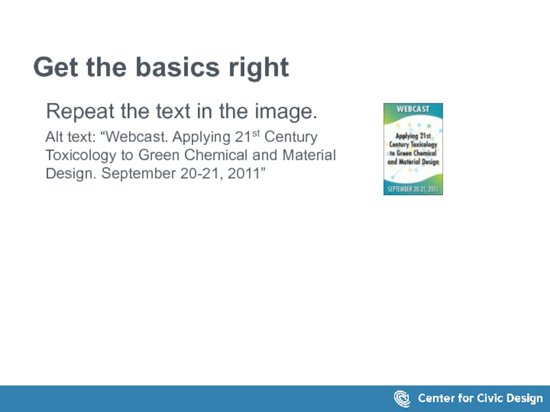
Repeat the text in the image.
Alt text: “Webcast.
Слайд 29Get the basics right
Identify the target of a link
Alt text:
“UXPA
Слайд 30Don't create noise
When images are used like a bullet, they can
If they are clickable make them part of the text link.
Слайд 31Don't hide meaningful images
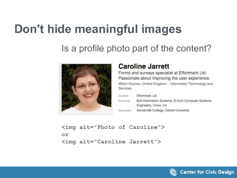
Is a profile photo part of the content?
or
Слайд 32Make captions and alt text work together
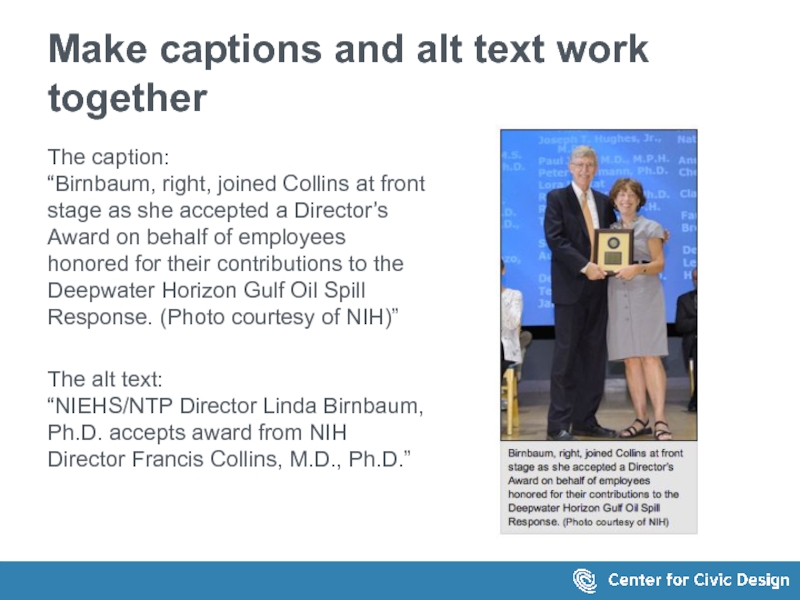
The caption:
“Birnbaum, right, joined Collins
The alt text: “NIEHS/NTP Director Linda Birnbaum, Ph.D. accepts award from NIH Director Francis Collins, M.D., Ph.D.”
Слайд 33Don't hide information in the alt text
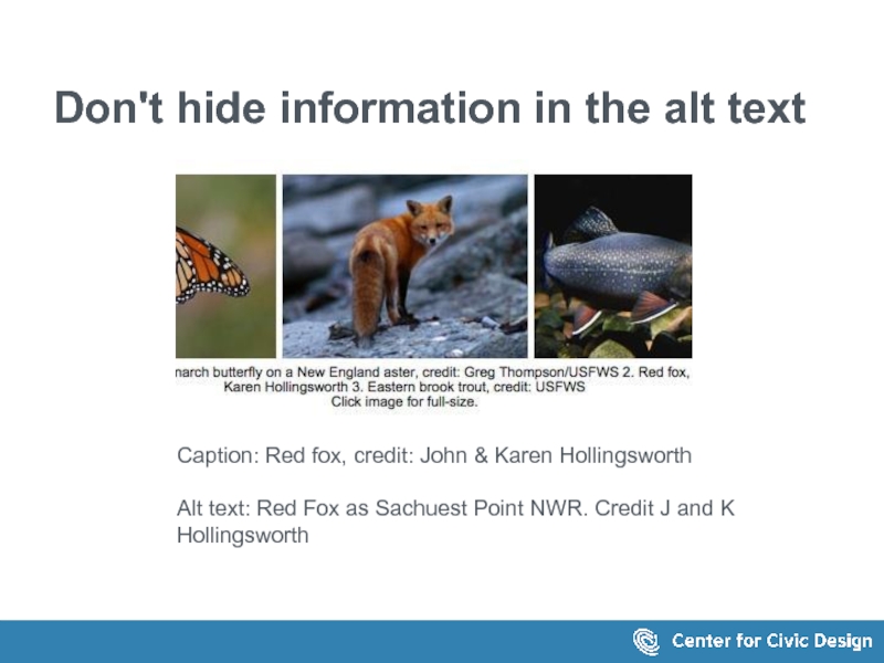
Caption: Red fox, credit: John
Alt text: Red Fox as Sachuest Point NWR. Credit J and K Hollingsworth
Слайд 34Don't just repeat the same text
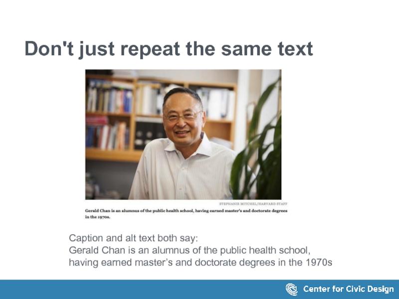
Caption and alt text both say:
Gerald
Слайд 35Consider the surrounding text
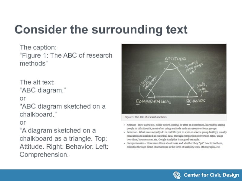
The caption:
“Figure 1: The ABC of research methods”
The
Слайд 36When the text is long...
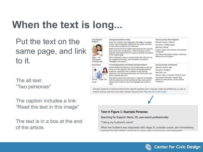
Put the text on the same page,
The alt text: “Two personas"
The caption includes a link: “Read the text in this image”
The text is in a box at the end of the article.
The caption reads: Example snapshots of personas demonstrate Spanish-speaking users’ language needs and preferences, as well as medical literacy, web skills, and other relevant characteristics. Read the text in this image."
The link points to a grey box below
Слайд 37When the information
is in a chart...
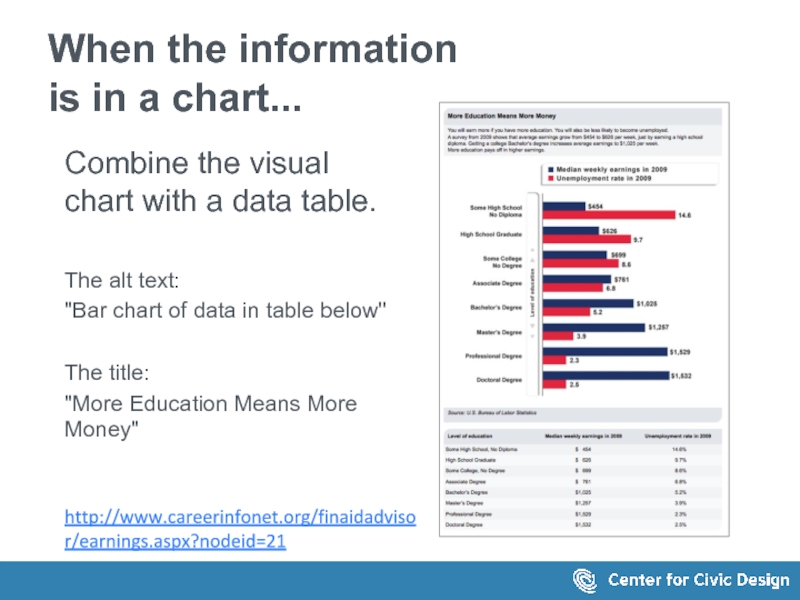
Combine the visual chart with
The alt text:
"Bar chart of data in table below"
The title:
"More Education Means More Money"
http://www.careerinfonet.org/finaidadvisor/earnings.aspx?nodeid=21
Слайд 38When the text is in an infographic..
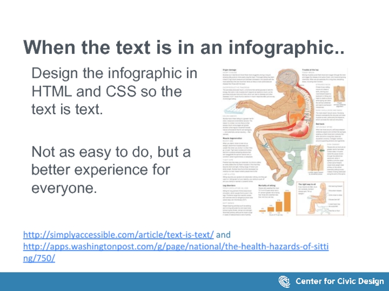
Design the infographic in HTML
Not as easy to do, but a better experience for everyone.
http://simplyaccessible.com/article/text-is-text/ and
http://apps.washingtonpost.com/g/page/national/the-health-hazards-of-sitting/750/
Слайд 40How long should alt text be?
No more than a few words?
5-15 words? (Many sources)
30-50 words (2-3 sentences)? (W3C Draft)
Слайд 41Keep it short
Focus on the important words (no prizes for writing
Avoid noise words
"Image of.. "
"This is a..."
Слайд 42Be consistent
Each image, each page, each section is all part of
Use the same approach everywhere, especially for functional elements:
Providing additional text
Locating explanatory text or data
Identifying figures in the text
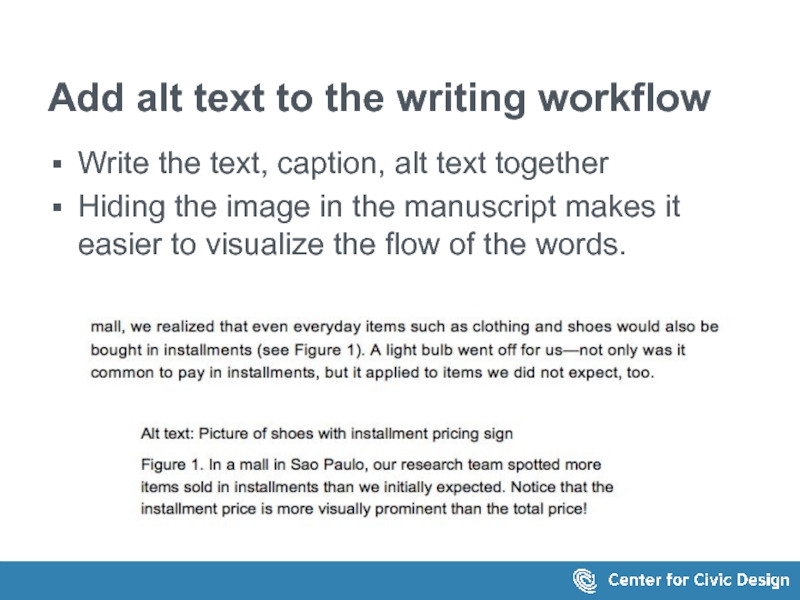
Слайд 43Write the text, caption, alt text together
Hiding the image in the
This is the text in the image:
...mall, we realized that even everyday items such as clothing and shoes would also be bought in installments (see Figure 1). A light bulb went off for us—not only was it common to pay in installments, but it applied to items we did not expect, too.
Alt text: Picture of shoes with installment pricing sign
Figure 1. In a mall in Sao Paulo, our research team spotted more items sold in installments than we initially expected. Notice that the installment price is more visually prominent than the total price!
Add alt text to the writing workflow
Слайд 44This is change!
Admit it
Embrace it
Set a reasonable pace
Rome wasn't built in
Слайд 46Storytelling for User Experience
with Kevin Brooks
Global UX
with Daniel Szuc
A Web for
http://rosenfeldmedia.com/books/a-web-for-everyone/

