- Главная
- Разное
- Дизайн
- Бизнес и предпринимательство
- Аналитика
- Образование
- Развлечения
- Красота и здоровье
- Финансы
- Государство
- Путешествия
- Спорт
- Недвижимость
- Армия
- Графика
- Культурология
- Еда и кулинария
- Лингвистика
- Английский язык
- Астрономия
- Алгебра
- Биология
- География
- Детские презентации
- Информатика
- История
- Литература
- Маркетинг
- Математика
- Медицина
- Менеджмент
- Музыка
- МХК
- Немецкий язык
- ОБЖ
- Обществознание
- Окружающий мир
- Педагогика
- Русский язык
- Технология
- Физика
- Философия
- Химия
- Шаблоны, картинки для презентаций
- Экология
- Экономика
- Юриспруденция
What Developers Need To Know About Visual Design презентация
Содержание
- 1. What Developers Need To Know About Visual Design
- 2. What Developers Need To Know About Visual Design @Ben_Hall Ben@BenHall.me.uk Blog.BenHall.me.uk
- 3. Who exactly is Ben Hall? I am not a designer Ocelot Uproar
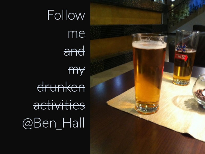
- 4. Follow me and my drunken activities @Ben_Hall
- 5. Key Topics Layout Images & Icons Colours Typography Feedback
- 6. Why design matters?
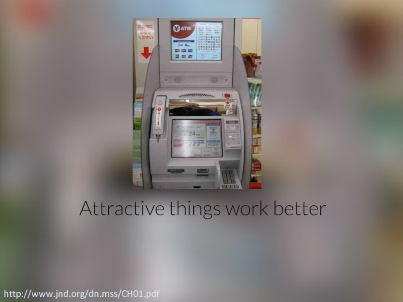
- 8. Attractive things work better http://www.jnd.org/dn.mss/CH01.pdf
- 9. Emotional reaction http://www.jnd.org/dn.mss/emotion_design_at.html
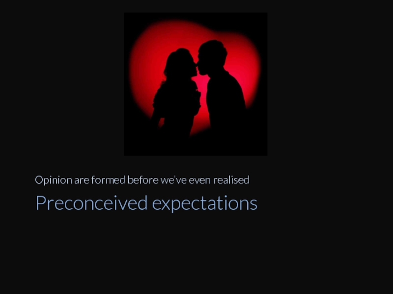
- 10. Preconceived expectations Opinion are formed before we’ve even realised
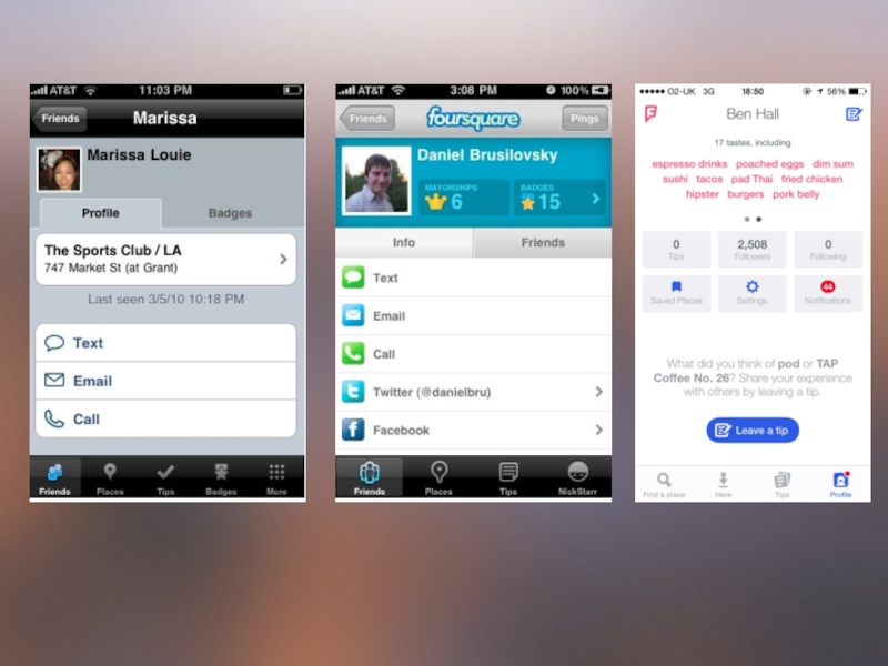
- 12. Result === influence / creditability
- 15. Software Craftsmanship “Raising the bar of professional software development”
- 16. In Startup, everyone should be a designer
- 17. Design is very similar to code Patterns, Practices, Heretics, Rules, Logic. TDD, Feedback Cycles.
- 18. Junior Designers vs. Senior Designers https://medium.com/the-year-of-the-looking-glass/junior-designers-vs-senior-designers-fbe483d3b51e
- 25. Layout
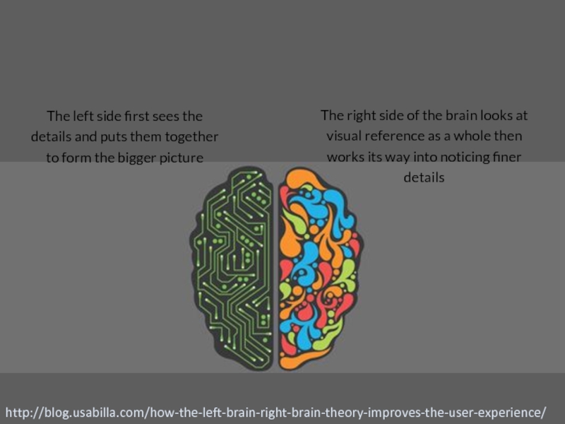
- 26. http://blog.usabilla.com/how-the-left-brain-right-brain-theory-improves-the-user-experience/ The right side of the brain
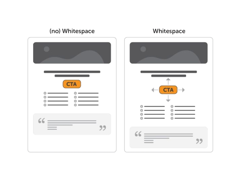
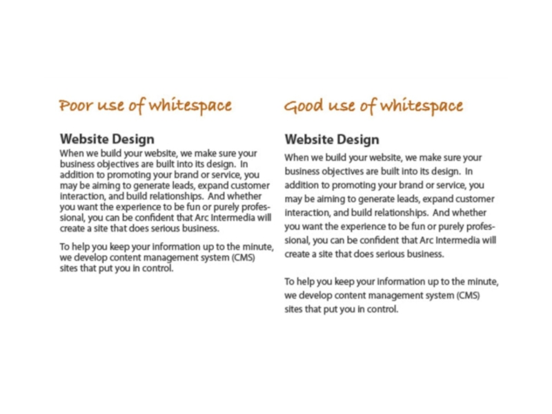
- 27. whitespace
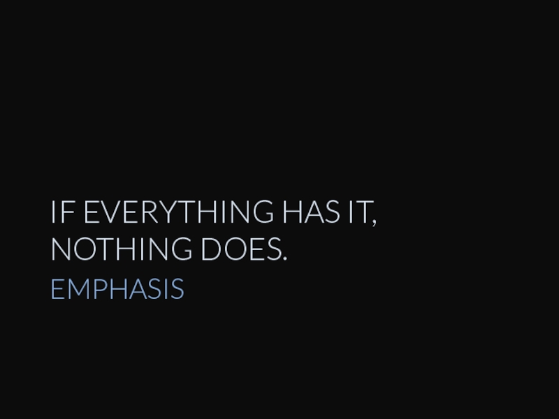
- 30. EMPHASIS IF EVERYTHING HAS IT, NOTHING DOES.
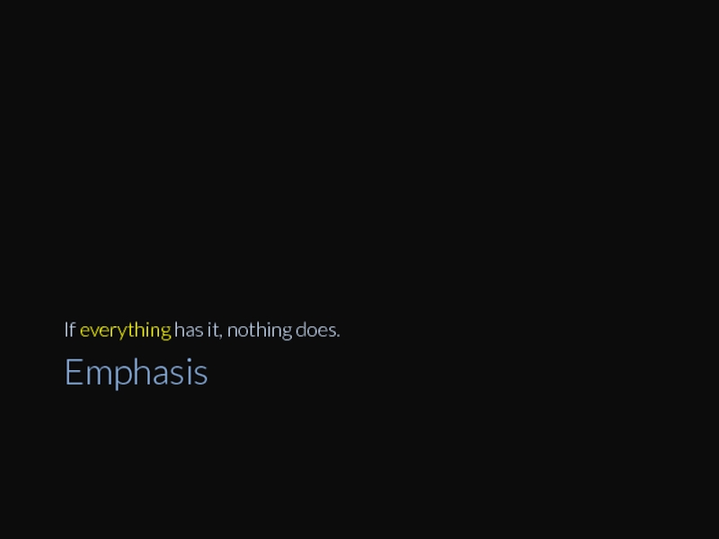
- 31. Emphasis If everything has it, nothing does.
- 32. Emphasis If everything has it, nothing does.
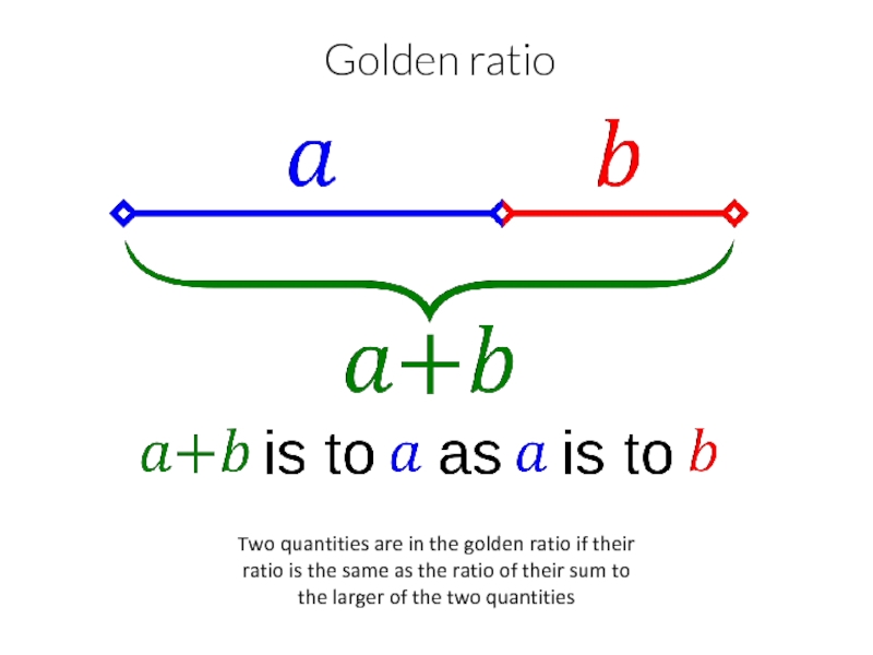
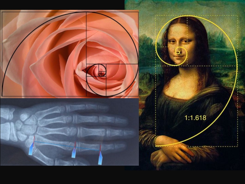
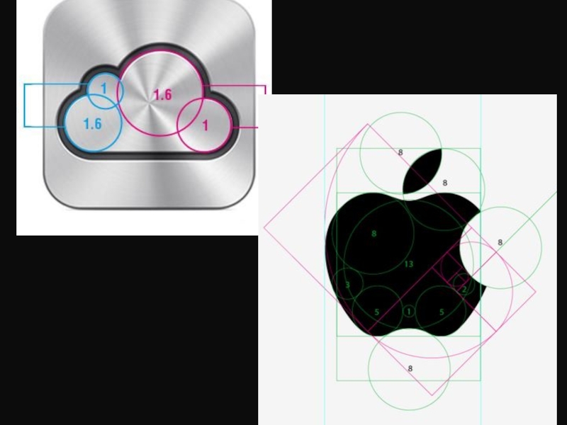
- 33. Two quantities are in the golden ratio
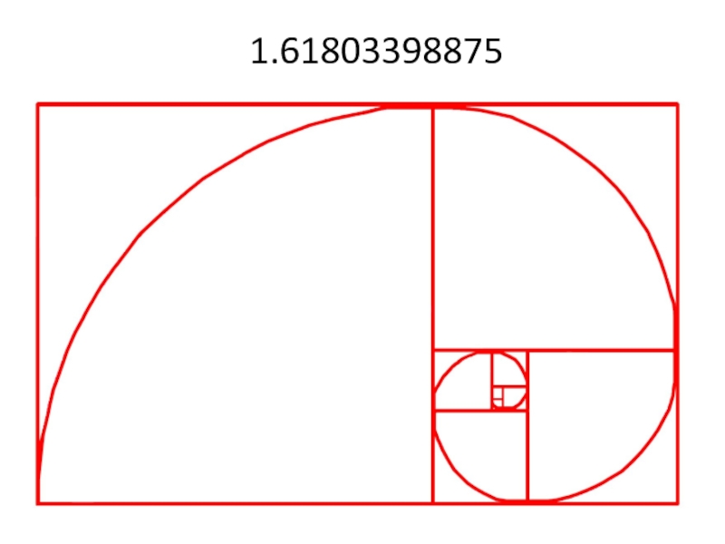
- 34. 1.61803398875
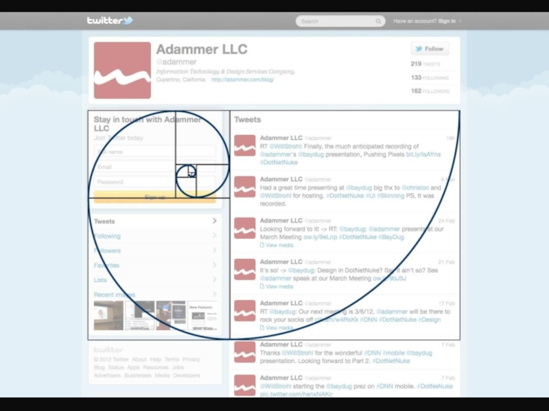
- 36. Twitter as an app example
- 38. Cognitive science
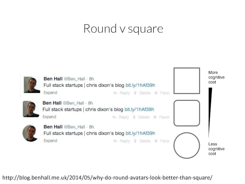
- 39. Round v square http://blog.benhall.me.uk/2014/05/why-do-round-avatars-look-better-than-square/
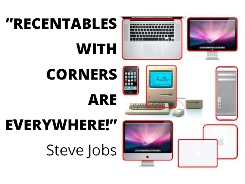
- 41. ”RECENTABLES WITH CORNERS ARE EVERYWHERE!” Steve Jobs
- 42. Real life isn’t square - Road signs
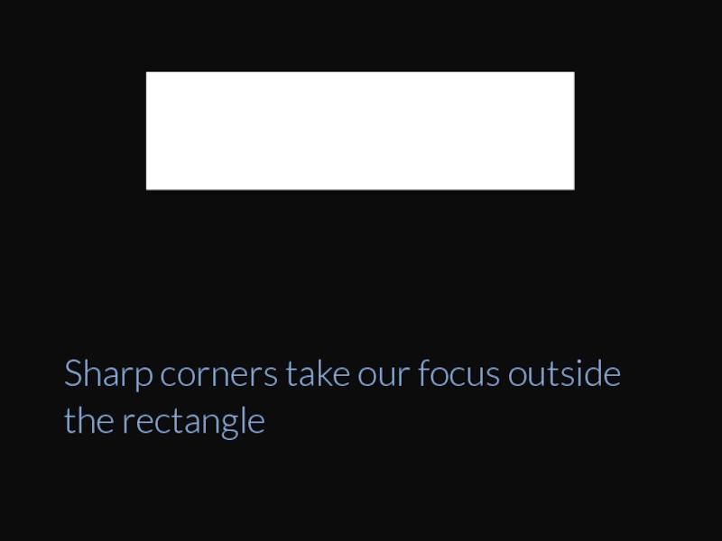
- 43. Sharp corners take our focus outside the rectangle
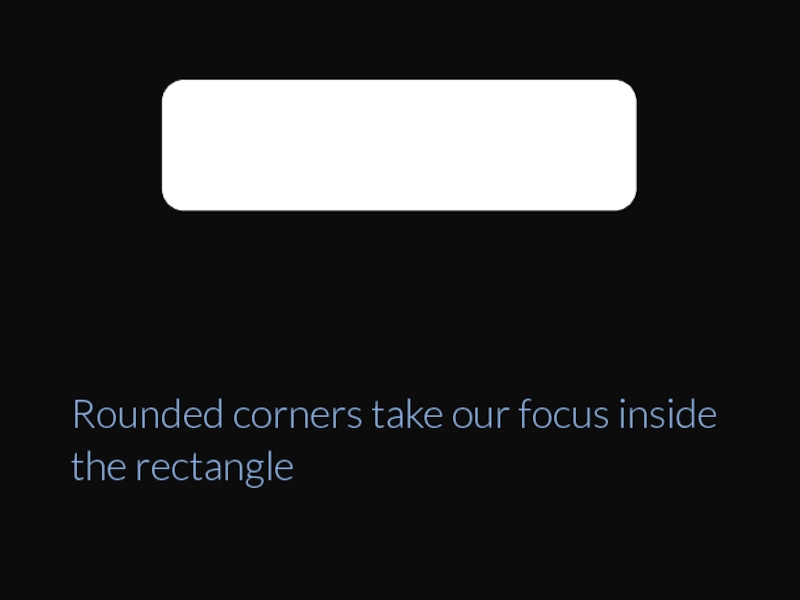
- 44. Rounded corners take our focus inside the rectangle
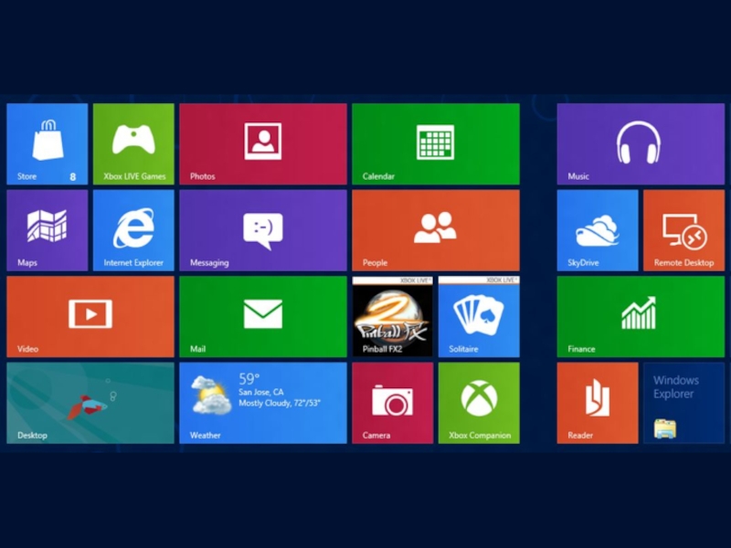
- 45. Windows 8
- 46. Sketch layouts until natural
- 47. Copy / clone to learn & train brain.
- 48. Images & Icons Picture is worth a
- 49. Recognition
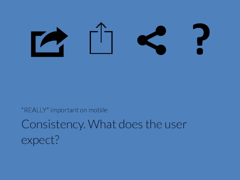
- 50. Consistency. What does the user expect? *REALLY* important on mobile ?
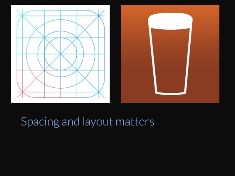
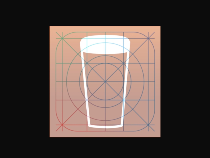
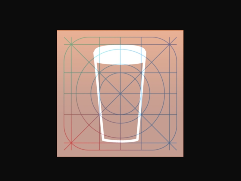
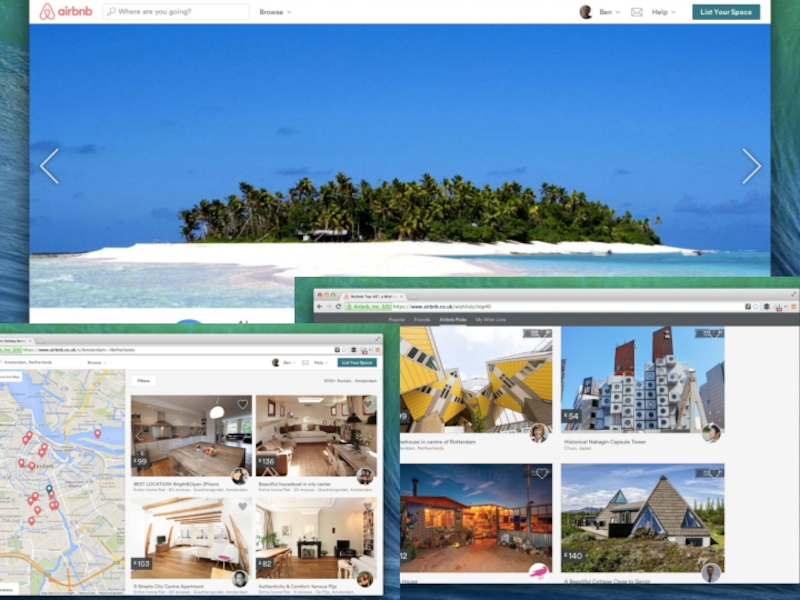
- 51. Spacing and layout matters
- 55. Great images create Desire and expression
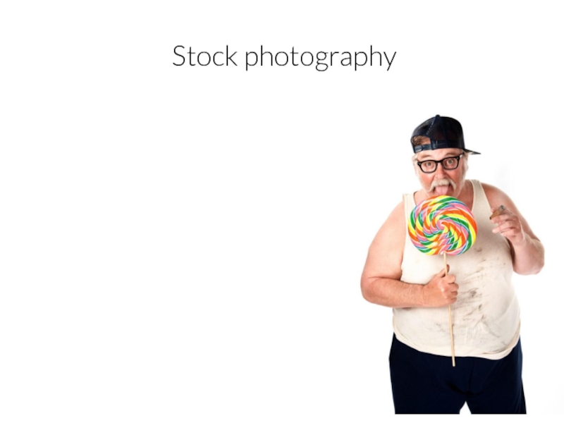
- 56. Stock photography
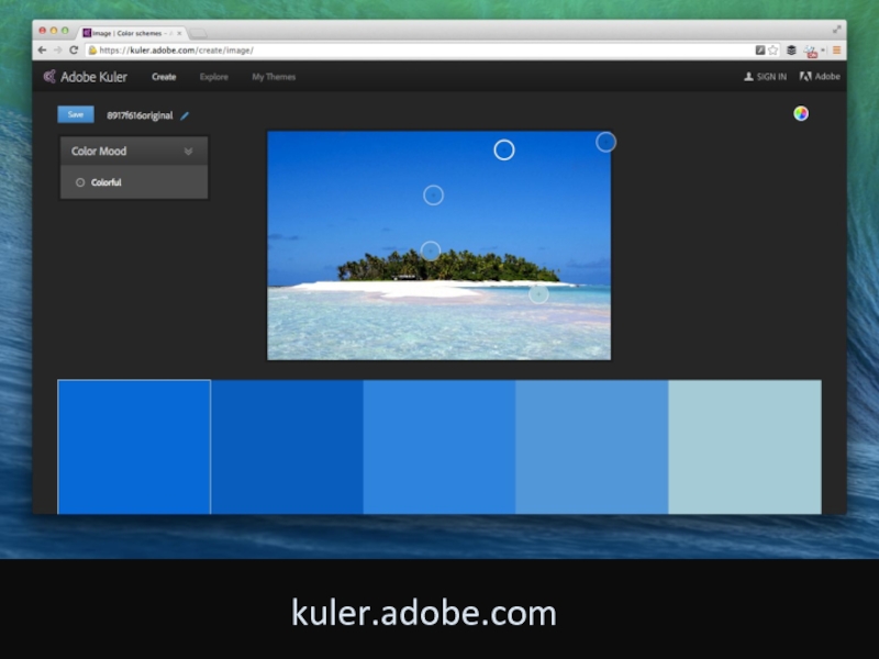
- 57. Define colour scheme for site kuler.adobe.com
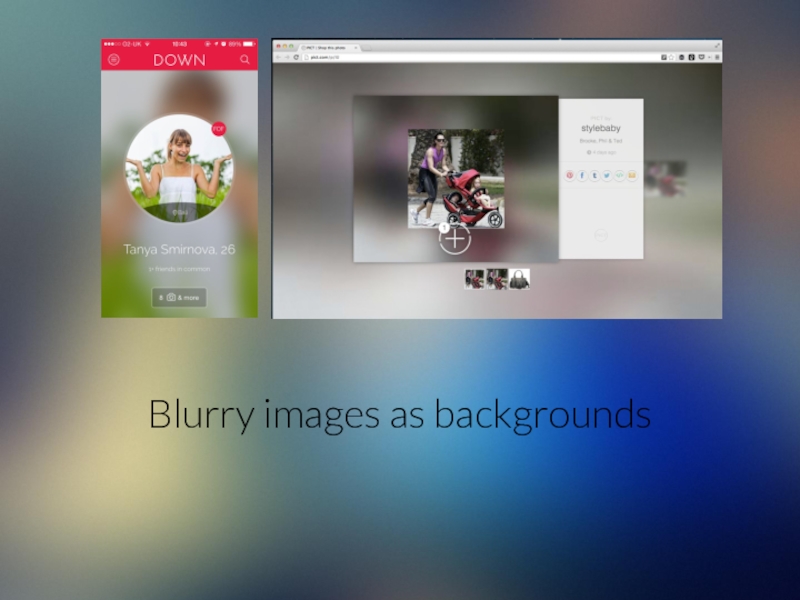
- 58. Blurry images as backgrounds
- 59. DRIVE USER ATTENTION
- 60. DRIVE USER ATTENTION
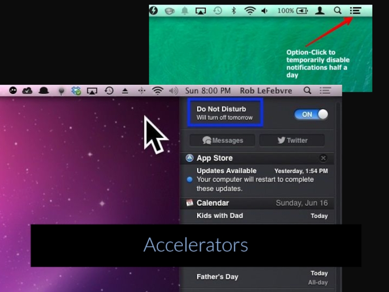
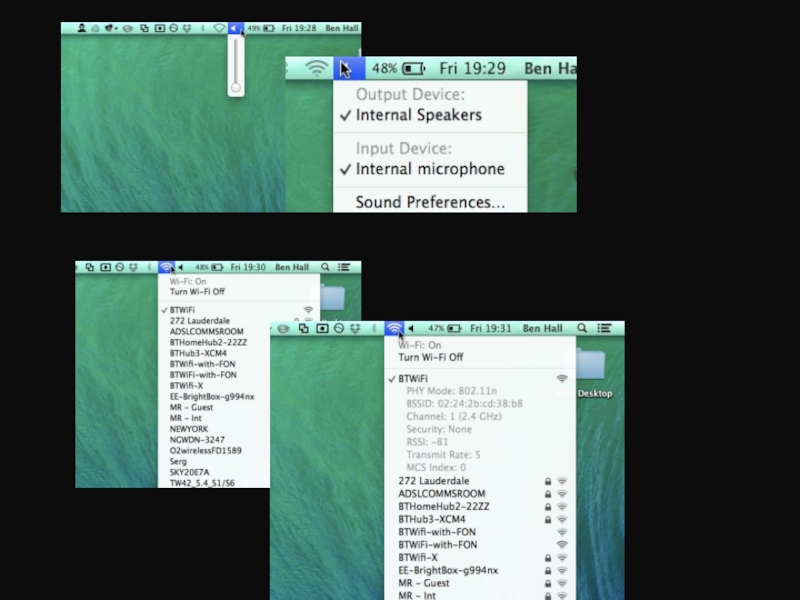
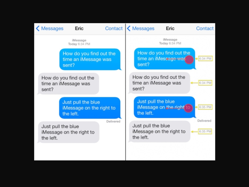
- 61. Accelerators
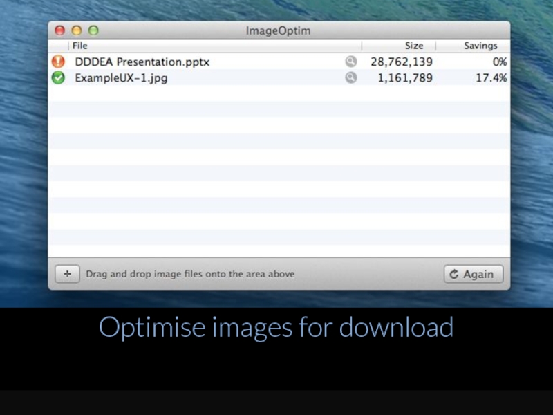
- 64. Optimise images for download
- 65. Responsive icons?
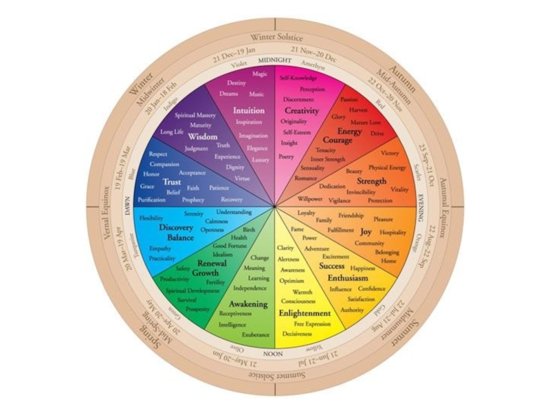
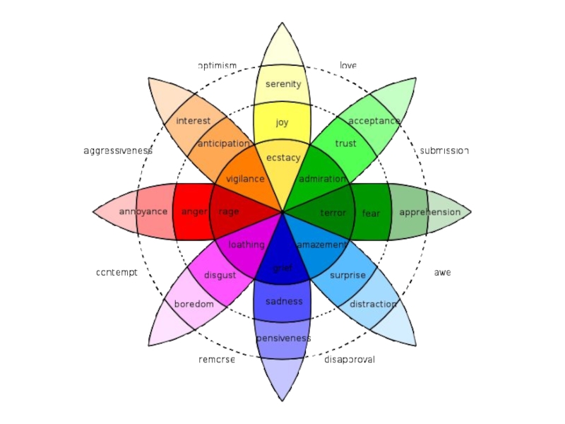
- 66. COLOURS
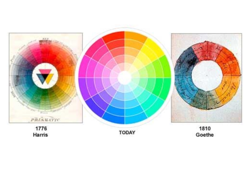
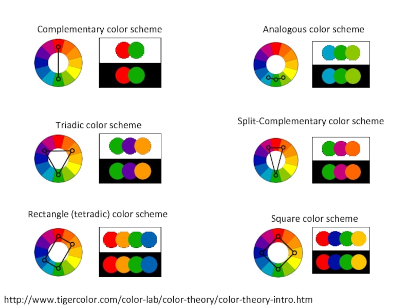
- 68. http://www.tigercolor.com/color-lab/color-theory/color-theory-intro.htm Complementary color scheme Analogous color scheme
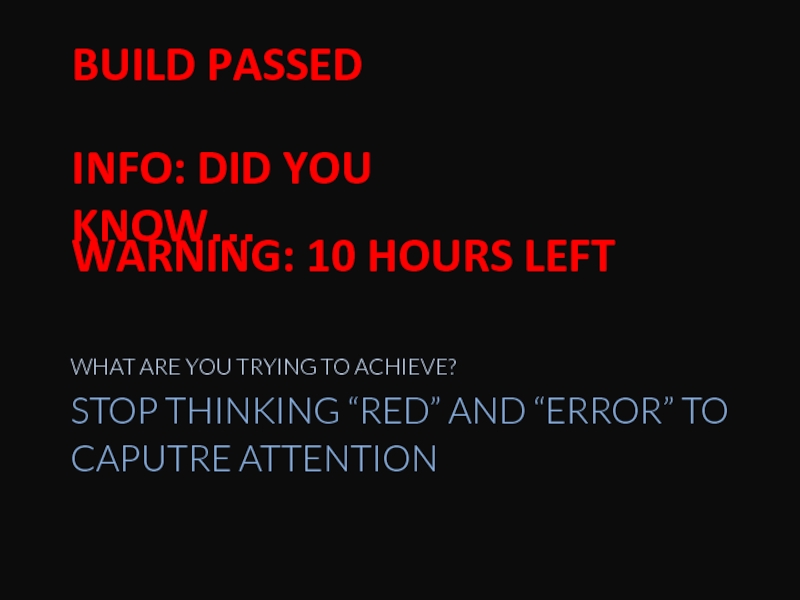
- 71. STOP THINKING “RED” AND “ERROR” TO CAPUTRE
- 72. Typography
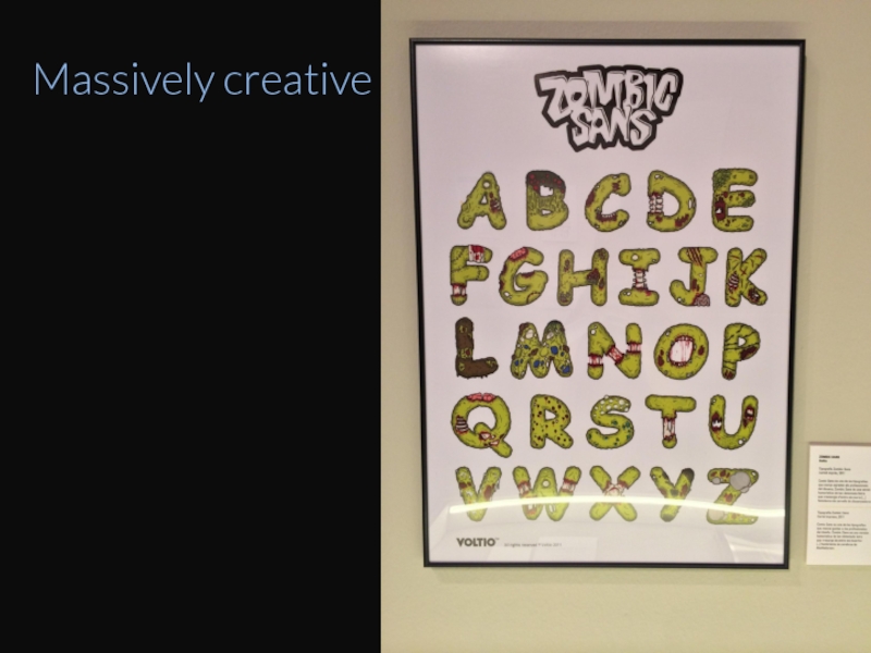
- 73. Massively creative
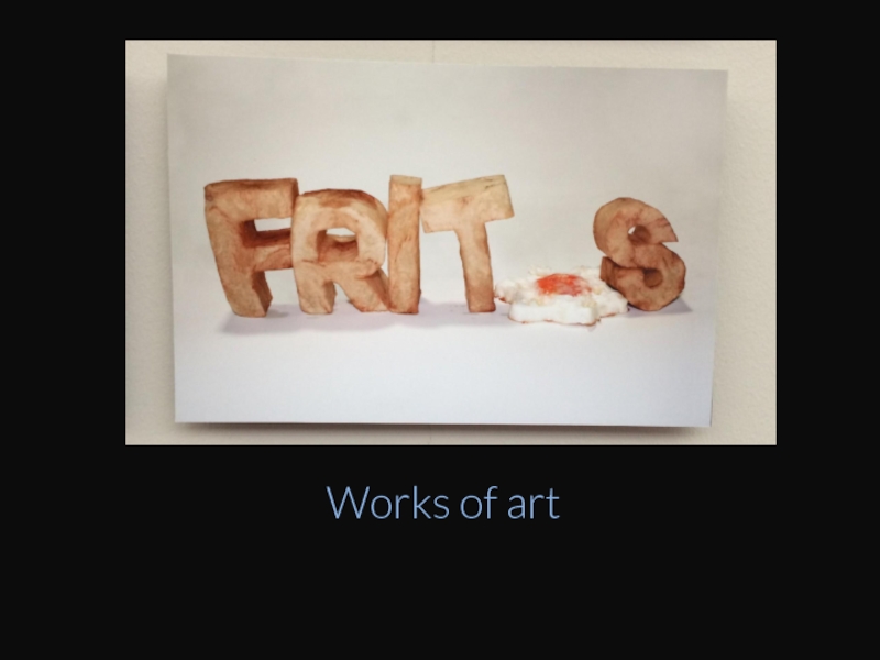
- 75. Works of art
- 76. "In some ways, the most difficult part
- 77. "Typefaces, like people, have their own personality" - Core Brand
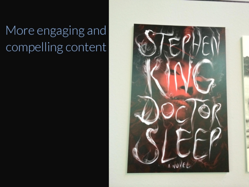
- 78. More engaging and compelling content
- 79. Looks Better = Works Better.
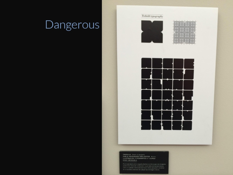
- 80. Dangerous
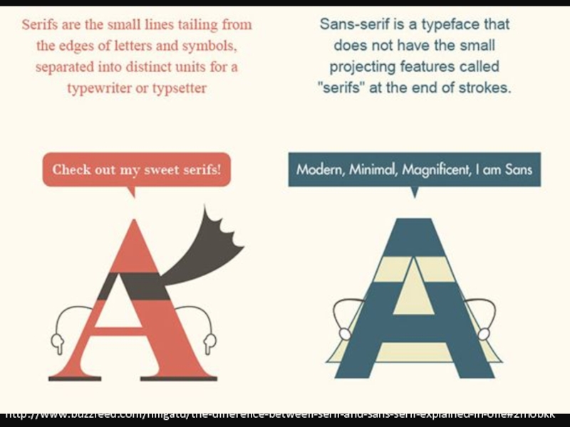
- 81. http://www.buzzfeed.com/hnigatu/the-difference-between-serif-and-sans-serif-explained-in-one#2fnobkk
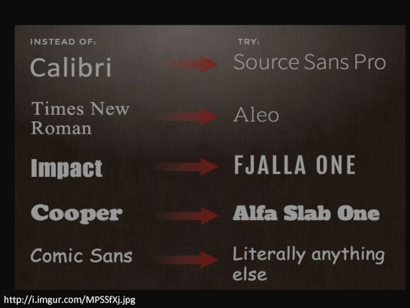
- 82. http://i.imgur.com/MPSSfXj.jpg
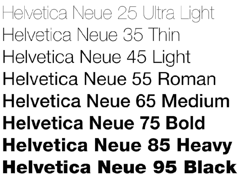
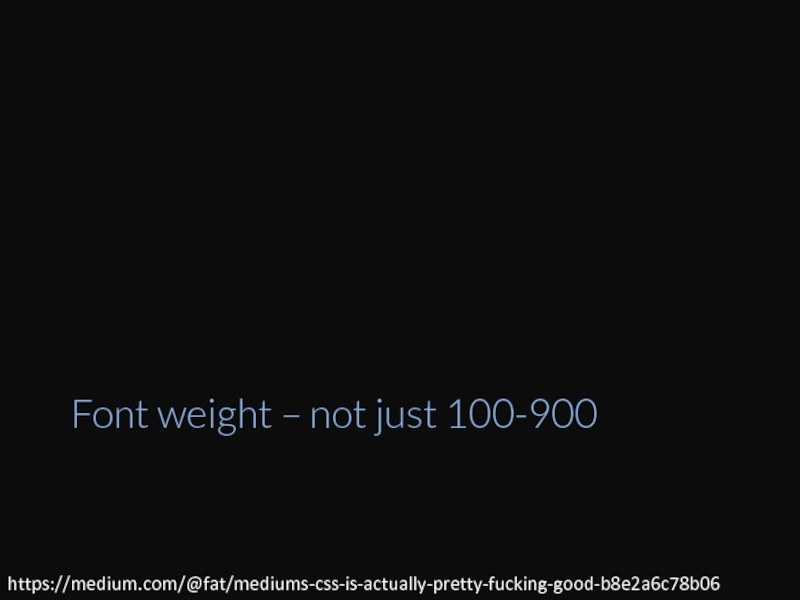
- 84. Font weight – not just 100-900 https://medium.com/@fat/mediums-css-is-actually-pretty-fucking-good-b8e2a6c78b06
- 85. WHY IS ALL CAPS SHOUTING?
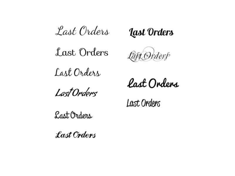
- 86. Experiment lots
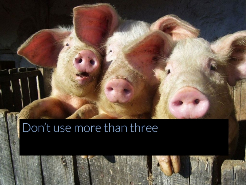
- 89. Don’t use more than three
- 92. Respond to touch EVENTS
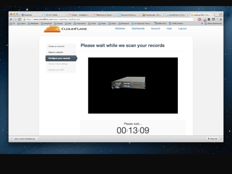
- 93. Progress bars – cloudflare example
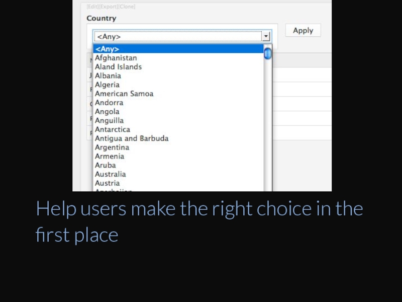
- 95. Help users make the right choice in the first place
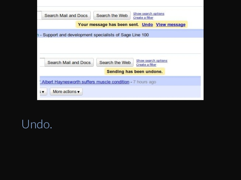
- 96. Undo.
- 98. Usability tests
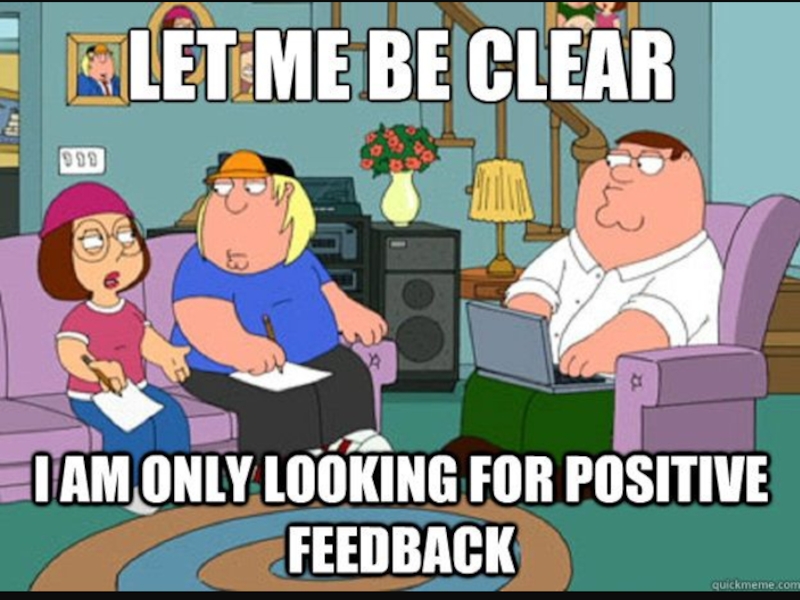
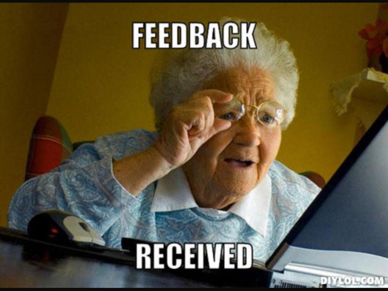
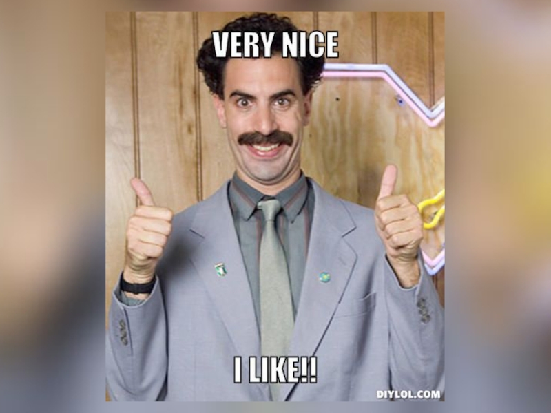
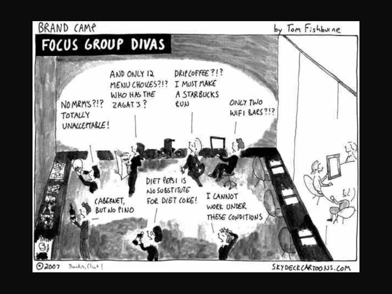
- 99. Not asking “do you like this?” Everyone will say yes!!! People are awesome.
- 100. Chance to learn. Ask more than you talk. It’s like a date
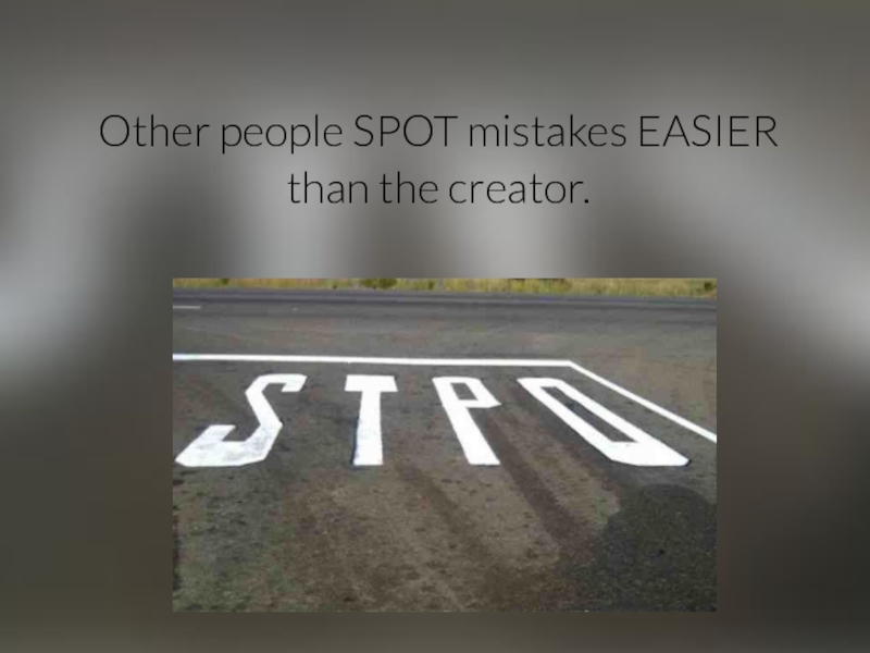
- 102. Other people SPOT mistakes EASIER than the creator.
- 103. “Oh yeah, of course, I didn’t notice”
- 104. New startup!!!
- 105. AND FINALLY
- 106. Layout, Images, Colours, Typography, Feedback Just
- 107. @Ben_Hall Ben@BenHall.me.uk Blog.BenHall.me.uk
Слайд 17Design is very similar to code
Patterns, Practices, Heretics, Rules, Logic. TDD,
Слайд 18Junior Designers vs. Senior Designers
https://medium.com/the-year-of-the-looking-glass/junior-designers-vs-senior-designers-fbe483d3b51e
Слайд 26http://blog.usabilla.com/how-the-left-brain-right-brain-theory-improves-the-user-experience/
The right side of the brain looks at visual reference as
The left side first sees the details and puts them together to form the bigger picture
Слайд 33Two quantities are in the golden ratio if their ratio is
Golden ratio
Слайд 39Round v square
http://blog.benhall.me.uk/2014/05/why-do-round-avatars-look-better-than-square/
Слайд 48Images & Icons
Picture is worth a thousand words.
No one reads
Слайд 68http://www.tigercolor.com/color-lab/color-theory/color-theory-intro.htm
Complementary color scheme
Analogous color scheme
Triadic color scheme
Split-Complementary color scheme
Rectangle (tetradic) color
Square color scheme
Слайд 71STOP THINKING “RED” AND “ERROR” TO CAPUTRE ATTENTION
WHAT ARE YOU TRYING
BUILD PASSED
INFO: DID YOU KNOW…
WARNING: 10 HOURS LEFT
Слайд 76"In some ways, the most difficult part of design process is
Most important aspect of design
Слайд 81http://www.buzzfeed.com/hnigatu/the-difference-between-serif-and-sans-serif-explained-in-one#2fnobkk
Слайд 84Font weight – not just 100-900
https://medium.com/@fat/mediums-css-is-actually-pretty-fucking-good-b8e2a6c78b06
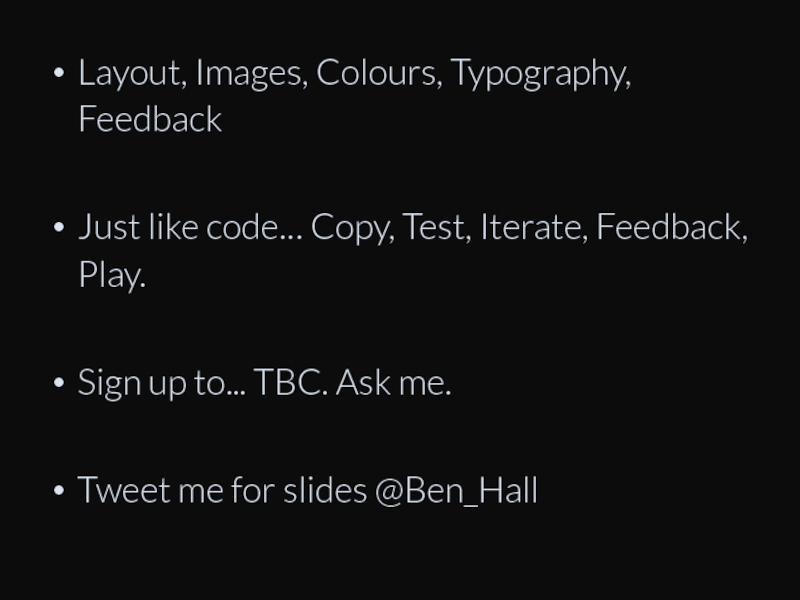
Слайд 106Layout, Images, Colours, Typography, Feedback
Just like code… Copy, Test, Iterate, Feedback,
Sign up to... TBC. Ask me.
Tweet me for slides @Ben_Hall
