- Главная
- Разное
- Дизайн
- Бизнес и предпринимательство
- Аналитика
- Образование
- Развлечения
- Красота и здоровье
- Финансы
- Государство
- Путешествия
- Спорт
- Недвижимость
- Армия
- Графика
- Культурология
- Еда и кулинария
- Лингвистика
- Английский язык
- Астрономия
- Алгебра
- Биология
- География
- Детские презентации
- Информатика
- История
- Литература
- Маркетинг
- Математика
- Медицина
- Менеджмент
- Музыка
- МХК
- Немецкий язык
- ОБЖ
- Обществознание
- Окружающий мир
- Педагогика
- Русский язык
- Технология
- Физика
- Философия
- Химия
- Шаблоны, картинки для презентаций
- Экология
- Экономика
- Юриспруденция
TYPOGRAPHIC SPUR презентация
Содержание
- 1. TYPOGRAPHIC SPUR
- 2. Typography has been recognized from, and dated
- 3. PRE-DIGITAL TYPE Technologies Woodblock printing, 220 AD
- 4. DIGITAL TYPOGRAPHY (Mid 1980s – Present) Outline (vector) fonts Bitmap (raster) fonts
- 5. Innovations in computers era provided a boost
- 6. Notice Tech Agencies And Corporations Are Moving From Conventional Typography to Digital typography
- 7. Font-asy of Tech Companies Let's Have A
- 9. The largest South Korean company making electronics,
- 11. In 2002, Apple started using a variant
- 13. The Google wordmark is based on the
- 15. The Toshiba logo uses the Eurostile® typeface.
- 17. Microsoft's new logo is in Segoe. It
- 19. Amazon.com chose the book and bold weights
- 21. The Sony logo has incorporated the modified
- 23. The font used in the HP logo
- 24. Take Away Small businesses should become accustomed
- 25. HOPE YOU LIKED THE PRESENTATION PLEASE SHARE YOUR OPINIONS

Слайд 2Typography has been recognized from, and dated back, to the early
years of human civilization. Initially, it existed in the form of stone carvings, and then expanded with the innovation brought by the invention of brushes and canvas.
It was further popularized through the art of sketching and calligraphy. However, the advent of digitization has caused a paradigm shift in the world of typography.

Слайд 3PRE-DIGITAL TYPE Technologies
Woodblock printing, 220 AD
Wooden font molds, 1800s
Handwriting and calligraphy,
3200 BC
Photo-type setting, 1950s
Movable type letterpress printing, 1040 AD
Continuous casting, 1890s
Photo-type setting, 1950s
Movable type letterpress printing, 1040 AD
Continuous casting, 1890s

Outline (vector) fontsBitmap (raster) fonts")
Слайд 5Innovations in computers era
provided a boost to typography,
where designers started applying
bitmaps and vectors with the help of advanced tools like,
RoboFont
FontLab
Glyphs
RoboFont
FontLab
Glyphs

Слайд 6Notice Tech Agencies And Corporations Are Moving From Conventional Typography to
Digital typography

Слайд 7Font-asy of Tech Companies
Let's Have A Look At How Digital Fonts
Are Being Used By Leading Tech Companies


Слайд 9The largest South Korean company making electronics, Samsung, uses the font
Helvetica Black with a modification to the “A”.

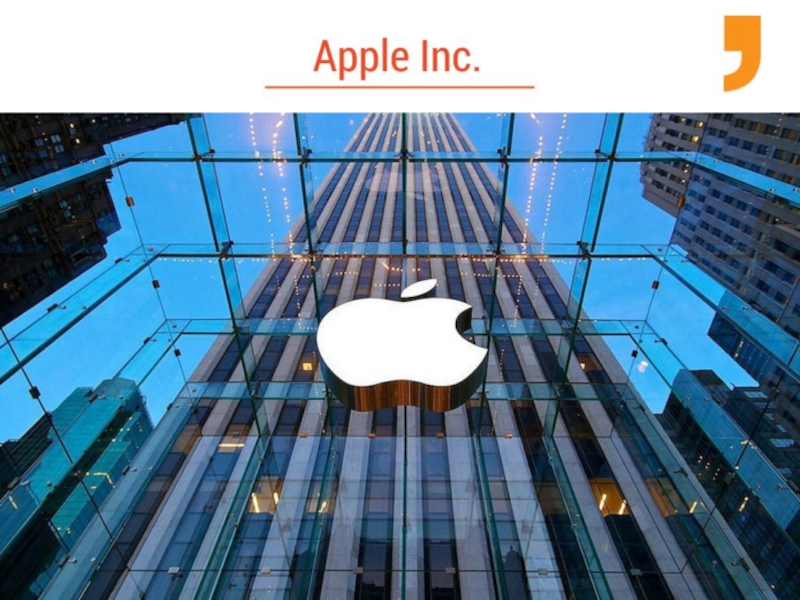
Слайд 11In 2002, Apple started using a variant of the Adobe Myriad
font in its marketing. The text changed from the serif Apple Garamond to the sans-serif Myriad Apple.

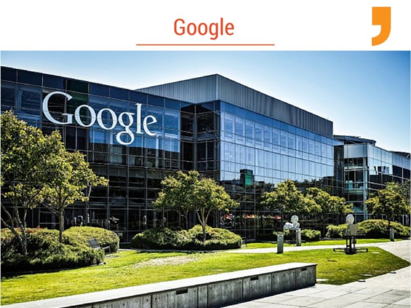
Слайд 13The Google wordmark is based on the Catull typeface, an old
style serif typeface designed by Gustav Jaeger for the Berthold Type Foundry in 1982.

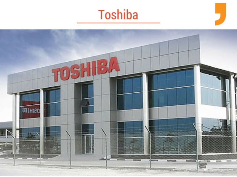
Слайд 15The Toshiba logo uses the Eurostile® typeface. In 2002, the iconic
“Toshiba logotype” was given a red color and was made the official emblem of Toshiba Group.

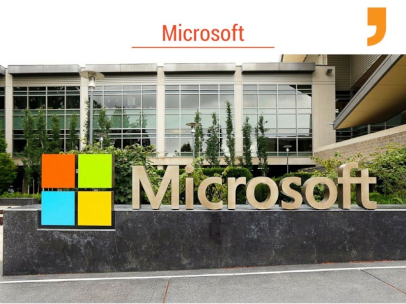
Слайд 17Microsoft's new logo is in Segoe. It is their first logo
change since 1987 and it certainly feels fresher than their aging mark in Helvetica Bold Italic.


Слайд 19Amazon.com chose the book and bold weights of the ITC Officina
Sans family when it's logo was created.

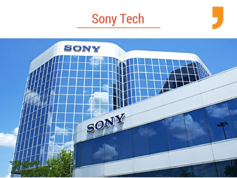
Слайд 21The Sony logo has incorporated the modified form of Clarendon typeface.
However, the use of black color in the logo symbolizes perfection, elegance, integrity and the illustrious history of the brand.

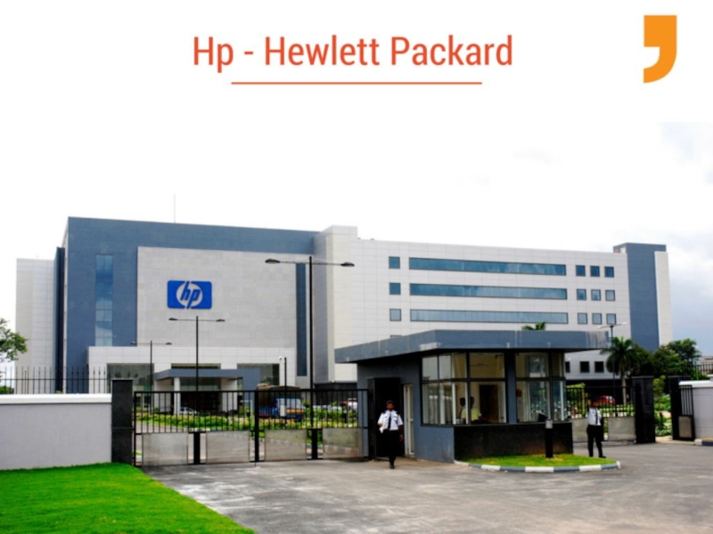
Слайд 23The font used in the HP logo is simple and presented
in italic. It comes into view vertically, in a bold and unique manner, capturing the entire concentration and appreciation of the viewer.

Слайд 24Take Away
Small businesses should become accustomed to this trend sooner rather
than later, and adapt a strategy of using technological font styles on their websites and promotional materials.