- Главная
- Разное
- Дизайн
- Бизнес и предпринимательство
- Аналитика
- Образование
- Развлечения
- Красота и здоровье
- Финансы
- Государство
- Путешествия
- Спорт
- Недвижимость
- Армия
- Графика
- Культурология
- Еда и кулинария
- Лингвистика
- Английский язык
- Астрономия
- Алгебра
- Биология
- География
- Детские презентации
- Информатика
- История
- Литература
- Маркетинг
- Математика
- Медицина
- Менеджмент
- Музыка
- МХК
- Немецкий язык
- ОБЖ
- Обществознание
- Окружающий мир
- Педагогика
- Русский язык
- Технология
- Физика
- Философия
- Химия
- Шаблоны, картинки для презентаций
- Экология
- Экономика
- Юриспруденция
STOP CREATING AWESOME UX(make awesome [bad@$$] users instead) презентация
Содержание
- 1. STOP CREATING AWESOME UX(make awesome [bad@$$] users instead)
- 2. Greetings and intros
- 3. and you?
- 4. What’s on tap today? How do we
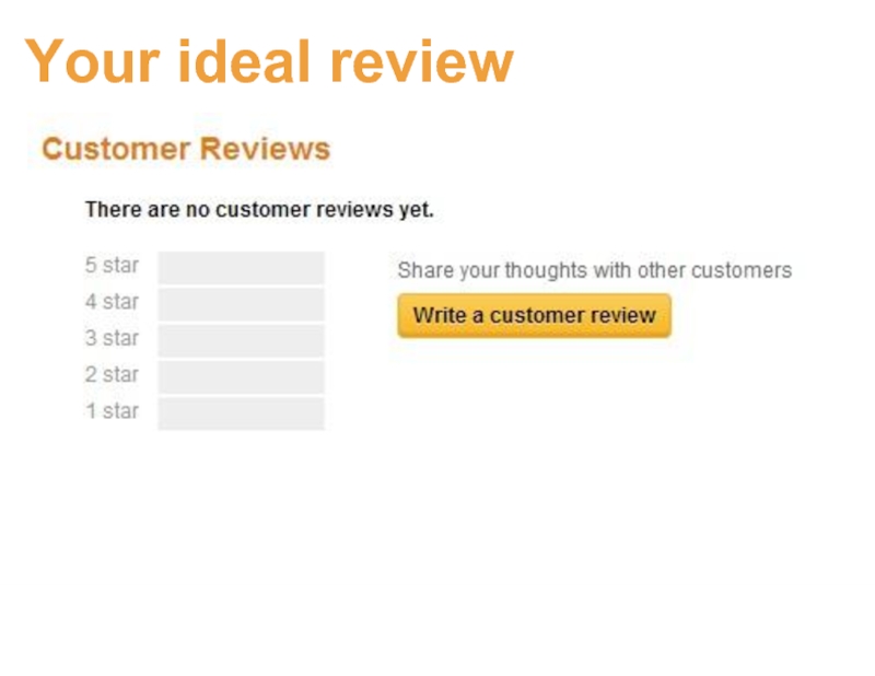
- 5. Your ideal review
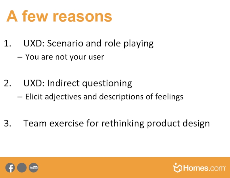
- 7. A few reasons UXD: Scenario and role
- 8. How do we do UX at DE? UX happens
- 9. How do we do good UX?
- 10. Genius design
- 11. Principles-practices-patterns Write great design principles Distell to the entire team Create pattern libraries Enforce
- 12. Principles
- 13. Patterns – to solve problems
- 14. ccc Practices
- 15. An Example Give good feedback
- 16. The problem
- 17. click here The design (solution) pattern
- 18. Best practices and rules of thumb:
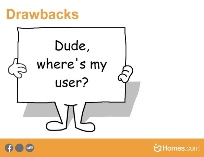
- 19. Drawbacks
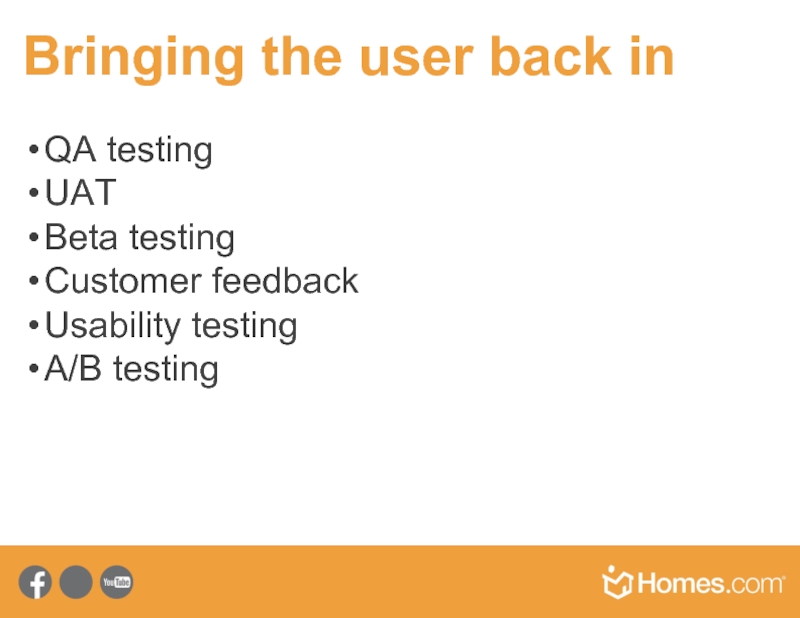
- 20. Bringing the user back in QA testing
- 21. Users are in the principles
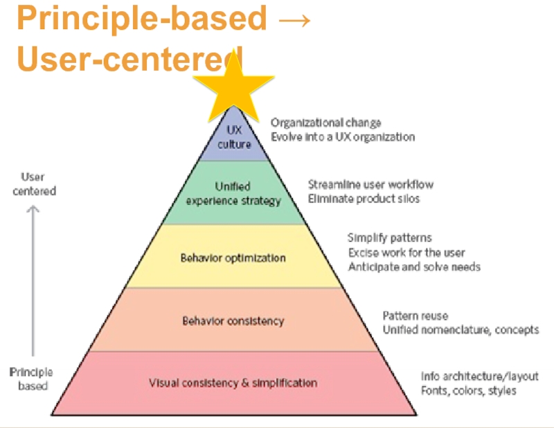
- 22. Principle-based → User-centered
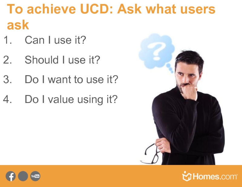
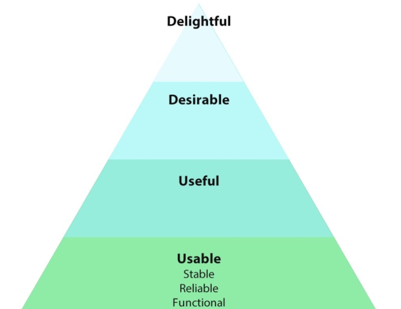
- 23. To achieve UCD: Ask what users ask
- 24. A UX-focused organization… is always asking:
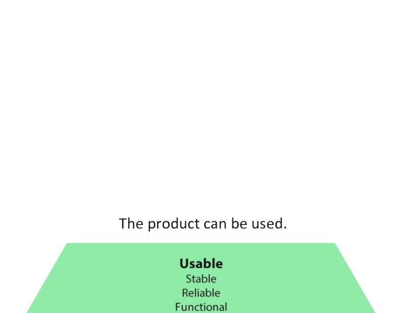
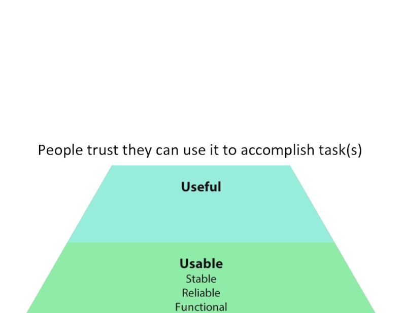
- 25. The product can be used.
- 26. People trust they can use it to accomplish task(s)
- 27. People want to use it more than other products
- 29. How do we know?
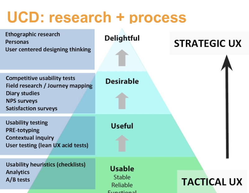
- 30. UCD: research + process Usability
- 32. Desirable? Delightful?
- 33. The D word problem Desirable? Delightful?
- 34. The D word problem Desirable? Delightful?
- 35. Too Squishy for the C Suite When
- 36. When there’s no competition Internal tools
- 37. When D words undermine trust Rounded corners
- 38. Mastery?
- 39. Master of what?
- 40. No one wants to master your app
- 41. Design for the post UX UX
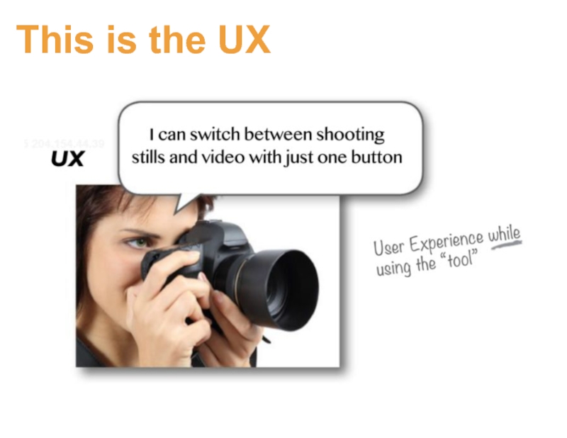
- 42. This is the UX
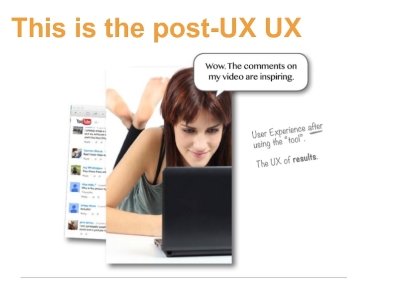
- 43. This is the post-UX UX
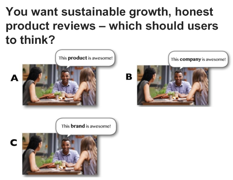
- 44. You want sustainable growth, honest product reviews – which should users to think?
- 45. Secret answer is D
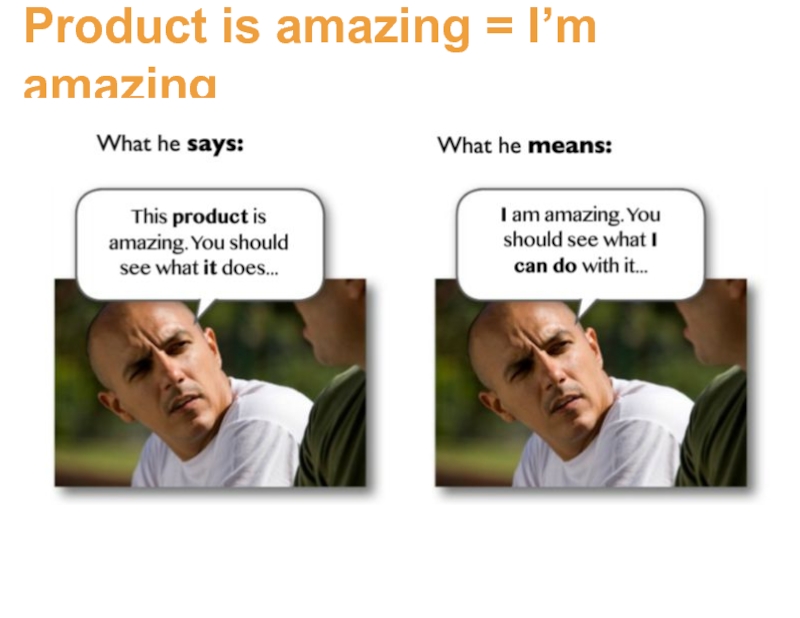
- 46. Product is amazing = I’m amazing
- 47. Why are people promoters? When people think
- 48. Why do they tell their friends?
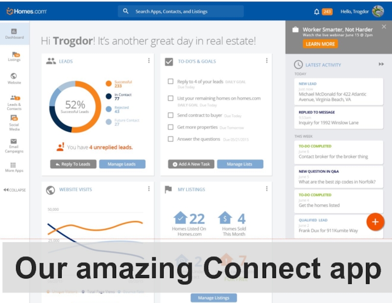
- 49. This is the UX Dashboard ux
- 50. No one wants to master the Connect App
- 51. They want to be excellent at
- 52. Dashboard ux Selling the American
- 53. Post UX: when the clicking is over
- 54. Post UX drives our success Users who
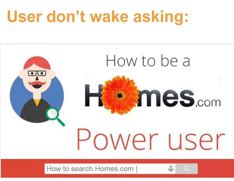
- 55. User don’t wake asking: No one wants to master search
- 56. They want to be excellent at
- 57. Some examples:
- 59. Is there a gift giving gap around
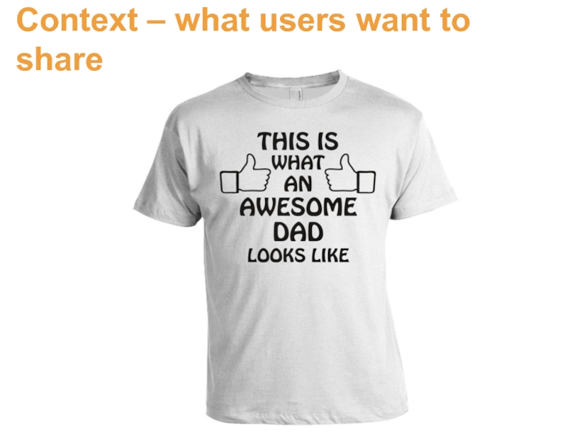
- 60. Context – what users want to share
- 61. Users think think in terms of the
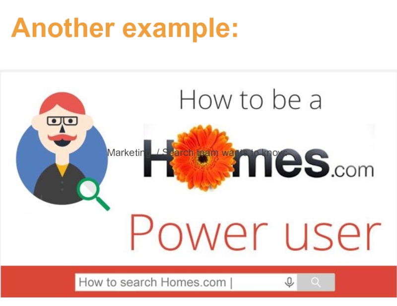
- 62. Another example: Marketing / Search team wants to know:
- 63. How are we doing? What did you
- 64. Product wanted to know How can
- 65. What did users want? Any guesses?
- 66. They didn’t want better search The
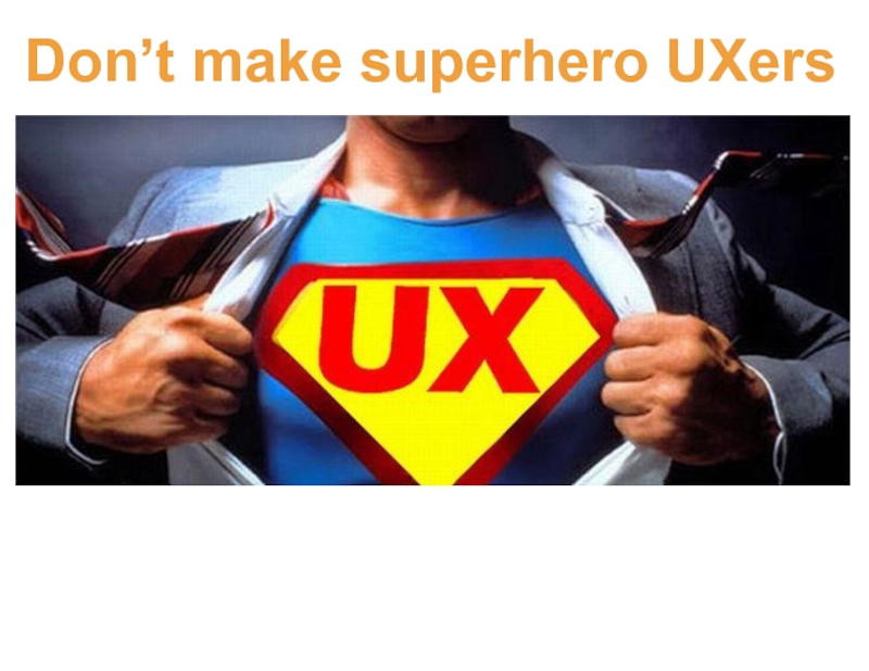
- 67. Don’t make superhero UXers
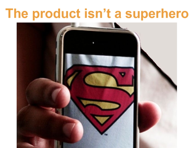
- 68. The product isn’t a superhero
- 69. Give users super hero powers
- 70. In sum - Stop focusing on making
- 71. For more research-based insights about Homes.com users,
Слайд 4What’s on tap today?
How do we do user experience at DE?
How
How do we know they’re great?
What are the limitations?
What are we supposed to be doing?
What are the limitations?
A better approach for the kind of work we actually do at DE: make your users awesome
Слайд 7A few reasons
UXD: Scenario and role playing
You are not your user
UXD:
Elicit adjectives and descriptions of feelings
Team exercise for rethinking product design
Слайд 11Principles-practices-patterns
Write great design principles
Distell to the entire team
Create pattern libraries
Enforce
Слайд 18Best practices and rules of thumb:
blue
Underlined
appearance changes (states)
response times
progress indicator
…
Practices
Слайд 20Bringing the user back in
QA testing
UAT
Beta testing
Customer feedback
Usability testing
A/B testing
Слайд 23To achieve UCD: Ask what users ask
Can I use it?
Should I
Do I want to use it?
Do I value using it?
Слайд 24A UX-focused organization…
is always asking:
Is it usable?
Is it useful?
Is it desirable?
Is
Слайд 30UCD: research + process
Usability heuristics (checklists)
Analytics
A/B tests
Usability testing
PRE-totyping
Contextual inquiry
User testing (lean
Ethographic research
Personas
User centered designing thinking
Competitive usability tests
Field research / Journey mapping
Diary studies
NPS surveys
Satisfaction surveys
TACTICAL UX
STRATEGIC UX
Слайд 35Too Squishy for the C Suite
When there’s no competition
Internal tools
When delightful
Rounded corners and delightful messaging in a tax app
When too squishy for the C suite
Слайд 52Dashboard ux
Selling the American Dream!
Connect is awesome.
I can turn leads
Слайд 53Post UX: when the clicking is over
What did the product enable?
What does it empower them to do?
What can they now show others?
What will they now say to others?
How are they more powerful after the clicking is over?
Слайд 54Post UX drives our success
Users who are successful in the bigger,
Success in the bigger context is why they show up to use your product
Making sure they are successful is what keeps them using it.
Слайд 59Is there a gift giving gap around Mother’s and Father’s Day?
UX
Marketing/Search wants to know:
Слайд 61Users think think in terms of the bigger context
They are
Poll interrupted search AND context
Слайд 63How are we doing?
What did you come here to do today?
Did
Is there anything we could have done to help you accomplish that task?
Слайд 64Product wanted to know
How can we fix stuff that’s broken? How
Слайд 66They didn’t want better search
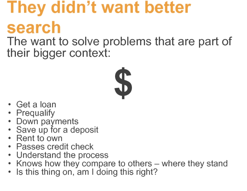
The want to solve problems that are
$
Get a loan
Prequalify
Down payments
Save up for a deposit
Rent to own
Passes credit check
Understand the process
Knows how they compare to others – where they stand
Is this thing on, am I doing this right?
Слайд 70In sum -
Stop focusing on making great UX
Instead:
Make successful users
Look for
Слайд 71For more research-based insights about Homes.com users, check out the UX
Thoughts? Questions?
![STOP CREATING AWESOME UX (make awesome [bad@$$] users instead)](/img/tmb/1/26406/51cbfcf772e35b4ad72c076c991d8b03-800x.jpg)
