- Главная
- Разное
- Дизайн
- Бизнес и предпринимательство
- Аналитика
- Образование
- Развлечения
- Красота и здоровье
- Финансы
- Государство
- Путешествия
- Спорт
- Недвижимость
- Армия
- Графика
- Культурология
- Еда и кулинария
- Лингвистика
- Английский язык
- Астрономия
- Алгебра
- Биология
- География
- Детские презентации
- Информатика
- История
- Литература
- Маркетинг
- Математика
- Медицина
- Менеджмент
- Музыка
- МХК
- Немецкий язык
- ОБЖ
- Обществознание
- Окружающий мир
- Педагогика
- Русский язык
- Технология
- Физика
- Философия
- Химия
- Шаблоны, картинки для презентаций
- Экология
- Экономика
- Юриспруденция
Interface Design Fundamentals презентация
Содержание
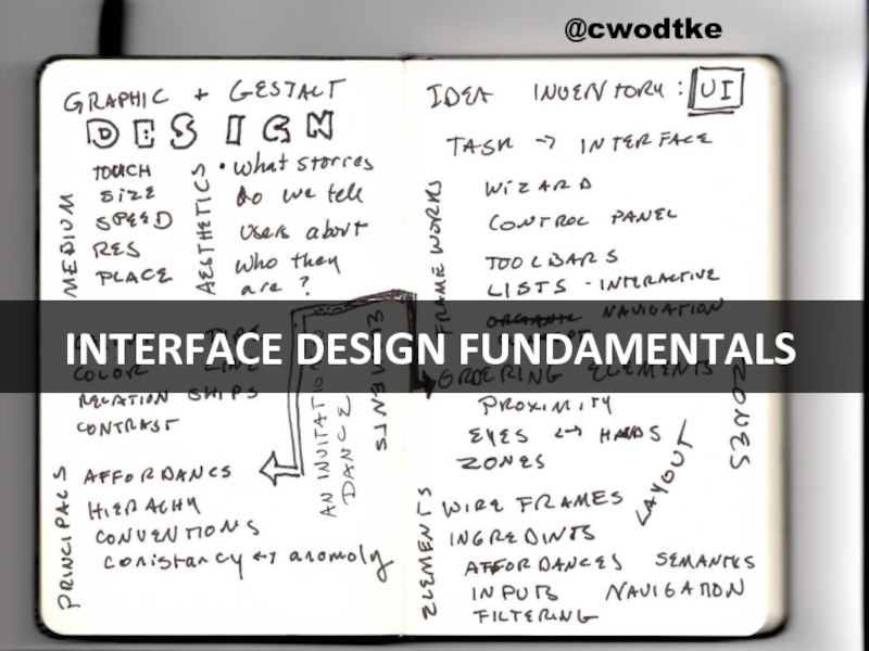
- 1. Interface Design Fundamentals
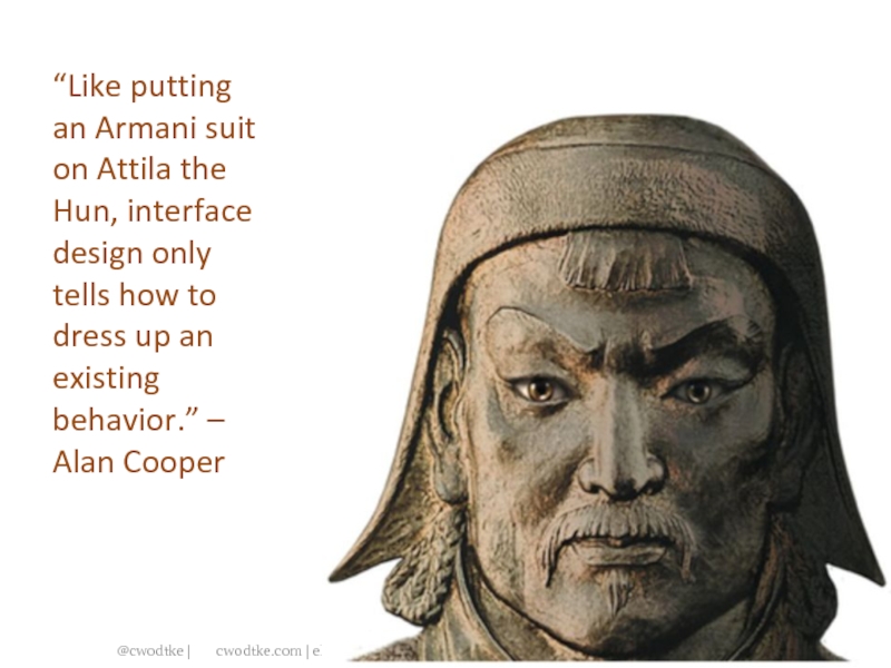
- 2. “Like putting an Armani suit on Attila
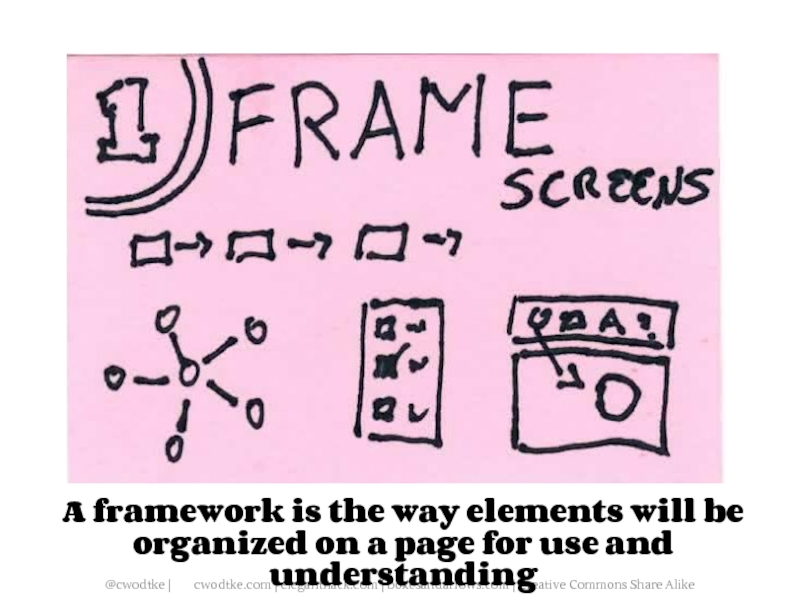
- 3. A framework is the way elements will
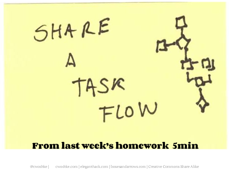
- 4. From last week’s homework 5min
- 5. A task analysis From Information Architecture:
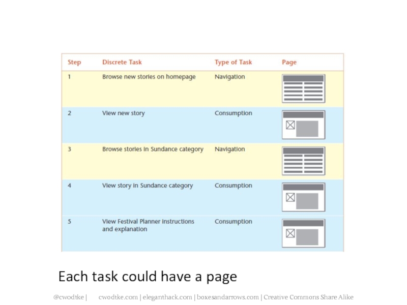
- 7. Each task could have a page
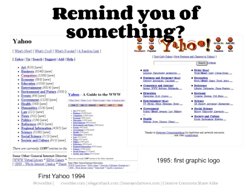
- 8. First Yahoo 1994 1995: first graphic logo Remind you of something?
- 9. Including the schedule creator tool…
- 10. Wizards: Many boxes, many pages
- 11. When to Use Wizards Multi step
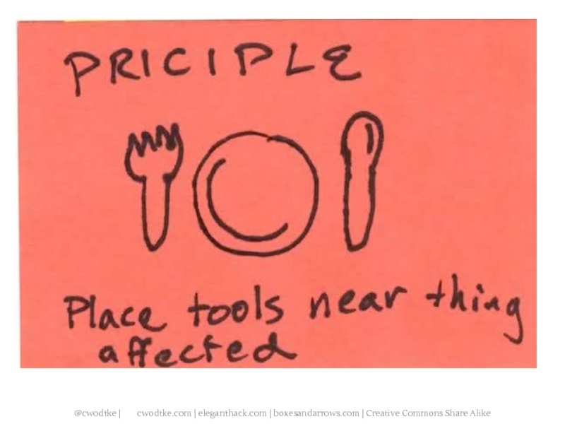
- 13. What if we put the tasks with the thing they were modifying?
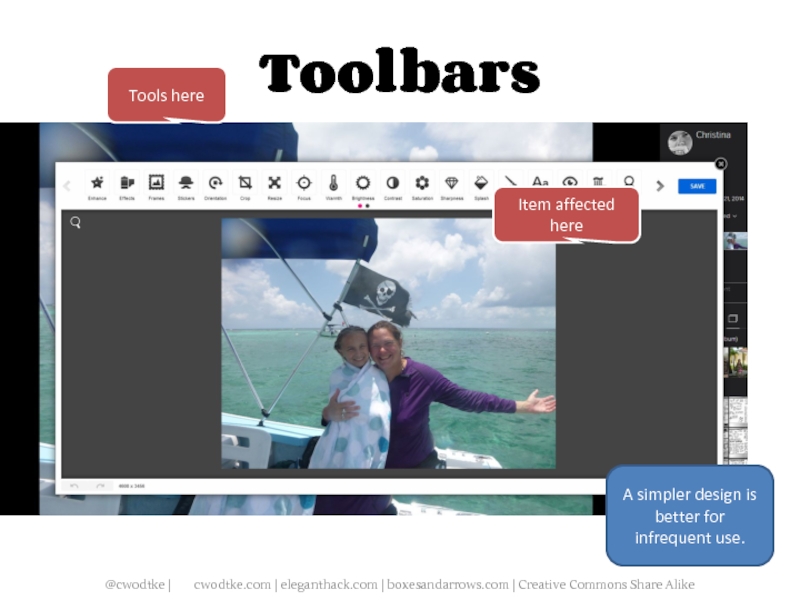
- 14. It’s a toolbar Tools here Item affected here
- 15. Toolbars Tools here Item affected here And here And here Photoshop: toolbars on steroids
- 16. The web uses toolbars more sparingly
- 17. Toolbars Tools here Item affected here A simpler design is better for infrequent use.
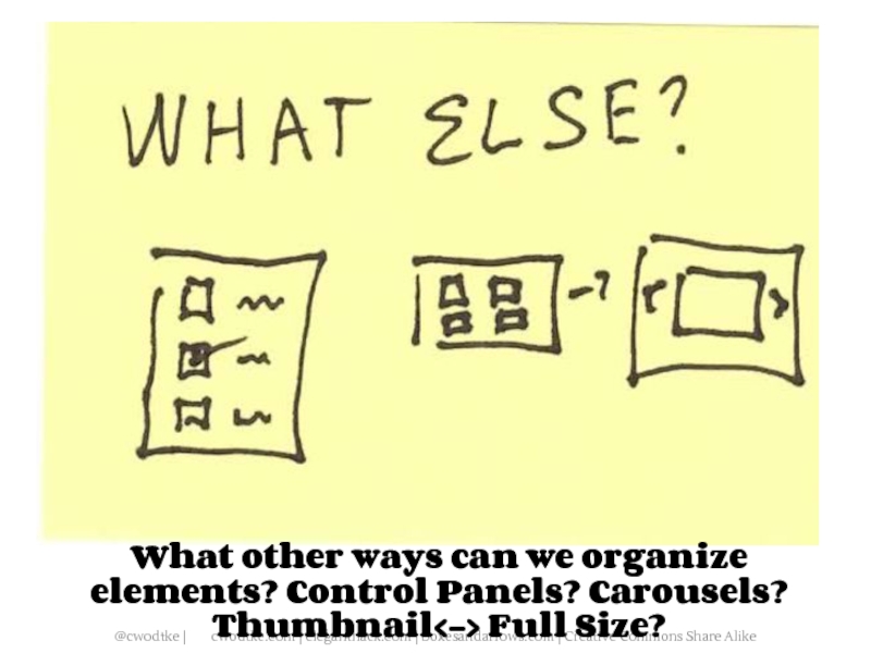
- 23. What other ways can we organize elements? Control Panels? Carousels? Thumbnail Full Size?
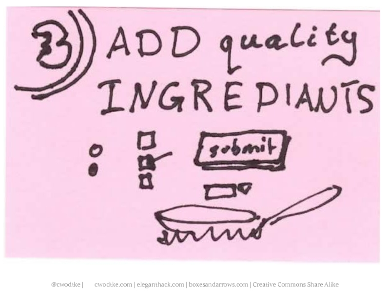
- 25. Two videos sites. The “meal”
- 26. WHICH PAIR OF PANTS ARE NOW 39.99?
- 27. WHICH CAR IS 49.99?
- 30. When designing the page, group items by
- 31. Create “zones” for functionality groups. You can
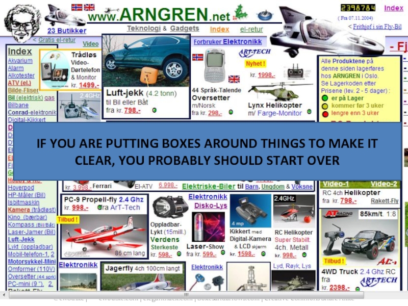
- 32. IF YOU ARE PUTTING BOXES AROUND THINGS
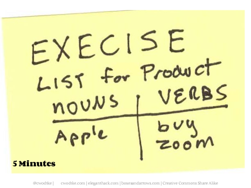
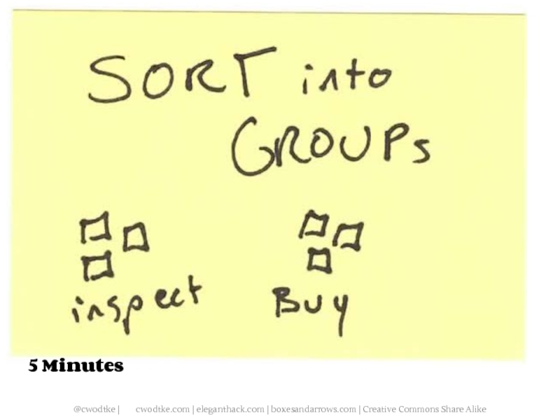
- 33. 5 Minutes
- 34. 5 Minutes
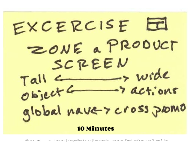
- 35. 10 Minutes
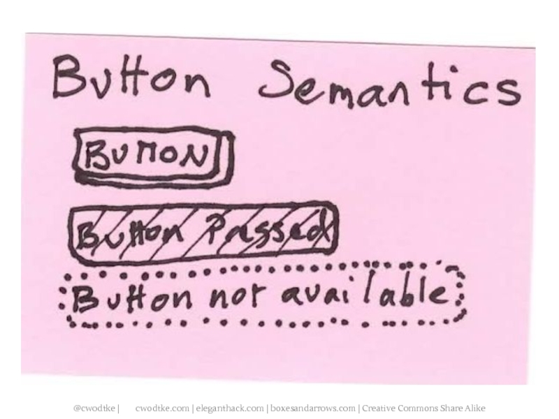
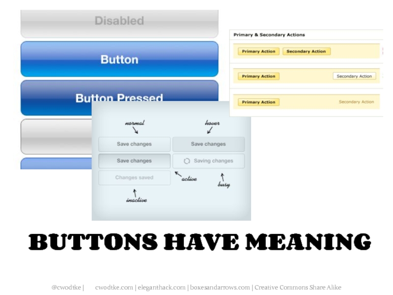
- 39. BUTTONS HAVE MEANING
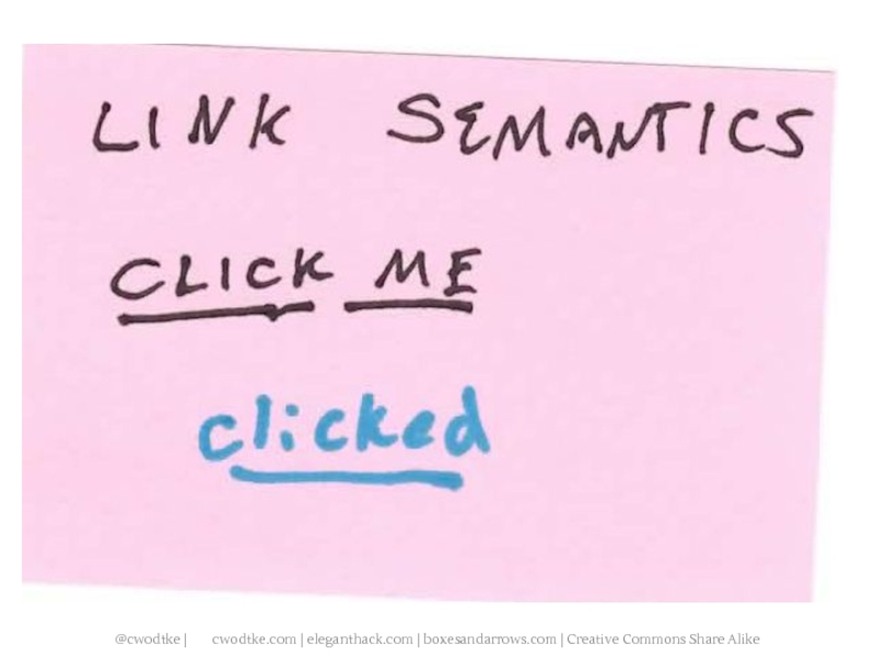
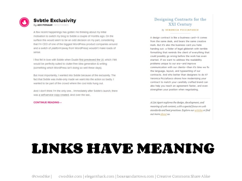
- 41. LINKS HAVE MEANING
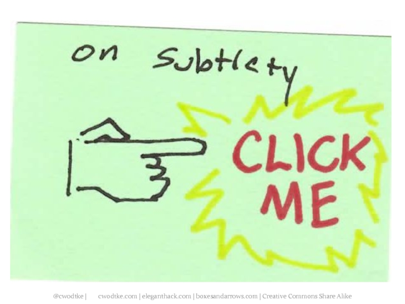
- 43. Subtlety will send you to the poor
- 49. 10 Minutes
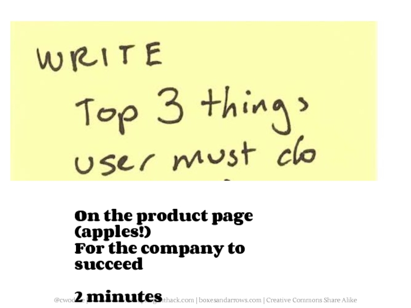
- 55. On the product page (apples!) For the company to succeed 2 minutes
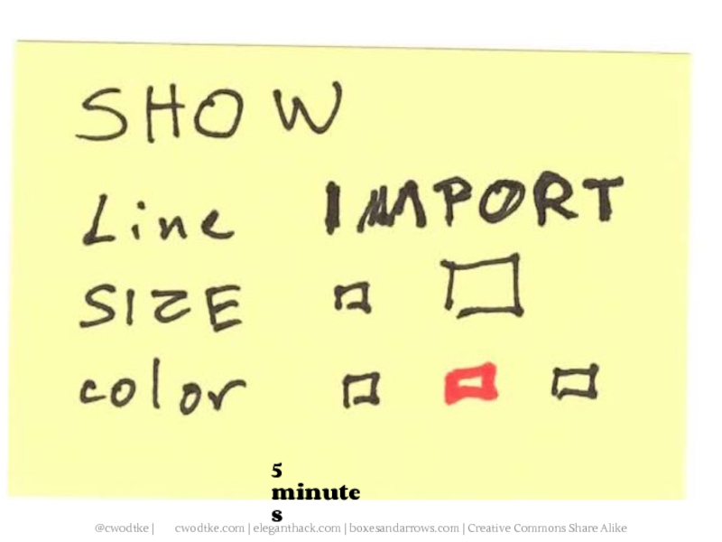
- 56. 5 minutes
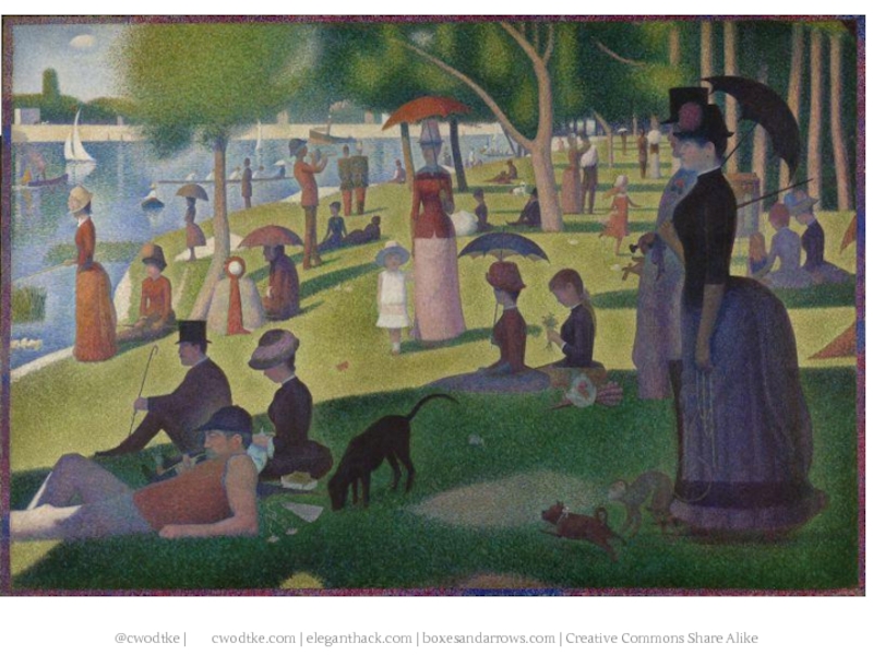
- 58. PAINTING
- 59. PAINTING
- 62. Comics are read in the west left
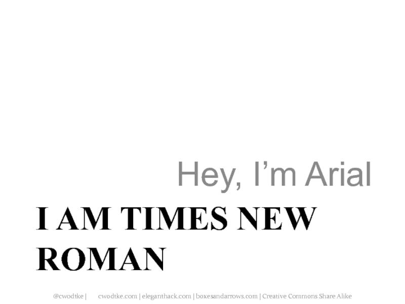
- 67. I AM TIMES NEW ROMAN Hey, I’m Arial
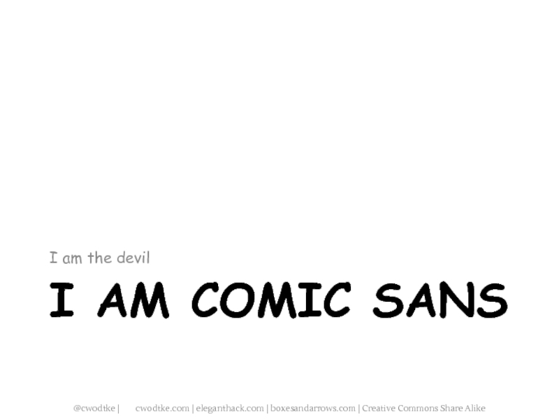
- 68. I AM COMIC SANS I am the devil
- 69. I AM IMPACT LOL
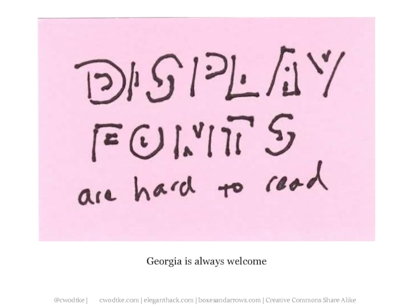
- 71. Georgia is always welcome
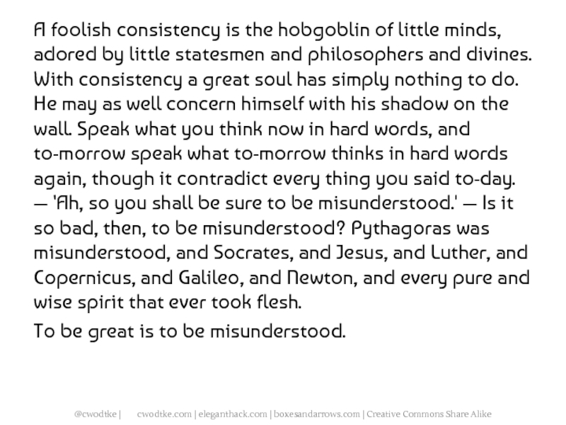
- 72. A foolish consistency is the hobgoblin of
- 73. To be great is to be misunderstood.
- 74. A foolish consistency is the hobgoblin of
- 75. To be great is to be misunderstood.
- 76. A foolish consistency is the hobgoblin of
- 77. To be great is to be misunderstood.
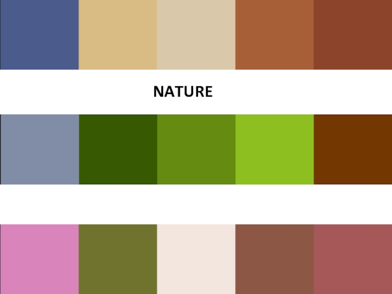
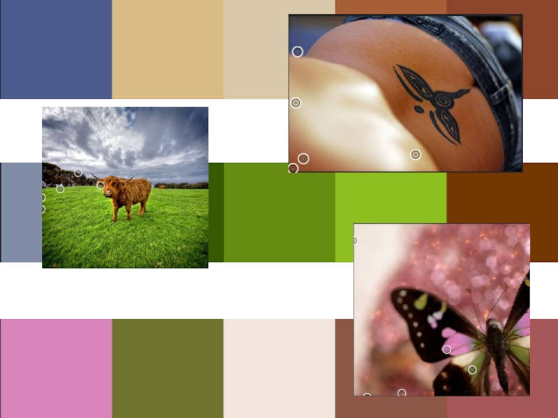
- 82. NATURE
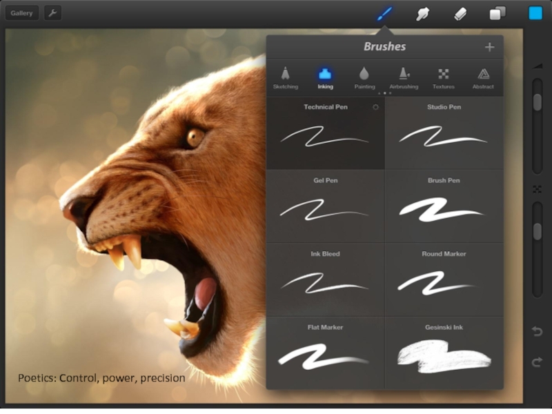
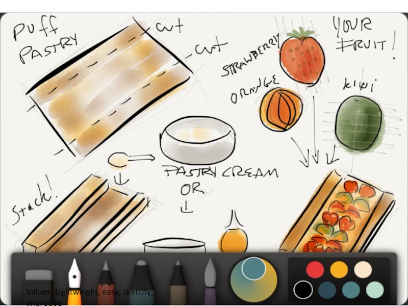
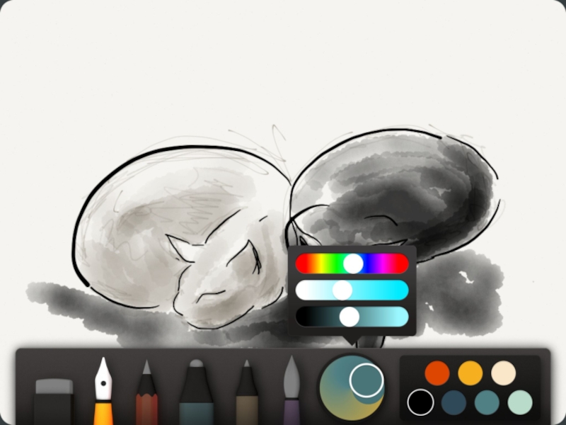
- 91. WHAT DO YOU THINK ABOUT WHEN YOU THINK OF A PAINTING PROGRAM?
- 92. Poetics: Control, power, precision
- 93. Values: Lightweight, easy, sketchy, imprecise
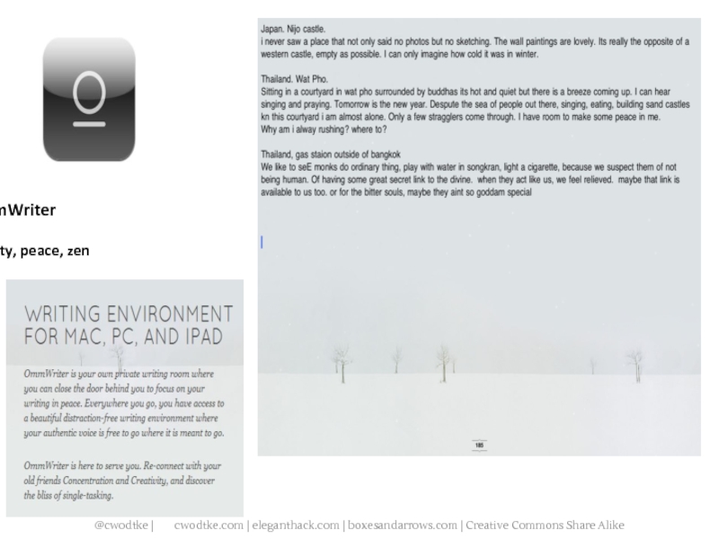
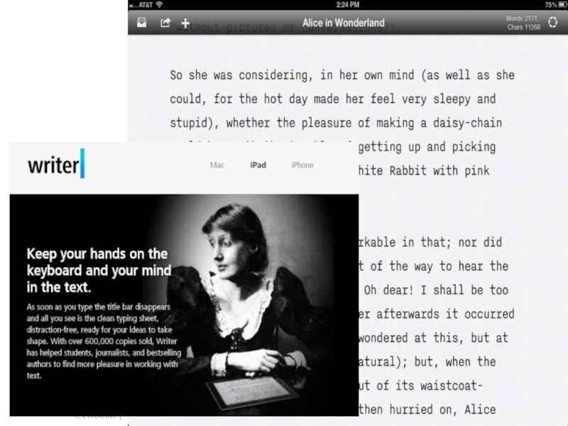
- 95. WHAT DO YOU THINK OF WHEN YOU THINK OF WRITING?
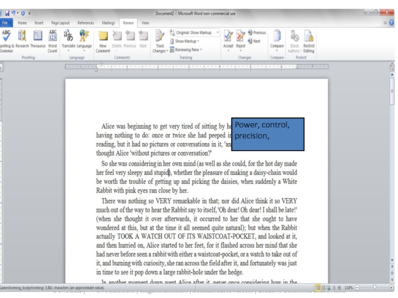
- 96. Power, control, precision,
- 97. OmmWriter Beauty, peace, zen
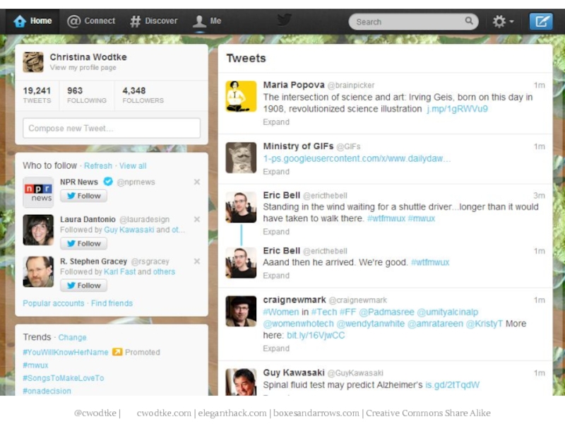
- 99. WHAT DO YOU THINK OF WHEN YOU THINK OF SOCIAL?
- 106. GRAPHIC DESIGN HACKS
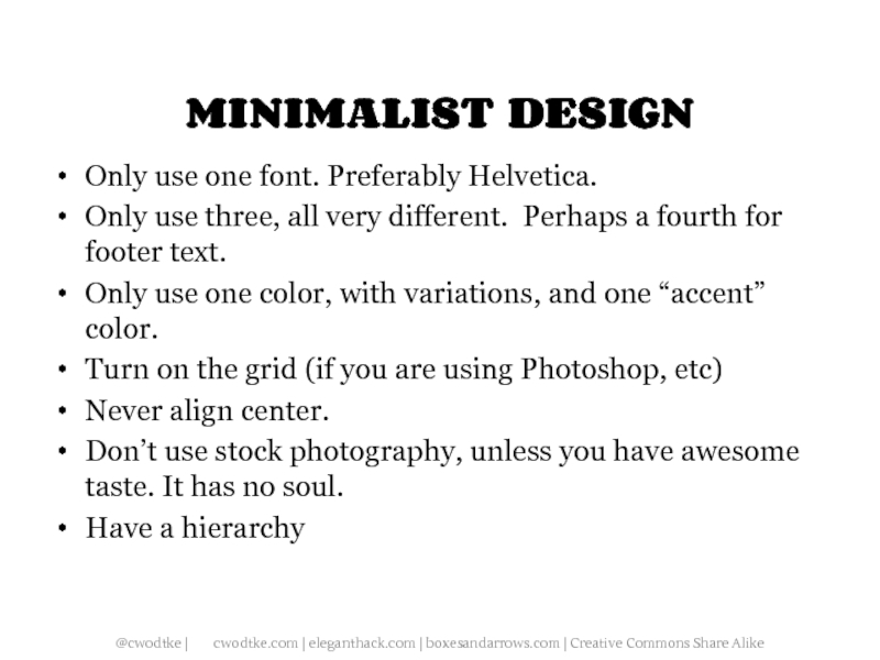
- 107. MINIMALIST DESIGN Only use one font. Preferably
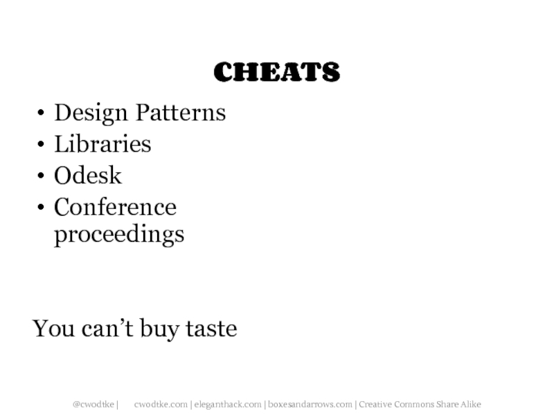
- 108. CHEATS Design Patterns Libraries Odesk Conference proceedings You can’t buy taste
- 109. Q&A "In an architecture of content, the information becomes the interface." -- Edward Tufte
Слайд 2“Like putting an Armani suit on Attila the Hun, interface design
only tells how to dress up an existing behavior.” – Alan Cooper
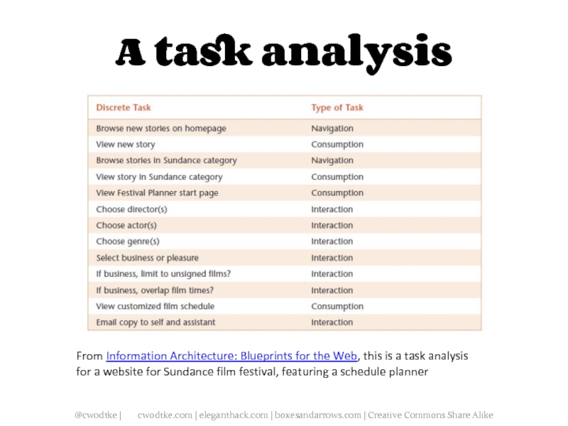
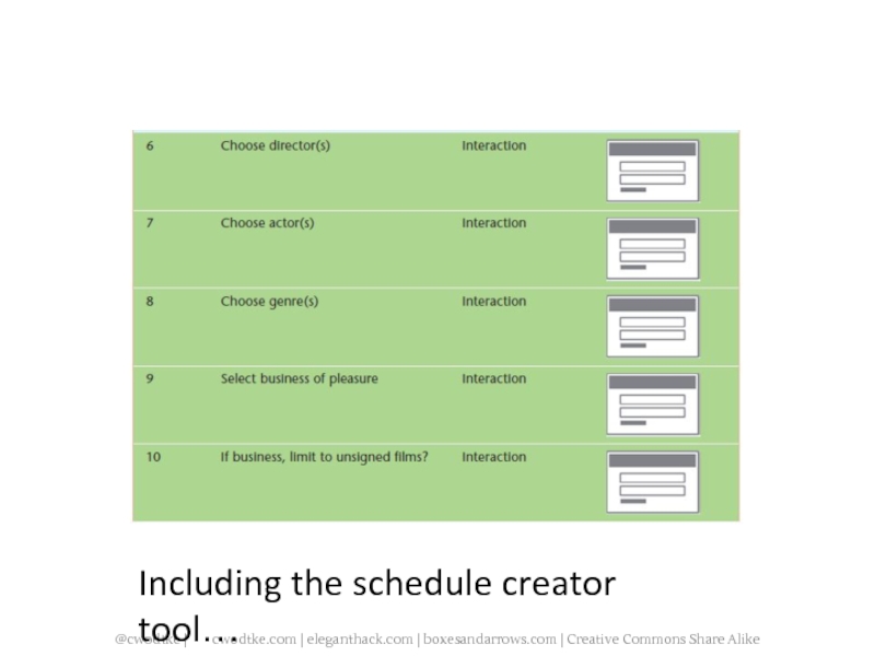
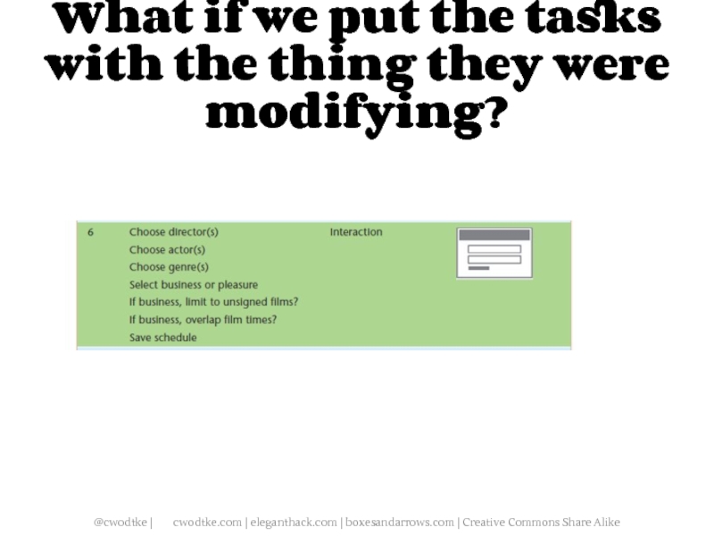
Слайд 5A task analysis
From Information Architecture: Blueprints for the Web, this
is a task analysis for a website for Sundance film festival, featuring a schedule planner
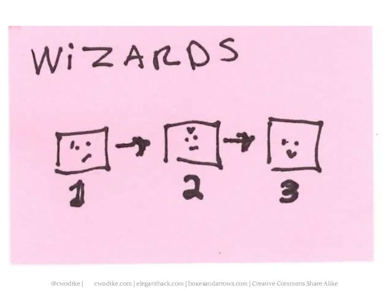
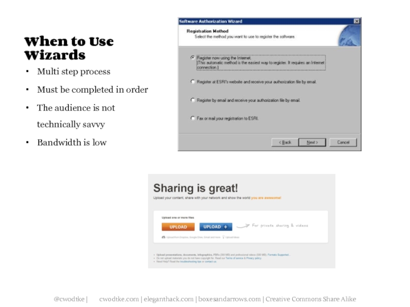
Слайд 11When to Use Wizards
Multi step process
Must be completed in order
The
audience is not technically savvy
Bandwidth is low
Bandwidth is low
Слайд 25
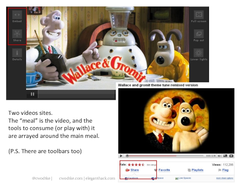
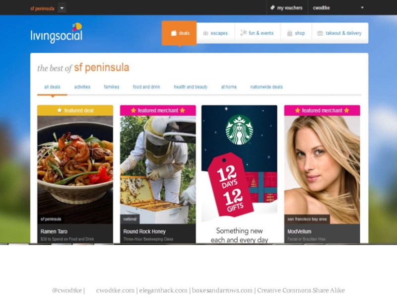
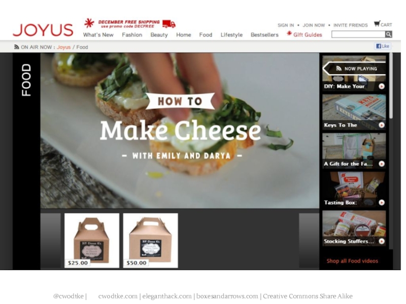
Two videos sites.
The “meal” is the video, and the tools to
consume (or play with) it are arrayed around the main meal.
(P.S. There are toolbars too)
(P.S. There are toolbars too)
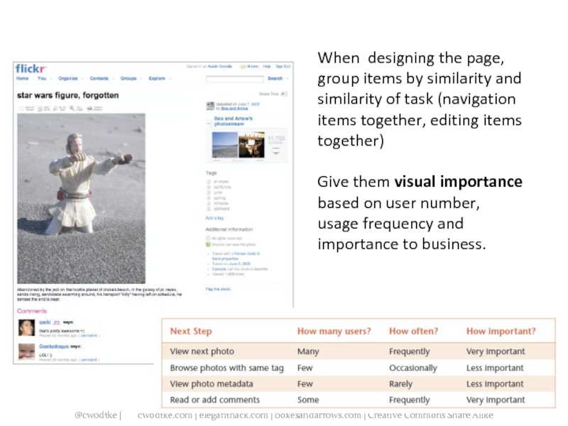
Слайд 30When designing the page, group items by similarity and similarity of
task (navigation items together, editing items together)
Give them visual importance based on user number, usage frequency and importance to business.
Give them visual importance based on user number, usage frequency and importance to business.
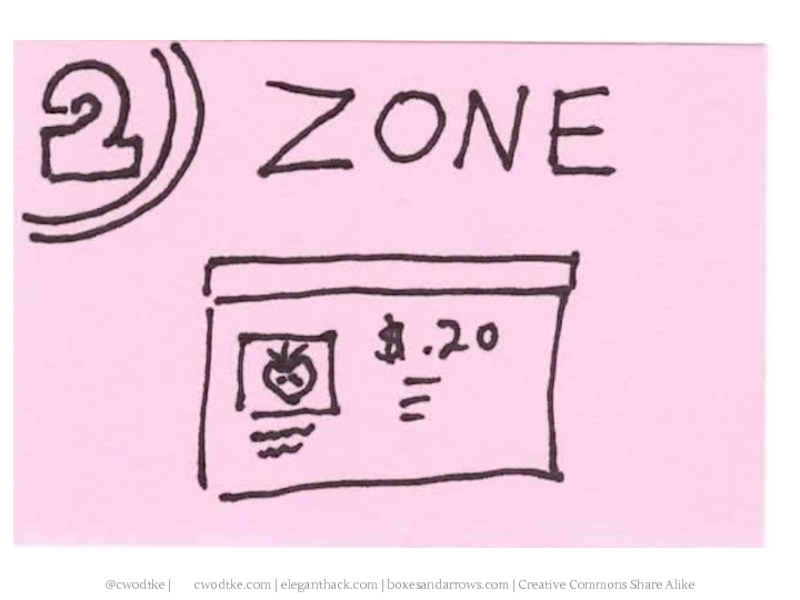
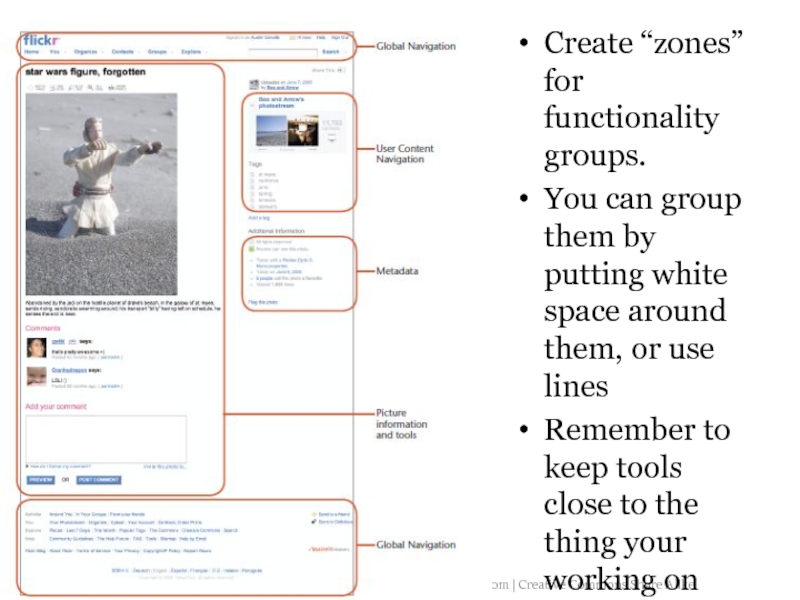
Слайд 31Create “zones” for functionality groups.
You can group them by putting white
space around them, or use lines
Remember to keep tools close to the thing your working on
Remember to keep tools close to the thing your working on
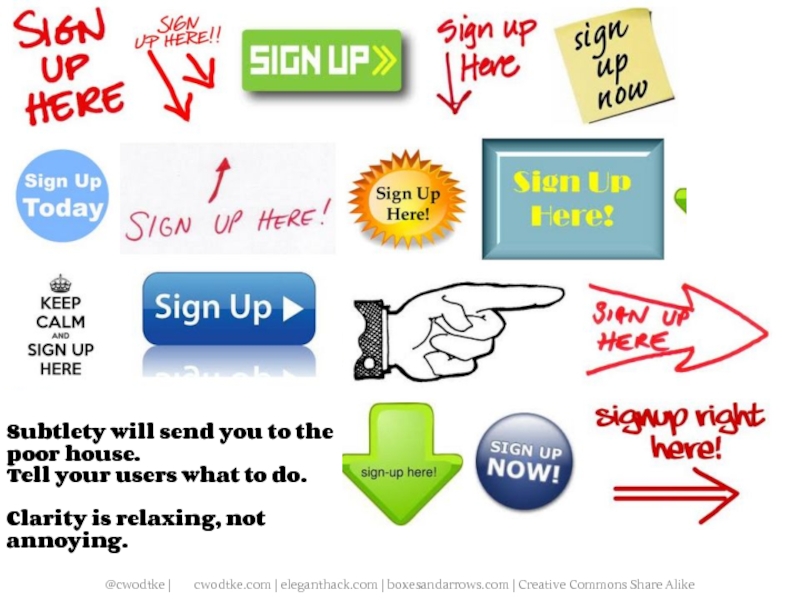
Слайд 43Subtlety will send you to the poor house.
Tell your users what
to do.
Clarity is relaxing, not annoying.
Clarity is relaxing, not annoying.
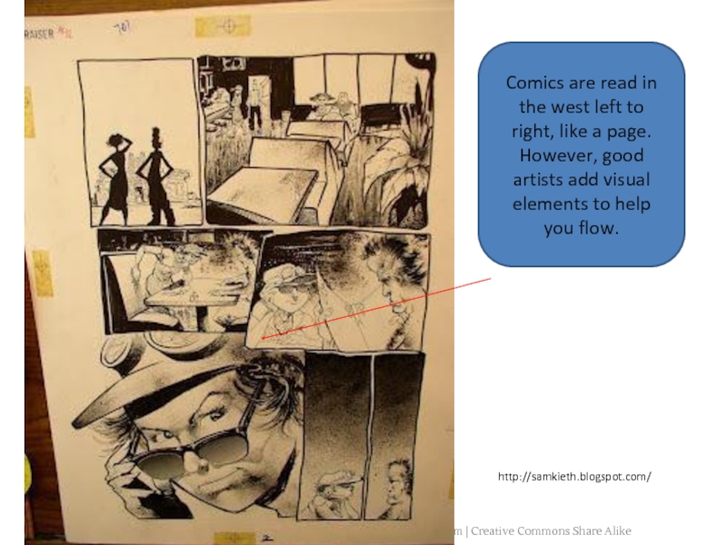
Слайд 62Comics are read in the west left to right, like a
page. However, good artists add visual elements to help you flow.
http://samkieth.blogspot.com/
Слайд 72A foolish consistency is the hobgoblin of little minds, adored by
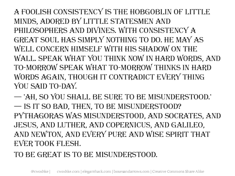
little statesmen and philosophers and divines. With consistency a great soul has simply nothing to do. He may as well concern himself with his shadow on the wall. Speak what you think now in hard words, and to-morrow speak what to-morrow thinks in hard words again, though it contradict every thing you said to-day. — 'Ah, so you shall be sure to be misunderstood.' — Is it so bad, then, to be misunderstood? Pythagoras was misunderstood, and Socrates, and Jesus, and Luther, and Copernicus, and Galileo, and Newton, and every pure and wise spirit that ever took flesh.
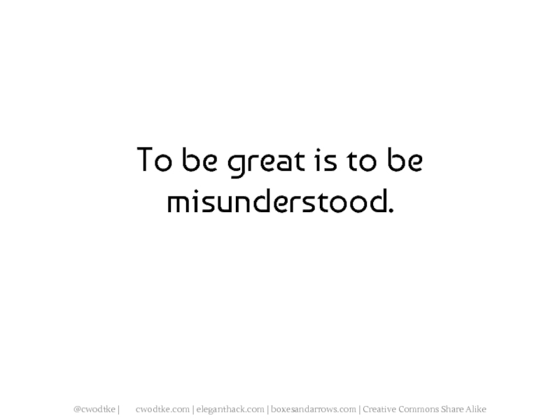
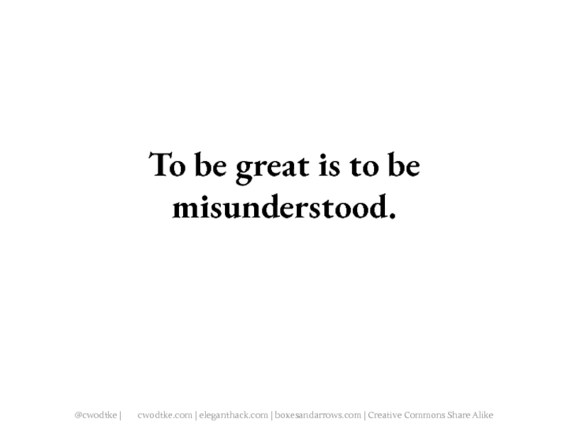
To be great is to be misunderstood.
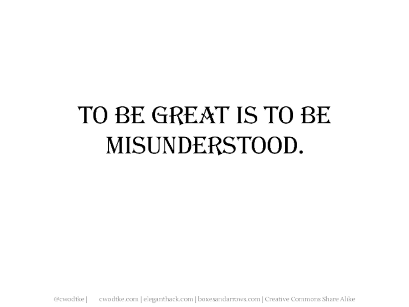
To be great is to be misunderstood.
Слайд 74A foolish consistency is the hobgoblin of little minds, adored by
little statesmen and philosophers and divines. With consistency a great soul has simply nothing to do. He may as well concern himself with his shadow on the wall. Speak what you think now in hard words, and to-morrow speak what to-morrow thinks in hard words again, though it contradict every thing you said to-day.
— 'Ah, so you shall be sure to be misunderstood.' — Is it so bad, then, to be misunderstood? Pythagoras was misunderstood, and Socrates, and Jesus, and Luther, and Copernicus, and Galileo, and Newton, and every pure and wise spirit that ever took flesh.
To be great is to be misunderstood.
— 'Ah, so you shall be sure to be misunderstood.' — Is it so bad, then, to be misunderstood? Pythagoras was misunderstood, and Socrates, and Jesus, and Luther, and Copernicus, and Galileo, and Newton, and every pure and wise spirit that ever took flesh.
To be great is to be misunderstood.
Слайд 76A foolish consistency is the hobgoblin of little minds, adored by
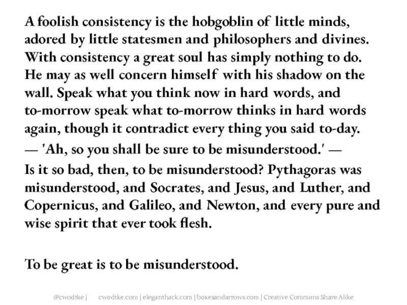
little statesmen and philosophers and divines. With consistency a great soul has simply nothing to do. He may as well concern himself with his shadow on the wall. Speak what you think now in hard words, and to-morrow speak what to-morrow thinks in hard words again, though it contradict every thing you said to-day.
— 'Ah, so you shall be sure to be misunderstood.' —
Is it so bad, then, to be misunderstood? Pythagoras was misunderstood, and Socrates, and Jesus, and Luther, and Copernicus, and Galileo, and Newton, and every pure and wise spirit that ever took flesh.
To be great is to be misunderstood.
— 'Ah, so you shall be sure to be misunderstood.' —
Is it so bad, then, to be misunderstood? Pythagoras was misunderstood, and Socrates, and Jesus, and Luther, and Copernicus, and Galileo, and Newton, and every pure and wise spirit that ever took flesh.
To be great is to be misunderstood.
Слайд 107MINIMALIST DESIGN
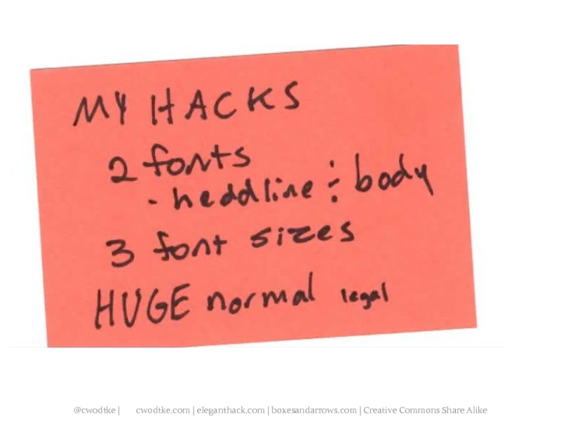
Only use one font. Preferably Helvetica.
Only use three, all
very different. Perhaps a fourth for footer text.
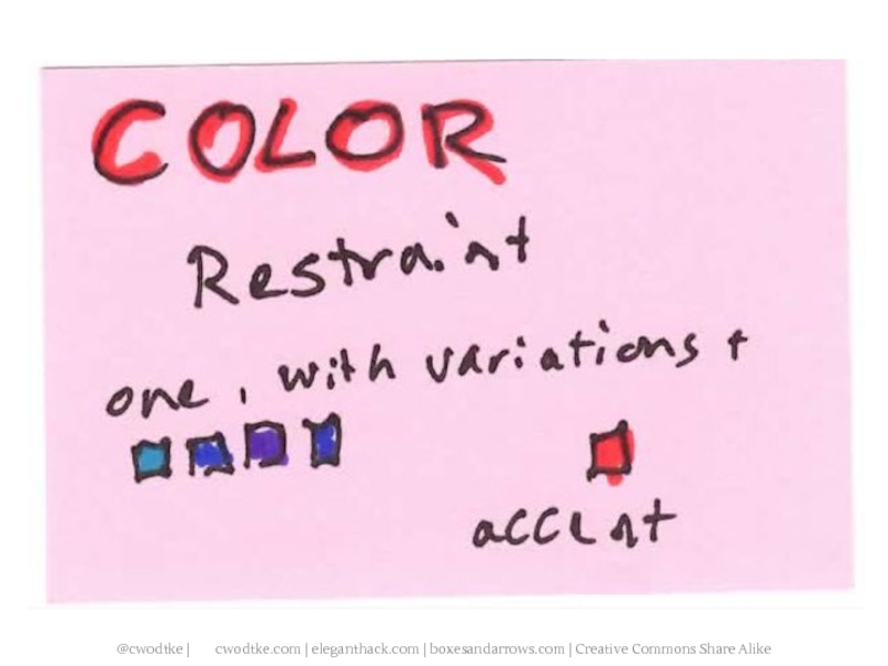
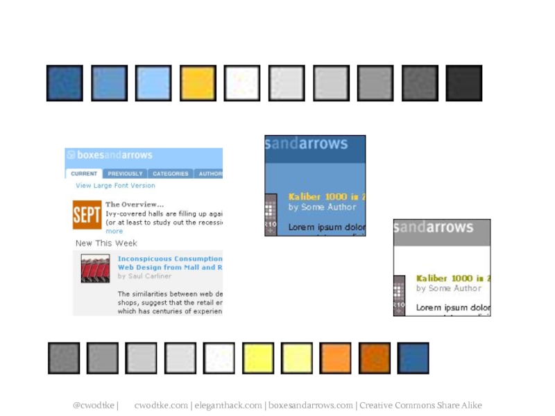
Only use one color, with variations, and one “accent” color.
Turn on the grid (if you are using Photoshop, etc)
Never align center.
Don’t use stock photography, unless you have awesome taste. It has no soul.
Have a hierarchy
Only use one color, with variations, and one “accent” color.
Turn on the grid (if you are using Photoshop, etc)
Never align center.
Don’t use stock photography, unless you have awesome taste. It has no soul.
Have a hierarchy
