- Главная
- Разное
- Дизайн
- Бизнес и предпринимательство
- Аналитика
- Образование
- Развлечения
- Красота и здоровье
- Финансы
- Государство
- Путешествия
- Спорт
- Недвижимость
- Армия
- Графика
- Культурология
- Еда и кулинария
- Лингвистика
- Английский язык
- Астрономия
- Алгебра
- Биология
- География
- Детские презентации
- Информатика
- История
- Литература
- Маркетинг
- Математика
- Медицина
- Менеджмент
- Музыка
- МХК
- Немецкий язык
- ОБЖ
- Обществознание
- Окружающий мир
- Педагогика
- Русский язык
- Технология
- Физика
- Философия
- Химия
- Шаблоны, картинки для презентаций
- Экология
- Экономика
- Юриспруденция
Describing Graphs презентация
Содержание
- 1. Describing Graphs
- 2. Grammar & Vocabulary Describing trends Trends are
- 3. Grammar: Expressing movement For each trend there
- 4. Expressing movement Describe the first trend * task 1-writing graphs
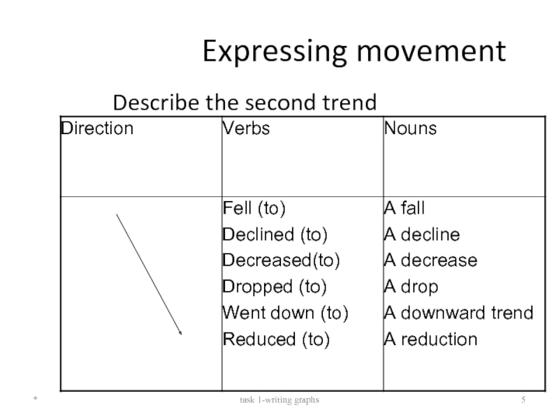
- 5. Expressing movement Describe the second trend * task 1-writing graphs
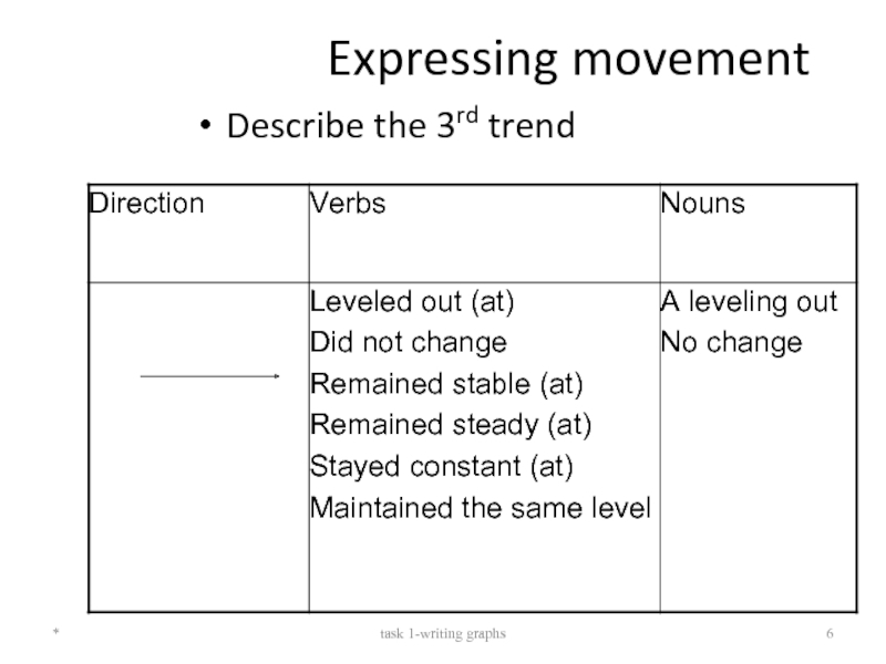
- 6. Expressing movement Describe the 3rd trend * task 1-writing graphs
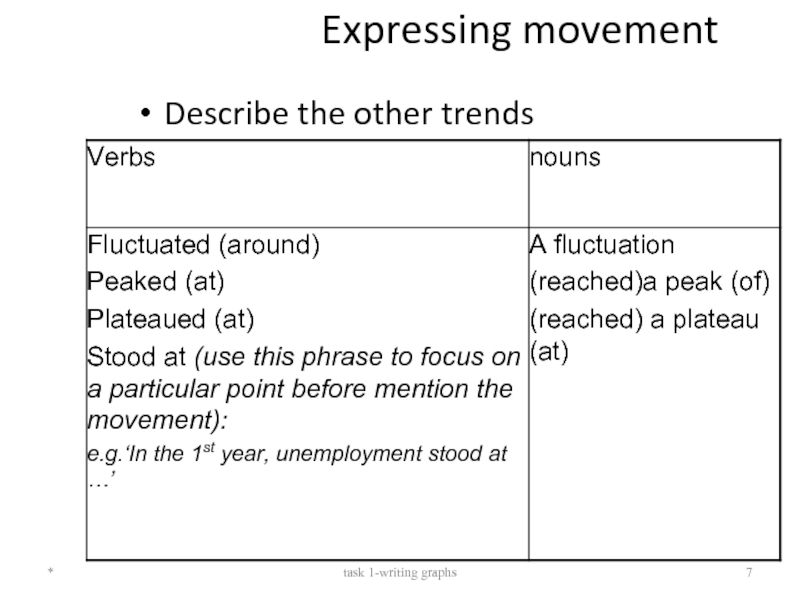
- 7. Expressing movement Describe the other trends * task 1-writing graphs
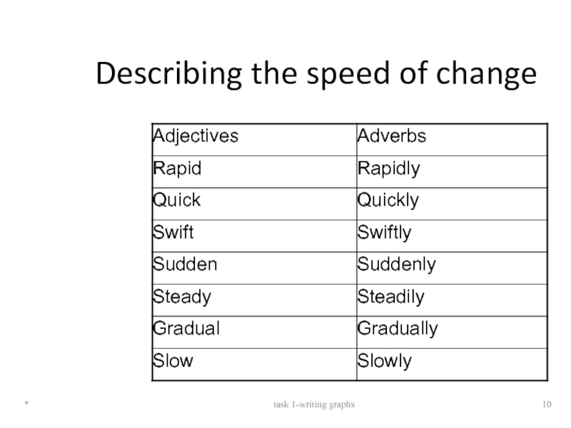
- 8. Describing Movement: Adjectives and Adverbs
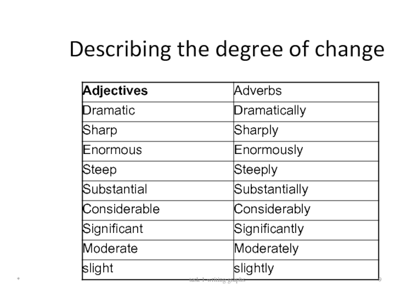
- 9. Describing the degree of change * task 1-writing graphs
- 10. Describing the speed of change * task 1-writing graphs
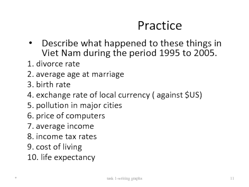
- 11. Practice Describe what happened to these things
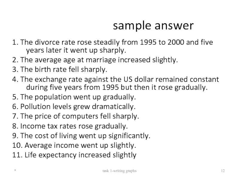
- 12. sample answer 1. The divorce rate rose
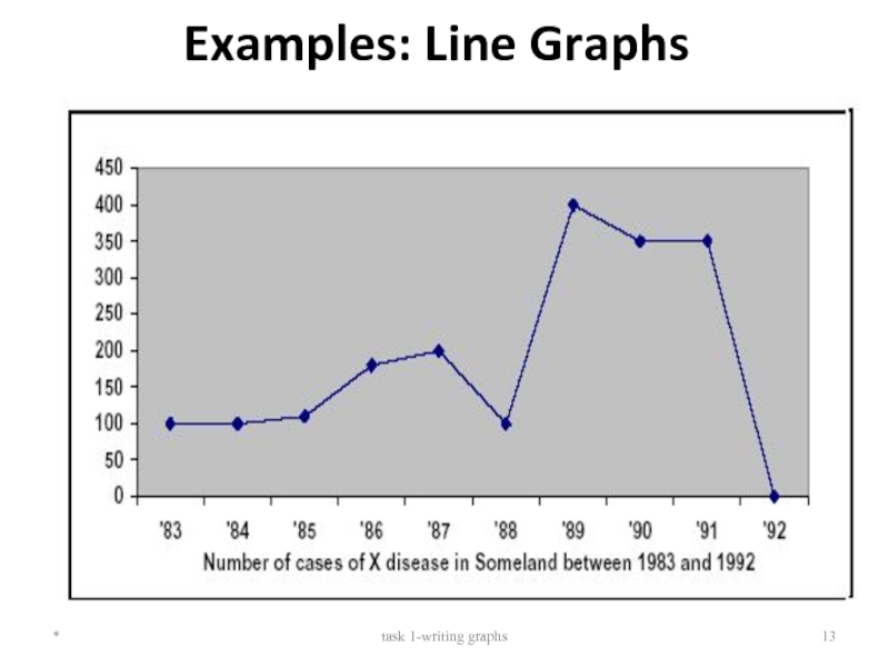
- 13. Examples: Line Graphs * task 1-writing graphs
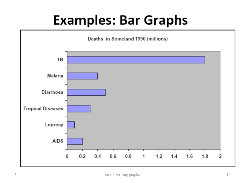
- 14. Examples: Bar Graphs * task 1-writing graphs
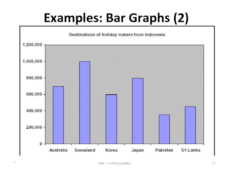
- 15. Examples: Bar Graphs (2) * task 1-writing graphs
- 16. Sample Task You should spend about
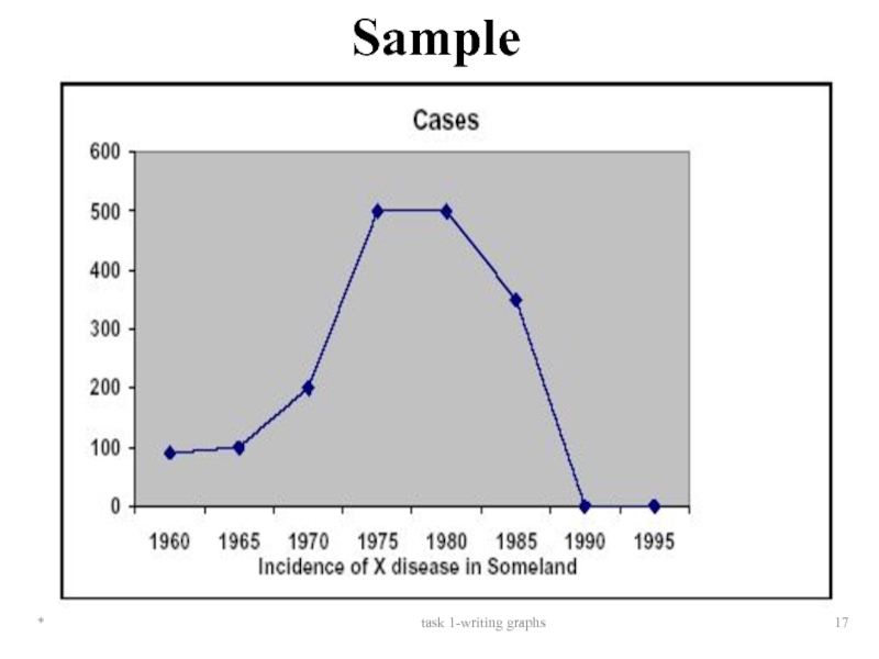
- 17. * task 1-writing graphs Sample
- 18. Guidelines for writing task Selecting information
- 19. Introduction Use two standard opening sentences
- 20. Body & conclusion Describing the graph in
- 21. Sample answer The graph shows the
Слайд 2Grammar & Vocabulary
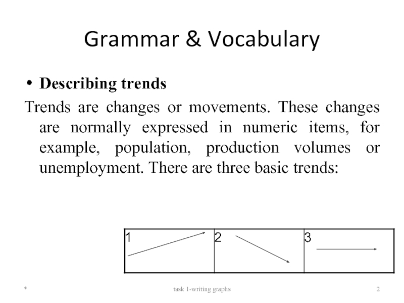
Describing trends
Trends are changes or movements. These changes are
*
task 1-writing graphs
Слайд 3Grammar: Expressing movement
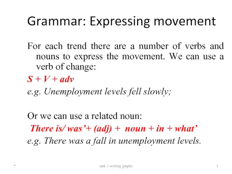
For each trend there are a number of verbs
S + V + adv
e.g. Unemployment levels fell slowly;
Or we can use a related noun:
There is/ was’+ (adj) + noun + in + what’
e.g. There was a fall in unemployment levels.
*
task 1-writing graphs
Слайд 8Describing Movement: Adjectives and Adverbs
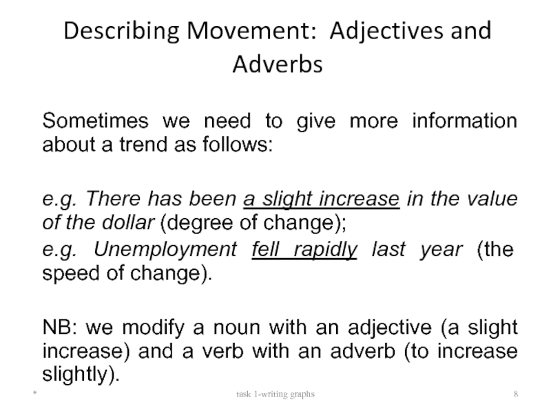
Sometimes we need to give more
e.g. There has been a slight increase in the value of the dollar (degree of change);
e.g. Unemployment fell rapidly last year (the speed of change).
NB: we modify a noun with an adjective (a slight increase) and a verb with an adverb (to increase slightly).
*
task 1-writing graphs
Слайд 11Practice
Describe what happened to these things in Viet Nam during the
1. divorce rate
2. average age at marriage
3. birth rate
4. exchange rate of local currency ( against $US)
5. pollution in major cities
6. price of computers
7. average income
8. income tax rates
9. cost of living
10. life expectancy
*
task 1-writing graphs
Слайд 12sample answer
1. The divorce rate rose steadily from 1995 to 2000
2. The average age at marriage increased slightly.
3. The birth rate fell sharply.
4. The exchange rate against the US dollar remained constant during five years from 1995 but then it rose gradually.
5. The population went up gradually.
6. Pollution levels grew dramatically.
7. The price of computers fell sharply.
8. Income tax rates rose gradually.
9. The cost of living went up significantly.
10. Average income went up slightly.
11. Life expectancy increased slightly
*
task 1-writing graphs
Слайд 16Sample Task
You should spend about 20 minutes on this task. Write
*
task 1-writing graphs
Слайд 18Guidelines for writing task
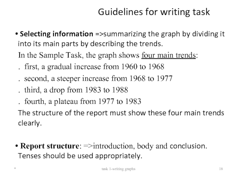
Selecting information =>summarizing the graph by dividing
In the Sample Task, the graph shows four main trends:
. first, a gradual increase from 1960 to 1968
. second, a steeper increase from 1968 to 1977
. third, a drop from 1983 to 1988
. fourth, a plateau from 1977 to 1983
The structure of the report must show these four main trends clearly.
Report structure: =>introduction, body and conclusion. Tenses should be used appropriately.
*
task 1-writing graphs
Слайд 19Introduction
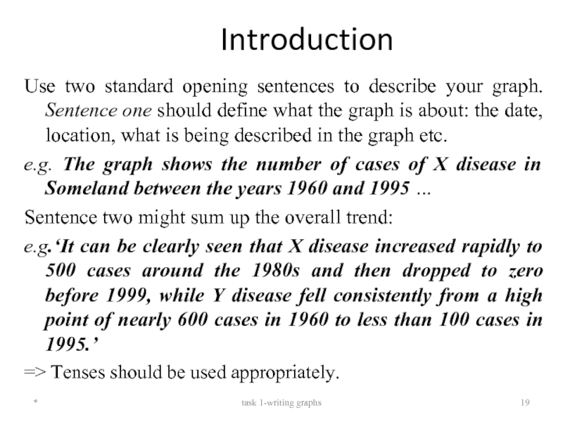
Use two standard opening sentences to describe your graph. Sentence
e.g. The graph shows the number of cases of X disease in Someland between the years 1960 and 1995 …
Sentence two might sum up the overall trend:
e.g.‘It can be clearly seen that X disease increased rapidly to 500 cases around the 1980s and then dropped to zero before 1999, while Y disease fell consistently from a high point of nearly 600 cases in 1960 to less than 100 cases in 1995.’
=> Tenses should be used appropriately.
=>Notice the tense used.
*
task 1-writing graphs
Слайд 20Body & conclusion
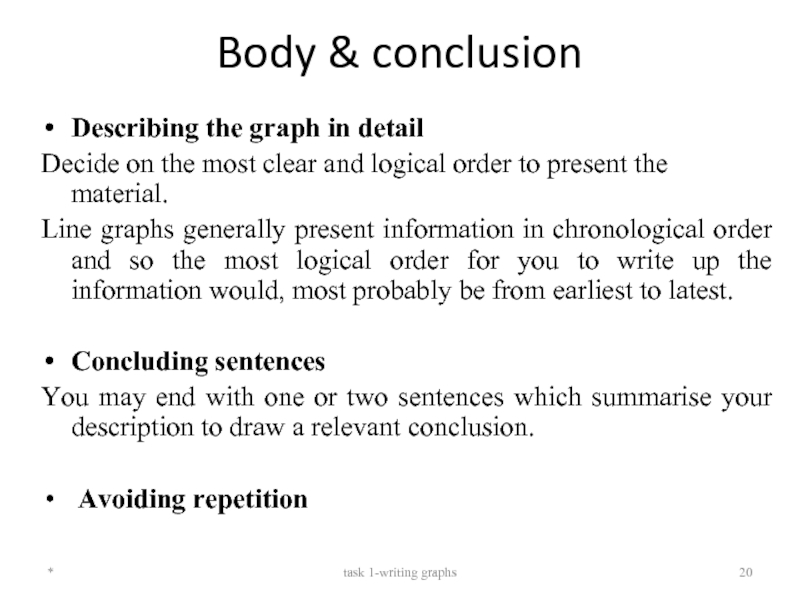
Describing the graph in detail
Decide on the most
Line graphs generally present information in chronological order and so the most logical order for you to write up the information would, most probably be from earliest to latest.
Concluding sentences
You may end with one or two sentences which summarise your description to draw a relevant conclusion.
Avoiding repetition
*
task 1-writing graphs
Слайд 21Sample answer
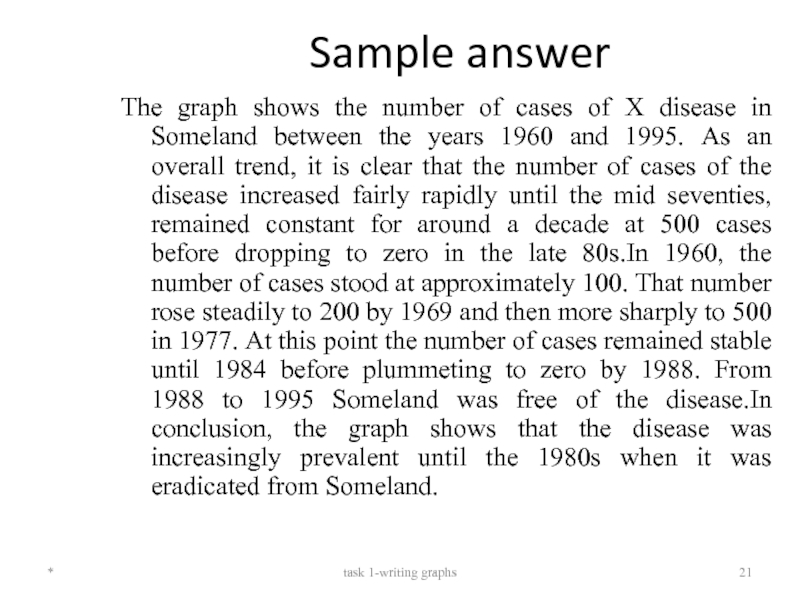
The graph shows the number of cases of X
*
task 1-writing graphs
