- Главная
- Разное
- Дизайн
- Бизнес и предпринимательство
- Аналитика
- Образование
- Развлечения
- Красота и здоровье
- Финансы
- Государство
- Путешествия
- Спорт
- Недвижимость
- Армия
- Графика
- Культурология
- Еда и кулинария
- Лингвистика
- Английский язык
- Астрономия
- Алгебра
- Биология
- География
- Детские презентации
- Информатика
- История
- Литература
- Маркетинг
- Математика
- Медицина
- Менеджмент
- Музыка
- МХК
- Немецкий язык
- ОБЖ
- Обществознание
- Окружающий мир
- Педагогика
- Русский язык
- Технология
- Физика
- Философия
- Химия
- Шаблоны, картинки для презентаций
- Экология
- Экономика
- Юриспруденция
5 презентация
Содержание
- 1. 5
- 2. Ryan Goodman CEO Centigon Solutions @rmgoodm
- 3. Topological Data Analysis
- 4. Many data sources do not always fit
- 5. Topological Data Analysis is a perfect aid
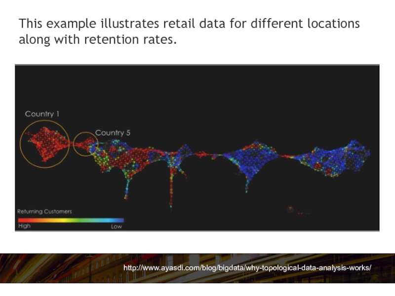
- 6. http://www.ayasdi.com/blog/bigdata/why-topological-data-analysis-works/ This example illustrates retail data for different locations along with retention rates.
- 7. Geospatial
- 8. Using geography as a common dimension to
- 9. Using geographic attributes or coordinates also provides
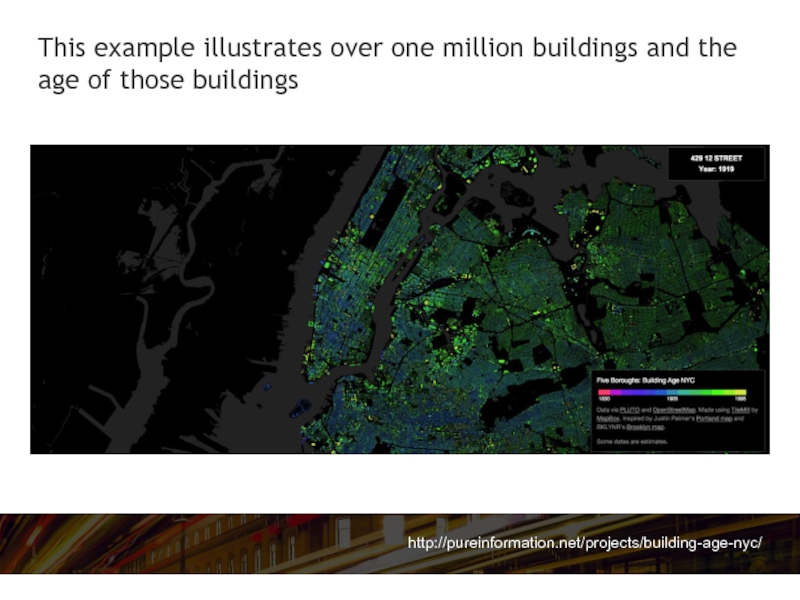
- 10. http://pureinformation.net/projects/building-age-nyc/ This example illustrates over one million buildings and the age of those buildings
- 11. Tree Map
- 12. A Tree Map is a great way
- 13. A Tree Map has its own algorithm
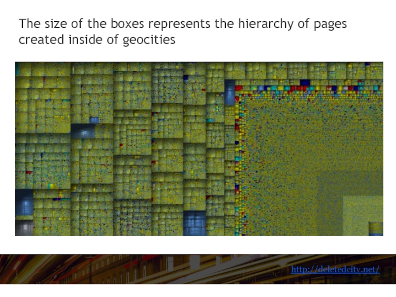
- 14. http://deletedcity.net/ The size of the boxes represents the hierarchy of pages created inside of geocities
- 15. 3D Spatial
- 16. Three-dimensional visualizations can unlock time and space
- 17. While 3D requires more computer power and
- 18. http://tctmagazine.com With millions of individual components,
- 19. Density / Heat Map
- 20. Density, also referred to as heat maps
- 21. Density maps are popular for spatial data
- 22. Indoors This particular solution is provided by
- 23. We want to hear your tricks and
- 24. For more great content go to… BIBrainz.com/aof
Слайд 2Ryan Goodman
CEO Centigon Solutions
@rmgoodm
Ryan Goodman is Centigon Solutions CEO, author, and
expert in Business Intelligence. Ryan applies over 12 years designing business applications to his leadership role shaping Centigon Solutions’ Location Intelligence platform strategy. Today, Ryan is focused on pushing wider adoption of Business Intelligence through visualization and Location based services.
Слайд 4Many data sources do not always fit nicely into a linear
regression during statistical analysis so when the shapes vary, you may want to understanding the shape and relationship between data elements.
Слайд 5Topological Data Analysis is a perfect aid to conceptualize relationships and
visual trends that could otherwise be hidden.
Слайд 6http://www.ayasdi.com/blog/bigdata/why-topological-data-analysis-works/
This example illustrates retail data for different locations along with retention
rates.
Слайд 8Using geography as a common dimension to understand spatial relationships from
a bird's eye view is a very popular visualization type.
Слайд 9Using geographic attributes or coordinates also provides additional context like distance
and proximity to analyze data.
Слайд 10http://pureinformation.net/projects/building-age-nyc/
This example illustrates over one million buildings and the age of
those buildings
Слайд 12A Tree Map is a great way to visualize a multidimensional
data set in a compressed two dimensional space.
Слайд 13A Tree Map has its own algorithm for organizing and placing
square boxes which are nested based on a hierarchical tree.
Слайд 14http://deletedcity.net/
The size of the boxes represents the hierarchy of pages created
inside of geocities
Слайд 16Three-dimensional visualizations can unlock time and space dimensions to simulate real
world objects and scenarios.
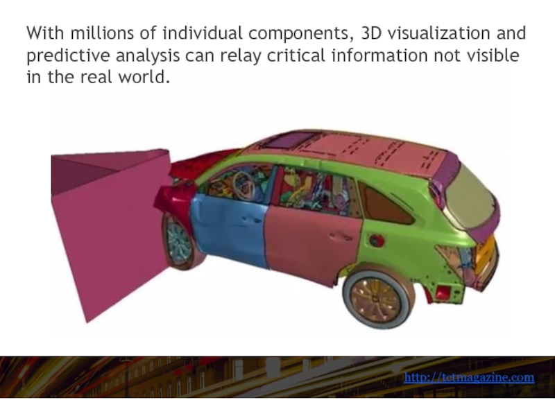
Слайд 17While 3D requires more computer power and lots of data, the
results can be profound. This example demonstrates a computer simulated crash and the resulting damage to vehicle components...
Слайд 18http://tctmagazine.com
With millions of individual components, 3D visualization and predictive analysis
can relay critical information not visible in the real world.
Слайд 20Density, also referred to as heat maps display color intensity as
the number of points increase and overlap within a given space.
Слайд 21Density maps are popular for spatial data visualization (both 3D and
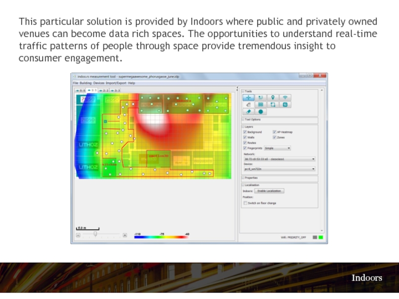
geographic). Heatmaps can be particularly useful for big data visualizations. The following example illustrates foot traffic through interaction with beacon sensors.
Слайд 22Indoors
This particular solution is provided by Indoors where public and privately
owned venues can become data rich spaces. The opportunities to understand real-time traffic patterns of people through space provide tremendous insight to consumer engagement.
Слайд 24For more great content go to…
BIBrainz.com/aof
Edited by
Matthew Broderick
Managing Editor of
Analytics on Fire
@MattdBroderick
@MattdBroderick
