- Главная
- Разное
- Дизайн
- Бизнес и предпринимательство
- Аналитика
- Образование
- Развлечения
- Красота и здоровье
- Финансы
- Государство
- Путешествия
- Спорт
- Недвижимость
- Армия
- Графика
- Культурология
- Еда и кулинария
- Лингвистика
- Английский язык
- Астрономия
- Алгебра
- Биология
- География
- Детские презентации
- Информатика
- История
- Литература
- Маркетинг
- Математика
- Медицина
- Менеджмент
- Музыка
- МХК
- Немецкий язык
- ОБЖ
- Обществознание
- Окружающий мир
- Педагогика
- Русский язык
- Технология
- Физика
- Философия
- Химия
- Шаблоны, картинки для презентаций
- Экология
- Экономика
- Юриспруденция
Your customers are mobile. Are you? презентация
Содержание
- 1. Your customers are mobile. Are you?
- 2. What is a mobile optimized website?
- 3. Why do I need a mobile
- 4. If your site aren’t optimized for mobile
- 5. Why does mobile need a different experience?
- 6. What are my options for building
- 7. Option 1: A separate site for mobile
- 8. Option 2: Responsive Web Design Responsive Web
- 9. How can I make the most out
- 10. How can I make the most out
- 11. How can I make the most out
- 12. Resources for you Want to know more
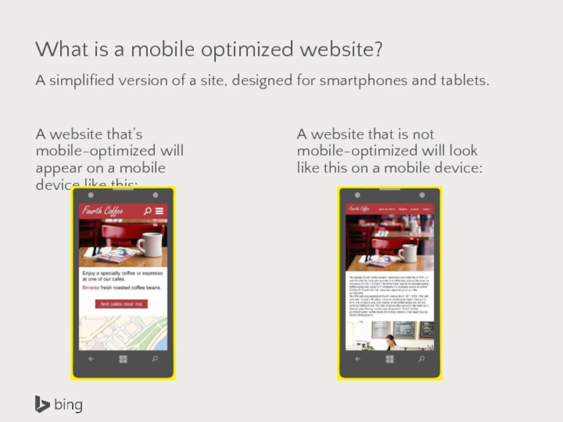
Слайд 2What is a mobile optimized website?
A simplified version of a site,
A website that’s mobile-optimized will appear on a mobile device like this:
A website that is not mobile-optimized will look like this on a mobile device:
Слайд 3
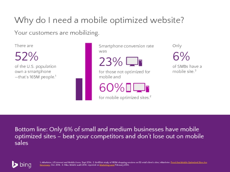
Why do I need a mobile optimized website?
Your customers are mobilizing.
There
52%
of the U.S. population own a smartphone —that’s 165M people.1
1. eMarketer, US Internet and Mobile Users, Sept 2014. 2. NetElixir study of 180M shopping sessions on 53 retail client’s sites; eMarketer, Proof that Mobile Optimized Sites Are Necessary, Oct, 2014. 3. Hibu, Mobile audit 2014, reported on Marketing Land February 2014.
Only
6%
of SMBs have a mobile site.3
Bottom line: Only 6% of small and medium businesses have mobile optimized sites – beat your competitors and don’t lose out on mobile sales
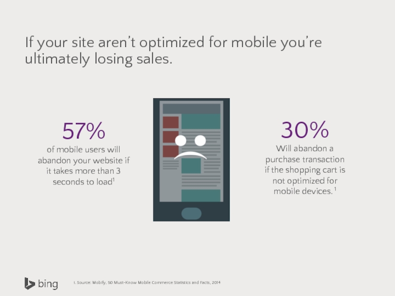
Слайд 4If your site aren’t optimized for mobile you’re ultimately losing sales.
57%
of
1. Source: Mobify, 50 Must-Know Mobile Commerce Statistics and Facts, 2014
30%
Will abandon a purchase transaction if the shopping cart is not optimized for mobile devices. 1
Слайд 5Why does mobile need a different experience?
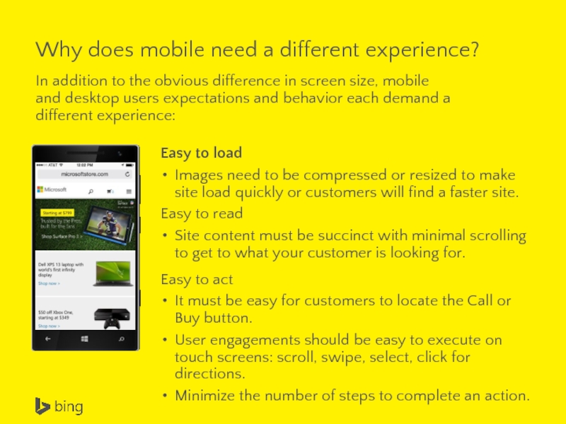
In addition to the obvious
Easy to load
Images need to be compressed or resized to make site load quickly or customers will find a faster site.
Easy to read
Site content must be succinct with minimal scrolling to get to what your customer is looking for.
Easy to act
It must be easy for customers to locate the Call or Buy button.
User engagements should be easy to execute on touch screens: scroll, swipe, select, click for directions.
Minimize the number of steps to complete an action.
Слайд 6
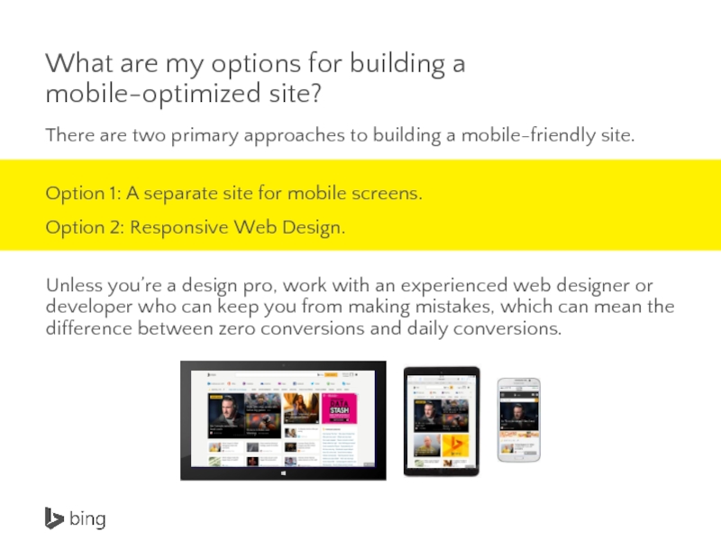
What are my options for building a mobile-optimized site?
There are two
Option 1: A separate site for mobile screens.
Option 2: Responsive Web Design.
Unless you’re a design pro, work with an experienced web designer or developer who can keep you from making mistakes, which can mean the difference between zero conversions and daily conversions.
Слайд 7Option 1: A separate site for mobile users
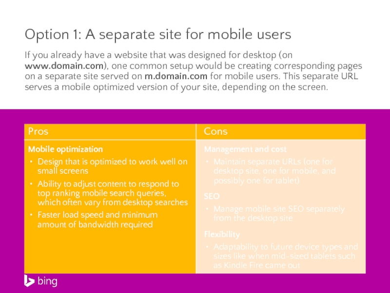
If you already
Слайд 8Option 2: Responsive Web Design
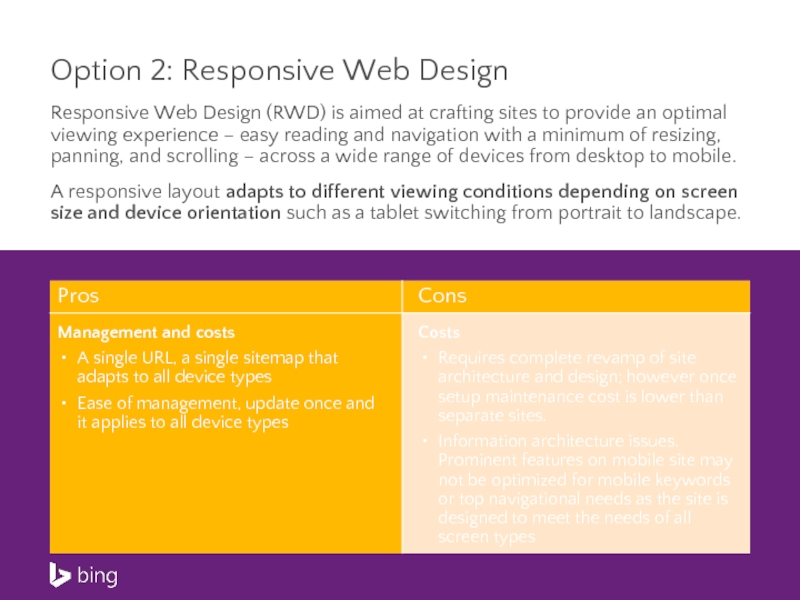
Responsive Web Design (RWD) is aimed at
A responsive layout adapts to different viewing conditions depending on screen size and device orientation such as a tablet switching from portrait to landscape.
Слайд 9How can I make the most out of my mobile landing
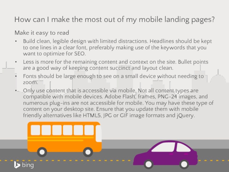
Make it easy to read
Build clean, legible design with limited distractions. Headlines should be kept to one lines in a clear font, preferably making use of the keywords that you want to optimize for SEO.
Less is more for the remaining content and context on the site. Bullet points are a good way of keeping content succinct and layout clean.
Fonts should be large enough to see on a small device without needing to zoom.
Only use content that is accessible via mobile. Not all content types are compatible with mobile devices. Adobe Flash, frames, PNG-24 images, and numerous plug-ins are not accessible for mobile. You may have these type of content on your desktop site. Ensure that you update them with mobile friendly alternatives like HTML5, JPG or GIF image formats and jQuery.
Слайд 10How can I make the most out of my mobile site?
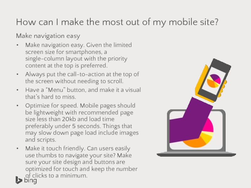
Make
Make navigation easy. Given the limited screen size for smartphones, a single-column layout with the priority content at the top is preferred.
Always put the call-to-action at the top of the screen without needing to scroll.
Have a “Menu” button, and make it a visual that’s hard to miss.
Optimize for speed. Mobile pages should be lightweight with recommended page size less than 20kb and load time preferably under 5 seconds. Things that may slow down page load include images and scripts.
Make it touch friendly. Can users easily use thumbs to navigate your site? Make sure your site design and buttons are optimized for touch and keep the number of clicks to a minimum.
Слайд 11How can I make the most out of my mobile site?
Create
This may be a button to click-to-call, a form to download, a special offer, a “like” or “more.” This button should be clearly visible as soon as the visitor lands on the home page. Limit the number of actions to three or less.
Simplify forms. Mobile landing page forms should be short and only include required fields and collect data that’s imperative. Target seven or fewer fields and anticipate each additional field to reduce conversion by 50%.
Design for local
Smartphones offer valuable location-based information that allows you to personalize content and serve up the most relevant page. A mobile user’s location can typically be determined by their IP address, GPS location or in some cases Wi-Fi network (without the user explicitly disclosing their location).
Personalize site experience based on where the user is. For example, a personalized heading with a city or metro area name, list nearby store locations, re-center and zoom maps to the user’s location, or a local phone number in place of a 1-800 number.
For more info, download the full Mobile Site Optimization guide >
Слайд 12Resources for you
Want to know more about responsive design? Here are
How to Use Responsive Web Design
Responsive Web Design Guidelines and Tutorials
7 Best Practices of Responsive Web Design
50 examples and best practices of well thought out responsive web designs
The following design testing tools can be helpful. They provide free evaluation for mobile readiness:
MobiReady
Responsinator
Mobile Phone Emulator
Listed below are companies that provide website services, in some cases offering automatic mobile optimization:
Web.com
Duda mobile
Wix
Microsoft does not endorse any of the third party tools and software listed in this guide.
