- Главная
- Разное
- Дизайн
- Бизнес и предпринимательство
- Аналитика
- Образование
- Развлечения
- Красота и здоровье
- Финансы
- Государство
- Путешествия
- Спорт
- Недвижимость
- Армия
- Графика
- Культурология
- Еда и кулинария
- Лингвистика
- Английский язык
- Астрономия
- Алгебра
- Биология
- География
- Детские презентации
- Информатика
- История
- Литература
- Маркетинг
- Математика
- Медицина
- Менеджмент
- Музыка
- МХК
- Немецкий язык
- ОБЖ
- Обществознание
- Окружающий мир
- Педагогика
- Русский язык
- Технология
- Физика
- Философия
- Химия
- Шаблоны, картинки для презентаций
- Экология
- Экономика
- Юриспруденция
Reading Graphs презентация
Содержание
- 1. Reading Graphs
- 2. The graph shows the number of cases
- 3. In 1960, the number of cases stood
- 4. In conclusion, the graph shows that the
- 6. Underground Station Passenger Numbers The graph
- 7. In the afternoon, numbers decline, with less
- 8. The busiest time of the day is
- 9. Overall, the graph shows that the station
- 12. Bar Graph (Bar Chart) столбчатая диаграмма; гистограмма
- 13. One axis of the chart shows the
- 14. Language requirements To make comparisons, you
- 15. To signal comparison and contrast within
- 16. To signal comparison and contrast between sentences
- 17. Read and translate The provided diagram shows
- 18. 3. The chart gives information on expenditures
- 19. 5. The bar graph and the table

Слайд 2The graph shows the number of cases of X disease in
Someland
between the years 1960 and 1995. As an overall
trend, it is clear that the number of cases of the disease
increased fairly rapidly until the mid seventies, remained
constant for around a decade at 500 cases before dropping to
zero in the late 80s.
trend, it is clear that the number of cases of the disease
increased fairly rapidly until the mid seventies, remained
constant for around a decade at 500 cases before dropping to
zero in the late 80s.

Слайд 3In 1960, the number of cases stood at approximately 100. That
number
rose steadily to 200 by 1969 and then more sharply to
500 in 1977. At this point the number of cases remained stable
until 1984 before plummeting to zero by 1988. From 1988 to
1995 Someland was free of the disease.
500 in 1977. At this point the number of cases remained stable
until 1984 before plummeting to zero by 1988. From 1988 to
1995 Someland was free of the disease.

Слайд 4In conclusion, the graph shows that the disease was
increasingly prevalent until
the 1980s when it was eradicated from Someland.

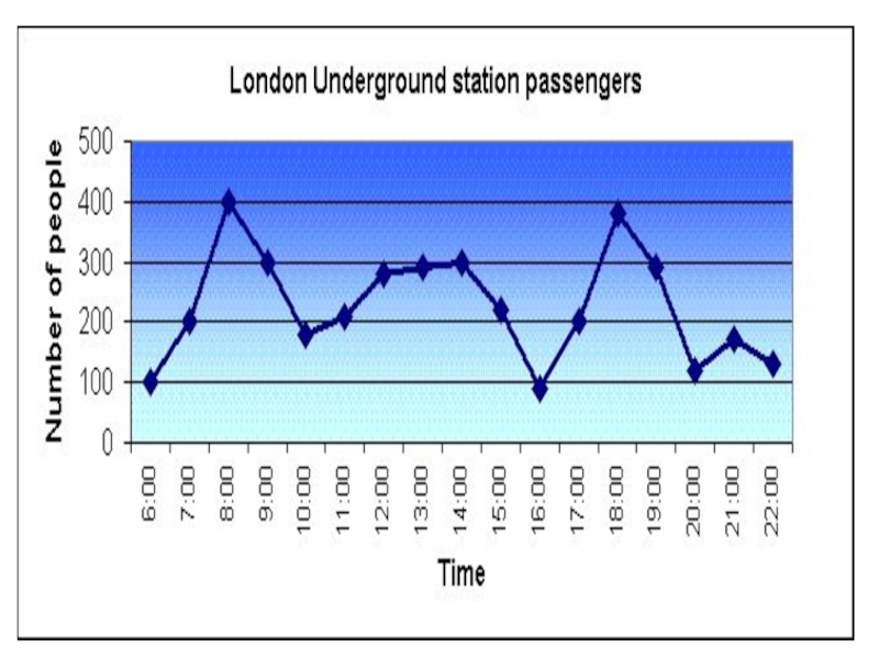
Слайд 6Underground Station Passenger Numbers
The graph shows the fluctuation in the number
of people at a London underground station over the course of a day.

Слайд 7In the afternoon, numbers decline, with less than 100 using the
station at 4 pm. There is then a rapid rise to a peak of 380 at 6pm. After 7 pm, numbers fall significantly, with only a slight increase again at 8pm, tailing off after 9 pm.

Слайд 8The busiest time of the day is in the morning. There
is a sharp increase between 06:00 and 08:00, with 400 people using the station at 8 o'clock. After this the numbers drop quickly to less than 200 at 10 o'clock. Between 11 am and 3 pm the number rises, with a plateau of just under 300 people using the station.

Слайд 9Overall, the graph shows that the station is most crowded in
the early morning and early evening periods.


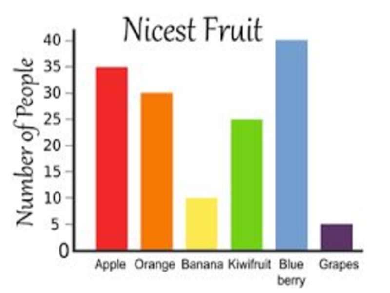
Слайд 12Bar Graph (Bar Chart)
столбчатая диаграмма; гистограмма
A bar graph is a chart
that uses either horizontal or vertical rectangular bars to show comparisons among categories.
The important thing to know is that the longer the bar, the greater its value.
The important thing to know is that the longer the bar, the greater its value.
 столбчатая диаграмма; гистограммаA bar graph is a chart that uses either")
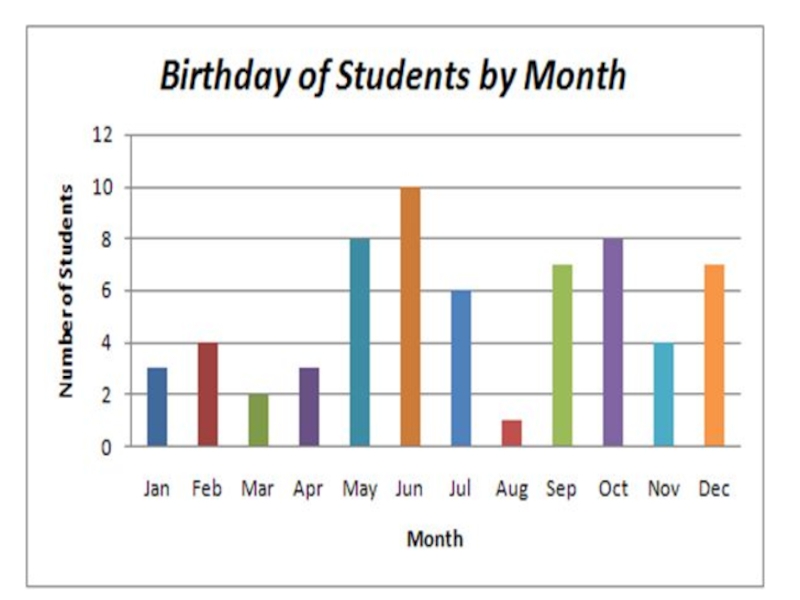
Слайд 13One axis of the chart shows the specific categories being compared,
and
the other axis represents a discrete value.
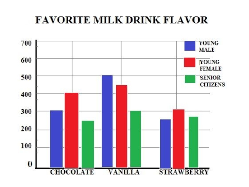
Some bar graphs present bars clustered in groups of more than one.
the other axis represents a discrete value.
Some bar graphs present bars clustered in groups of more than one.

Слайд 14Language requirements
To make comparisons, you need to know the comparatives
and superlatives of common adjectives.
bad worse worst
big bigger biggest
expensive more expensive most expensive
good better best
great greater greatest
bad worse worst
big bigger biggest
expensive more expensive most expensive
good better best
great greater greatest

Слайд 15 To signal comparison and contrast within a sentence you can
use the following conjunctions:
as ……. as, not as ……… as, not so …….. as, whereas, but, while, although
as ……. as, not as ……… as, not so …….. as, whereas, but, while, although

Слайд 16To signal comparison and contrast between sentences you can use the
following words and phrases:
Describing bar charts …
In general, when describing a chart …
The most important information on this chart is that…
However, it is easier to see …
Describing bar charts …
In general, when describing a chart …
The most important information on this chart is that…
However, it is easier to see …

Слайд 17Read and translate
The provided diagram shows data on employment categories in
energy producing sectors in Europe starting from 1925 and till 1985.
The given charts represent the proportion of male and female employees in 6 broad categories, divided into manual and non-manual occupations in Freedonia.
The given charts represent the proportion of male and female employees in 6 broad categories, divided into manual and non-manual occupations in Freedonia.

Слайд 183. The chart gives information on expenditures of 4 European countries
on six consumer products namely Germany, Italy, Britain and France.
4. The supplied bar graph compares the number of males and females graduated in three developing countries while the table data presents the overall literacy rate in these countries.
4. The supplied bar graph compares the number of males and females graduated in three developing countries while the table data presents the overall literacy rate in these countries.

Слайд 195. The bar graph and the table data depict the water
use in different sectors in five regions.
6. The bar graph enumerates the money spent on different research projects while the column graph demonstrates the sources of the amount spent over a decade, beginning from 1981.
6. The bar graph enumerates the money spent on different research projects while the column graph demonstrates the sources of the amount spent over a decade, beginning from 1981.