- Главная
- Разное
- Дизайн
- Бизнес и предпринимательство
- Аналитика
- Образование
- Развлечения
- Красота и здоровье
- Финансы
- Государство
- Путешествия
- Спорт
- Недвижимость
- Армия
- Графика
- Культурология
- Еда и кулинария
- Лингвистика
- Английский язык
- Астрономия
- Алгебра
- Биология
- География
- Детские презентации
- Информатика
- История
- Литература
- Маркетинг
- Математика
- Медицина
- Менеджмент
- Музыка
- МХК
- Немецкий язык
- ОБЖ
- Обществознание
- Окружающий мир
- Педагогика
- Русский язык
- Технология
- Физика
- Философия
- Химия
- Шаблоны, картинки для презентаций
- Экология
- Экономика
- Юриспруденция
Design. Visual Design презентация
Содержание
- 1. Design. Visual Design
- 2. agenda principles of good design grid and layout feedback, feedforward, affordance visual hierarchy typography
- 3. Good design is innovative Possibilities always there
- 4. Good design makes a product useful A
- 5. Good design is aesthetic The aesthetic quality
- 6. Good design makes a product understandable
- 7. Good design is unobtrusive Products fulfilling a
- 8. Good design is honest It does not
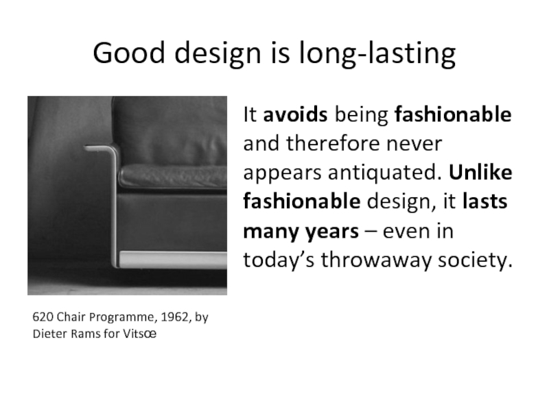
- 9. Good design is long-lasting It avoids being
- 10. Good design is thorough down to
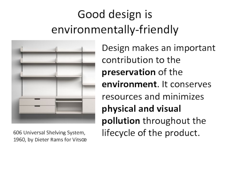
- 11. Good design is environmentally-friendly Design makes
- 12. Good design is as little design
- 13. Precedence (Guiding the Eye) Visual weight of
- 14. Spacing Empty space seemed wasteful. In fact
- 15. Navigation One of the most frustrating experiences:
- 16. Design to Build Can it actually be
- 17. Typography The most common element in design
- 18. Usability (we learned a lot here) Design
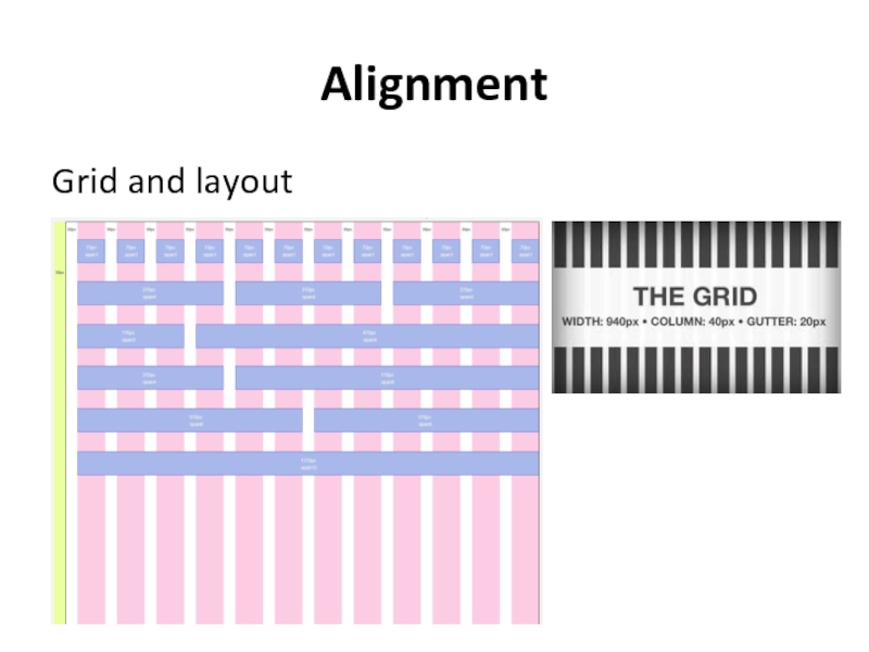
- 19. Alignment Grid and layout
- 20. Clarity (Sharpness) Keeping the design crisp and
- 21. Consistency making everything match. Heading sizes, font
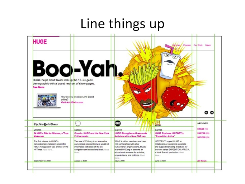
- 25. Line things up
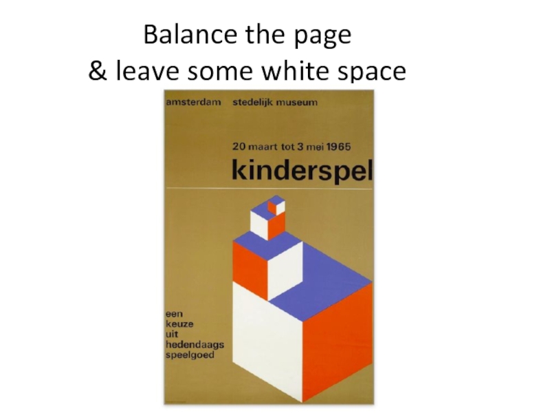
- 26. Balance the page & leave some white space
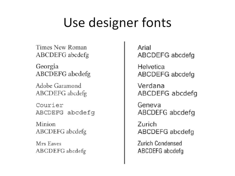
- 27. Use designer fonts
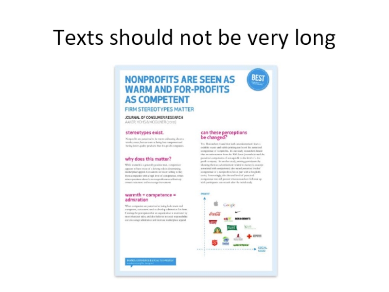
- 28. Texts should not be very long
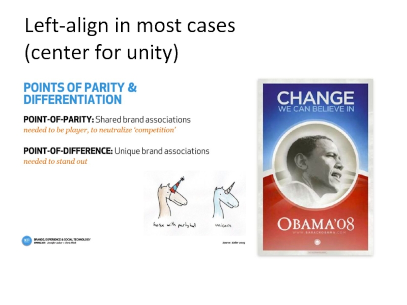
- 29. Left-align in most cases (center for unity)
- 30. USE COLORS TO COMMUNICATE & MAKE THINGS POP DON’T USE THEM FRIVOLOUSLY
- 31. TAKE ADVANTAGE OF GOOGLE IMAGE SEARCH & FLICKR (be tasteful)
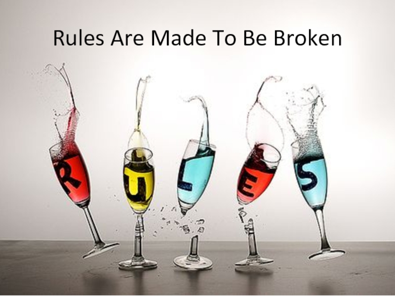
- 32. Rules Are Made To Be Broken
- 33. One more thing Good design principles video:
Слайд 2agenda
principles of good design
grid and layout
feedback, feedforward, affordance
visual hierarchy
typography
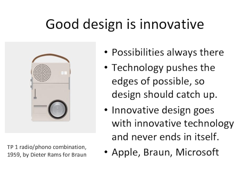
Слайд 3Good design is innovative
Possibilities always there
Technology pushes the edges of
Innovative design goes with innovative technology and never ends in itself.
Apple, Braun, Microsoft
TP 1 radio/phono combination, 1959, by Dieter Rams for Braun
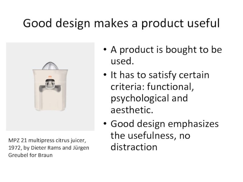
Слайд 4Good design makes a product useful
A product is bought to be
It has to satisfy certain criteria: functional, psychological and aesthetic.
Good design emphasizes the usefulness, no distraction
MPZ 21 multipress citrus juicer, 1972, by Dieter Rams and Jürgen Greubel for Braun
Слайд 5Good design is aesthetic
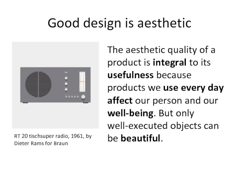
The aesthetic quality of a product is integral
RT 20 tischsuper radio, 1961, by Dieter Rams for Braun
Слайд 6Good design makes
a product understandable
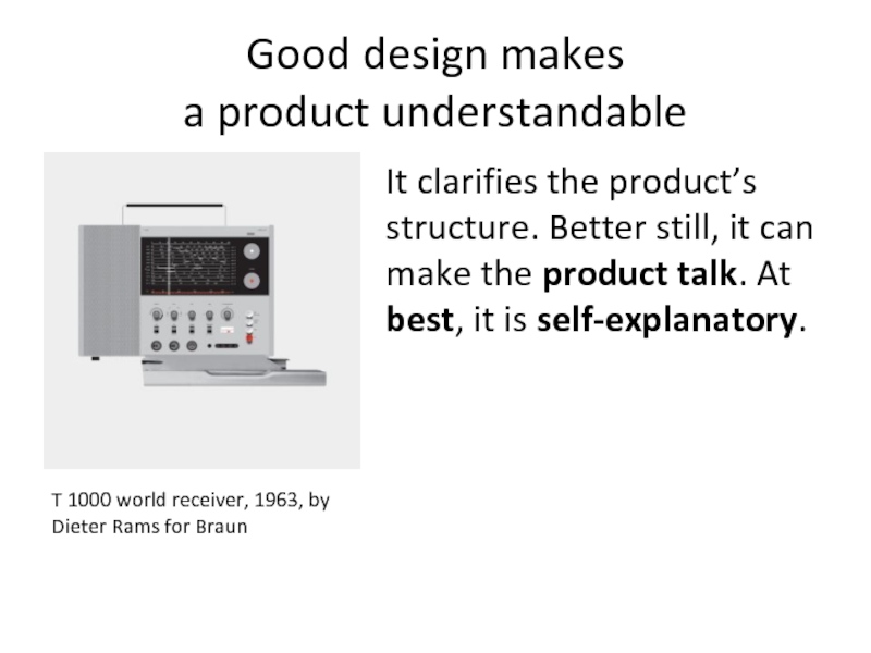
It clarifies the product’s structure. Better
T 1000 world receiver, 1963, by Dieter Rams for Braun
Слайд 7Good design is unobtrusive
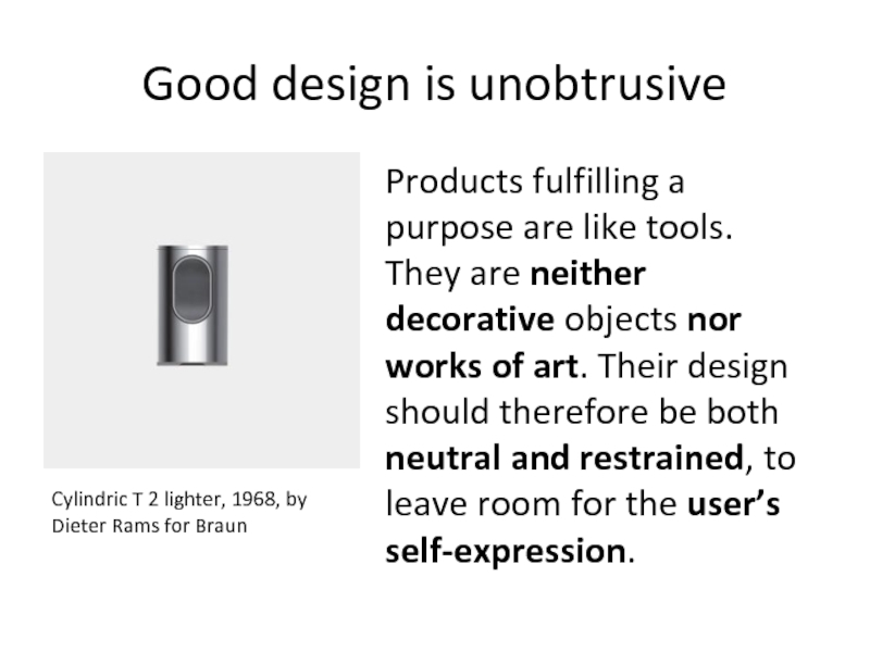
Products fulfilling a purpose are like tools. They
Cylindric T 2 lighter, 1968, by Dieter Rams for Braun
Слайд 8Good design is honest
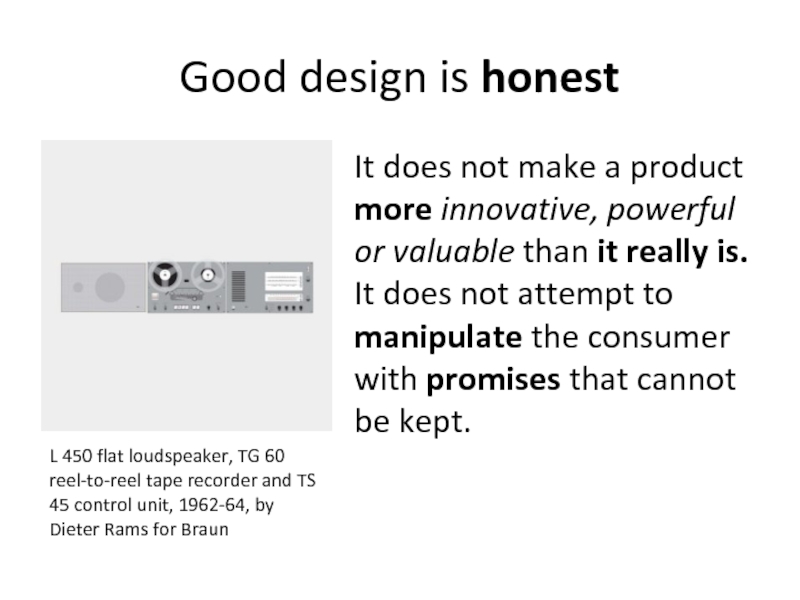
It does not make a product more innovative,
L 450 flat loudspeaker, TG 60 reel-to-reel tape recorder and TS 45 control unit, 1962-64, by Dieter Rams for Braun
Слайд 9Good design is long-lasting
It avoids being fashionable and therefore never appears
620 Chair Programme, 1962, by Dieter Rams for Vitsœ
Слайд 10Good design is thorough
down to the last detail
Nothing must be
ET 66 calculator, 1987, by Dietrich Lubs for Braun
Слайд 11Good design is
environmentally-friendly
Design makes an important contribution to the preservation
606 Universal Shelving System, 1960, by Dieter Rams for Vitsœ
Слайд 12Good design is as little
design as possible
Less, but better –
Back to purity, back to simplicity.
L 2 speaker, 1958, by Dieter Rams for Braun
Слайд 13Precedence (Guiding the Eye)
Visual weight of parts of design and navigation
Position — Order of elements, so users see it by structure
Color — Bold and subtle colors help users where to look
Contrast — Different – stands out, similar – makes it hide
Size — big is a contrast to small, and makes it important
Design Elements — if there is a gigantic arrow pointing at something, guess where the user will look?
Слайд 14Spacing
Empty space seemed wasteful. In fact the opposite is true.
Line Spacing
Padding – elements and text should not touch each other. There must be some space.
White Space – (negative). More – elegant, less – cheap.
Слайд 15Navigation
One of the most frustrating experiences: failing to figure out where
Navigation — Where can you go? Feedback, feedforward and affordance here. Explicit and prominent.
Orientation — Where are you now?
Bread-crumbs trails, sub-headings, and site map for truly lost people.
Слайд 16Design to Build
Can it actually be done? – feasibility (tech, css)
What
Are you doing anything that is technically difficult? - could it avoided or done?
Could small changes in your design greatly simplify how you build it? - balance btw. Look and simplicity of implementation
For large sites, particularly, can you simplify things? – simplify design by using CSS3 (buttons, gradients, shadows)
Слайд 17Typography
The most common element in design of UI
Font Choices – modern,
Font sizes – consistency in sizes. Meant to be read, not just look (Kinetic Typography – exc.)
Spacing – btw lines, letters. Gestalt principles.
Line Length – columns, lines (60 words is good)
Color – less saturated when lots of text
Paragraphing – aligned with the grid and layout
Слайд 18Usability (we learned a lot here)
Design is about how it works,
Adhering to Standards – link underlined
Think about what users will actually do – prototyping, user-testing, design decisions
Think about user tasks – site is a tool. e.g. ‘reading info about us’, ‘start shopping’, ‘sending a feedback’
Слайд 20Clarity (Sharpness)
Keeping the design crisp and sharp
Edges – snapped to
Anti-aliasing in fonts
Contrast is high, so borders can be defined
Слайд 21 Consistency
making everything match. Heading sizes, font choices, coloring, button styles, spacing,
Слайд 33One more thing
Good design principles video:
http://www.youtube.com/watch?feature=player_embedded&v=A6-wA-7QIeE
Google keywords: visual design, graphic
Sites to look: tutsplus, blogs of great designers
