Types of Data – (continued). Week 2 (2) презентация

NEW IN CLASS? Send me an email to the following address:

Слайд 1BBA182 Applied Statistics Week 2 (2) Types of Data – (continued)
DR SUSANNE

HANSEN SARAL
EMAIL: SUSANNE.SARAL@OKAN.EDU.TR
HTTPS://PIAZZA.COM/CLASS/IXRJ5MMOX1U2T8?CID=4#
WWW.KHANACADEMY.ORG

DR SUSANNE HANSEN SARAL


Слайд 2 NEW

IN CLASS?


Send me an email to the following address:

susanne.saral@okan.edu.tr

DR SUSANNE HANSEN SARAL


Слайд 3 Activation of piazza.com account


Enter your first and last name
Select : Undergraduate
Select : Economy
Select : Class 1 and add BBA 182 and click “join the class”

DR SUSANNE HANSEN SARAL


Слайд 4 Organizing categorical data

Categorical data produce values that are names,

words or codes, but not real numbers.

Only calculations based on the frequency of occurrence of these names, words or codes are valid.

We count the number of times a certain value occurs and add the frequency in the table.

DR SUSANNE HANSEN SARAL, SUSANNE.SARAL@GMAIL.COM


Слайд 5 The Frequency and relative frequency -

Distribution Table Summarizing categorical data


A frequency table organizes data by recording totals and category names.
The variable we measure here is the number of times a country became world champion in football:

DR SUSANNE HANSEN SARAL, SUSANNE.SARAL@GMAIL.COM


Слайд 6 Contingency table another type of

frequency table


Contingency tables list the number of observations for every combination of values for two categorical variables

DR SUSANNE HANSEN SARAL, SUSANNE.SARAL@GMAIL.COM


Слайд 7 Contingency table
A

larger retailer of electronics conducted a survey to determine consumer preferences for
various brands of digital cameras. The table summarizes responses by brand and gender:


Each cell in a contingency table (any intersection of a row and column of the table) gives the count
for a combination of values of two categorical variables


Слайд 8 Three Rules of Data Analysis

Rule 1, 2

and 3: Make a picture of the data

Pictures….

Reveal things that cannot be seen in a frequency table

Show important patterns in the data

Provide an excellent way for presenting findings to other people

DR SUSANNE HANSEN SARAL, SUSANNE.SARAL@GMAIL.COM


Слайд 9 Bar Chart – Hospital patients
DR SUSANNE HANSEN SARAL, SUSANNE.SARAL@GMAIL.COM


Hospital

Number
Unit of Patients

Cardiac Care 1,052
Emergency 2,245
Intensive Care 340
Maternity 552
Surgery 4,630

Слайд 10 Pie Chart – Hospital patients
DR SUSANNE HANSEN SARAL, SUSANNE.SARAL@GMAIL.COM

(Percentages

are rounded to the nearest percent)


Hospital Number % of Total
Unit of Patients


Cardiac Care 1,052 11.93
Emergency 2,245 25.46
Intensive Care 340 3.86
Maternity 552 6.26
Surgery 4,630 52.50


Слайд 11

Bar-chart Number of visits to OKAN University website

Слайд 12

Pie-chart Number of visits to OKAN University website

Слайд 13

Graphing Multivariate Categorical Data

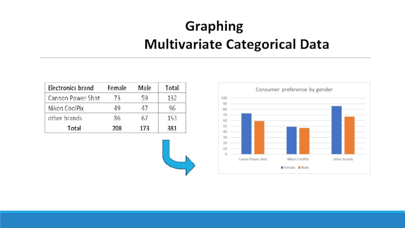
MULTIVARIATE= MORE THAN ONE VARIABLE

Why multivariate?

We are investigating more than one variable:
(1) Gender: Female and male
(2) Camera brand: Canon Powershot, Nikon
CoolPix, other brands


DR SUSANNE HANSEN SARAL, SUSANNE.SARAL@GMAIL.COM

(continued)


Слайд 14


Graphing Multivariate Categorical Data


Слайд 15

Graphing Multivariate Categorical Data

Side by side horizontal bar chart

DR SUSANNE HANSEN SARAL, SUSANNE.SARAL@GMAIL.COM

(continued)


Слайд 16

Graphing Multivariate Categorical Data

Stacked bar chart

DR SUSANNE HANSEN SARAL, SUSANNE.SARAL@GMAIL.COM

(continued)


Слайд 17Class exercise
The following raw data show responses to the question “What

is your primary source for news?”
from a sample of college students:
Internet Newspaper Internet TV Internet Newspaper TV Internet Internet TV
Newspaper TV TV Newspaper TV Internet Internet Internet Internet Internet
TV Internet Internet TV TV

a. Prepare a frequency table for these data. How many students were sampled?
b. Prepare a relative frequency table for these data.
c. Based on the frequencies, construct a bar chart manually.
d. What is the variable we are measuring?


Слайд 18Class exercise A cable company surveyed its customers and asked how

likely they were to bundle other services, such as phone and Internet, with their cable TV subscription. The following raw data show the responses:


  Very Likely Unlikely Unlikely Very Likely
Likely Unlikely Likely Likely
Unlikely Unlikely Likely Likely
Very Likely Unlikely Unlikely Very Likely
Unlikely Unlikely Unlikely Likely
 
a. Prepare a frequency table for these data. How many customers were sampled?
b. Prepare a relative frequency table for these data.
c. Based on frequencies, construct a bar chart manually
d. What is the variable we are measuring?


Слайд 19 Week 2 (2) How to organize and illustrate numerical data
DR SUSANNE

HANSEN SARAL
EMAIL: SUSANNE.SARAL@OKAN.EDU.TR OR
SUSANNEHANSENSARAL@GMAIL.COM

DR SUSANNE HANSEN SARAL


Слайд 20 Classification

of Variables

DR SUSANNE HANSEN SARAL

Examples:
# of goals in a football match
# of subscriptions
# of meals sold in a restaurant (Counted items)

Examples:
Weight
Volume
Size
(Measured in units)

Nominal

Ordinal


Слайд 21
Numerical/quantitative Data
Histogram
Frequency Distributions and
Cumulative Distributions
Tables and Graphs to Describe

Numerical Variables

DR SUSANNE HANSEN SARAL, SUSANNE.SARAL@GMAIL.COM


Слайд 22 Enron Corporation - energy trading company
Energy

trading company from 1985 – 2001 (then went bankrupt):

Company grew steadily over the 15 years
Stock price in 1985 $ 5/share. By the end of 2000 it was $ 89.75
At the end of 2000 the company was worth $ 6 billion

At the end of 2001 the stock had fallen to $ 0.25! The company had lost 99% of it’s value
Were there any warning signs in the data?

Слайд 23 Enron Corporation - energy trading company
Energy

trading company from 1985 – 2001:
Were there any warning signs in the data?

Слайд 24 Enron Corporation - energy trading company

Energy

trading company from 1985 – 2001:
Were there any warning signs about the fall of the stock price in the data?

Hard to tell from the raw data


Let’s follow the first rule of data analysis and make a picture of the data

Слайд 26 Enron Corporation – frequency distribution


Слайд 28Why Use Frequency Distributions and graphs

for numerical data?


A frequency distribution is a way to summarize numerical data
It condenses the raw data into ranges/intervals
and allows for a quick visual interpretation of the data – a PICTURE

The picture of numerical/quantitative data is called a histogram

DR SUSANNE HANSEN SARAL, SUSANNE.SARAL@GMAIL.COM


Слайд 29 Frequency Distributions
What is a Frequency Distribution for numerical data?

A frequency distribution is a table
containing ranges/intervals within which the data fall
and the corresponding frequencies with which data fall within each class
or category

DR SUSANNE HANSEN SARAL, SUSANNE.SARAL@GMAIL.COM


Слайд 30Frequency Distributions for numerical data
Intervals for numerical data are not as

easy to identify as for categorical data.

Determining the intervals of a frequency table for numerical data requires answers to the following questions:

How many intervals should be used?
How wide should each interval be?

DR SUSANNE HANSEN SARAL, SUSANNE.SARAL@GMAIL.COM


Слайд 31

Raw data (sample of 110 employees in a production plant)

Completion Times of a particular task (in seconds) for 110 employees
271 236 294 252 254 263 266 222 262 278 288
262 237 247 282 224 263 267 254 271 278 263
262 288 247 252 264 263 247 225 281 279 238
252 242 248 263 255 294 268 255 272 271 291
263 242 288 252 226 263 269 227 273 281 267
263 244 249 252 256 263 252 261 245 252 294
288 245 251 269 256 264 252 232 275 284 252
263 274 252 252 256 254 269 234 285 275 263
263 246 294 252 231 265 269 235 275 288 294
263 247 252 269 261 266 269 236 276 248 299

DR SUSANNE HANSEN SARAL, SUSANNE.SARAL@GMAIL.COM

Not easy to see a picture or pattern!


Слайд 32 How to determine the number of intervals/classes

A quick guide


Sample size Number of intervals

Fewer than 50 5 - 7
50 to 100 7 - 8
101 to 500 8 - 10
501 to 1,000 10 - 11
1,001 to 5,000 11 - 14
More than 5,000 14 - 20

Use at least 5 intervals but no more than 15-20 otherwise we loose the overview of the data

DR SUSANNE HANSEN SARAL, SUSANNE.SARAL@GMAIL.COM


Слайд 33 How to determine the interval width
Each class/interval grouping has to

have the same width
Determine the width of each interval by

DR SUSANNE HANSEN SARAL, SUSANNE.SARAL@GMAIL.COM

Use at least 5 but no more than 15-20 intervals
Intervals never overlap
Round up the interval width to get desirable interval endpoints


Слайд 34 Employee completion time

110 employees’ time have

been recorded and the plant supervisor needs to report to his manager how long on average his employees finish the job.
We have 110 values ranging from 222 seconds to 299
We need to determine the number of intervals:

DR SUSANNE HANSEN SARAL, SUSANNE.SARAL@GMAIL.COM

Sample size Number of intervals

Fewer than 50 5 - 7
50 to 100 7 - 8
101 to 500 8 - 10
501 to 1,000 10 - 11
1,001 to 5,000 11 - 14
More than 5,000 14 - 20


Слайд 35 Employee completion time
 
DR SUSANNE HANSEN

SARAL, SUSANNE.SARAL@GMAIL.COM

Слайд 36 Employee completion

time


Completion time (in seconds) Frequency Relative frequency %
220 – 229 5 4.5
230 – 239 8 7.3
240 – 249 13 11.8
250 – 259 22 20.0
260 – 269 32 29.1
270 – 279 13 11.8
280 – 289 10 9.1
290 – 300 7 6.4
Total 110 100 %

DR SUSANNE HANSEN SARAL, SUSANNE.SARAL@GMAIL.COM


Слайд 37 Histogram of employee completion times

Absolute frequency

DR SUSANNE HANSEN SARAL, SUSANNE.SARAL@GMAIL.COM


Слайд 38 Histogram of employee completion times

Relative frequency same graph as absolute frequency

DR SUSANNE HANSEN SARAL, SUSANNE.SARAL@GMAIL.COM


Слайд 39 Employee completion time

Cumulative frequency

DR SUSANNE HANSEN SARAL, SUSANNE.SARAL@GMAIL.COM


Слайд 40 Histogram – Absolute frequency

Enron: Change in stock price

DR SUSANNE HANSEN SARAL, SUSANNE.SARAL@GMAIL.COM


Слайд 41 Histogram – Relative frequency

Enron: Change in stock price

DR SUSANNE HANSEN SARAL, SUSANNE.SARAL@GMAIL.COM


Обратная связь

Если не удалось найти и скачать презентацию, Вы можете заказать его на нашем сайте. Мы постараемся найти нужный Вам материал и отправим по электронной почте. Не стесняйтесь обращаться к нам, если у вас возникли вопросы или пожелания:

Email: Нажмите что бы посмотреть 

Что такое ThePresentation.ru?

Это сайт презентаций, докладов, проектов, шаблонов в формате PowerPoint. Мы помогаем школьникам, студентам, учителям, преподавателям хранить и обмениваться учебными материалами с другими пользователями.


Для правообладателей

Яндекс.Метрика