Outdoor Ads
- Главная
- Разное
- Дизайн
- Бизнес и предпринимательство
- Аналитика
- Образование
- Развлечения
- Красота и здоровье
- Финансы
- Государство
- Путешествия
- Спорт
- Недвижимость
- Армия
- Графика
- Культурология
- Еда и кулинария
- Лингвистика
- Английский язык
- Астрономия
- Алгебра
- Биология
- География
- Детские презентации
- Информатика
- История
- Литература
- Маркетинг
- Математика
- Медицина
- Менеджмент
- Музыка
- МХК
- Немецкий язык
- ОБЖ
- Обществознание
- Окружающий мир
- Педагогика
- Русский язык
- Технология
- Физика
- Философия
- Химия
- Шаблоны, картинки для презентаций
- Экология
- Экономика
- Юриспруденция
Techniques in Print & Billboard Advertising презентация
Содержание
- 1. Techniques in Print & Billboard Advertising
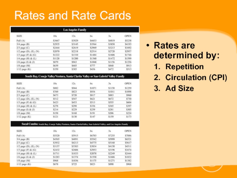
- 2. Rates and Rate Cards Rates are determined by: Repetition Circulation (CPI) Ad Size
- 3. Basic Elements of a Print Ad Visual Focus (Photo) Headline Body Copy Logo
- 4. Introduction Effective ad design and layout starts
- 5. Basic Design Strategies Keep your layouts simple
- 6. Headline Body Content or Photo Company Logo Asymmetrical
- 7. Basic Design Strategies Create Unity Have one
- 8. Symmetrical
- 10. Basic Design Strategies Create Contrast Using contrasting
- 11. Basic Design Strategies Create Emphasis through Proportion
- 12. Advanced Design Strategies Make an easy path
- 13. Advanced Design Strategies Eye Path
- 14. Advanced Design Strategies Use variety to spice
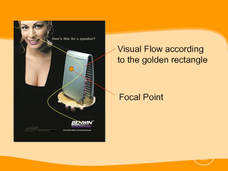
- 15. Basic Design Strategies The golden rectangle is
- 16. Basic Design Strategies
- 17. Visual Flow according to the golden rectangle Focal Point
- 18. Grouping Design Strategies Group by using similar
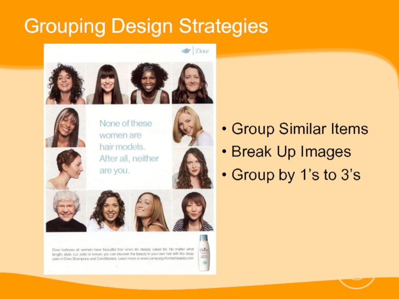
- 19. Grouping Design Strategies Group Similar Items
- 20. Color Design Strategies Black and white is
- 21. Color Design Strategies
- 22. Color Design Strategies Use colors to help
- 24. Color Design Strategies
- 25. Photo Design Strategies Photo design and layout
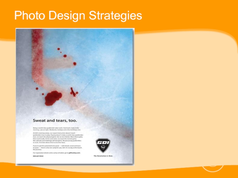
- 26. Photo Design Strategies
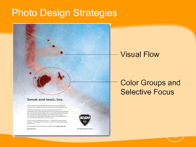
- 27. Photo Design Strategies Visual Flow Color Groups and Selective Focus
- 28. Photo Design Strategies Before taking a shot
- 29. Photo Design Strategies Cling to one idea
- 30. Photo Design Strategies
- 31. Photo Design Strategies Choose the right background
- 32. Photo Design Strategies This ad has a
- 33. Photo Design Strategies Use visual stepping stones
- 34. Photo Design Strategies
- 35. Photo Design Strategies Include people in photos
- 36. Photo Design Strategies
- 37. Headlines and Body Copy Design Strategies Readability
- 38. Headlines and Body Copy Design Strategies Typestyles
- 39. Headlines and Body Copy Design Strategies Never
- 40. Headlines and Body Copy Design Strategies Use
- 41. Headlines and Body Copy Design Strategies Use
- 42. Use graphic accents to emphasize key
- 43. Reminders Don’t make your ad look too
- 44. Designing for Outdoor Ads Product Identification Is
- 45. Designing for Outdoor Ads Product Identification Short Copy Short Words
- 46. Designing for Outdoor Ads Legible Type Is
- 47. Designing for Outdoor Ads Legible Type Large Illustrations
- 48. Designing for Outdoor Ads Bold Colors Do
- 49. Designing for Outdoor Ads Bold Colors Simplicity Intrigue
- 50. Guidelines for Legibility Color
- 51. Guidelines for Legibility Typestyle Upper and lower
- 52. Guidelines for Legibility Typestyle Too little spacing between letters makes them merge together
- 53. Guidelines for Legibility Typestyle At long distance,
- 54. Guidelines for Legibility Typestyle Ornate script faces,
- 55. Less is more
- 56. Less is more
- 57. Less is more
- 58. Less is more
- 59. Less is more
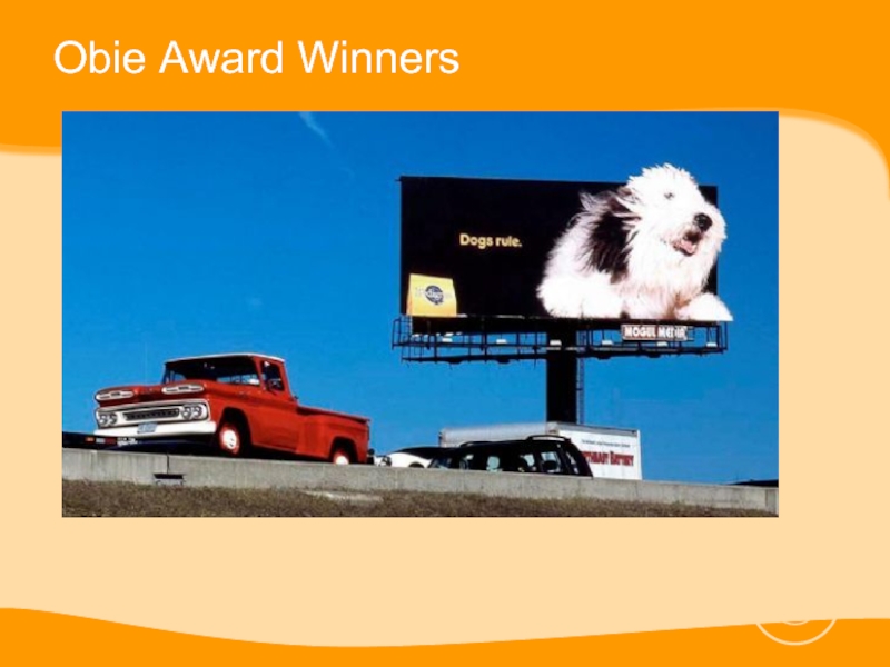
- 60. Obie Award Winners
- 61. Obie Award Winners
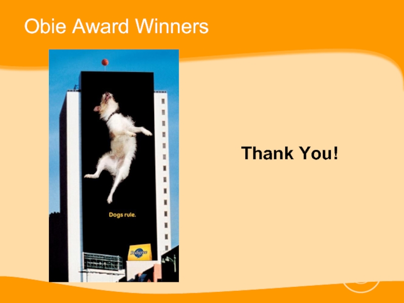
- 62. Obie Award Winners Thank You!
Слайд 4Introduction
Effective ad design and layout starts with a clear understanding of
a project’s goals and written content.
Headlines, body copy and assorted visuals must already be figured out before you begin
Headlines, body copy and assorted visuals must already be figured out before you begin
Слайд 5Basic Design Strategies
Keep your layouts simple
E.g. Large picture at the
top, headline underneath, body copy in 2 or 3 columns under the headline, logo or address in the bottom right-hand corner.
Слайд 7Basic Design Strategies
Create Unity
Have one central focus or focal point where
the eye has the tendency to concentrate on which is usually the visual or even the headline.
Create Symmetrical or Asymmetrical Balance
Seesaw analogy
Create Symmetrical or Asymmetrical Balance
Seesaw analogy
Слайд 10Basic Design Strategies
Create Contrast
Using contrasting sizes, shapes, lines, typestyles and figures
draw attention to key items you want to emphasize
Слайд 11Basic Design Strategies
Create Emphasis through Proportion
Important ideas or figures should be
emphasized by making them larger, bolder, brighter or essentially different from the main components of the rest of the ads.
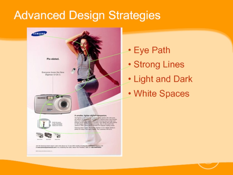
Слайд 12Advanced Design Strategies
Make an easy path for the eye to follow
Make
effective use of white space in your ad
Use strong lines to hold together graphics and body copy.
Use light and dark relationships to create layout interest
Use strong lines to hold together graphics and body copy.
Use light and dark relationships to create layout interest
Слайд 14Advanced Design Strategies
Use variety to spice up your ads
Visual boredom occurs
when predictability and mirror-like symmetry dominate a document
Carefully select backgrounds to accentuate figures
Use the golden rectangle
Carefully select backgrounds to accentuate figures
Use the golden rectangle
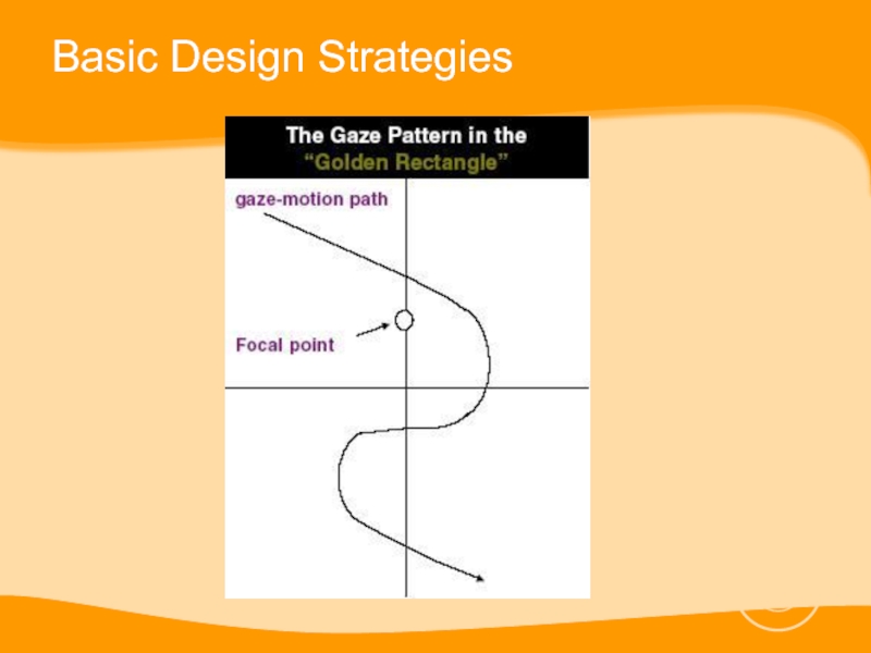
Слайд 15Basic Design Strategies
The golden rectangle is a visually balanced geometric shape
with the primary ratio of 3 to 5 (or 1 to 1.61803398874989…). This number is also known as the Fibonacci Series or Phi.
Слайд 18Grouping Design Strategies
Group by using similar shapes, sizes, textures and colors
Break
up long lists
Group ideas in ones, twos or threes
By finding relationships between them and making those relationships obvious
E.g. positive-negative, graphics-words-numbers
Up to three only, 4 is visually too much
Group ideas in ones, twos or threes
By finding relationships between them and making those relationships obvious
E.g. positive-negative, graphics-words-numbers
Up to three only, 4 is visually too much
Слайд 20Color Design Strategies
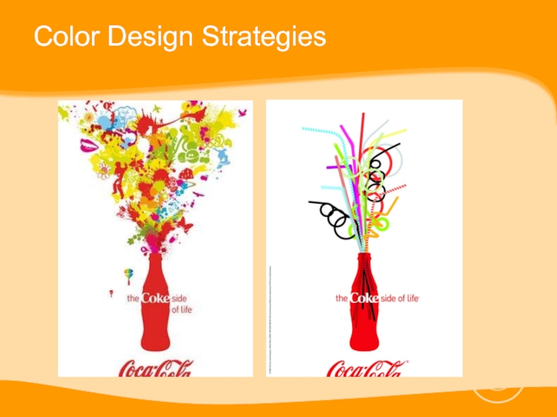
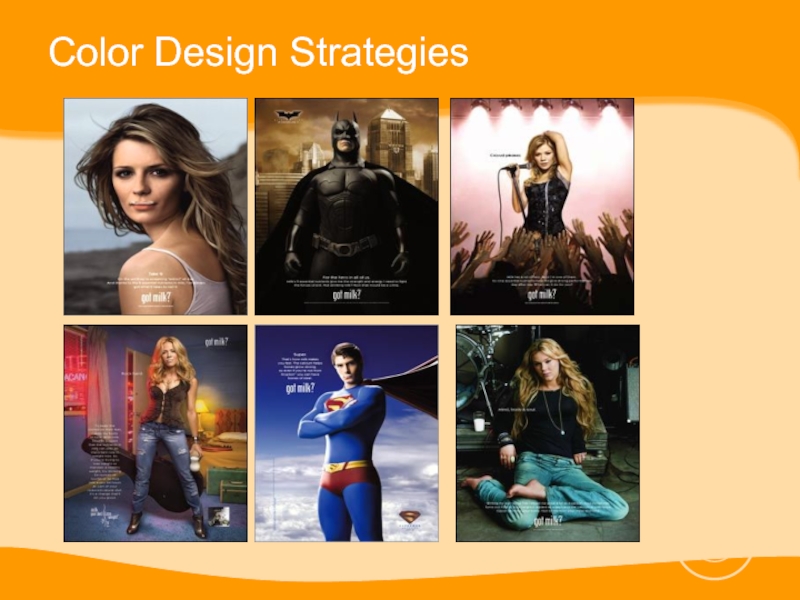
Black and white is boring. Color is EXCITING.
Excessive color
detracts from copy
Color works because of its contrast with non-colored areas; use it in one or two strong clustered areas rather than scattering it through out your ad.
Color works because of its contrast with non-colored areas; use it in one or two strong clustered areas rather than scattering it through out your ad.
Слайд 22Color Design Strategies
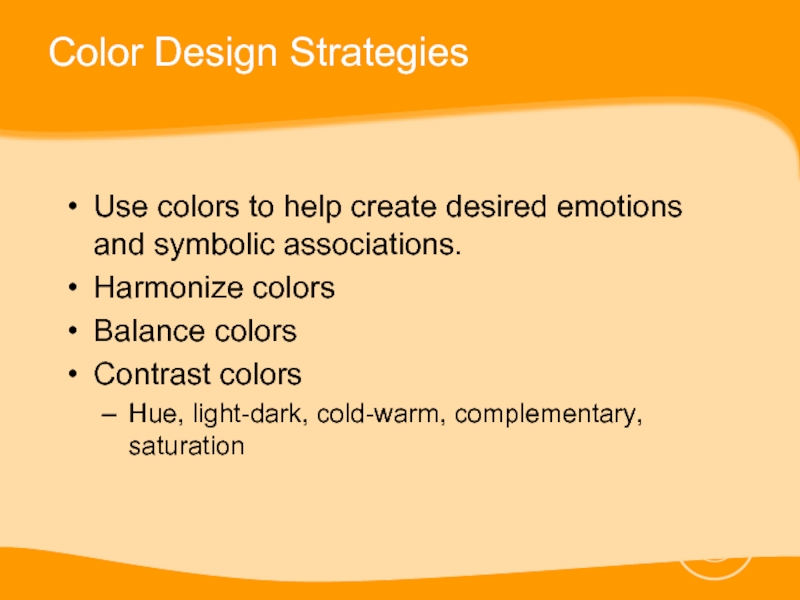
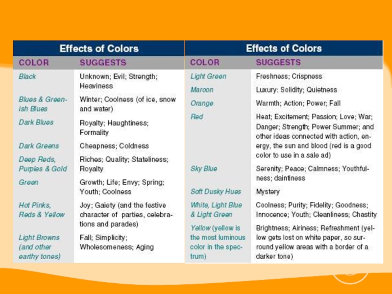
Use colors to help create desired emotions and symbolic
associations.
Harmonize colors
Balance colors
Contrast colors
Hue, light-dark, cold-warm, complementary, saturation
Harmonize colors
Balance colors
Contrast colors
Hue, light-dark, cold-warm, complementary, saturation
Слайд 25Photo Design Strategies
Photo design and layout strategies center on two ideas:
Make
the mind group things to increase communicability
Bring items in and out of focus to suggest and emphasize importance.
Bring items in and out of focus to suggest and emphasize importance.
Слайд 28Photo Design Strategies
Before taking a shot decide on:
The best shape and
proportion for your subject
How much detail you want in the frame
Your central point of interest
How you want to link images together
What your point of view will be
How much detail you want in the frame
Your central point of interest
How you want to link images together
What your point of view will be
Слайд 29Photo Design Strategies
Cling to one idea
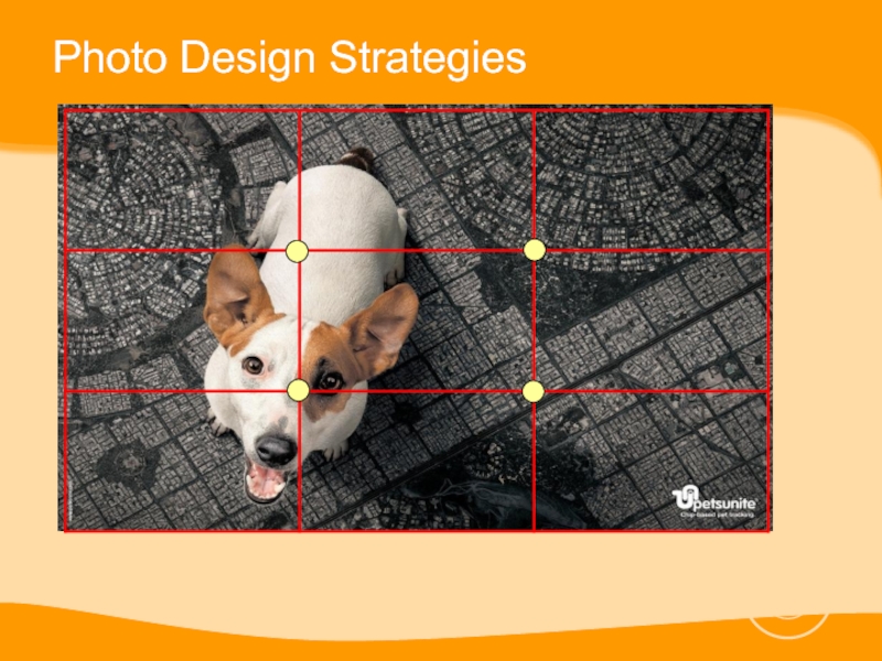
Use the rule of thirds when
taking a photograph
Use shadows and light to create the illusion of depth
Experiment with various kinds of lighting
Use shadows and light to create the illusion of depth
Experiment with various kinds of lighting
Слайд 31Photo Design Strategies
Choose the right background color
Gray is the best all-around
background for color photography.
Black provides strongest contrast and brings out colors.
Backgrounds should be absent of strong colors.
Black provides strongest contrast and brings out colors.
Backgrounds should be absent of strong colors.
Слайд 32Photo Design Strategies
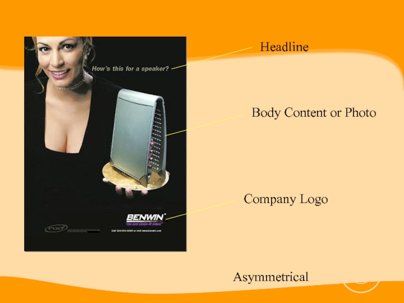
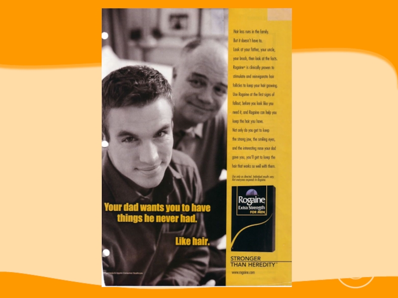
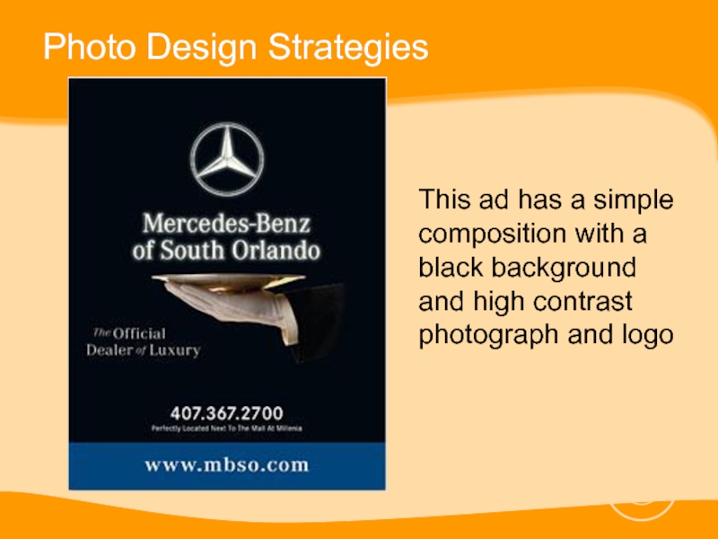
This ad has a simple composition with a black
background and high contrast photograph and logo
Слайд 33Photo Design Strategies
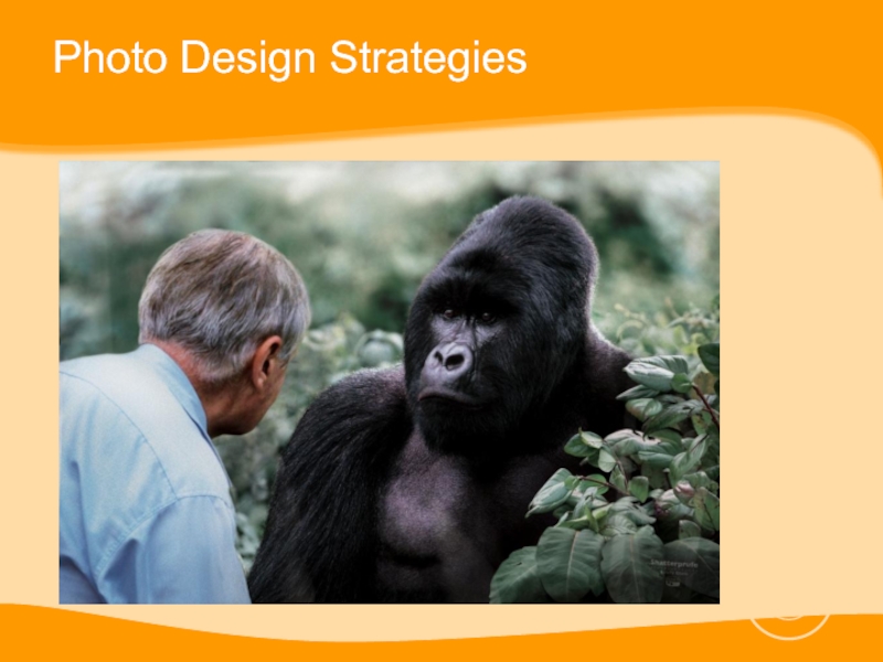
Use visual stepping stones to draw attention to the
inner details of the photograph
Frame your photos with objects
Shoot on location to get a greater sense of reality.
Frame your photos with objects
Shoot on location to get a greater sense of reality.
Слайд 35Photo Design Strategies
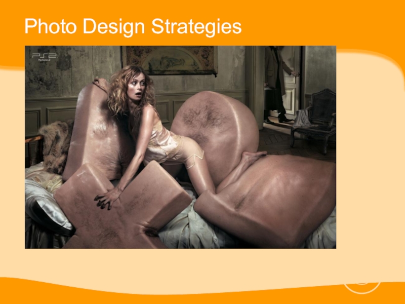
Include people in photos of products
Give people in photos
looking space
Look for special qualities in people when photographing them
Look for special qualities in people when photographing them
Слайд 37Headlines and Body Copy Design Strategies
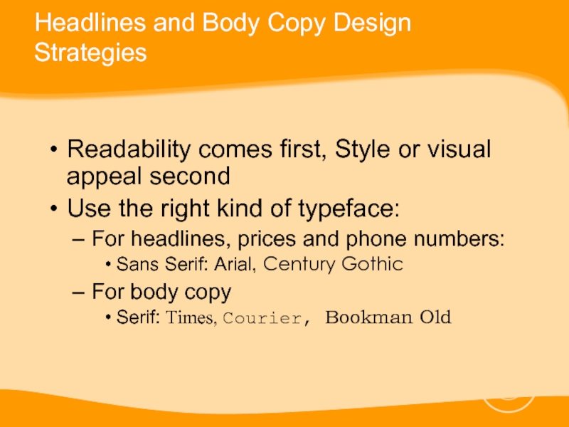
Readability comes first, Style or visual
appeal second
Use the right kind of typeface:
For headlines, prices and phone numbers:
Sans Serif: Arial, Century Gothic
For body copy
Serif: Times, Courier, Bookman Old
Use the right kind of typeface:
For headlines, prices and phone numbers:
Sans Serif: Arial, Century Gothic
For body copy
Serif: Times, Courier, Bookman Old
Слайд 38Headlines and Body Copy Design Strategies
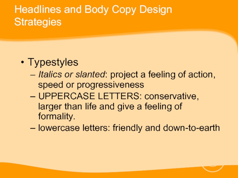
Typestyles
Italics or slanted: project a feeling
of action, speed or progressiveness
UPPERCASE LETTERS: conservative, larger than life and give a feeling of formality.
lowercase letters: friendly and down-to-earth
UPPERCASE LETTERS: conservative, larger than life and give a feeling of formality.
lowercase letters: friendly and down-to-earth
Слайд 39Headlines and Body Copy Design Strategies
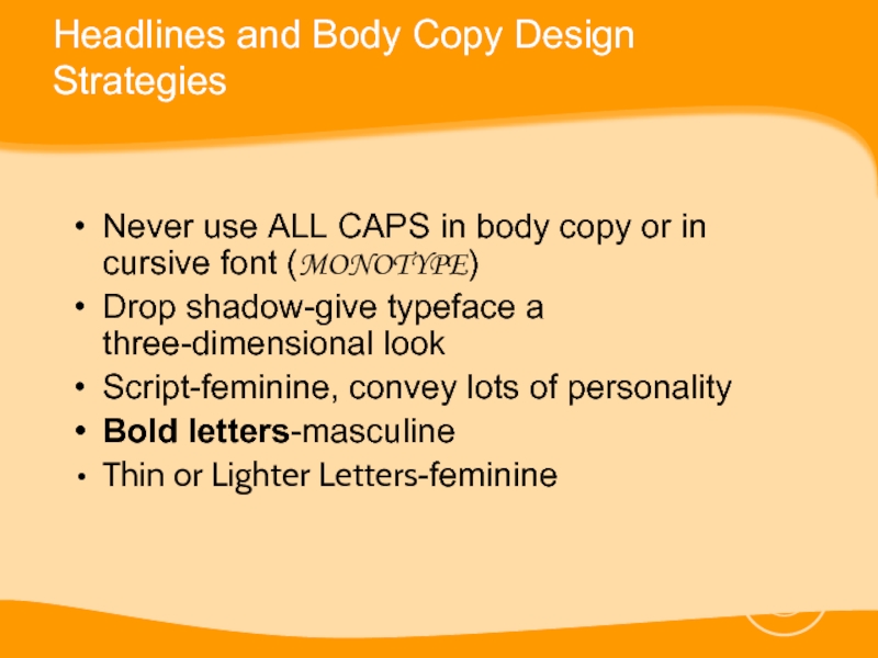
Never use ALL CAPS in body
copy or in cursive font (MONOTYPE)
Drop shadow-give typeface a three-dimensional look
Script-feminine, convey lots of personality
Bold letters-masculine
Thin or Lighter Letters-feminine
Drop shadow-give typeface a three-dimensional look
Script-feminine, convey lots of personality
Bold letters-masculine
Thin or Lighter Letters-feminine
Слайд 40Headlines and Body Copy Design Strategies
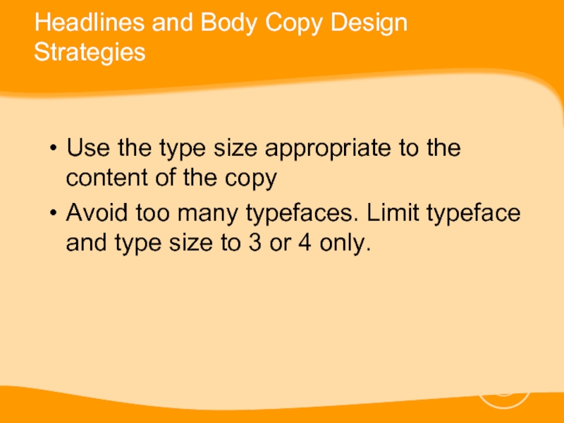
Use the type size appropriate to
the content of the copy
Avoid too many typefaces. Limit typeface and type size to 3 or 4 only.
Avoid too many typefaces. Limit typeface and type size to 3 or 4 only.
Слайд 41Headlines and Body Copy Design Strategies
Use clear readable typeface for body
copy
Body copy type size minimum of 12-14 pts.
Set body copy underneath the headline and photograph
Break long copy into shorter sections.
Body copy type size minimum of 12-14 pts.
Set body copy underneath the headline and photograph
Break long copy into shorter sections.
Слайд 42
Use graphic accents to emphasize key phrases
UNDERLINE CAPITAL, indented paragraphs, bold,
italic, colored, arrows→, yellow highlighting, etc
Avoid irregularly shaped blocks of body copy (i.e. silhouette of an object)
Avoid irregularly shaped blocks of body copy (i.e. silhouette of an object)
Headlines and Body Copy Design Strategies
Слайд 43Reminders
Don’t make your ad look too much like everybody else’s ad
Place
your logo at the upper left hand or bottom right hand corner
Always keep in mind the purpose of your ad and your target demographic
Always keep in mind the purpose of your ad and your target demographic
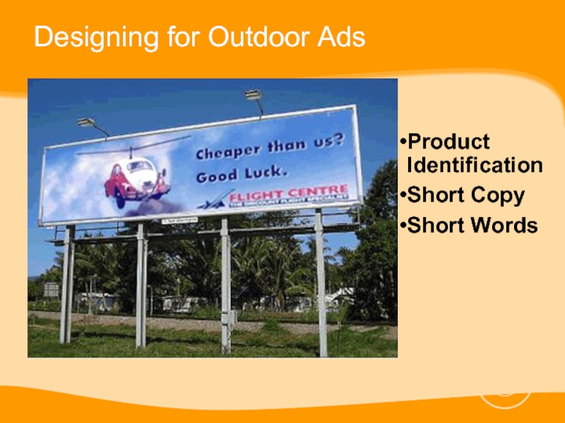
Слайд 44Designing for Outdoor Ads
Product Identification Is the product clearly visible?
Short Copy
Is the basic idea expressed quickly and with impact?
Short Words Can the reader read the copy at a distance?
Short Words Can the reader read the copy at a distance?
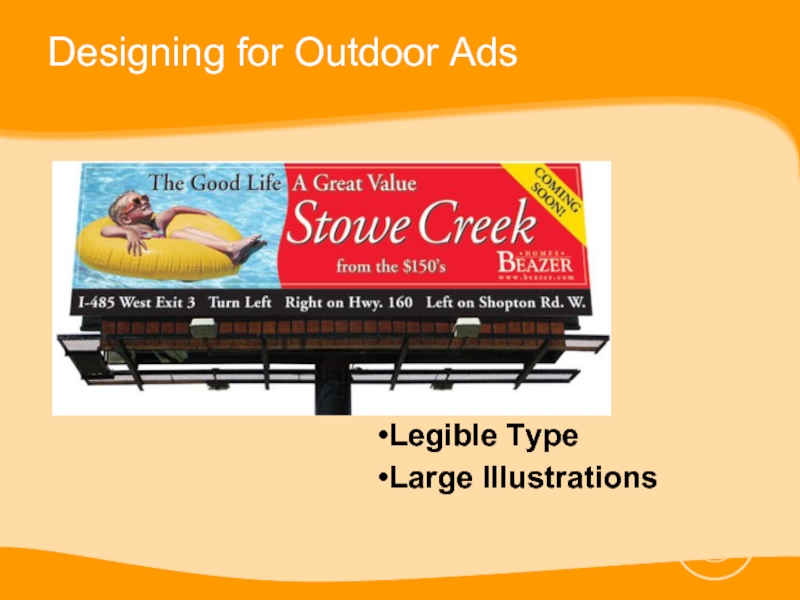
Слайд 46Designing for Outdoor Ads
Legible Type Is the copy legible while moving?
Large
Illustrations Do the illustrations demonstrate the product’s usage?
Are the illustrations visible from a distance?
Are the illustrations visible from a distance?
Слайд 48Designing for Outdoor Ads
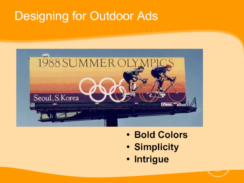
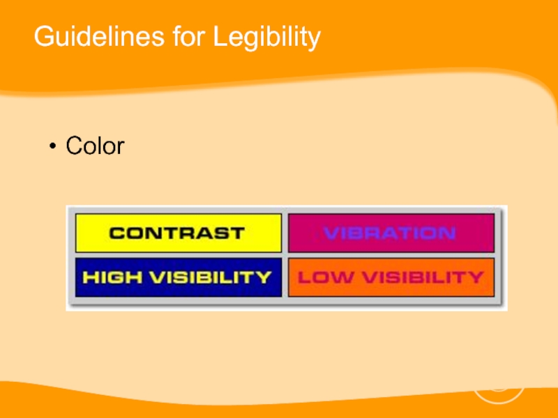
Bold Colors Do the colors have impact and
complement each other? Use colors with contrast. Try to avoid subtle color blends which belong in print.
Simplicity “Keep it simple” - does the background interfere with the basic idea?
Intrigue Is the consumer involved? Will it attract attention - does it have an IDEA?
Simplicity “Keep it simple” - does the background interfere with the basic idea?
Intrigue Is the consumer involved? Will it attract attention - does it have an IDEA?
Слайд 51Guidelines for Legibility
Typestyle
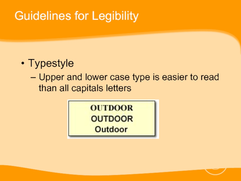
Upper and lower case type is easier to read
than all capitals letters
Слайд 52Guidelines for Legibility
Typestyle
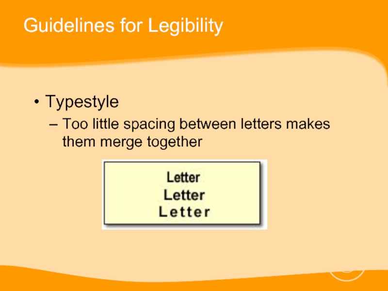
Too little spacing between letters makes them merge together
Слайд 53Guidelines for Legibility
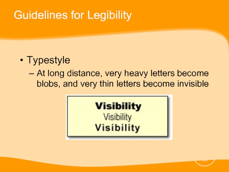
Typestyle
At long distance, very heavy letters become blobs, and
very thin letters become invisible
Слайд 54Guidelines for Legibility
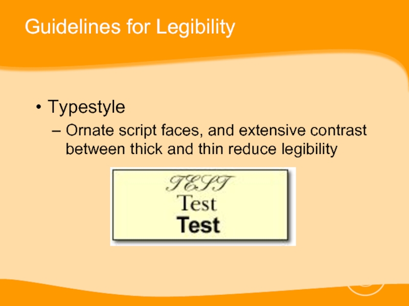
Typestyle
Ornate script faces, and extensive contrast between thick and
thin reduce legibility
