- Главная
- Разное
- Дизайн
- Бизнес и предпринимательство
- Аналитика
- Образование
- Развлечения
- Красота и здоровье
- Финансы
- Государство
- Путешествия
- Спорт
- Недвижимость
- Армия
- Графика
- Культурология
- Еда и кулинария
- Лингвистика
- Английский язык
- Астрономия
- Алгебра
- Биология
- География
- Детские презентации
- Информатика
- История
- Литература
- Маркетинг
- Математика
- Медицина
- Менеджмент
- Музыка
- МХК
- Немецкий язык
- ОБЖ
- Обществознание
- Окружающий мир
- Педагогика
- Русский язык
- Технология
- Физика
- Философия
- Химия
- Шаблоны, картинки для презентаций
- Экология
- Экономика
- Юриспруденция
Brand book by tailor brands презентация
Содержание
- 1. Brand book by tailor brands
- 2. Table Of Contents. SECTION 1 I
- 3. 01 This style guide is important.
- 4. Clearspace & Computation.
- 5. Logo Variations. Tailor Brands provides you with
- 6. Minimum Sizes. The logo is the key
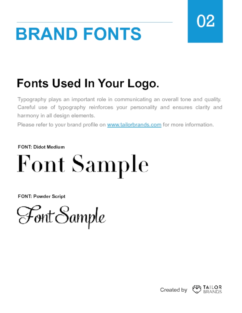
- 7. Fonts Used In Your Logo. Typography plays
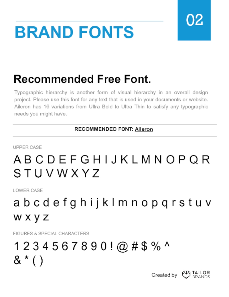
- 8. Recommended Free Font. A B C D
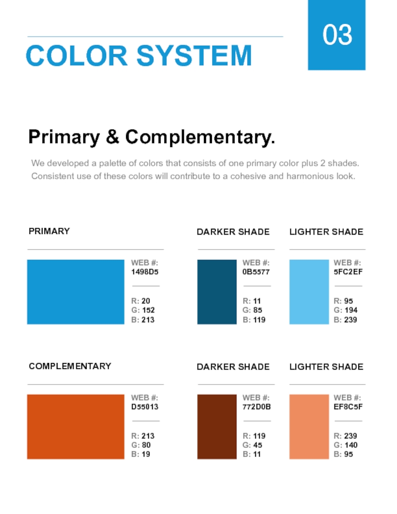
- 9. Primary & Complementary. We developed a palette
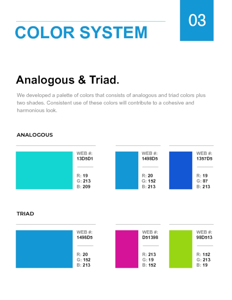
- 10. Analogous & Triad. We developed a
- 11. Correct Use Of Backgrounds. Images you use
- 12. 04 LOGO USE Incorrect Use Of
- 13. Incorrect Use Of Logos. Please follow these
- 14. PNG & EPS Formats. Depending on the
- 15. How To Resize Your Logo. PNG Since
- 16. Accessing Brand Assets. BRAND PROFILE Your Brand
- 17. Expand Your World. Below you will find
Слайд 2Table Of Contents.
SECTION 1 I LOGOTYPE
SECTION 2 I
SECTION 3 I COLOR SYSTEM
SECTION 4 I LOGO USE
SECTION 5 I LOGO FORMATS
SECTION 6 I RESIZING
SECTION 7 I BRAND ASSETS
SECTION 8 I MOCK UPS
GUIDELINES
3
7
11
13
16
17
18
19
Created by
Слайд 3
01
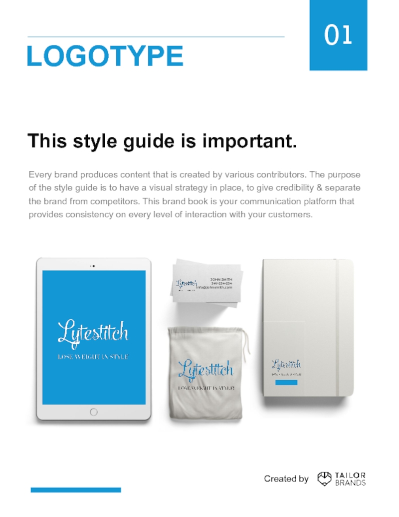
This style guide is important.
Every brand produces content that is created
JOHN SMITH
347-234-234
info@johnsmith.com
LOGOTYPE
Created by
Слайд 4
Clearspace & Computation.
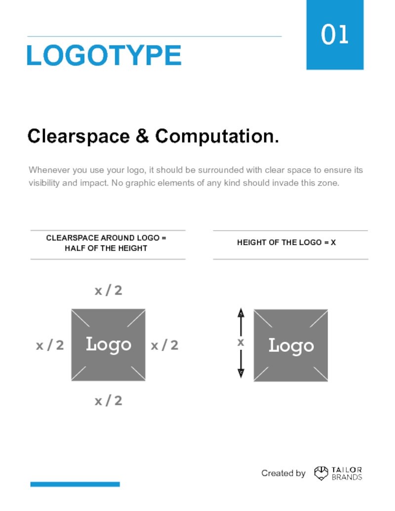
Whenever you use your logo, it should
CLEARSPACE AROUND LOGO =
HALF OF THE HEIGHT
HEIGHT OF THE LOGO = X
01
LOGOTYPE
Created by
Слайд 5Logo Variations.
Tailor Brands provides you with light & dark versions of
01
LOGOTYPE
DARK LOGO VERSION
LIGHT LOGO VERSION
Created by
Слайд 6Minimum Sizes.
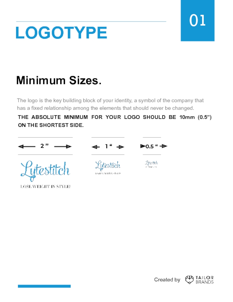
The logo is the key building block of your identity,
THE ABSOLUTE MINIMUM FOR YOUR LOGO SHOULD BE 10mm (0.5”)
ON THE SHORTEST SIDE.
01
LOGOTYPE
2 ”
Created by
Слайд 7Fonts Used In Your Logo.
Typography plays an important role in communicating
Please refer to your brand profile on www.tailorbrands.com for more information.
02
BRAND FONTS
FONT: Didot Medium
FONT: Powder Script
Created by
Слайд 8Recommended Free Font.
A B C D E F G H I
a b c d e f g h i j k l m n o p q r s t u v w x y z
1 2 3 4 5 6 7 8 9 0 ! @ # $ % ^
& * ( )
UPPER CASE
LOWER CASE
FIGURES & SPECIAL CHARACTERS
Typographic hierarchy is another form of visual hierarchy in an overall design project. Please use this font for any text that is used in your documents or website. Aileron has 16 variations from Ultra Bold to Ultra Thin to satisfy any typographic needs you might have.
RECOMMENDED FONT: Aileron
02
BRAND FONTS
Created by
Слайд 9Primary & Complementary.
We developed a palette of colors that consists of
PRIMARY
DARKER SHADE
LIGHTER SHADE
03
COLOR SYSTEM
COMPLEMENTARY
DARKER SHADE
LIGHTER SHADE
Слайд 10Analogous & Triad.
We developed a palette of colors that consists
03
COLOR SYSTEM
ANALOGOUS
TRIAD
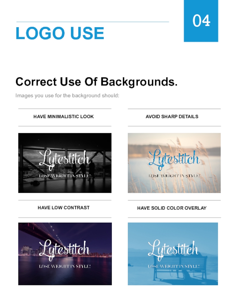
Слайд 11Correct Use Of Backgrounds.
Images you use for the background should:
04
LOGO USE
HAVE
AVOID SHARP DETAILS
HAVE LOW CONTRAST
HAVE SOLID COLOR OVERLAY
Слайд 12
04
LOGO USE
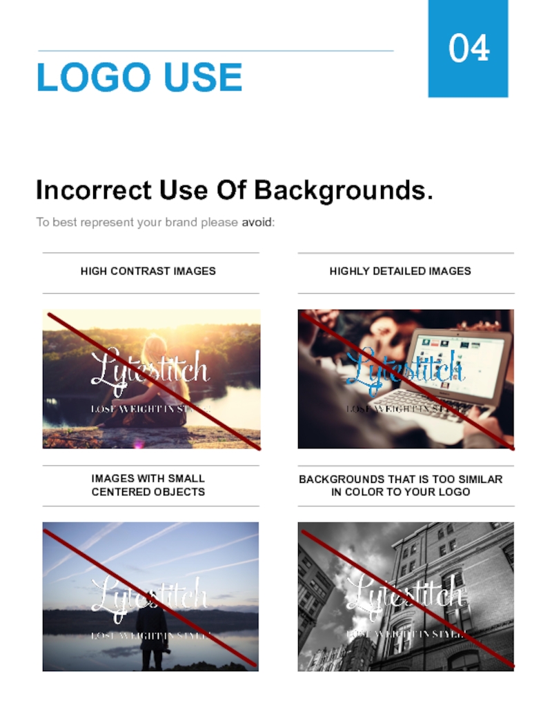
Incorrect Use Of Backgrounds.
To best represent your brand please avoid:
HIGH
HIGHLY DETAILED IMAGES
IMAGES WITH SMALL
CENTERED OBJECTS
BACKGROUNDS THAT IS TOO SIMILAR IN COLOR TO YOUR LOGO
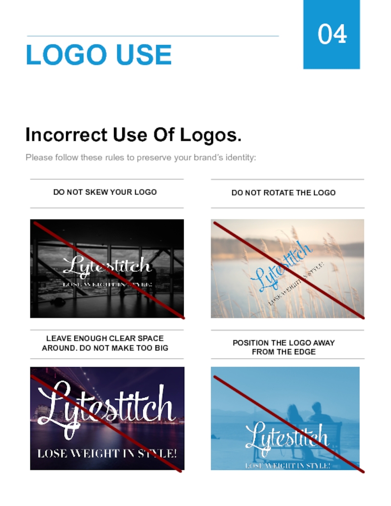
Слайд 13Incorrect Use Of Logos.
Please follow these rules to preserve your brand’s
04
LOGO USE
DO NOT SKEW YOUR LOGO
DO NOT ROTATE THE LOGO
LEAVE ENOUGH CLEAR SPACE AROUND. DO NOT MAKE TOO BIG
POSITION THE LOGO AWAY
FROM THE EDGE
Слайд 14PNG & EPS Formats.
Depending on the nature of the project, you
PNG file has a transparent background and is a high resolution raster file suitable best for web and small scale printing. Each Tailor Brands logo package comes with the original logo + dark & white versions of it.
Best for web & small scale printing.
Has a transparent background & can be placed over a colored background.
EPS is a vector file of a graphic, text or illustration. Because it’s a vector, it can be easily resized. An EPS file can be reopened and edited in a vector editing software such as Adobe Illustrator, Sketch or Photoshop.
Best for print.
Editable with a proper software.
05
LOGO FORMATS
Created by
Слайд 15How To Resize Your Logo.
PNG
Since PNG file is a raster file,
EPS
EPS is a vector file that can be resized and scaled up and down without a loss of quality and clarity. If you wish to print on very large or very small surfaces please use EPS file. EPS format could be saved as PDF, PNG or JPG formats in programs such as Photoshop, Illustrator or Sketch.
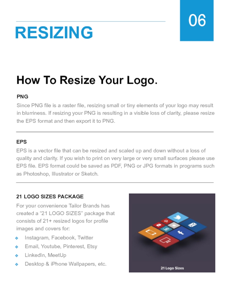
21 LOGO SIZES PACKAGE
For your convenience Tailor Brands has created a “21 LOGO SIZES” package that consists of 21+ resized logos for profile images and covers for:
Instagram, Facebook, Twitter
Email, Youtube, Pinterest, Etsy
LinkedIn, MeetUp
Desktop & iPhone Wallpapers, etc.
06
RESIZING
Слайд 16Accessing Brand Assets.
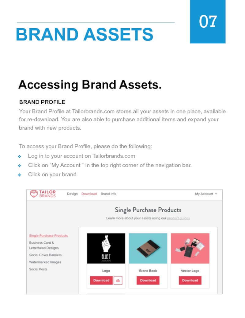
BRAND PROFILE
Your Brand Profile at Tailorbrands.com stores all your
To access your Brand Profile, please do the following:
Log in to your account on Tailorbrands.com
Click on “My Account “ in the top right corner of the navigation bar.
Click on your brand.
07
BRAND ASSETS
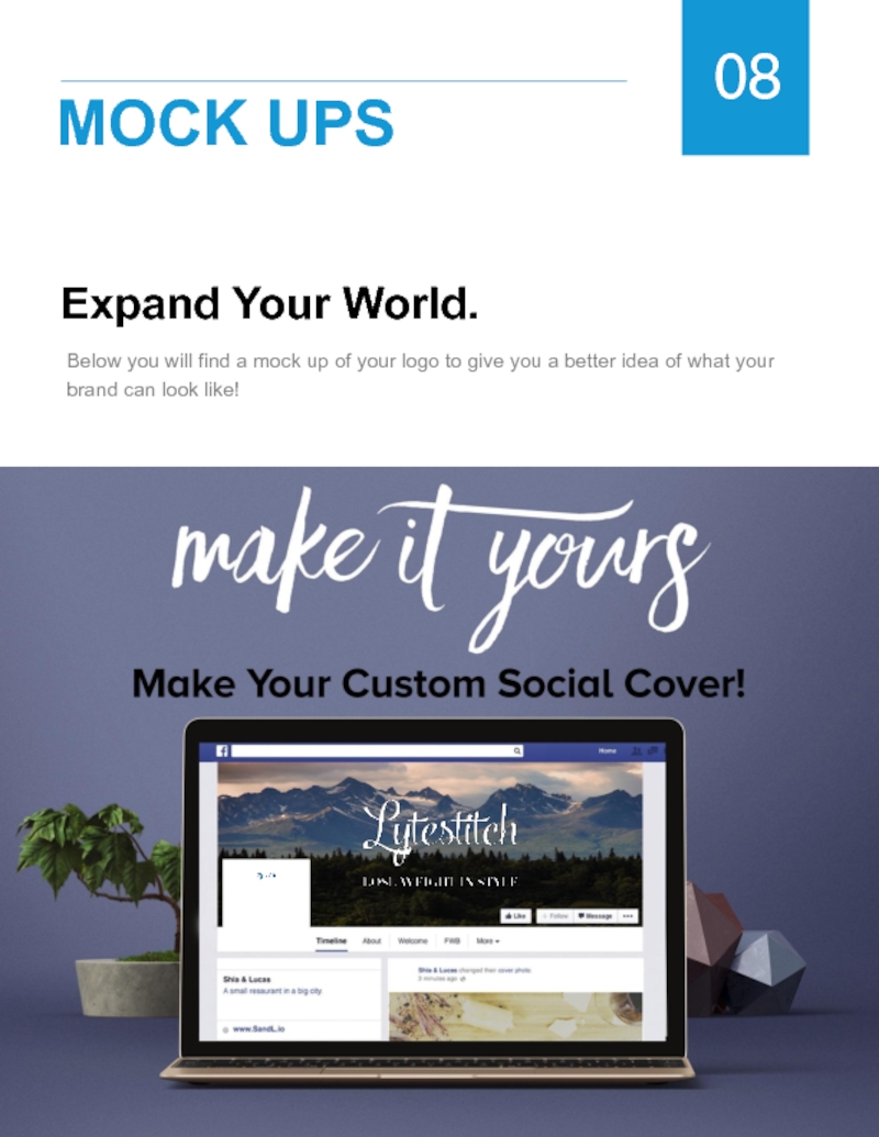
Слайд 17Expand Your World.
Below you will find a mock up of your
08
MOCK UPS

