- Главная
- Разное
- Дизайн
- Бизнес и предпринимательство
- Аналитика
- Образование
- Развлечения
- Красота и здоровье
- Финансы
- Государство
- Путешествия
- Спорт
- Недвижимость
- Армия
- Графика
- Культурология
- Еда и кулинария
- Лингвистика
- Английский язык
- Астрономия
- Алгебра
- Биология
- География
- Детские презентации
- Информатика
- История
- Литература
- Маркетинг
- Математика
- Медицина
- Менеджмент
- Музыка
- МХК
- Немецкий язык
- ОБЖ
- Обществознание
- Окружающий мир
- Педагогика
- Русский язык
- Технология
- Физика
- Философия
- Химия
- Шаблоны, картинки для презентаций
- Экология
- Экономика
- Юриспруденция
Organizing data graphical and nabular descriptive techniques презентация
Содержание
- 1. Organizing data graphical and nabular descriptive techniques
- 2. Learning Objectives Overall: To give students a
- 3. 2. Descriptive statistics involves arranging, summarizing, and
- 4. DATA MINING Most companies routinely collect data
- 5. DATA MINING is a collection of methods
- 6. 1. Marketing and sales: companies have lots
- 7. Finance: Mining of financial data can be
- 8. Statistical methods, such as hypothesis testing, are
- 9. 3. Product design: What particular combinations
- 10. 4. Production Imagine a factory running
- 11. 5. Fraud detections: Fraud can
- 12. YOU once received a telephone call from
- 13. Data mining is a large task
- 14. Statistics: All of the basic activities of
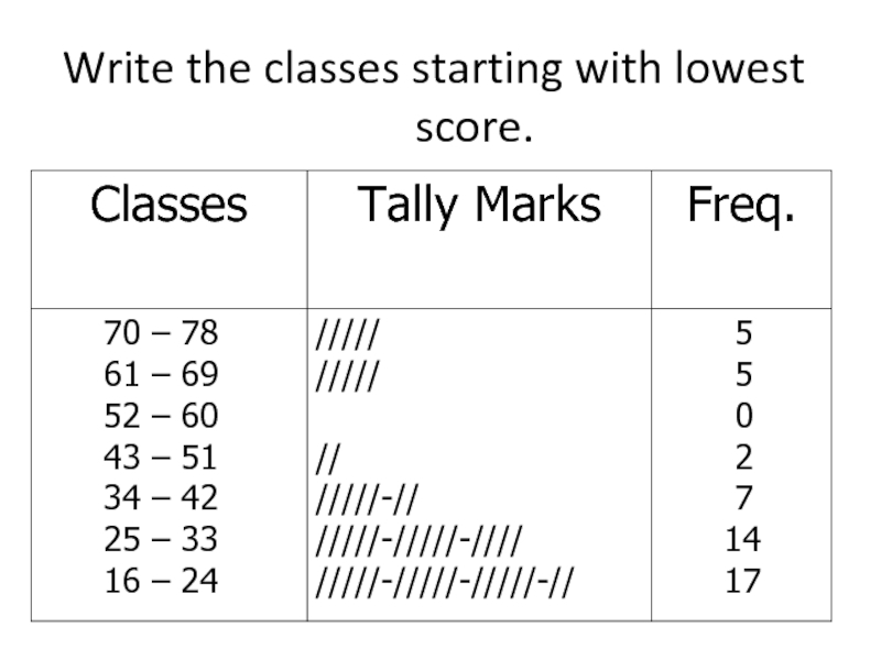
- 15. Some specialized statistical methods are particularly useful,
- 16. Computer science: Efficient algorithms (computer instructions) are
- 17. Optimization: These methods help you achieve a
- 18. Alternatively, the goal might be more vague
- 19. WHAT IS PROBABILITY? Probability is a what
- 20. You might learn, for example, that an
- 21. Here are additional examples of situations where
- 22. 3. What are the chances that a
- 23. Probability is the inverse of statistics. Whereas
- 24. Probability also works together with statistics by
- 26. 2. Definitions… A variable [Typically called a
- 27. 2. We Deal with “2” Types of
- 28. 2. Quantitative/Numerical Data… Quantitative Data is further
- 29. 2. Qualitative/Categorical Data Nominal Data [has no
- 30. 2. Graphical & Tabular Techniques for Nominal
- 31. 2. Nominal Data (Tabular Summary) -
- 32. 2. Nominal Data (Frequency) Bar Charts are
- 33. 2. Nominal Data (Relative Frequency) Pie Charts show relative frequencies…
- 34. Frequency Distributions Definition A frequency distribution for
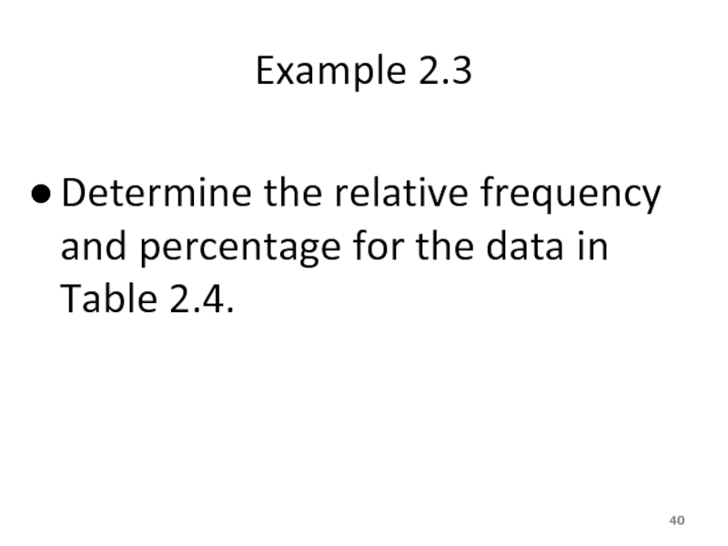
- 35. Example 2.2 A sample of 30 employees
- 36. Example 2.2 Construct a frequency distribution table for these data.
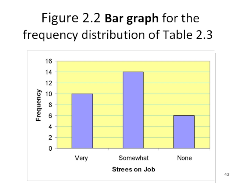
- 37. Solution 2.2 Table 2.2 Frequency Distribution of Stress on Job
- 38. Relative Frequency and Percentage Distributions Calculating Relative Frequency of a Category
- 39. Relative Frequency and Percentage Distributions cont. Calculating
- 40. Example 2.3 Determine the relative frequency and percentage for the data in Table 2.4.
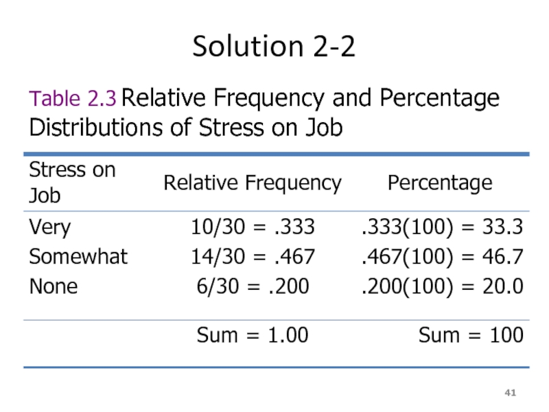
- 41. Solution 2-2 Table 2.3 Relative Frequency and Percentage Distributions of Stress on Job
- 42. Graphical Presentation of Qualitative Data Definition A
- 43. Figure 2.2 Bar graph for the frequency
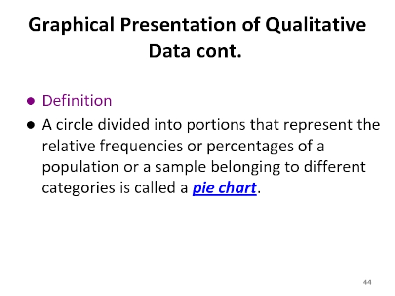
- 44. Graphical Presentation of Qualitative Data cont. Definition
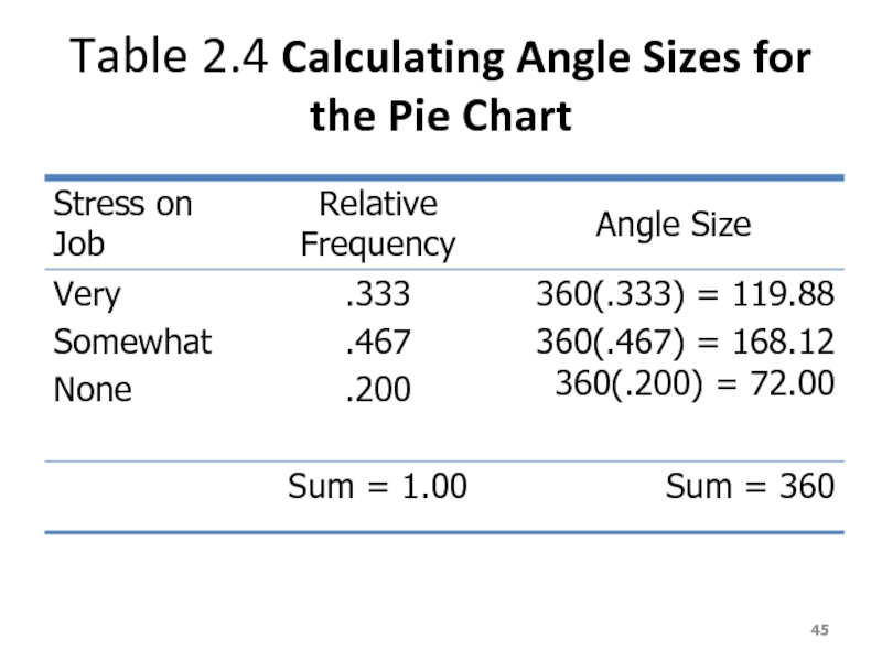
- 45. Table 2.4 Calculating Angle Sizes for the Pie Chart
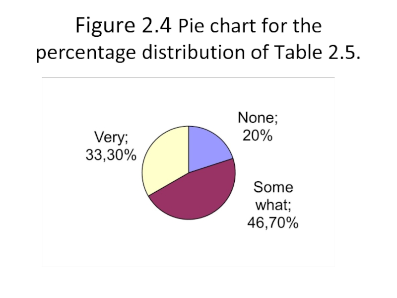
- 46. Figure 2.4 Pie chart for the percentage distribution of Table 2.5.
- 47. ORGANIZING AND GRAPHING QUANTITATIVE DATA Frequency Distributions
- 48. Frequency Distributions Table
- 49. Frequency Distributions cont. Definition A frequency
- 50. Essential Question : How do we construct a frequency distribution table?
- 51. Process of Constructing a Frequency Table
- 52. STEP 2. Determine the tentative number of
- 53. STEP 3. Find the class width by
- 54. STEP 4. Write the classes or categories
- 55. STEP 5. Determine the frequency for each
- 56. When constructing frequency tables, the following guidelines
- 57. 3. All classes should have the same
- 58. Let’s Try!!! Time magazine collected information
- 59. 19 18 30 40 41 33
- 60. Determine the range. R = Highest Value
- 61. Determine the tentative number of classes (K).
- 62. Find the class width (c).
- 63. Write the classes starting with lowest score.
- 64. Using Table: What is the lower class
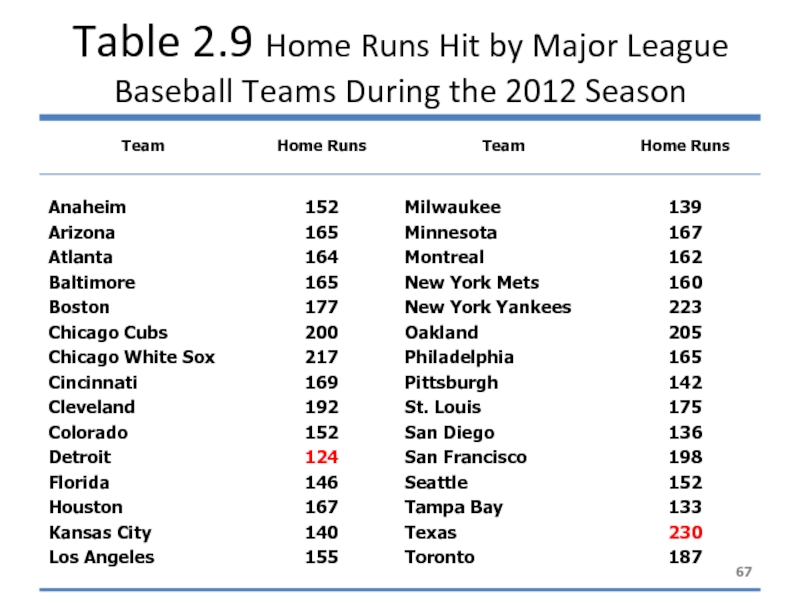
- 66. Example Table 2.9 gives the total
- 67. Table 2.9 Home Runs Hit by Major League Baseball Teams During the 2012 Season
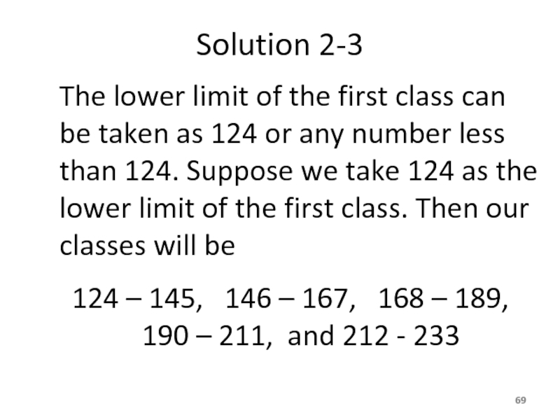
- 68. Solution 2-3 Now we round this approximate width to a convenient number – say, 22.
- 69. Solution 2-3 The lower limit of the
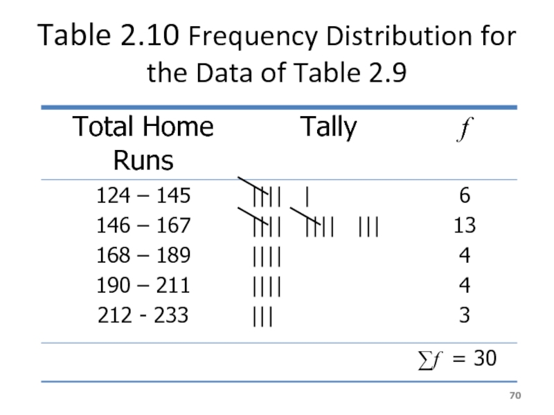
- 70. Table 2.10 Frequency Distribution for the Data of Table 2.9
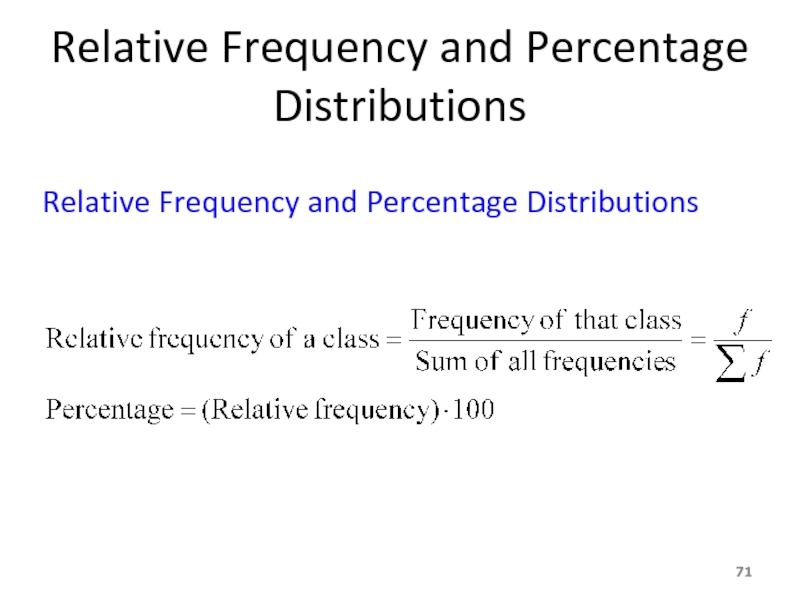
- 71. Relative Frequency and Percentage Distributions Relative Frequency and Percentage Distributions
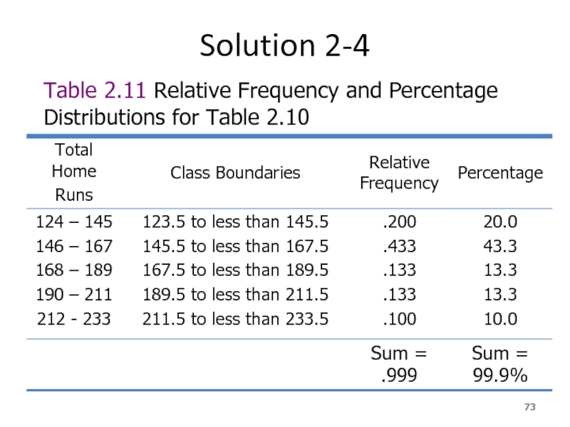
- 72. Example 2-4 Calculate the relative frequencies and percentages for Table 2.10
- 73. Solution 2-4 Table 2.11 Relative Frequency and Percentage Distributions for Table 2.10
- 74. Graphing Grouped Data Definition A histogram is
- 75. Figure 2.3 Frequency histogram for Table 2.10.
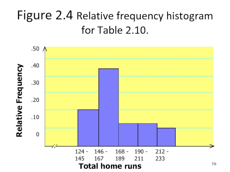
- 76. Figure 2.4 Relative frequency histogram for Table
- 77. Graphing Grouped Data cont. Definition A graph
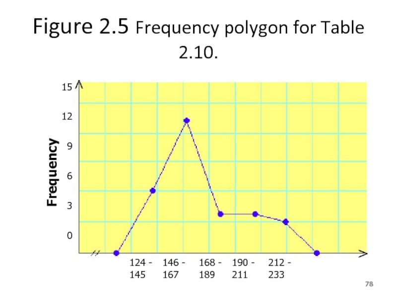
- 78. Figure 2.5 Frequency polygon for Table 2.10.
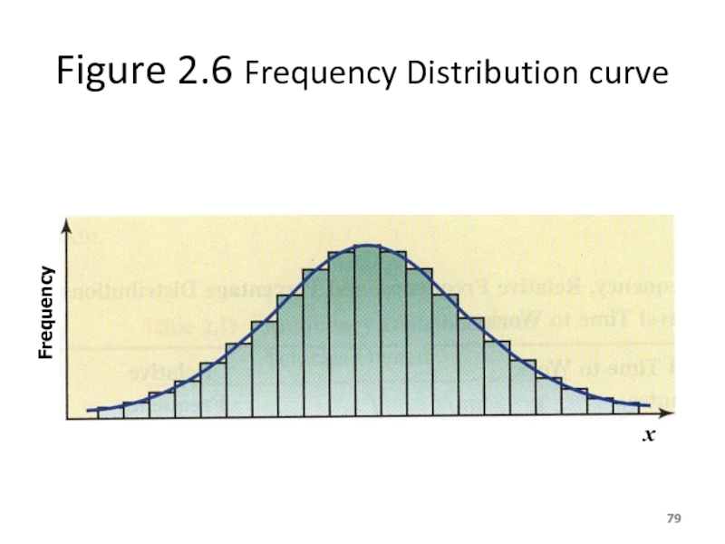
- 79. Figure 2.6 Frequency Distribution curve Frequency x
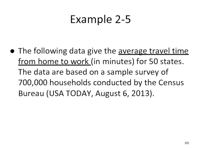
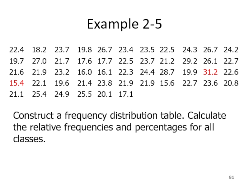
- 80. Example 2-5 The following data give the
- 81. Example 2-5 Construct a
- 82. Solution 2-5
- 83. Solution 2-5 Table 2.12 Frequency, Relative Frequency,
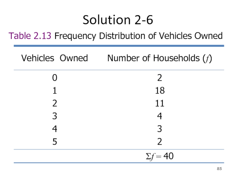
- 84. Example 2-6 The administration
- 85. Solution 2-6 Table 2.13 Frequency Distribution of Vehicles Owned
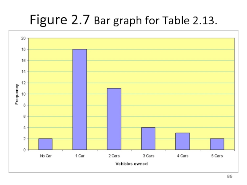
- 86. Figure 2.7 Bar graph for Table 2.13.
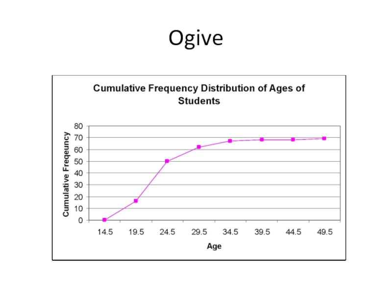
- 87. Ogive The ogive is a graph that
- 88. Ogive
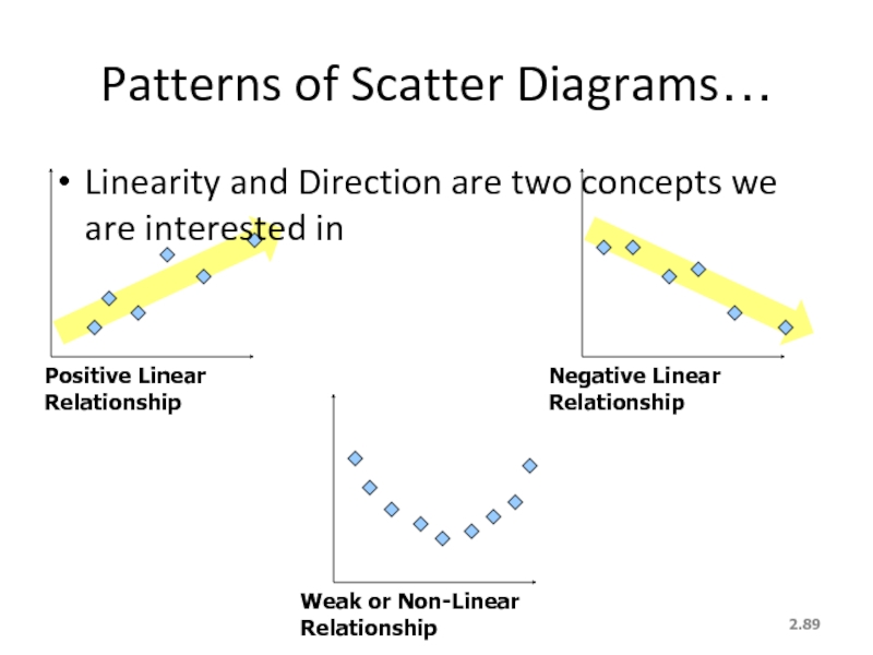
- 89. 2.
Слайд 12.
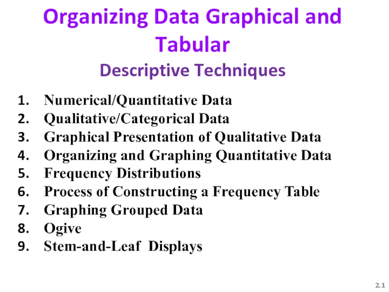
Organizing Data Graphical and Tabular
Descriptive Techniques
Numerical/Quantitative Data
Qualitative/Categorical Data
Graphical Presentation of
Organizing and Graphing Quantitative Data
Frequency Distributions
Process of Constructing a Frequency Table
Graphing Grouped Data
Ogive
Stem-аnd-Leaf Displays
Слайд 2Learning Objectives
Overall: To give students a basic understanding of best way
Specific: Students will be able to
Understand Types of data
Draw Tables
Draw Graphs
Make Frequency distribution………….
Слайд 32.
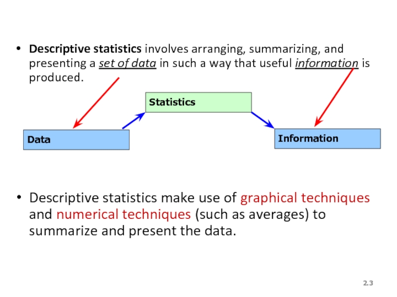
Descriptive statistics involves arranging, summarizing, and presenting a set of data
Descriptive statistics make use of graphical techniques and numerical techniques (such as averages) to summarize and present the data.
Data
Statistics
Information
Слайд 4DATA MINING
Most companies routinely collect data – at the cash register
Слайд 5DATA MINING is a collection of methods for obtaining useful knowledge
Слайд 61. Marketing and sales: companies have lots of information about past
Слайд 7Finance: Mining of financial data can be useful in forming and
Слайд 8Statistical methods, such as hypothesis testing, are helpful as part of
Слайд 9 3. Product design: What particular combinations of features are customers
Слайд 104. Production
Imagine a factory running 24/7 with thousands of partially
Слайд 11 5. Fraud detections:
Fraud can affect many areas of business,
Слайд 12YOU once received a telephone call from your credit card company
Слайд 13
Data mining is a large task that involves combining resources from
Слайд 14Statistics: All of the basic activities of statistics are involved: a
Слайд 15Some specialized statistical methods are particularly useful, including classification analysis (also
Слайд 16Computer science: Efficient algorithms (computer instructions) are needed for collecting, maintaining,
Слайд 17Optimization:
These methods help you achieve a goal, which might be very
Слайд 18Alternatively, the goal might be more vague such as obtaining a
Слайд 19 WHAT IS PROBABILITY?
Probability is a what if tool for understanding risk
Слайд 20You might learn, for example, that an international project has only
Слайд 21 Here are additional examples of situations where finding the appropriate answer
Given the nature of an investment portfolio and a set of assumptions that describe how financial markets work, what are the chances that you will profit over a one-year horizon?
What are the chances of rain tomorrow? What are the chances that next winter will be cold enough so that your heating-oil business will make a profit?
Слайд 223. What are the chances that a foreign country (where you
4. What are the chances that the college student you just interviewed for a job will become a valued employee over the coming months?
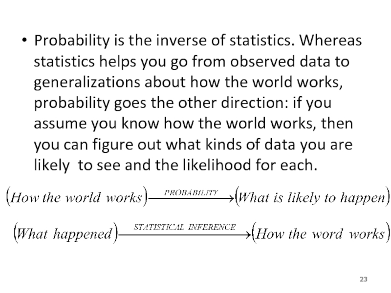
Слайд 23Probability is the inverse of statistics. Whereas statistics helps you go
Слайд 24Probability also works together with statistics by providing a solid foundation
Слайд 262.
Definitions…
A variable [Typically called a “random” variable since we do not
E.g. student grades, weight of a potato, # heads in 10 flips of a coin, etc.
Typically denoted with a capital letter: X, Y, Z…
The values of the variable are the range of possible values for a variable.
E.g. student marks (0..100)
Data are the observed values of a random variable.
E.g. student marks: {67, 74, 71, 83, 93, 55, 48}
Слайд 272.
We Deal with “2” Types of Data
Numerical/Quantitative Data [Real Numbers]:
* height
*
* temperature
Qualitative/Categorical Data [Labels rather than numbers]:
* favorite color
* Gender
* SES
Слайд 282.
Quantitative/Numerical Data…
Quantitative Data is further broken down into
Continuous Data – Data
Discrete Data – Data can only be very specific values which we can list. Normally count data [# of firecrackers in a package of 100 that fail to pop, # of accidents on the UTA campus each week, etc]
Слайд 292.
Qualitative/Categorical Data
Nominal Data [has no natural order to the values].
E.g.
Arithmetic operations don’t make any sense (e.g. does Widowed ÷ 2 = Married?!)
Ordinal Data [values have a natural order]:
E.g. College course rating system: poor = 1, fair = 2, good = 3, very good = 4, excellent = 5
Слайд 302.
Graphical & Tabular Techniques for Nominal Data…
The only allowable calculation on
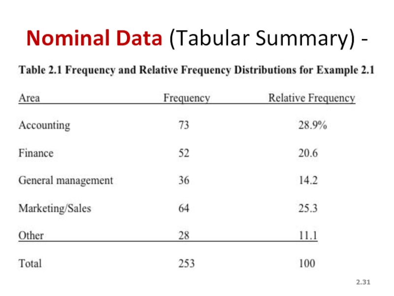
We can summarize the data in a table that presents the categories and their counts called a frequency distribution.
A relative frequency distribution lists the categories and the proportion with which each occurs.
Since Nominal data has no order, if we arrange the outcomes from the most frequently occurring to the least frequently occurring, we call this a “pareto chart”
Слайд 322.
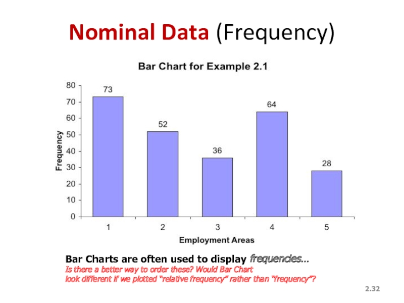
Nominal Data (Frequency)
Bar Charts are often used to display frequencies…
Is there
look different if we plotted “relative frequency” rather than “frequency”?
Слайд 34Frequency Distributions
Definition
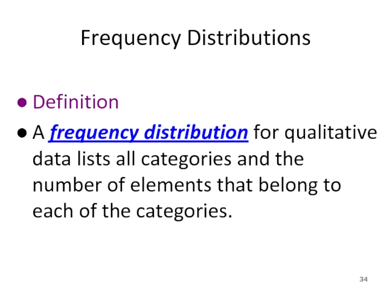
A frequency distribution for qualitative data lists all categories and
Слайд 35Example 2.2
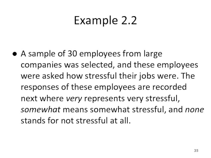
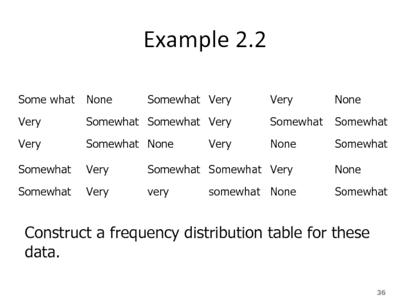
A sample of 30 employees from large companies was selected,
Слайд 39Relative Frequency and Percentage Distributions cont.
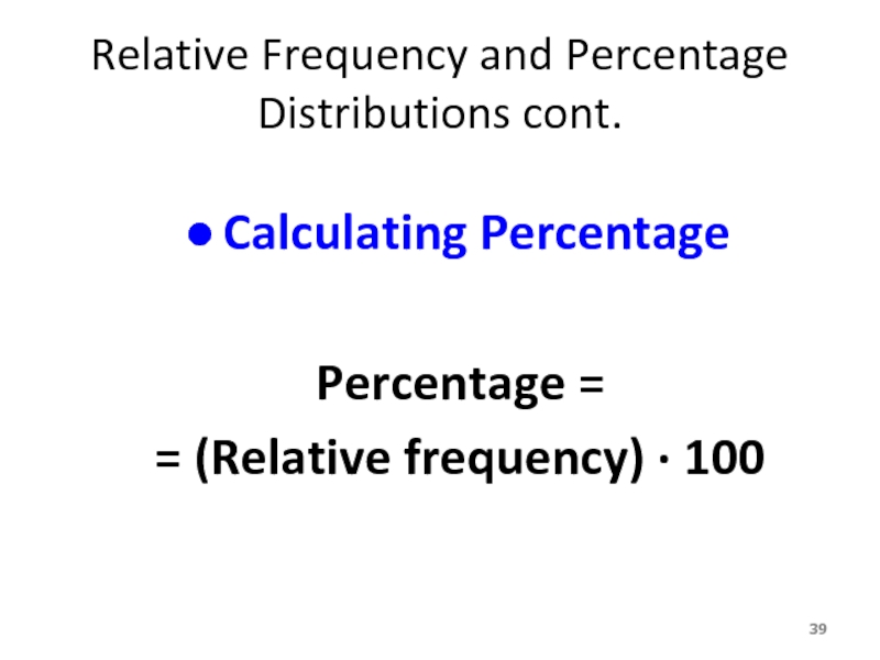
Calculating Percentage
Percentage =
= (Relative frequency)
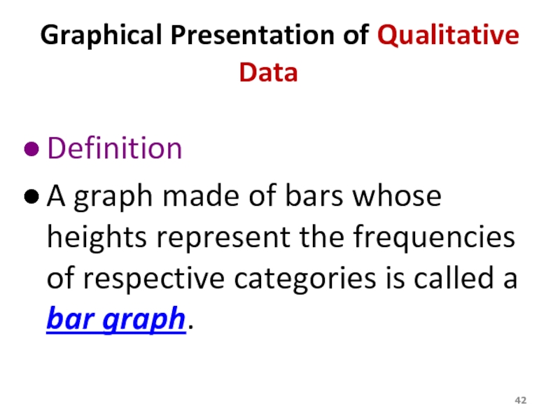
Слайд 42Graphical Presentation of Qualitative Data
Definition
A graph made of bars whose heights
Слайд 44Graphical Presentation of Qualitative Data cont.
Definition
A circle divided into portions that
Слайд 47ORGANIZING AND GRAPHING QUANTITATIVE DATA
Frequency Distributions
Constructing Frequency Distribution Tables
Relative and Percentage
Graphing Grouped Data
Histograms
Polygons
Слайд 48Frequency Distributions
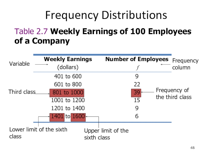
Table 2.7 Weekly Earnings of 100 Employees of a Company
Variable
Third class
Lower limit of the sixth class
Upper limit of the sixth class
Frequency of the third class
Frequency column
Слайд 49Frequency Distributions cont.
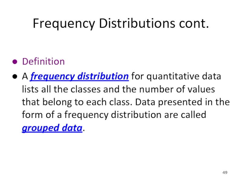
Definition
A frequency distribution for quantitative data lists all
Слайд 51Process of Constructing a Frequency Table
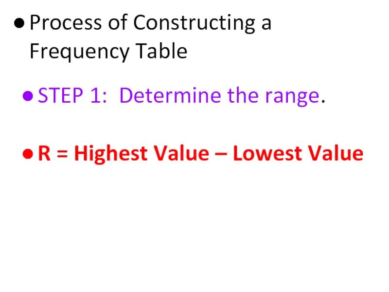
STEP 1: Determine the range.
R = Highest Value – Lowest Value
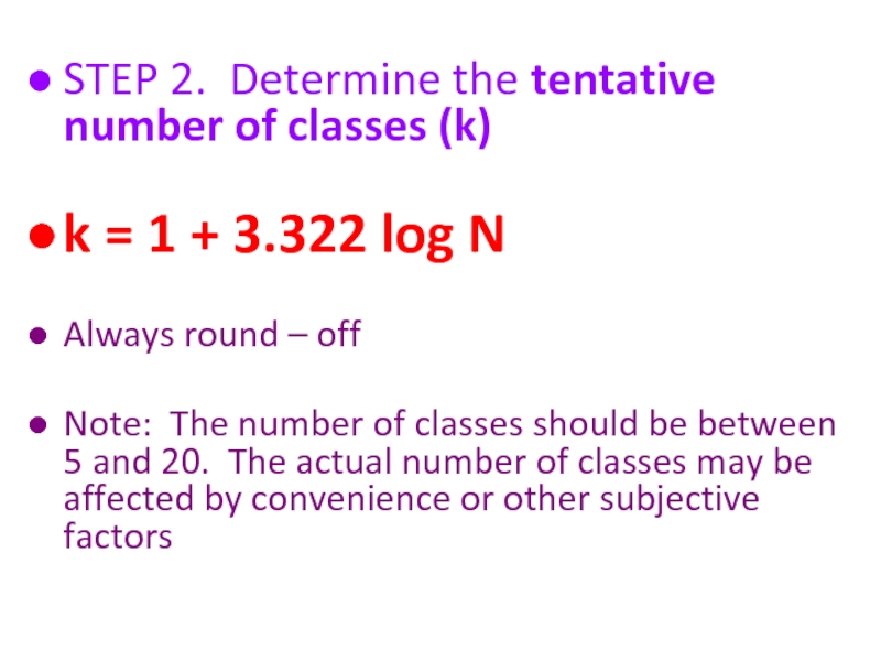
Слайд 52STEP 2. Determine the tentative number of classes (k)
k = 1
Always round – off
Note: The number of classes should be between 5 and 20. The actual number of classes may be affected by convenience or other subjective factors
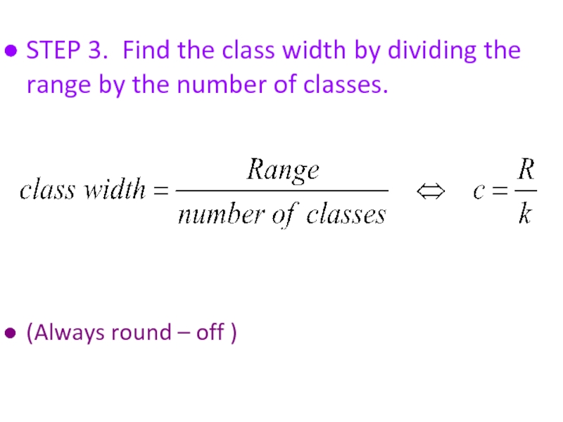
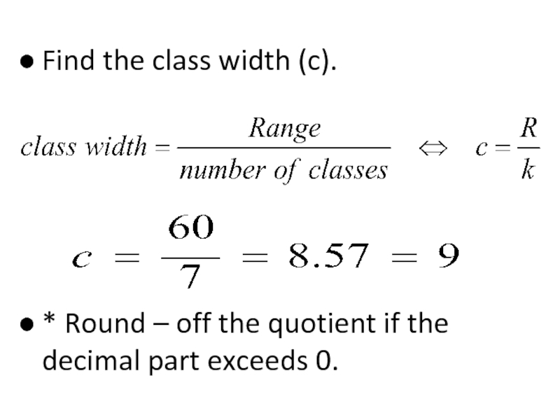
Слайд 53STEP 3. Find the class width by dividing the range by
(Always round – off )
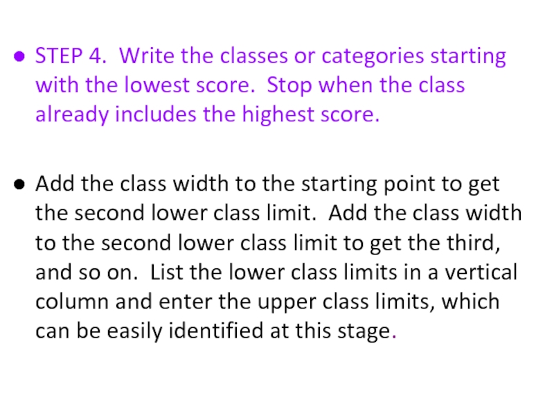
Слайд 54STEP 4. Write the classes or categories starting with the lowest
Add the class width to the starting point to get the second lower class limit. Add the class width to the second lower class limit to get the third, and so on. List the lower class limits in a vertical column and enter the upper class limits, which can be easily identified at this stage.
Слайд 55STEP 5. Determine the frequency for each class by referring to
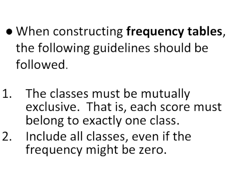
Слайд 56When constructing frequency tables, the following guidelines should be followed.
The classes
Include all classes, even if the frequency might be zero.
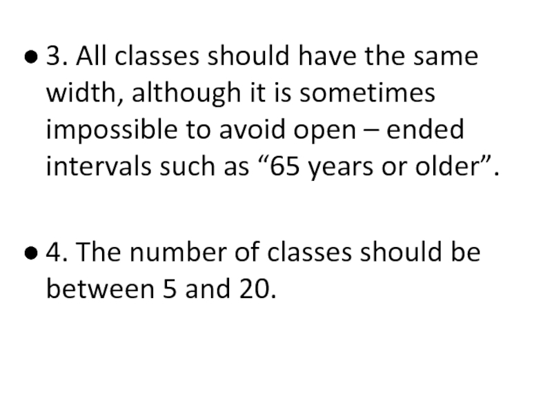
Слайд 573. All classes should have the same width, although it is
4. The number of classes should be between 5 and 20.
Слайд 58Let’s Try!!!
Time magazine collected information on all 464 people who
Слайд 5919 18 30 40 41 33 73 25
23 25
47 69 20 31 18 24 35 24
17 36 65 70 22 25 65 16
24 29 42 37 26 46 27 63
21 27 23 25 71 37 75 25
27 23
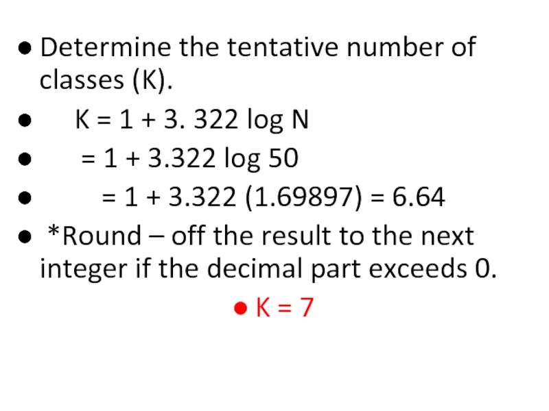
Слайд 61Determine the tentative number of classes (K).
K =
= 1 + 3.322 log 50
= 1 + 3.322 (1.69897) = 6.64
*Round – off the result to the next integer if the decimal part exceeds 0.
K = 7
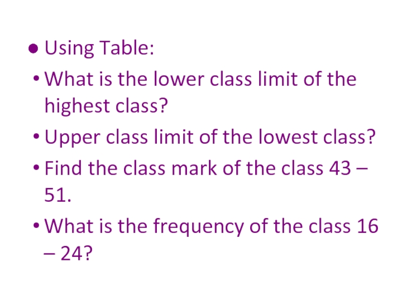
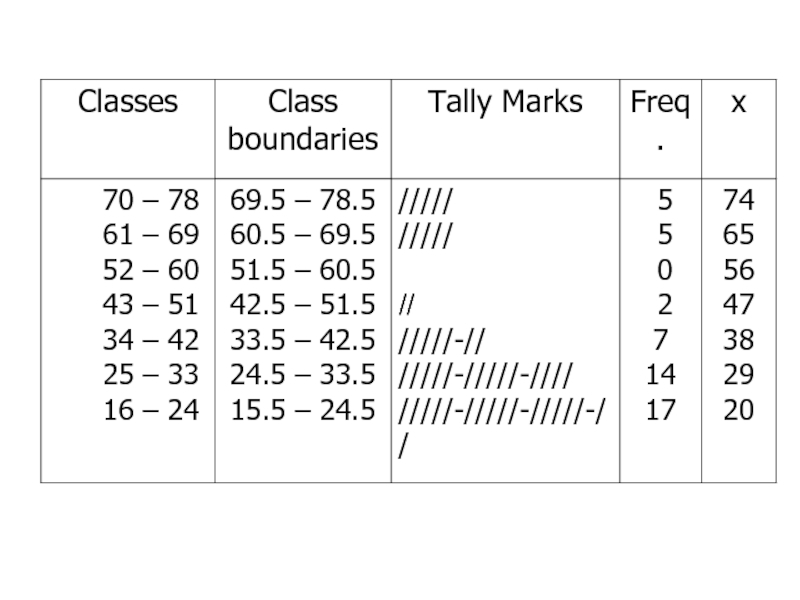
Слайд 64Using Table:
What is the lower class limit of the highest class?
Upper class limit of the lowest class?
Find the class mark of the class 43 – 51.
What is the frequency of the class 16 – 24?
Слайд 66Example
Table 2.9 gives the total home runs hit by all
Слайд 69Solution 2-3
The lower limit of the first class can be taken
124 – 145, 146 – 167, 168 – 189, 190 – 211, and 212 - 233
Слайд 71Relative Frequency and Percentage Distributions
Relative Frequency and Percentage Distributions
Слайд 74Graphing Grouped Data
Definition
A histogram is a graph in which classes are
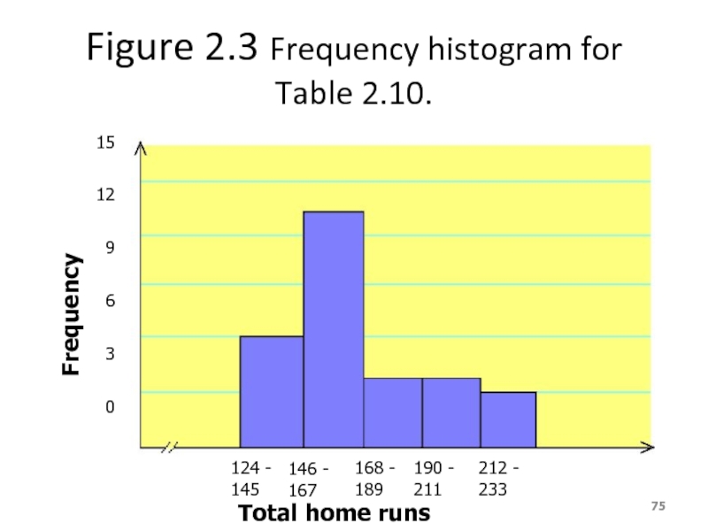
Слайд 75Figure 2.3 Frequency histogram for Table 2.10.
124 - 145
146 - 167
168
190 - 211
212 - 233
Total home runs
15
12
9
6
3
0
Frequency
Слайд 76Figure 2.4 Relative frequency histogram for Table 2.10.
124 - 145
146 -
168 - 189
190 - 211
212 - 233
Total home runs
.50
.40
.30
.20
.10
0
Relative Frequency
Слайд 77Graphing Grouped Data cont.
Definition
A graph formed by joining the midpoints of
Слайд 78Figure 2.5 Frequency polygon for Table 2.10.
124 - 145
146 - 167
168
190 - 211
212 - 233
15
12
9
6
3
0
Frequency
Слайд 80Example 2-5
The following data give the average travel time from home
Слайд 81Example 2-5
Construct a frequency distribution table. Calculate the relative
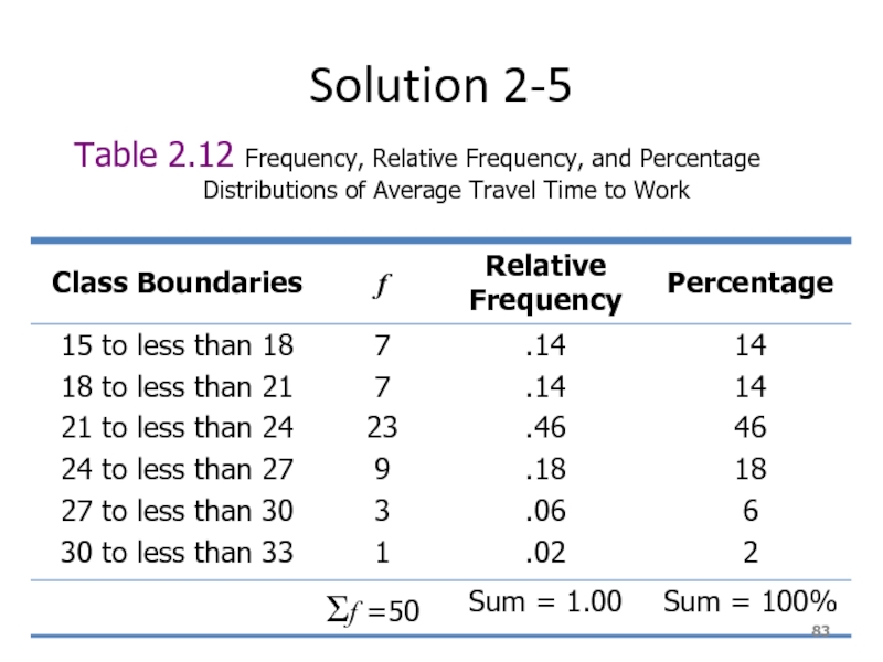
Слайд 83Solution 2-5
Table 2.12 Frequency, Relative Frequency, and Percentage
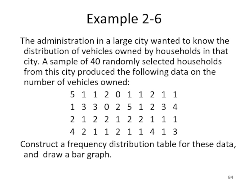
Слайд 84Example 2-6
The administration in a large city wanted
5 1 1 2 0 1 1 2 1 1
1 3 3 0 2 5 1 2 3 4
2 1 2 2 1 2 2 1 1 1
4 2 1 1 2 1 1 4 1 3
Construct a frequency distribution table for these data, and draw a bar graph.
Слайд 87Ogive
The ogive is a graph that represents the cumulative frequencies for
Step 1. Find the cumulative frequency for each class.
Step 2. Draw the x and y axes. Label the x-axis with the class boundaries.
Step 3. Plot the cumulative frequency at each upper class boundary.
Слайд 892.
Patterns of Scatter Diagrams…
Linearity and Direction are two concepts we are
Positive Linear Relationship
Negative Linear Relationship
Weak or Non-Linear Relationship







![2.We Deal with “2” Types of DataNumerical/Quantitative Data [Real Numbers]: * height * weight * temperature Qualitative/Categorical Data](/img/tmb/5/492282/c75c50d88784f75a8639c2db662436ac-800x.jpg)
![2.Qualitative/Categorical DataNominal Data [has no natural order to the values]. E.g. responses to questions about](/img/tmb/5/492282/15305a1dbb4fb327375c9d0a5397d084-800x.jpg)
