- Главная
- Разное
- Дизайн
- Бизнес и предпринимательство
- Аналитика
- Образование
- Развлечения
- Красота и здоровье
- Финансы
- Государство
- Путешествия
- Спорт
- Недвижимость
- Армия
- Графика
- Культурология
- Еда и кулинария
- Лингвистика
- Английский язык
- Астрономия
- Алгебра
- Биология
- География
- Детские презентации
- Информатика
- История
- Литература
- Маркетинг
- Математика
- Медицина
- Менеджмент
- Музыка
- МХК
- Немецкий язык
- ОБЖ
- Обществознание
- Окружающий мир
- Педагогика
- Русский язык
- Технология
- Физика
- Философия
- Химия
- Шаблоны, картинки для презентаций
- Экология
- Экономика
- Юриспруденция
Design principles презентация
Содержание
- 1. Design principles
- 2. 06 Design Basics (a few tools)
- 3. Fundamental Questions When starting a new design
- 4. Hierarchy Movement Balance – asymmetrical &
- 5. Lead your viewer through information in
- 6. What is the most important information? What
- 7. Scale: relative size Contrast: colour, value, texture…..
- 8. Value: light to dark area Color: colour
- 9. contrast
- 10. Where do you look first, second third?
- 11. Where do you look first, second third?
- 12. Contrast of face against dark background. Direct
- 13. contrast
- 14. contrast
- 15. contrast
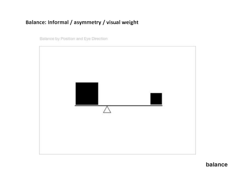
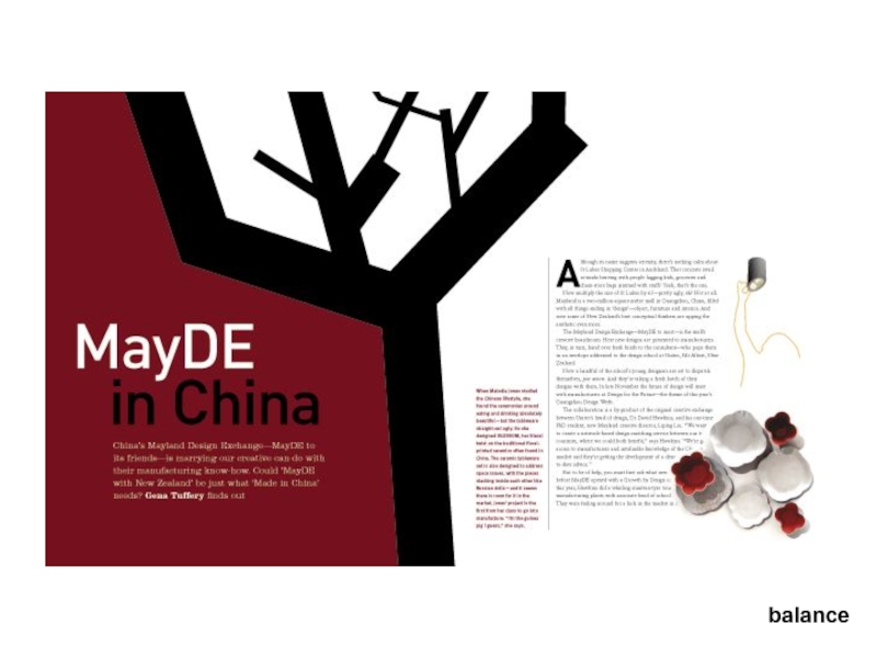
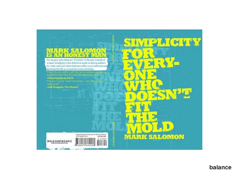
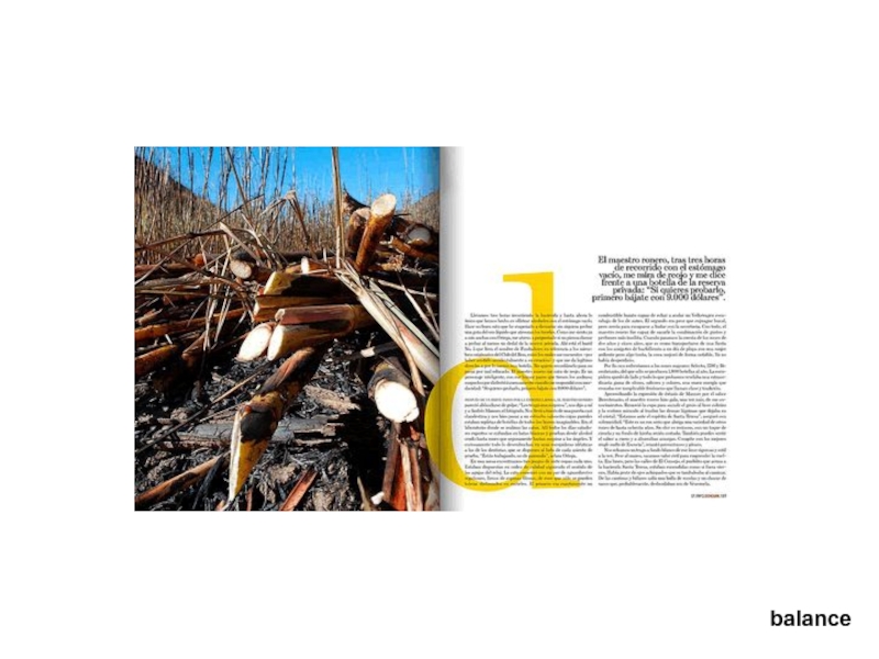
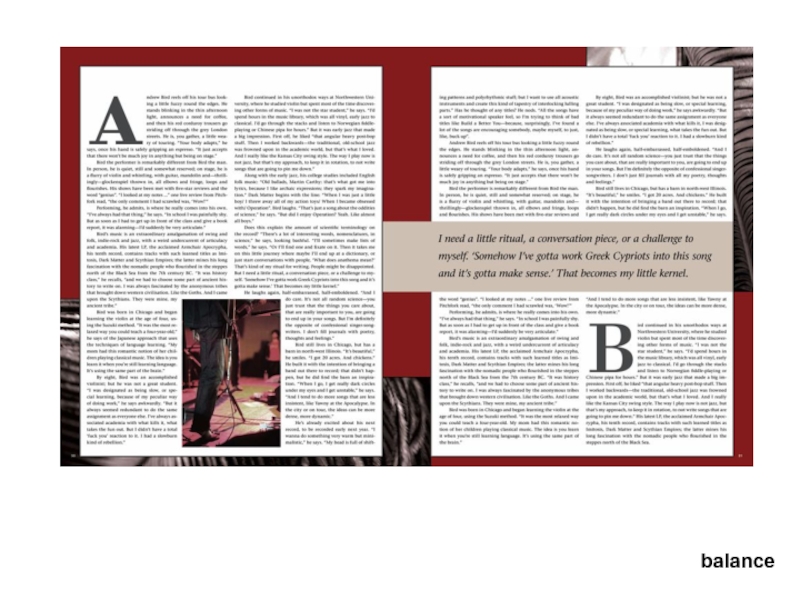
- 16. Balance Can be achieved using:
- 17. Balance: Informal / asymmetry / visual weight balance
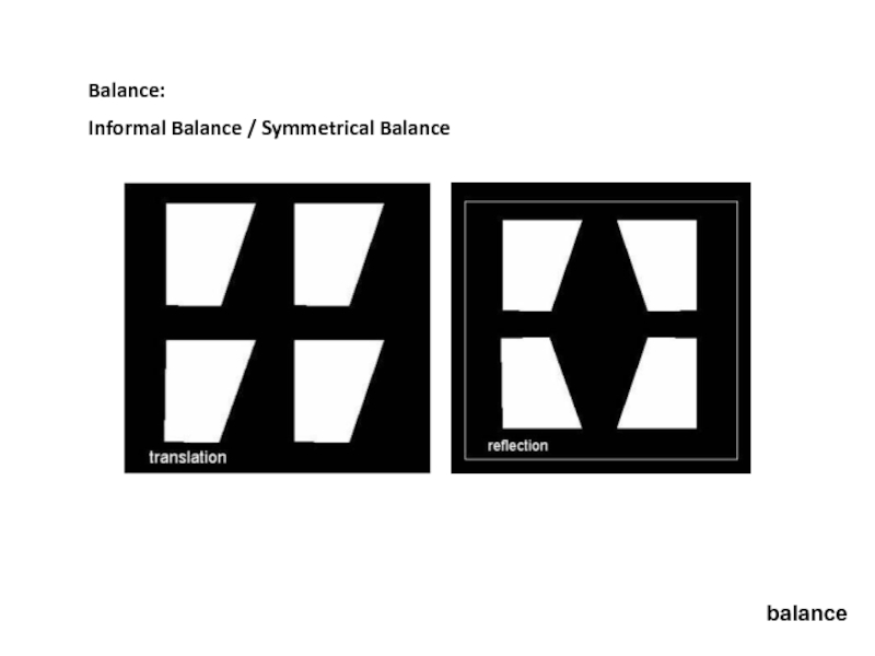
- 18. Balance: Informal Balance / Symmetrical Balance balance
- 19. balance
- 20. balance
- 21. balance
- 22. balance
- 23. balance
- 24. balance
- 25. balance
- 26. balance
- 27. balance
- 28. balance
- 29. balance
- 30. balance
- 31. balance
- 32. White space Don’t fear white
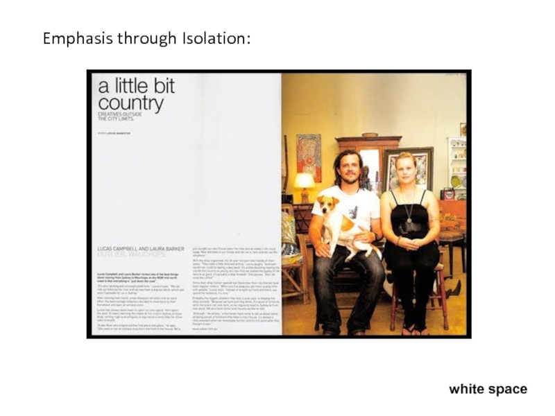
- 33. Emphasis through Isolation: white space
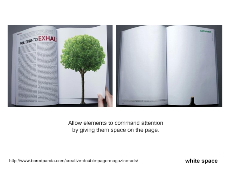
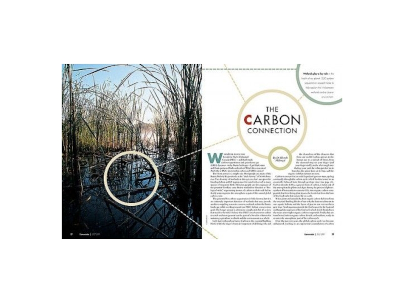
- 34. http://www.boredpanda.com/creative-double-page-magazine-ads/ Allow elements to command attention
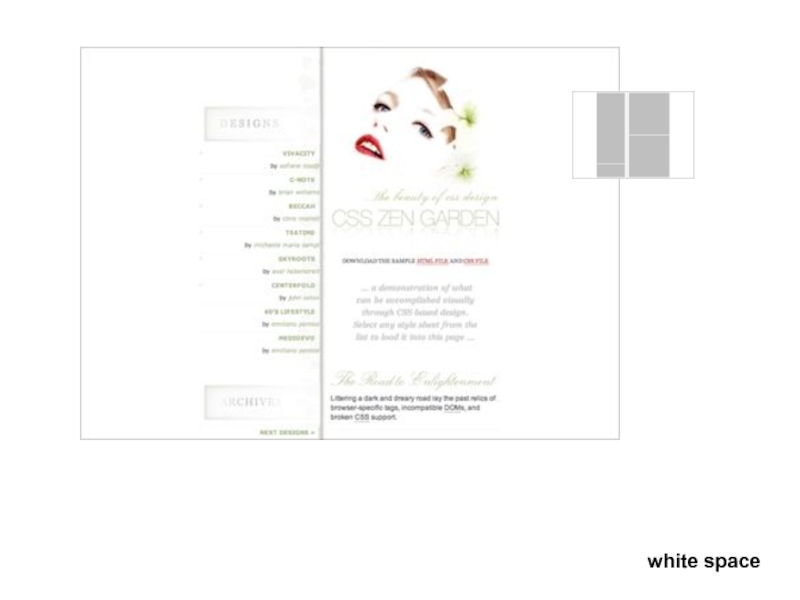
- 35. white space
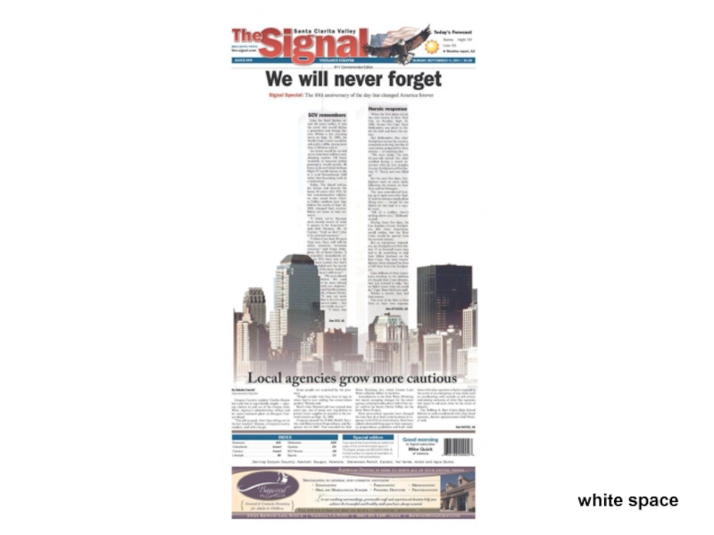
- 36. white space
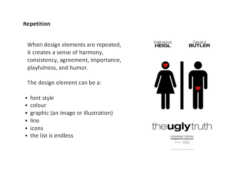
- 37. Repetition When design elements are repeated, it
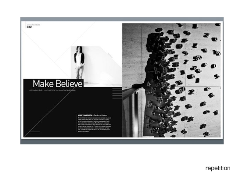
- 38. repetition
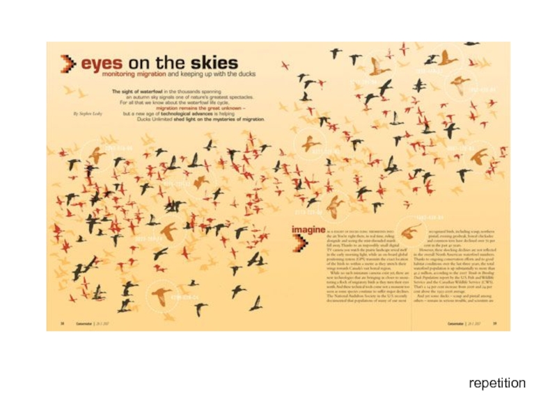
- 39. repetition
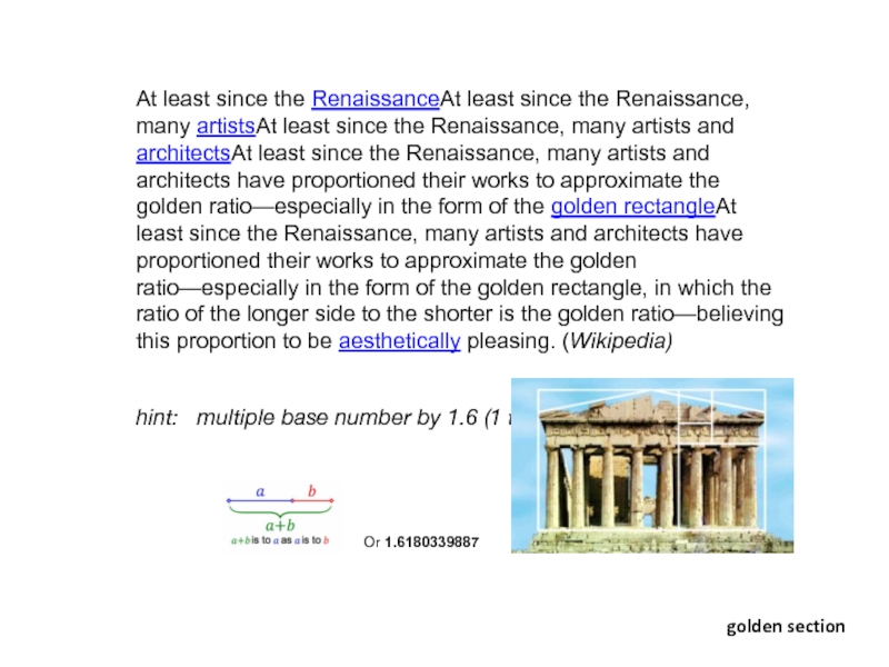
- 40. At least since the RenaissanceAt least since
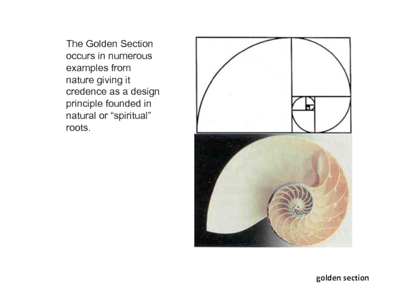
- 41. golden section The Golden Section occurs in
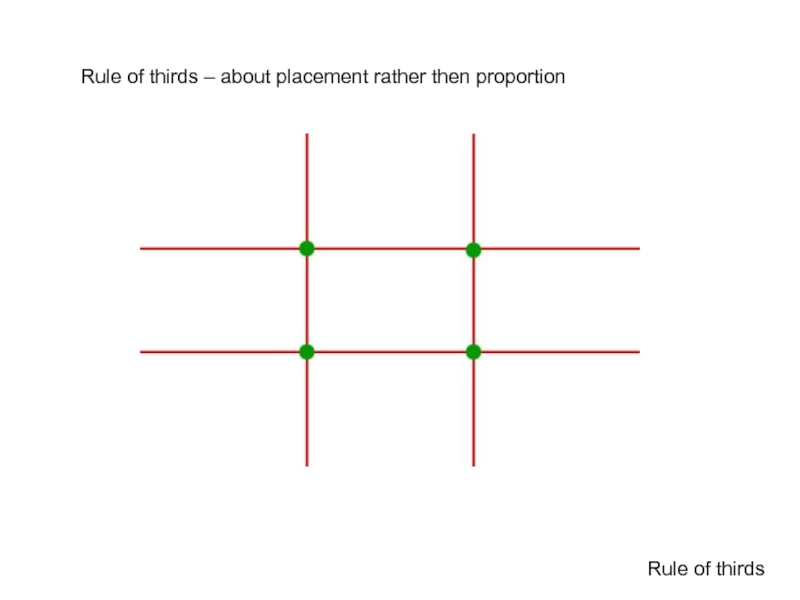
- 42. Rule of thirds – about placement rather then proportion Rule of thirds
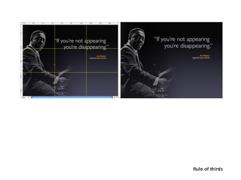
- 43. Rule of thirds
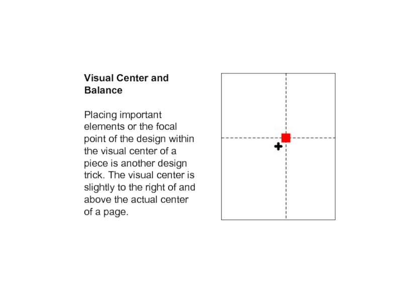
- 44. Visual Center and Balance Placing important
- 45. Proximity The concept of proximity says that
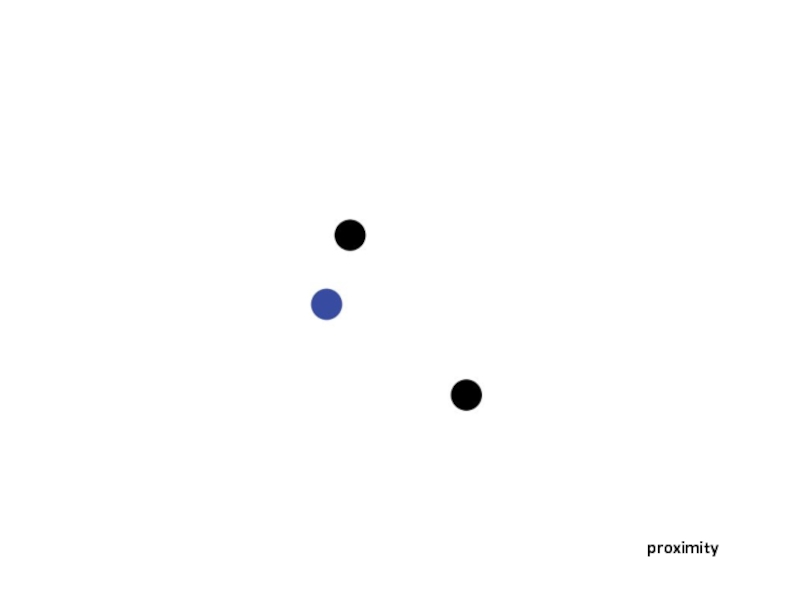
- 46. proximity
- 47. proximity
- 48. Alignment The concept of alignment says that
- 51. examples
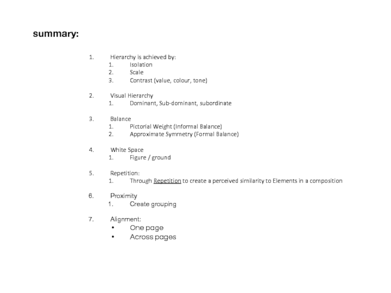
- 52. summary: Hierarchy is achieved by: Isolation Scale
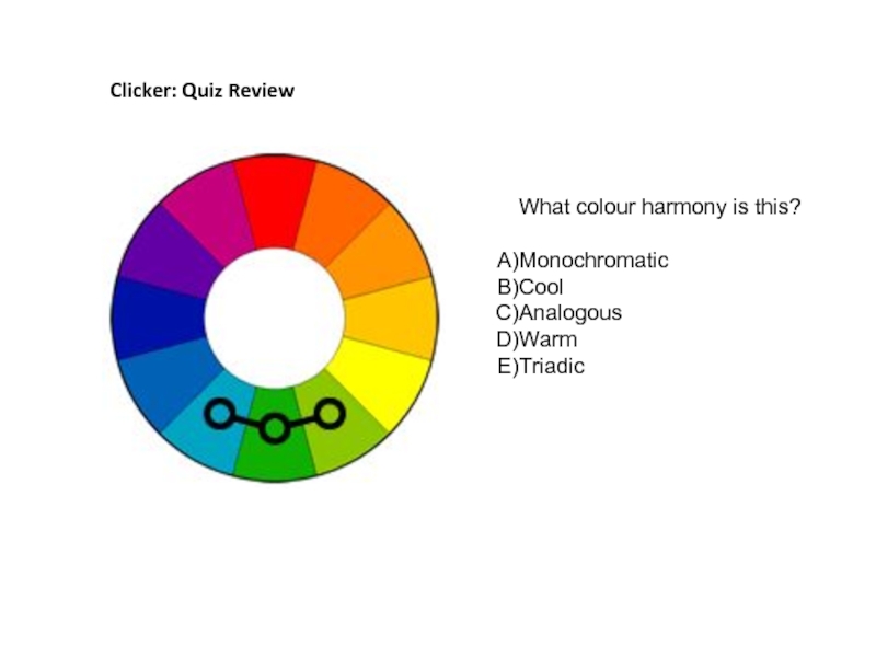
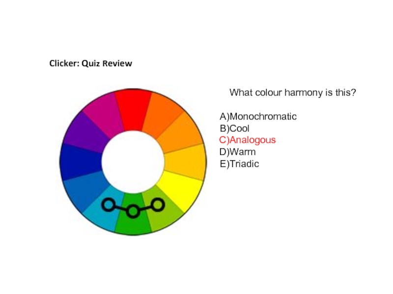
- 53. Clicker: Quiz Review What colour harmony is this? Monochromatic Cool Analogous Warm Triadic
- 54. Clicker: Quiz Review What colour harmony is this? Monochromatic Cool Analogous Warm Triadic
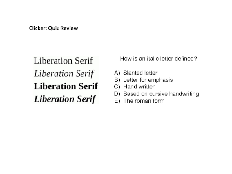
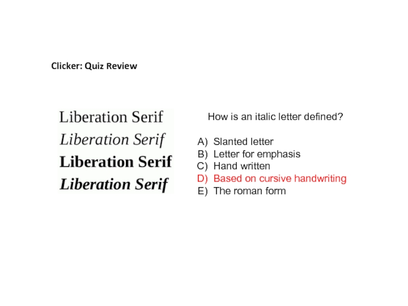
- 55. Clicker: Quiz Review How is an italic
- 56. Clicker: Quiz Review How is an italic
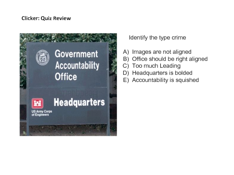
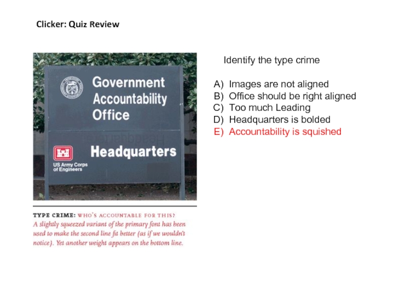
- 57. Clicker: Quiz Review Identify the type crime
- 58. Clicker: Quiz Review Identify the type crime
- 59. fin
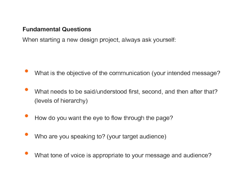
Слайд 3Fundamental Questions
When starting a new design project, always ask yourself:
What is
What needs to be said/understood first, second, and then after that? (levels of hierarchy)
How do you want the eye to flow through the page?
Who are you speaking to? (your target audience)
What tone of voice is appropriate to your message and audience?
Слайд 4
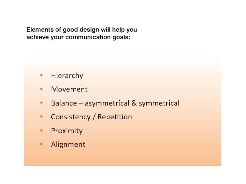
Hierarchy
Movement
Balance – asymmetrical & symmetrical
Consistency / Repetition
Proximity
Alignment
Elements of good
Слайд 5
Lead your viewer through information in the order you think is
HIERARCHY
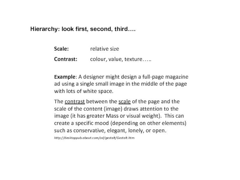
Слайд 7Scale: relative size
Contrast: colour, value, texture…..
Example: A designer might design a
The contrast between the scale of the page and the scale of the content (image) draws attention to the image (it has greater Mass or visual weight). This can create a specific mood (depending on other elements) such as conservative, elegant, lonely, or open.
http://desktoppub.about.com/od/gestalt/Gestalt.htm
Hierarchy: look first, second, third….
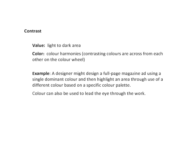
Слайд 8Value: light to dark area
Color: colour harmonies (contrasting colours are across
Example: A designer might design a full-page magazine ad using a single dominant colour and then highlight an area through use of a different colour based on a specific colour palette.
Colour can also be used to lead the eye through the work.
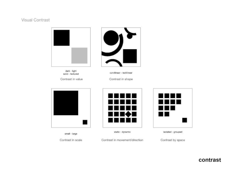
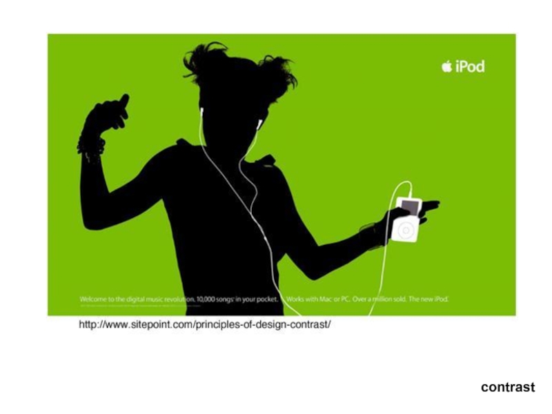
Contrast
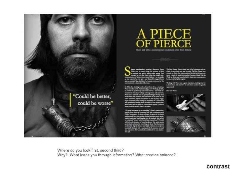
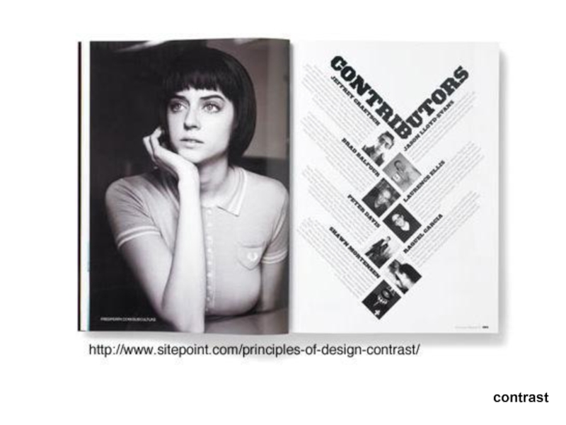
Слайд 10Where do you look first, second third?
Why? What leads you
contrast
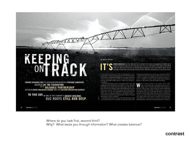
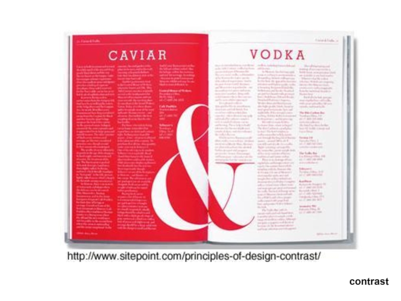
Слайд 11Where do you look first, second third?
Why? What leads you
contrast
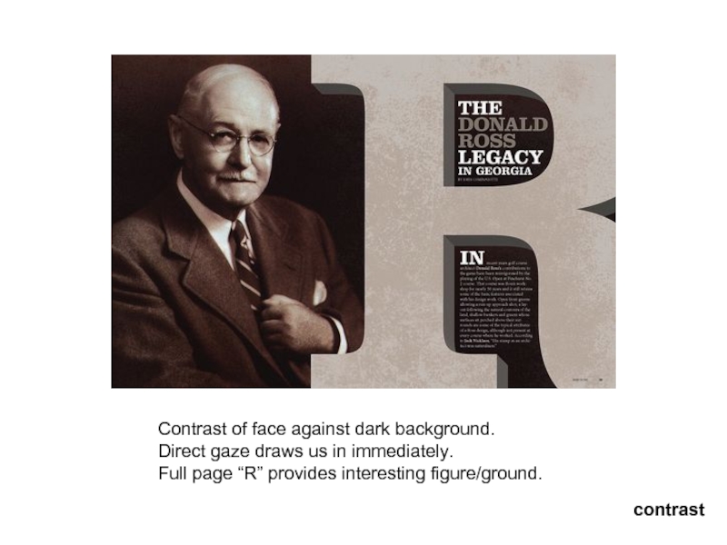
Слайд 12Contrast of face against dark background.
Direct gaze draws us in immediately.
Full page “R” provides interesting figure/ground.
contrast
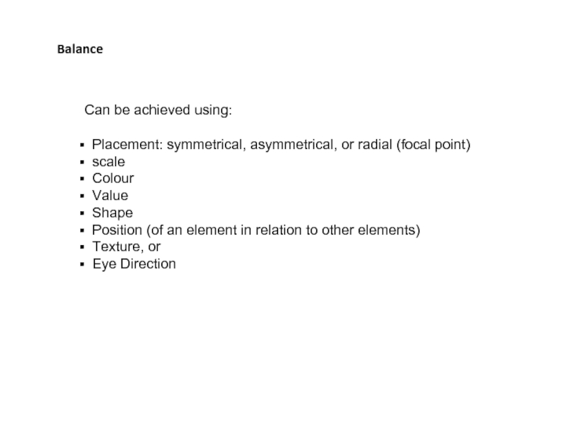
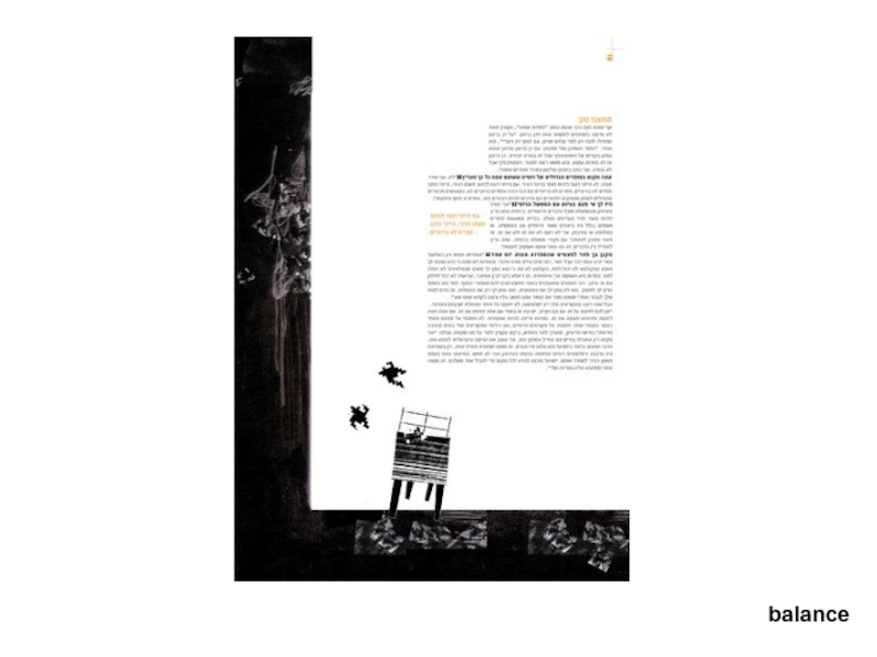
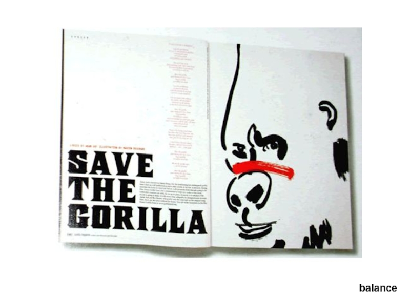
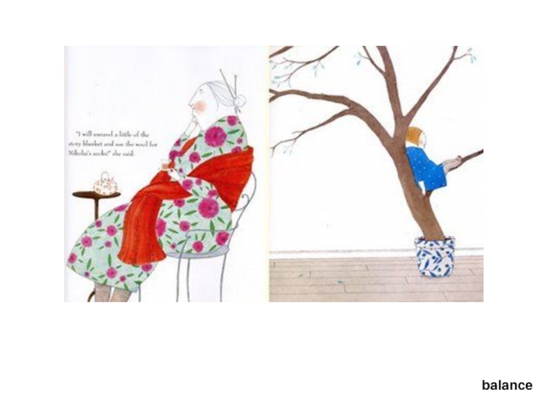
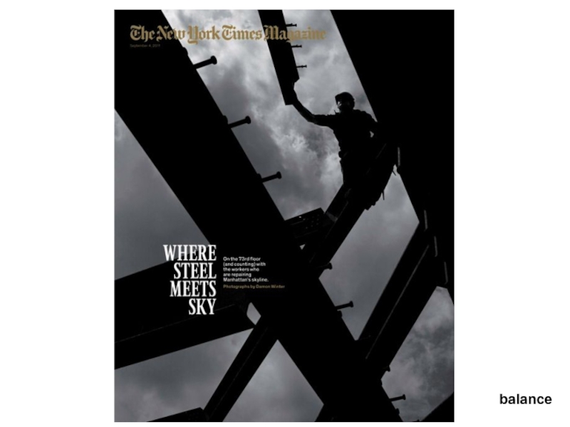
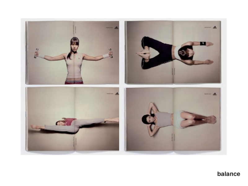
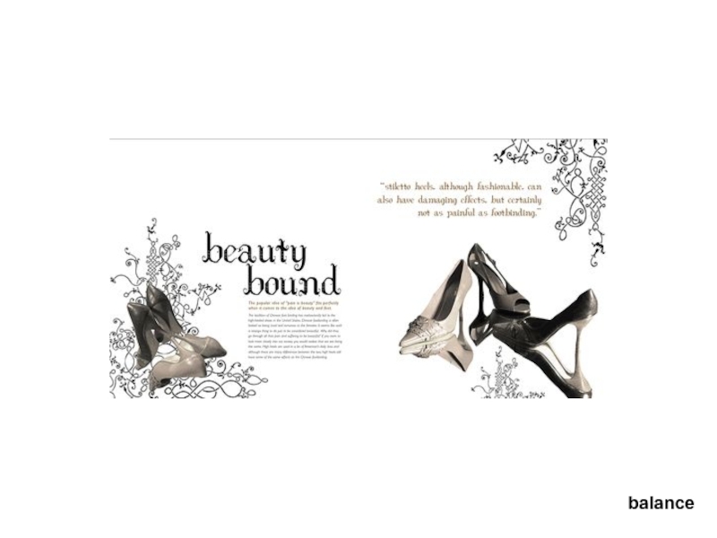
Слайд 16Balance
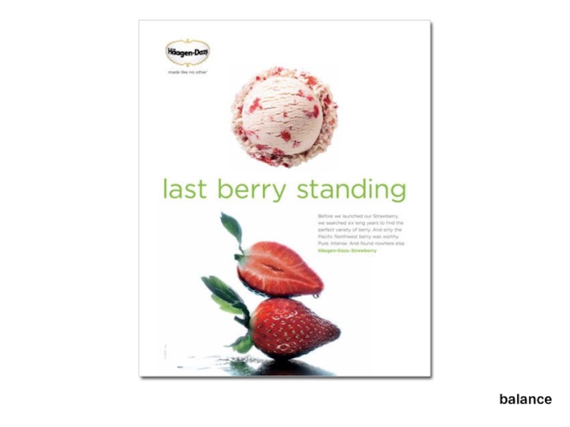
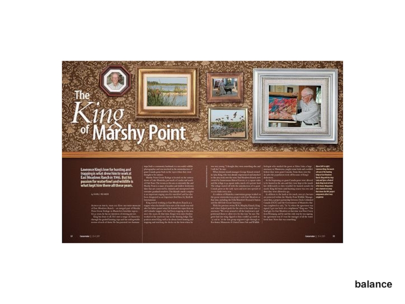
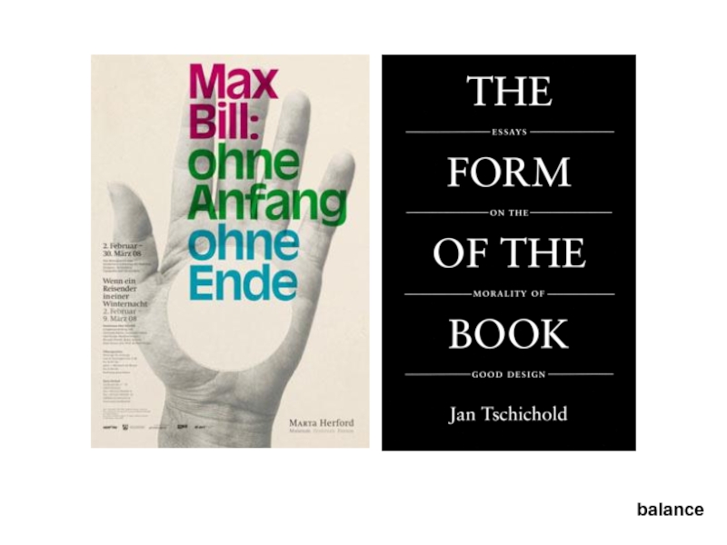
Can be achieved using:
Placement: symmetrical, asymmetrical, or radial (focal
scale
Colour
Value
Shape
Position (of an element in relation to other elements)
Texture, or
Eye Direction
Слайд 32White space
Don’t fear white space.
Avoid the temptation to
Use white space to draw attention to elements.
Слайд 34http://www.boredpanda.com/creative-double-page-magazine-ads/
Allow elements to command attention
by giving them space on the
white space
Слайд 37Repetition
When design elements are repeated, it creates a sense of harmony,
The design element can be a:
font style
colour
graphic (an image or illustration)
line
icons
the list is endless
Слайд 40At least since the RenaissanceAt least since the Renaissance, many artistsAt
hint: multiple base number by 1.6 (1 to 1.6)
golden section
Or 1.6180339887
Слайд 41golden section
The Golden Section
occurs in numerous examples from nature giving it
Слайд 44Visual Center and Balance
Placing important elements or the focal point of
Слайд 45Proximity
The concept of proximity says that related items should be grouped
Слайд 48Alignment
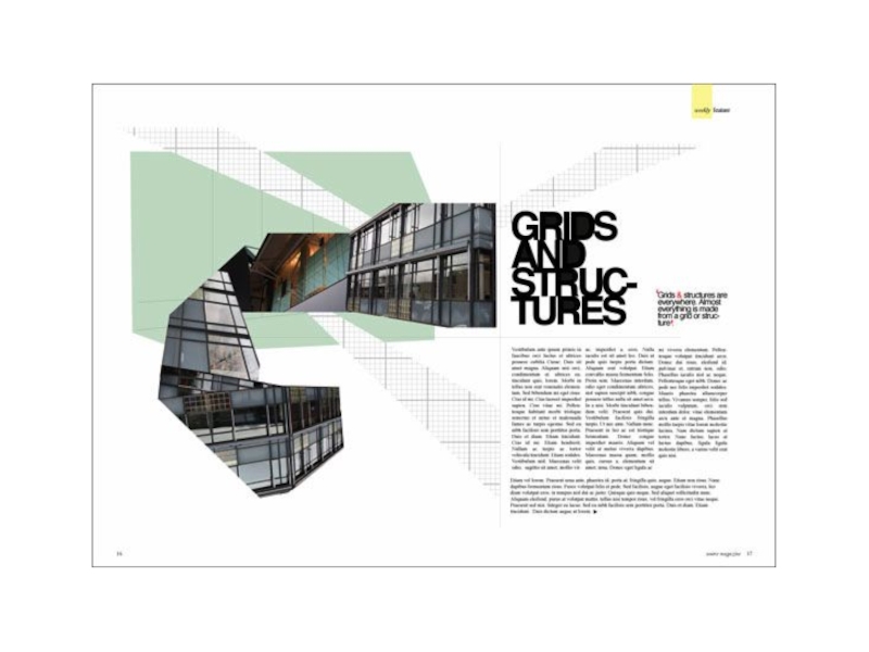
The concept of alignment says that everything on a page should
Слайд 52summary:
Hierarchy is achieved by:
Isolation
Scale
Contrast (value, colour, tone)
Visual Hierarchy
Dominant, Sub-dominant, subordinate
Balance
Pictorial
Approximate Symmetry (Formal Balance)
White Space
Figure / ground
Repetition:
Through Repetition to create a perceived similarity to Elements in a composition
Proximity
Create grouping
Alignment:
One page
Across pages
Слайд 55Clicker: Quiz Review
How is an italic letter defined?
Slanted letter
Letter
Hand written
Based on cursive handwriting
The roman form
Слайд 56Clicker: Quiz Review
How is an italic letter defined?
Slanted letter
Letter
Hand written
Based on cursive handwriting
The roman form
Слайд 57Clicker: Quiz Review
Identify the type crime
Images are not aligned
Office
Too much Leading
Headquarters is bolded
Accountability is squished
Слайд 58Clicker: Quiz Review
Identify the type crime
Images are not aligned
Office
Too much Leading
Headquarters is bolded
Accountability is squished
