- Главная
- Разное
- Дизайн
- Бизнес и предпринимательство
- Аналитика
- Образование
- Развлечения
- Красота и здоровье
- Финансы
- Государство
- Путешествия
- Спорт
- Недвижимость
- Армия
- Графика
- Культурология
- Еда и кулинария
- Лингвистика
- Английский язык
- Астрономия
- Алгебра
- Биология
- География
- Детские презентации
- Информатика
- История
- Литература
- Маркетинг
- Математика
- Медицина
- Менеджмент
- Музыка
- МХК
- Немецкий язык
- ОБЖ
- Обществознание
- Окружающий мир
- Педагогика
- Русский язык
- Технология
- Физика
- Философия
- Химия
- Шаблоны, картинки для презентаций
- Экология
- Экономика
- Юриспруденция
Contents and Design презентация
Содержание
- 1. Contents and Design
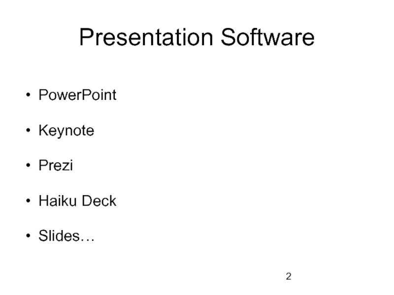
- 2. Presentation Software PowerPoint Keynote Prezi Haiku Deck Slides…
- 3. Design of Slides Think about avoidinig
- 4. Is it a good choice of
- 5. Design of Slides size of the text:
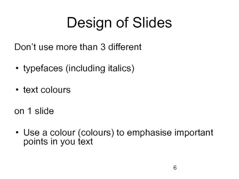
- 6. Design of Slides Don’t use more than
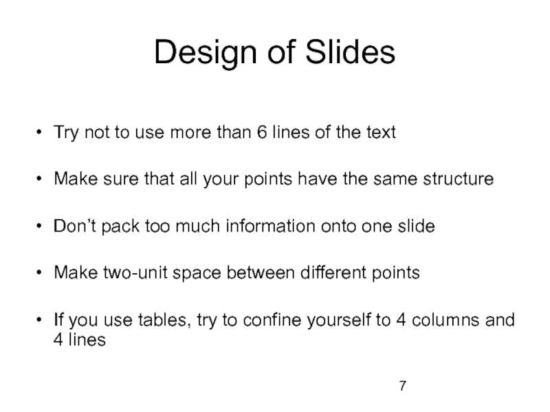
- 7. Design of Slides Try not to
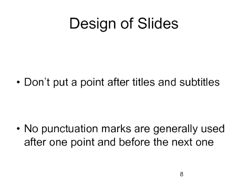
- 8. Design of Slides Don’t put
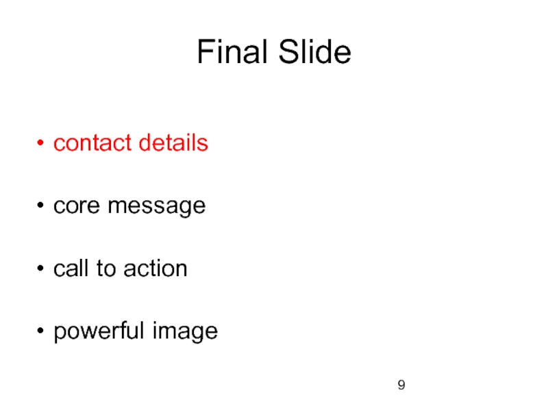
- 9. Final Slide contact details core
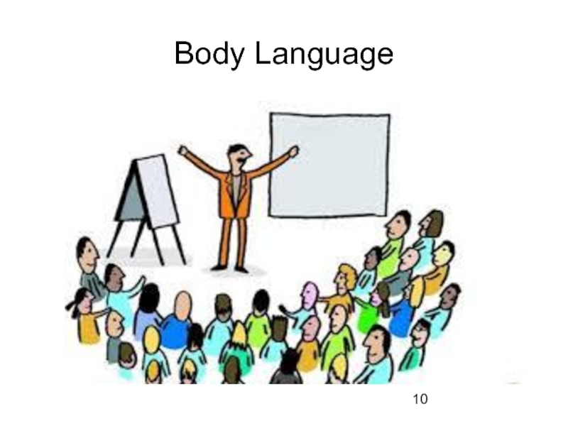
- 10. Body Language
- 11. Body Language stance and movement
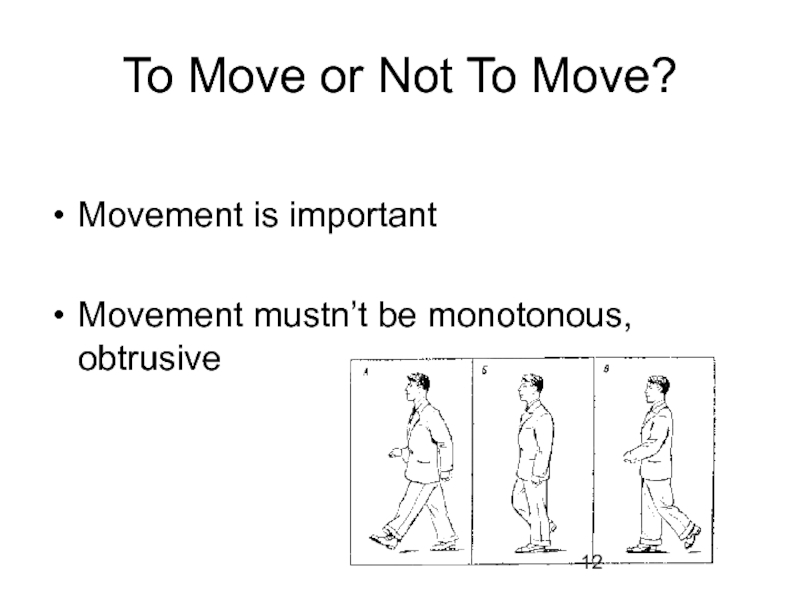
- 12. To Move or Not To Move?
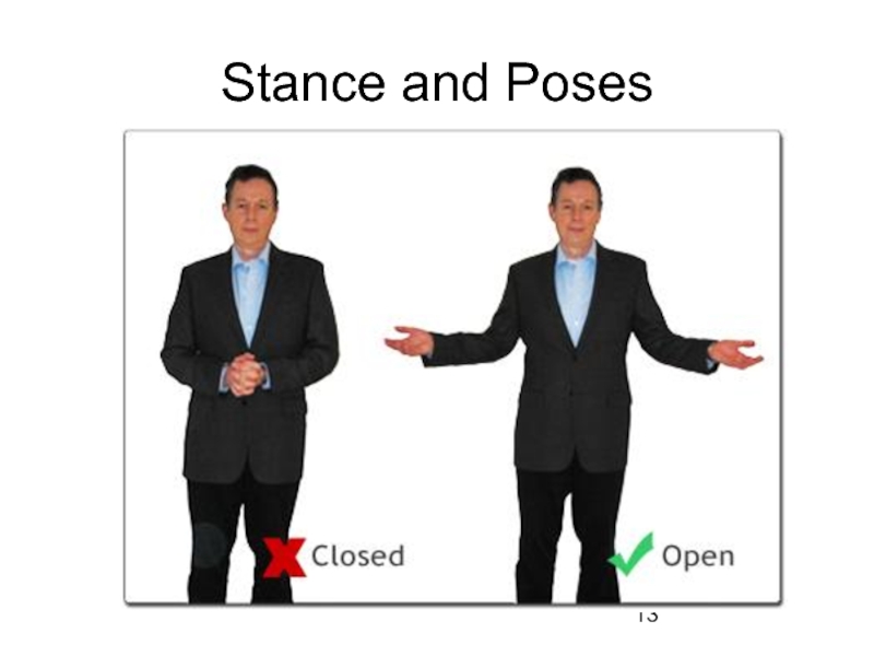
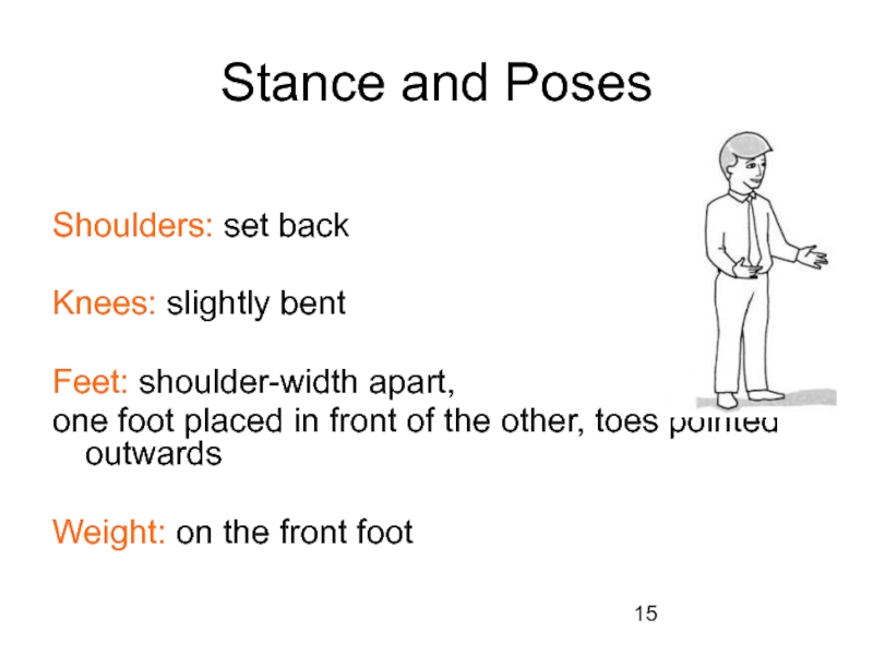
- 13. Stance and Poses
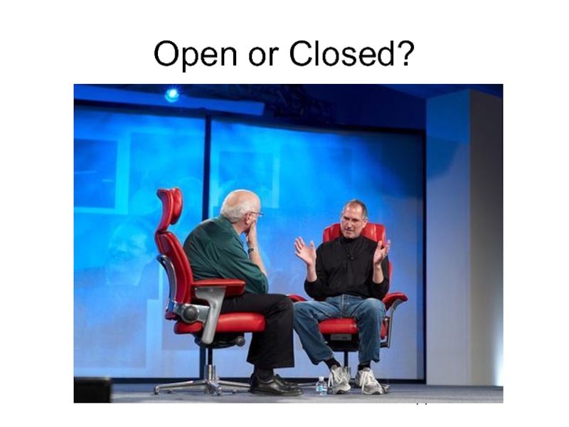
- 14. Open or Closed?
- 15. Stance and Poses Shoulders: set
- 16. Gestures NB: “air” under the
- 17. Head Position and Eye Contact Chin:
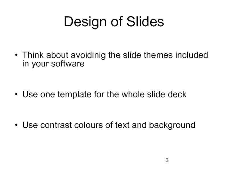
Слайд 3Design of Slides
Think about avoidinig the slide themes included in your
software
Use one template for the whole slide deck
Use contrast colours of text and background
Use one template for the whole slide deck
Use contrast colours of text and background
Слайд 4
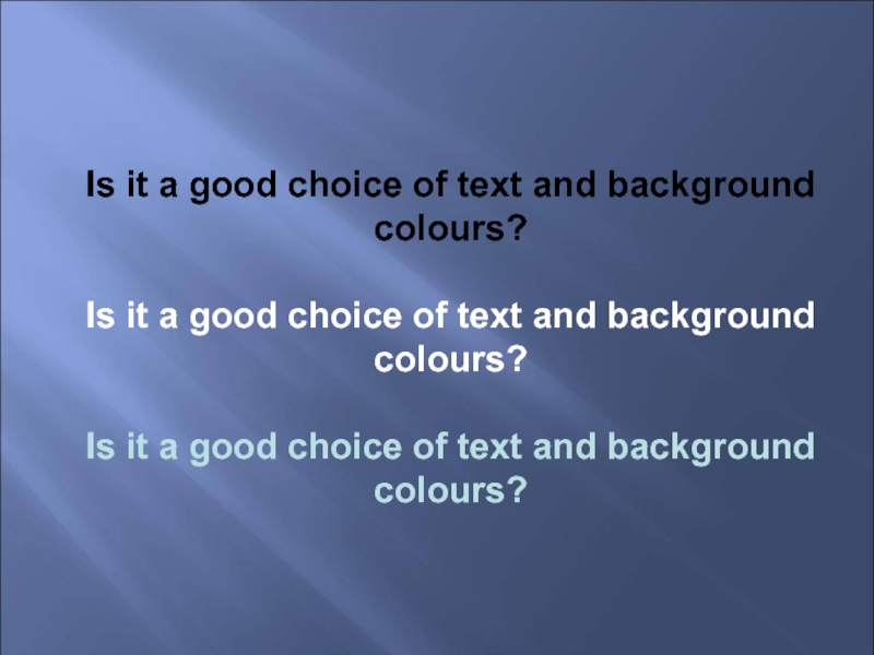
Is it a good choice of text and background colours?
Is
it a good choice of text and background colours?
Is it a good choice of text and background colours?
Is it a good choice of text and background colours?
Is it a good choice of text and background colours?
Is it a good choice of text and background colours?
Is it a good choice of text and background colours?
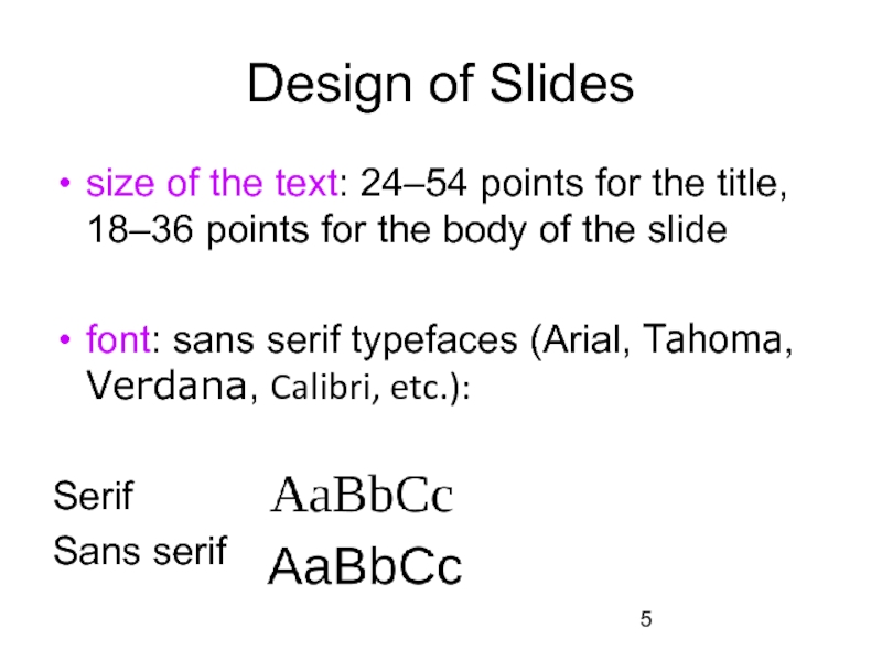
Слайд 5Design of Slides
size of the text: 24–54 points for the title,
18–36 points for the body of the slide
font: sans serif typefaces (Arial, Tahoma, Verdana, Calibri, etc.):
Serif
Sans serif
font: sans serif typefaces (Arial, Tahoma, Verdana, Calibri, etc.):
Serif
Sans serif
Слайд 6Design of Slides
Don’t use more than 3 different
typefaces (including italics)
text
colours
on 1 slide
Use a colour (colours) to emphasise important points in you text
on 1 slide
Use a colour (colours) to emphasise important points in you text
Слайд 7Design of Slides
Try not to use more than 6 lines of
the text
Make sure that all your points have the same structure
Don’t pack too much information onto one slide
Make two-unit space between different points
If you use tables, try to confine yourself to 4 columns and 4 lines
Make sure that all your points have the same structure
Don’t pack too much information onto one slide
Make two-unit space between different points
If you use tables, try to confine yourself to 4 columns and 4 lines
Слайд 8Design of Slides
Don’t put a point after titles and subtitles
No punctuation
marks are generally used after one point and before the next one
Слайд 15Stance and Poses
Shoulders: set back
Knees: slightly bent
Feet: shoulder-width apart,
one foot
placed in front of the other, toes pointed outwards
Weight: on the front foot
Weight: on the front foot
Слайд 16Gestures
NB: “air” under the arms
arise from shoulder or elbows
held
at chest level
have good amplitude
correspond to the pronounced words
have good amplitude
correspond to the pronounced words
Слайд 17Head Position and Eye Contact
Chin: slightly raised
Eye focus: on one person
at a time, long enough to complete a natural phrase
(sometimes you can look into the distance)
(sometimes you can look into the distance)

