- Главная
- Разное
- Дизайн
- Бизнес и предпринимательство
- Аналитика
- Образование
- Развлечения
- Красота и здоровье
- Финансы
- Государство
- Путешествия
- Спорт
- Недвижимость
- Армия
- Графика
- Культурология
- Еда и кулинария
- Лингвистика
- Английский язык
- Астрономия
- Алгебра
- Биология
- География
- Детские презентации
- Информатика
- История
- Литература
- Маркетинг
- Математика
- Медицина
- Менеджмент
- Музыка
- МХК
- Немецкий язык
- ОБЖ
- Обществознание
- Окружающий мир
- Педагогика
- Русский язык
- Технология
- Физика
- Философия
- Химия
- Шаблоны, картинки для презентаций
- Экология
- Экономика
- Юриспруденция
Save the designers презентация
Содержание
- 1. Save the designers
- 2. Contents What is a Design Guide? Working with Developers Understanding the Situation Understanding Your Job
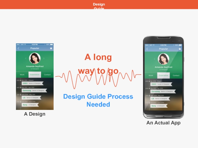
- 3. Design Guide A Design An Actual App
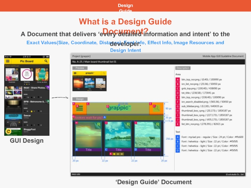
- 4. Design Guide Exact Values(Size, Coordinate, Distance), Font
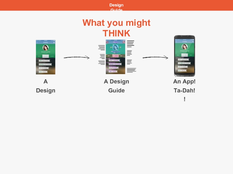
- 5. Design Guide A Design A Design Guide What you might THINK An App! Ta-Dah!!
- 6. Design Guide A Design A Design Guide
- 7. Design Guide A Design A Design Guide
- 8. Design Guide A Design A Design Guide
- 9. Practical Tips What You Need to Discuss Few Suggested Topics
- 10. Practical Tips Communication with a developer
- 11. Practical Tips Coordinate vs Distance Even you
- 12. Practical Tips Absolute Value vs Relative Value
- 13. Practical Tips Exporting an Image
- 14. Practical Tips Understanding the Situation
- 15. Practical Tips Understanding Units px, pt, dpi,
- 16. Practical Tips Absolute Value vs Relative Value
- 17. Practical Tips Absolute Value vs Relative Value
- 18. Practical Tips Image vs Code Background
- 19. Practical Tips Which Platform and Language Developers
- 20. Practical Tips How Text will be Shown
- 21. Practical Tips Size of a Text Box
- 22. Practical Tips Understanding Your Job
- 23. Practical Tips Looking at the Whole Picture
- 24. Practical Tips Looking at the Whole Picture
- 25. Practical Tips Different Button Design for Different
- 26. Practical Tips Always Design Elements in Groups
- 27. Practical Tips Understanding Blend Mode 1 Blend
- 28. Practical Tips Understanding Blend Mode 2
- 29. Practical Tips Learning Attitude As the trend
- 30. Introducing Assistor PS Design Guide Tool Specially Made for UI Designers http://assistor.net/en/assistor
- 31. For More Information Contact service@witstudio.net Company http://witstudio.net/en/witstudio http://blog.witstudio.net/ Product http://assistor.net/en/assistor https://www.facebook.com/assistorAPPitnl
- 32. 1. 제안 내용 witstudio.net service@witstudio.net T
Слайд 2Contents
What is a Design Guide?
Working with Developers
Understanding the Situation
Understanding Your Job
Слайд 4Design Guide
Exact Values(Size, Coordinate, Distance), Font Info, Effect Info, Image Resources
What is a Design Guide Document?
A Document that delivers ‘every detailed information and intent’ to the developer.
GUI Design
‘Design Guide’ Document
Слайд 7Design Guide
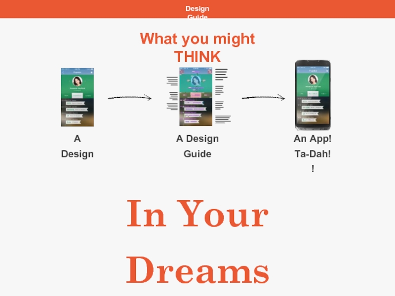
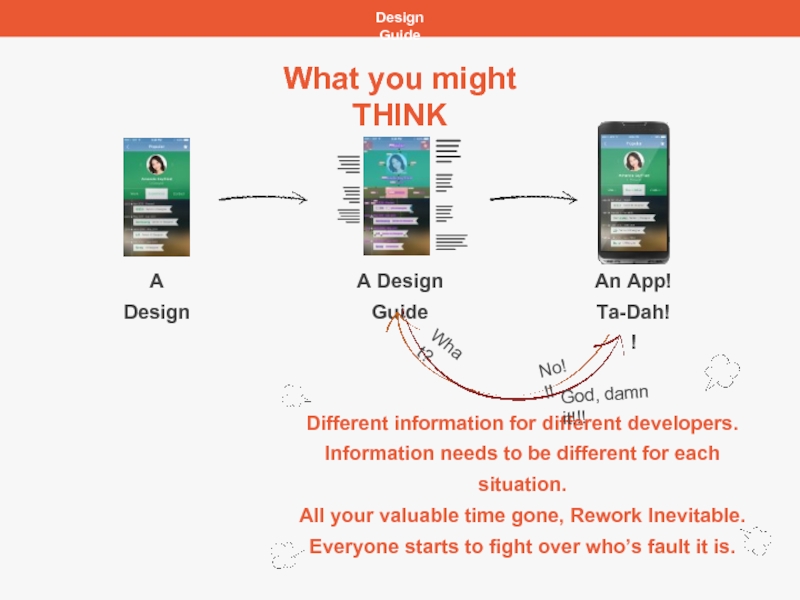
A Design
A Design Guide
An App!
Ta-Dah!!
What you might THINK
Different information for
Information needs to be different for each situation.
All your valuable time gone, Rework Inevitable.
Everyone starts to fight over who’s fault it is.
No!!!
What?
God, damn it!!!
Слайд 8Design Guide
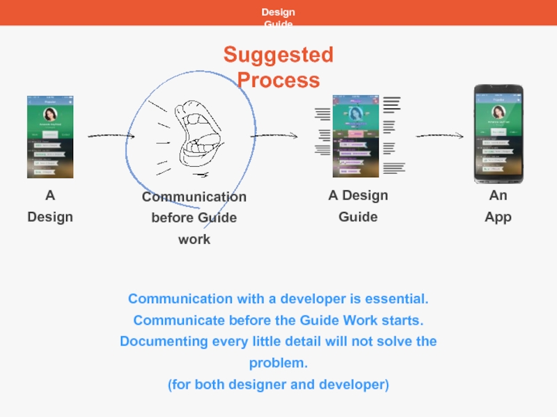
A Design
A Design Guide
An App
Suggested Process
Communication
before Guide work
Communication with
Communicate before the Guide Work starts.
Documenting every little detail will not solve the problem.
(for both designer and developer)
Слайд 11Practical Tips
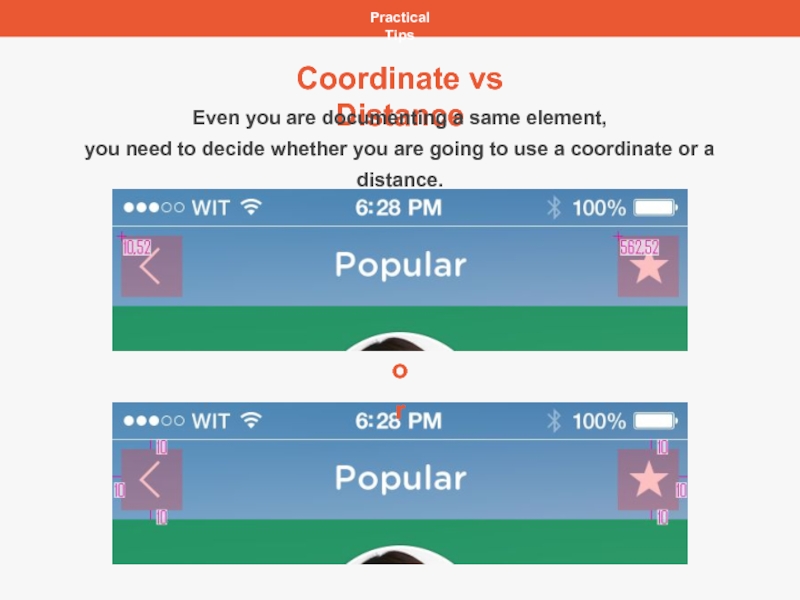
Coordinate vs Distance
Even you are documenting a same element,
you
Слайд 12Practical Tips
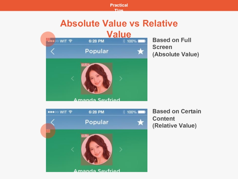
Absolute Value vs Relative Value
Based on Full Screen
(Absolute Value)
Based on
(Relative Value)
Слайд 13
Practical Tips
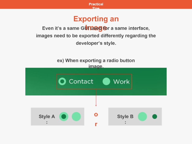
Exporting an Image
ex) When exporting a radio button image.
or
Even it’s
images need to be exported differently regarding the developer’s style.
Слайд 15Practical Tips
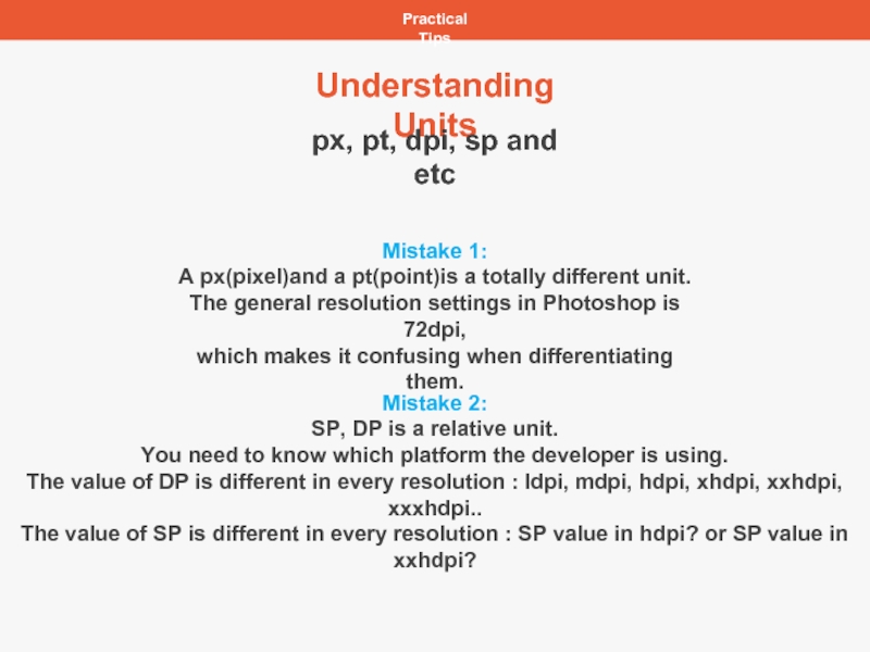
Understanding Units
px, pt, dpi, sp and etc
Mistake 1:
A px(pixel)and a
The general resolution settings in Photoshop is 72dpi,
which makes it confusing when differentiating them.
Mistake 2:
SP, DP is a relative unit.
You need to know which platform the developer is using.
The value of DP is different in every resolution : ldpi, mdpi, hdpi, xhdpi, xxhdpi, xxxhdpi..
The value of SP is different in every resolution : SP value in hdpi? or SP value in xxhdpi?
Слайд 16Practical Tips
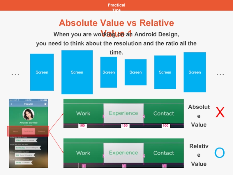
Absolute Value vs Relative Value 1
X
O
When you are working on
you need to think about the resolution and the ratio all the time.
Absolute
Value
Relative
Value
Слайд 17Practical Tips
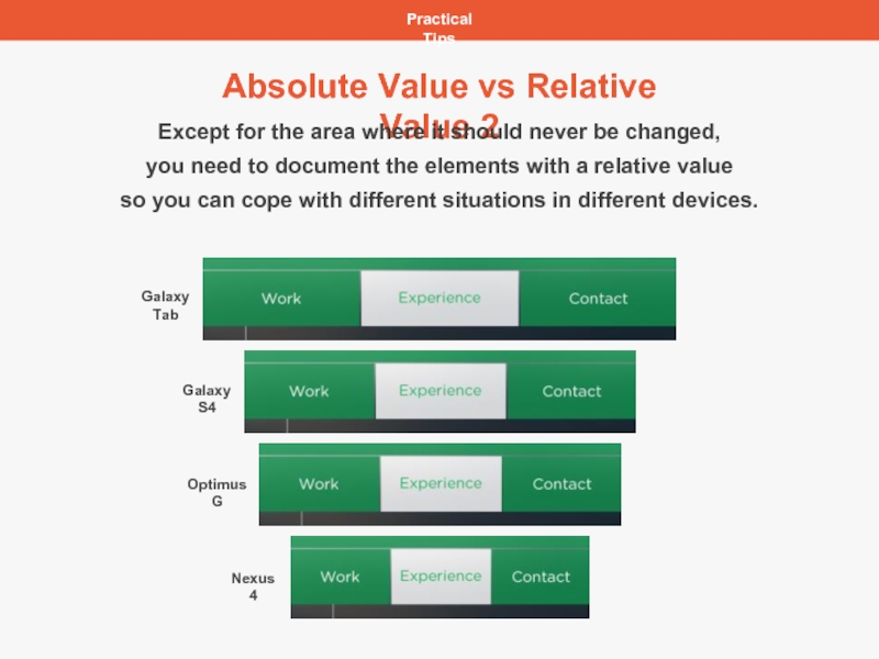
Absolute Value vs Relative Value 2
Galaxy Tab
Galaxy S4
Optimus G
Nexus 4
Except
you need to document the elements with a relative value
so you can cope with different situations in different devices.
Слайд 18Practical Tips
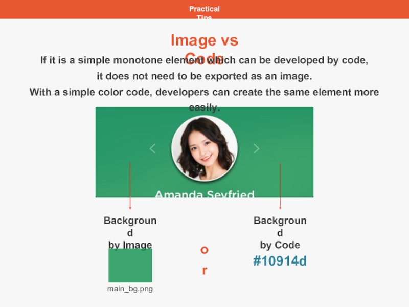
Image vs Code
Background
by Image
Background
by Code
main_bg.png
#10914d
or
If it is a simple
it does not need to be exported as an image.
With a simple color code, developers can create the same element more easily.
Слайд 19Practical Tips
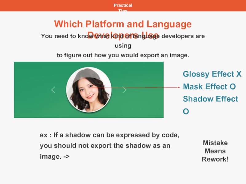
Which Platform and Language Developers Use
Glossy Effect X
Mask Effect O
Shadow
ex : If a shadow can be expressed by code,
you should not export the shadow as an image. ->
You need to know what kind of language developers are using
to figure out how you would export an image.
Mistake
Means Rework!
Слайд 20Practical Tips
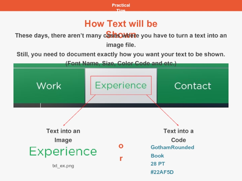
How Text will be Shown
Text into an Image
Text into a
txt_ex.png
GothamRounded Book
28 PT
#22AF5D
or
These days, there aren’t many cases where you have to turn a text into an image file.
Still, you need to document exactly how you want your text to be shown.
(Font Name, Size, Color Code and etc.)
Слайд 21Practical Tips
Size of a Text Box
(Ctrl + T is not the
How Photoshop and Development tools render text is totally different.
Very accurate work is needed to find the exact size of the text box.
Most of the time, Transform Box(Ctrl + T) is considered as a standard value.
But the problem is, even though the text might be a same font, and same size,
the size of the Transform Box is always different.(CS3, CS4, CS5, CS6, CC and etc.)
Confirming the size of the Transform Box in Photoshop is only
a way of getting the closest value as possible.
Слайд 23Practical Tips
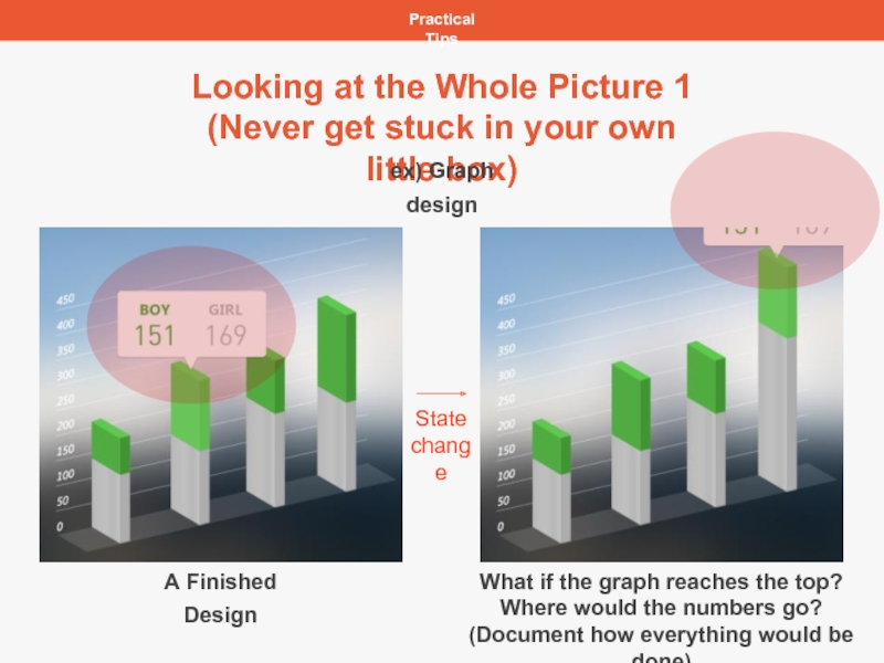
Looking at the Whole Picture 1
(Never get stuck in your
ex) Graph design
A Finished Design
What if the graph reaches the top?
Where would the numbers go?
(Document how everything would be done)
State
change
Слайд 24Practical Tips
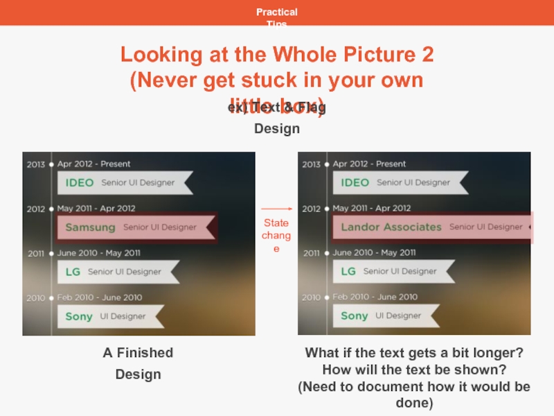
Looking at the Whole Picture 2
(Never get stuck in your
ex) Text & Flag Design
State
change
A Finished Design
What if the text gets a bit longer?
How will the text be shown?
(Need to document how it would be done)
Слайд 25Practical Tips
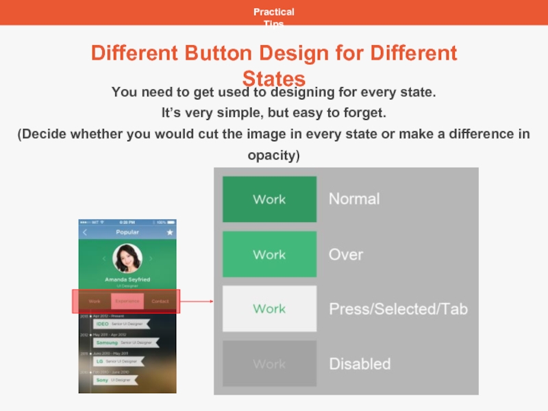
Different Button Design for Different States
You need to get used
It’s very simple, but easy to forget.
(Decide whether you would cut the image in every state or make a difference in opacity)
Слайд 26Practical Tips
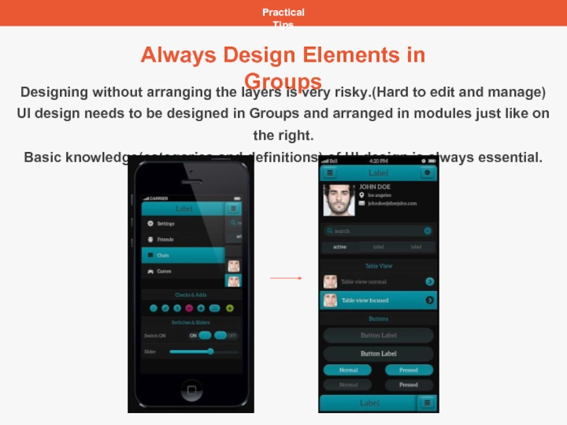
Always Design Elements in Groups
Designing without arranging the layers is
UI design needs to be designed in Groups and arranged in modules just like on the right.
Basic knowledge(categories and definitions) of UI design is always essential.
Слайд 27Practical Tips
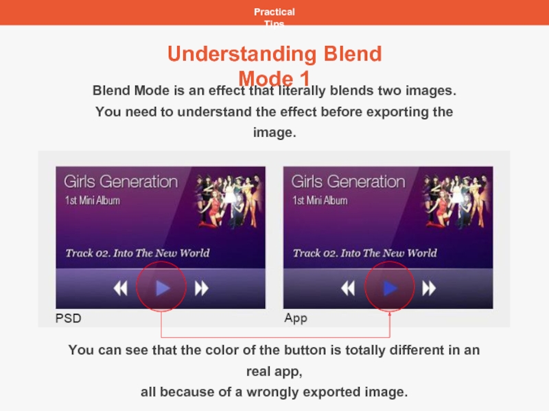
Understanding Blend Mode 1
Blend Mode is an effect that literally
You need to understand the effect before exporting the image.
You can see that the color of the button is totally different in an real app,
all because of a wrongly exported image.
Слайд 28
Practical Tips
Understanding Blend Mode 2
The moment you cut out the top
Blend Mode applied in layer
Слайд 29Practical Tips
Learning Attitude
As the trend never stops changing, you always need
UI and UX is both very important,
but the most important thing is to understand the basics of units.
(px, dpi, sp and etc.)
You need to make an effort to design logically.
Websites for UI Designers
Dribble : http://dribbble.com/
Behance : https://www.behance.net/
Android Design : Android Developers > Design Principles
iOS Design : iOS Human Interface Guidelines > Designing for iOS 7
wit studio Pinterest : http://www.pinterest.com/witstudio/
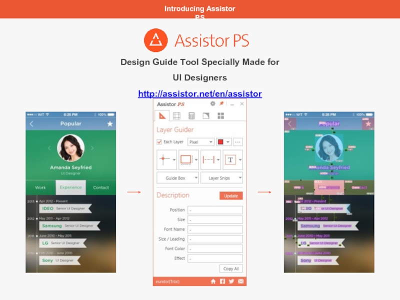
Слайд 30Introducing Assistor PS
Design Guide Tool Specially Made for UI Designers
http://assistor.net/en/assistor
Слайд 31For More Information
Contact
service@witstudio.net
Company
http://witstudio.net/en/witstudio
http://blog.witstudio.net/
Product
http://assistor.net/en/assistor
https://www.facebook.com/assistorAPPitnl
Слайд 321. 제안 내용
witstudio.net
service@witstudio.net
T : +82 (0)2 508 2146
F : +82 (0)2
Office : Gangnam-gu, Seoul, Korea
Contacts
