- Главная
- Разное
- Дизайн
- Бизнес и предпринимательство
- Аналитика
- Образование
- Развлечения
- Красота и здоровье
- Финансы
- Государство
- Путешествия
- Спорт
- Недвижимость
- Армия
- Графика
- Культурология
- Еда и кулинария
- Лингвистика
- Английский язык
- Астрономия
- Алгебра
- Биология
- География
- Детские презентации
- Информатика
- История
- Литература
- Маркетинг
- Математика
- Медицина
- Менеджмент
- Музыка
- МХК
- Немецкий язык
- ОБЖ
- Обществознание
- Окружающий мир
- Педагогика
- Русский язык
- Технология
- Физика
- Философия
- Химия
- Шаблоны, картинки для презентаций
- Экология
- Экономика
- Юриспруденция
Accessible UXBeyond the checklist to great experiences презентация
Содержание
- 1. Accessible UXBeyond the checklist to great experiences
- 2. On today's agenda Usability and accessibility
- 3. Usability and accessibility Twins separated at birth
- 4. Accessibility The usability of a product,
- 5. The user-centered design process 1. Understand
- 6. Accessibility error priorities Critical An absolute barrier
- 7. Usability problem priorities Critical A problem that
- 8. Prioritize problems by their impact on people
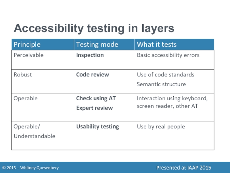
- 9. Accessibility testing in layers
- 10. Inspection Check for basic accessibility errors Quick
- 11. Code review Check for accessible coding Look
- 12. Use Check with assistive technology Check that
- 13. Expert review Check with expert AT users
- 14. Usability testing Check with voters with disabilities
- 15. Usability and accessibility problems interact When interaction problems hide
- 16. Noisy problems mask critical ones Accessibility
- 17. Critical features may not be accessibly usable
- 18. Participants with disabilities add perspectives to a
- 19. Poor usability can become critical accessibility barriers
- 20. People with disabilties can show where orientation
- 21. To understand accessible UX we have to look at real people and real behavior.
- 22. Accessible UX needs diversity People with different
- 23. Recruit "people" not "disabilities" Aptitude motivation, emotion,
- 24. Vishnu "I want to be on the
- 25. Vishnu "I want to be on the
- 26. Steven "My only disability is that everyone
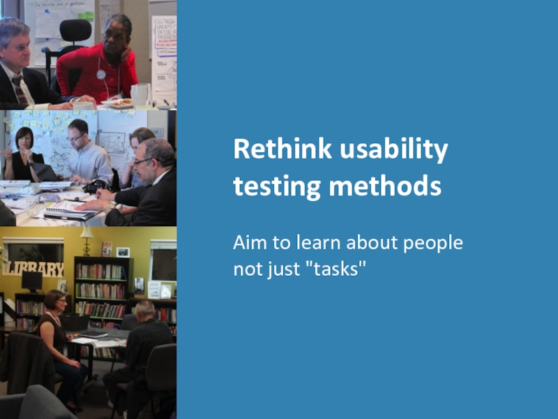
- 27. Rethink usability testing methods Aim to learn about people not just "tasks"
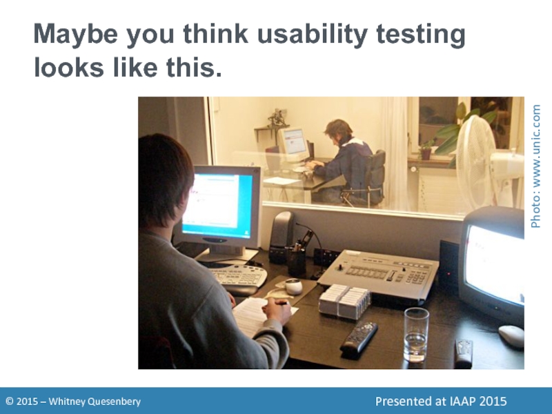
- 28. Maybe you think usability testing looks like this. Photo: www.unic.com
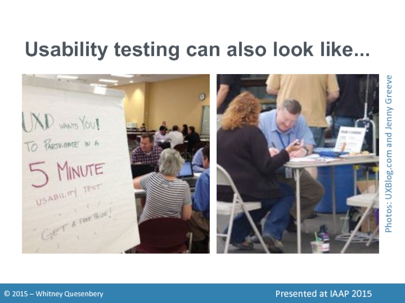
- 29. Usability testing can also look like... Photos: UXBlog.com and Jenny Greeve
- 30. What makes it a usability test? We
- 31. Build relationships in the community Get to
- 32. Engage expertise in many ways Think outside
- 33. Aim for a rich view Take time
- 34. Expand your recruiting reach Think about where
- 35. Work with your participants Tips and tricks for successful usability sessions with diverse users
- 36. Think beyond the "task" Are your research
- 37. Getting set-up is part of the session
- 38. Be flexible about devices Using their device
- 39. Include a preliminary activity Use this time
- 40. Decide on the research location At your
- 41. Consider your recording options Check for conflicts
- 42. Recording setup with screen sharing GoToMeeting recording
- 43. Recording setup with 2 cameras Morae has
- 44. Interacting with the participant Don't distract Give
- 45. Be prepared. Don't panic. Sharing a web
- 46. Above all, be human.
- 47. You can... Help usability and accessibility reunite.
- 48. Whitney UX research, plain language, accessibility, civic
- 49. Session description Accessible UX: beyond the checklist
Слайд 1Accessible UX
Beyond the checklist
to great experiences
Whitney Quesenbery
@whitneyq | @AWebforEveryone
Presented
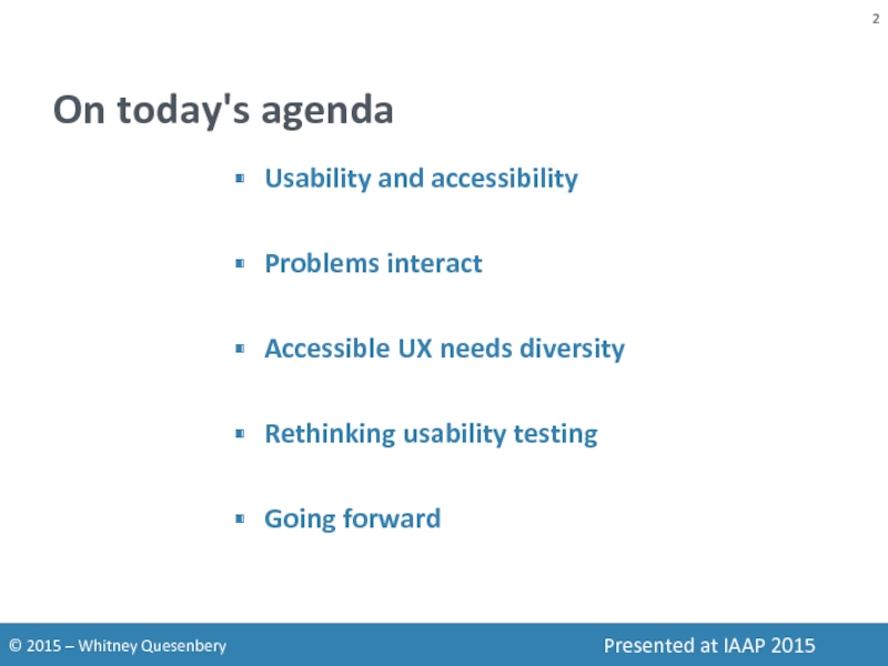
Слайд 2On today's agenda
Usability and accessibility
Problems interact
Accessible UX needs diversity
Rethinking usability
Going forward
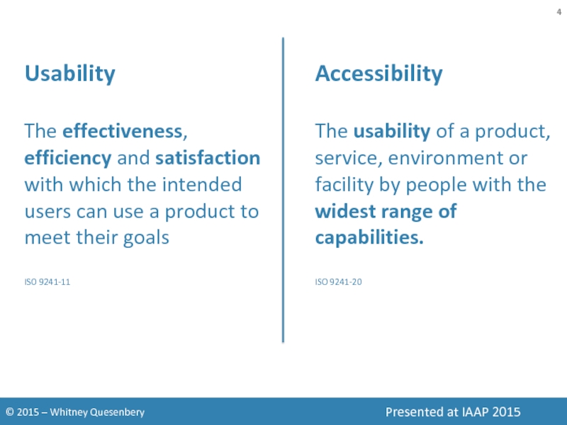
Слайд 4Accessibility
The usability of a product, service, environment or facility by people
Usability
The effectiveness, efficiency and satisfaction with which the intended users can use a product to meet their goals
ISO 9241-11
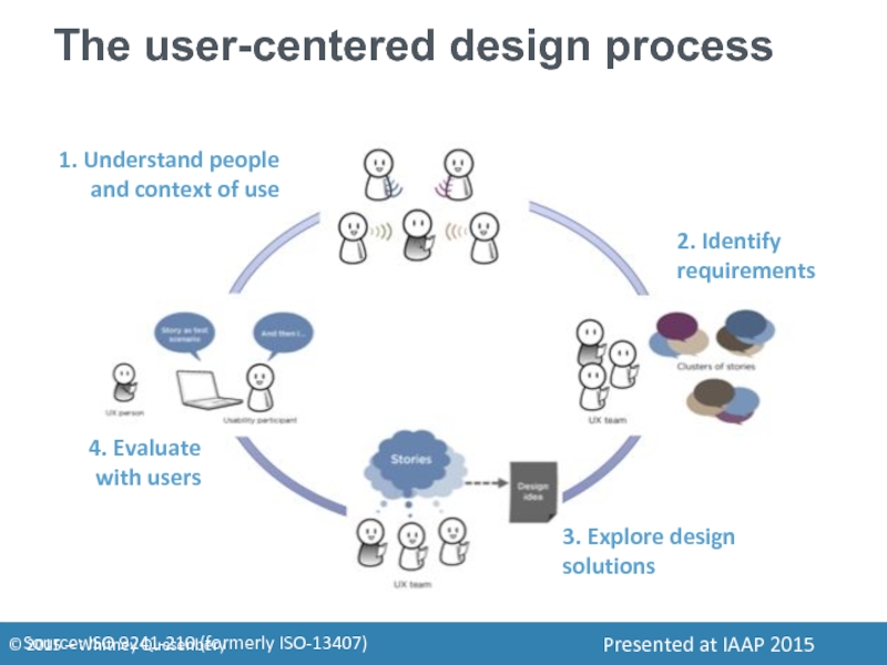
Слайд 5The user-centered design process
1. Understand people and context of use
2. Identify
3. Explore design solutions
4. Evaluate with users
Source: ISO 9241-210 (formerly ISO-13407)
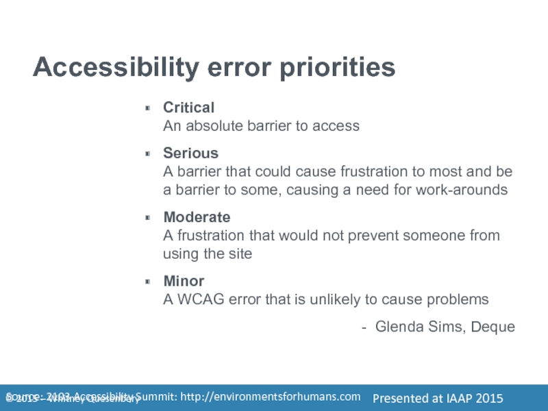
Слайд 6Accessibility error priorities
Critical
An absolute barrier to access
Serious
A barrier that could cause
Moderate A frustration that would not prevent someone from using the site
Minor A WCAG error that is unlikely to cause problems
- Glenda Sims, Deque
Source: 2103 Accessibility Summit: http://environmentsforhumans.com
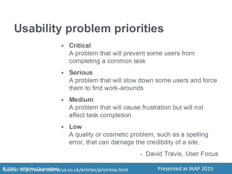
Слайд 7Usability problem priorities
Critical
A problem that will prevent some users from completing
Serious A problem that will slow down some users and force them to find work-arounds
Medium A problem that will cause frustration but will not affect task completion
Low A quality or cosmetic problem, such as a spelling error, that can damage the credibility of a site.
- David Travis, User Focus
Source: http://www.userfocus.co.uk/articles/prioritise.html
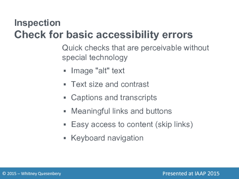
Слайд 10Inspection
Check for basic accessibility errors
Quick checks that are perceivable without special
Image "alt" text
Text size and contrast
Captions and transcripts
Meaningful links and buttons
Easy access to content (skip links)
Keyboard navigation
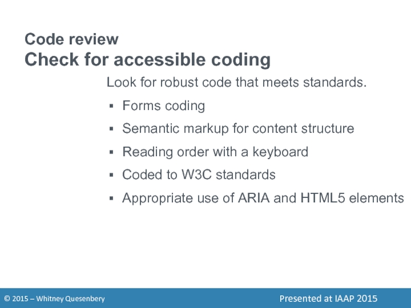
Слайд 11Code review
Check for accessible coding
Look for robust code that meets standards.
Forms
Semantic markup for content structure
Reading order with a keyboard
Coded to W3C standards
Appropriate use of ARIA and HTML5 elements
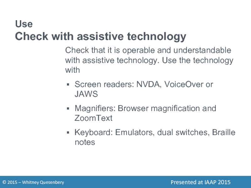
Слайд 12Use
Check with assistive technology
Check that it is operable and understandable with
Screen readers: NVDA, VoiceOver or JAWS
Magnifiers: Browser magnification and ZoomText
Keyboard: Emulators, dual switches, Braille notes
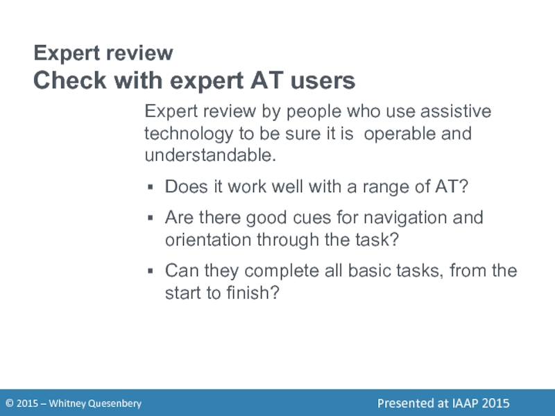
Слайд 13Expert review
Check with expert AT users
Expert review by people who use
Does it work well with a range of AT?
Are there good cues for navigation and orientation through the task?
Can they complete all basic tasks, from the start to finish?
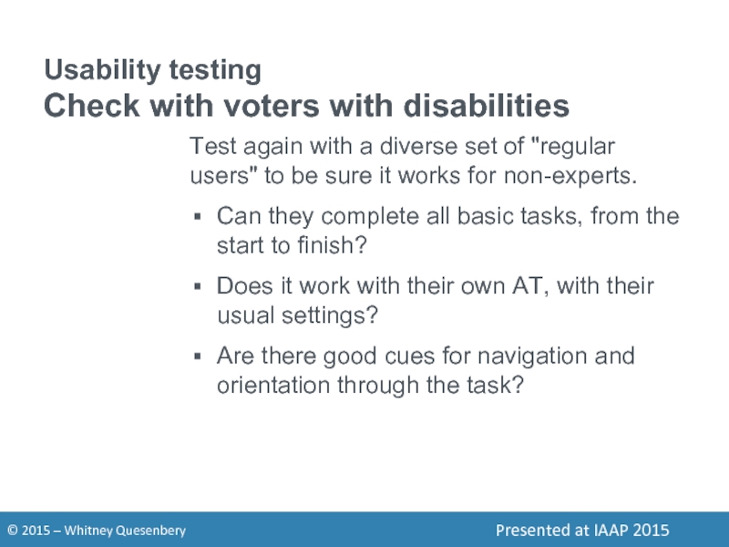
Слайд 14Usability testing
Check with voters with disabilities
Test again with a diverse set
Can they complete all basic tasks, from the start to finish?
Does it work with their own AT, with their usual settings?
Are there good cues for navigation and orientation through the task?
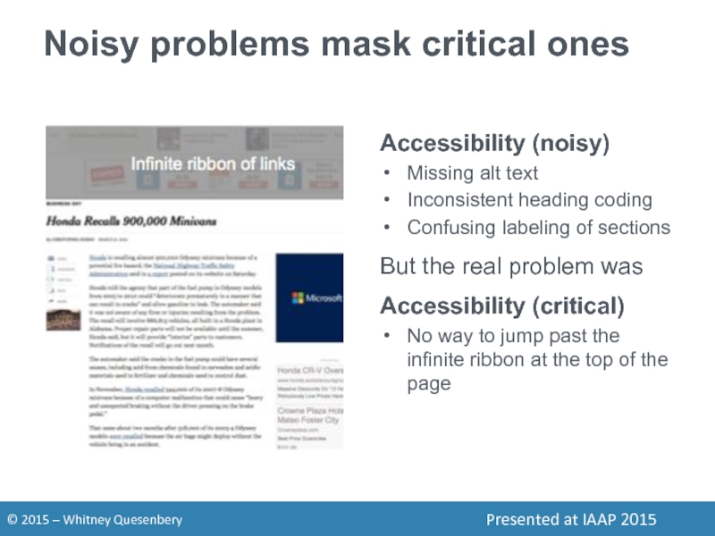
Слайд 16Noisy problems mask critical ones
Accessibility (noisy)
Missing alt text
Inconsistent heading coding
Confusing labeling
But the real problem was
Accessibility (critical)
No way to jump past the infinite ribbon at the top of the page
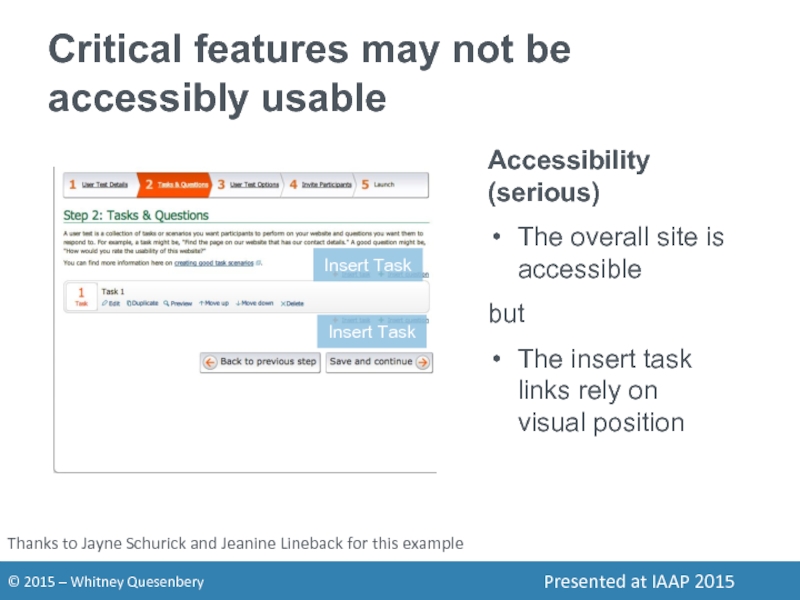
Слайд 17Critical features may not be accessibly usable
Accessibility (serious)
The overall site
but
The insert task links rely on visual position
Thanks to Jayne Schurick and Jeanine Lineback for this example
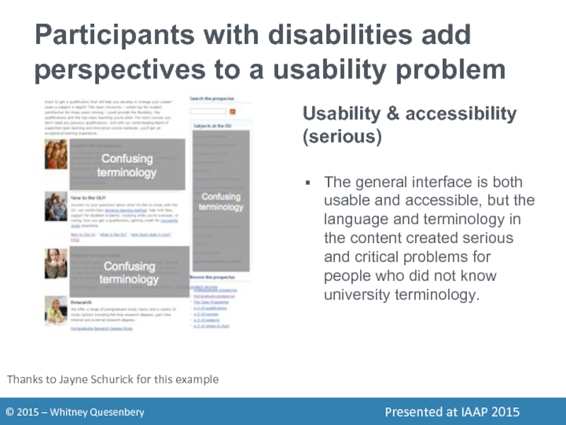
Слайд 18Participants with disabilities add perspectives to a usability problem
Usability & accessibility
The general interface is both usable and accessible, but the language and terminology in the content created serious and critical problems for people who did not know university terminology.
Thanks to Jayne Schurick for this example
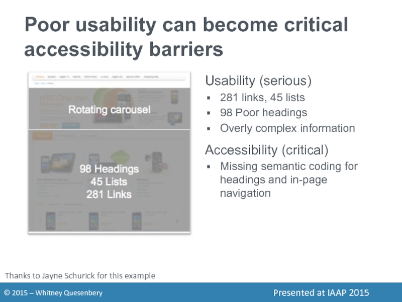
Слайд 19Poor usability can become critical accessibility barriers
Usability (serious)
281 links, 45 lists
98
Overly complex information
Accessibility (critical)
Missing semantic coding for headings and in-page navigation
Thanks to Jayne Schurick for this example
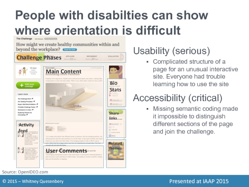
Слайд 20People with disabilties can show where orientation is difficult
Source: OpenIDEO.com
Usability (serious)
Complicated
Accessibility (critical)
Missing semantic coding made it impossible to distinguish different sections of the page and join the challenge.
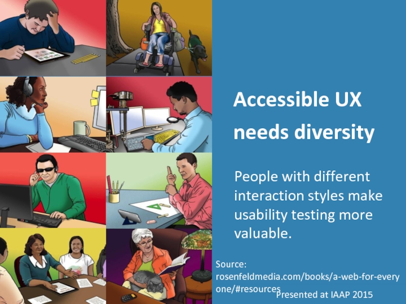
Слайд 22Accessible UX needs diversity
People with different interaction styles make usability testing
Source: rosenfeldmedia.com/books/a-web-for-everyone/#resources
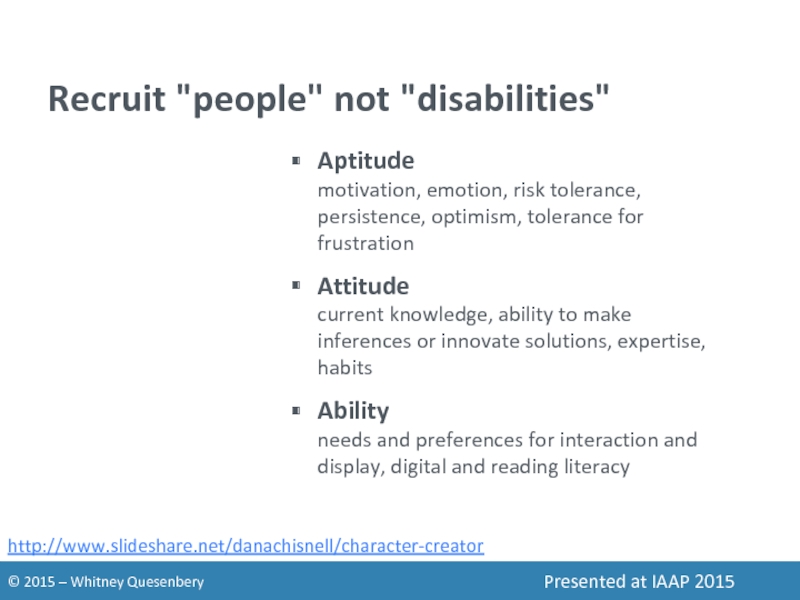
Слайд 23Recruit "people" not "disabilities"
Aptitude
motivation, emotion, risk tolerance, persistence, optimism, tolerance for
Attitude current knowledge, ability to make inferences or innovate solutions, expertise, habits
Ability needs and preferences for interaction and display, digital and reading literacy
http://www.slideshare.net/danachisnell/character-creator
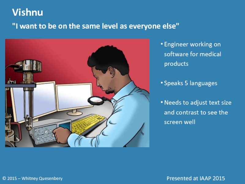
Слайд 24Vishnu
"I want to be on the same level as everyone else"
Engineer
Speaks 5 languages
Needs to adjust text size and contrast to see the screen well
Слайд 25Vishnu
"I want to be on the same level as everyone else"
Engineer
Speaks 5 languages
Needs to adjust text size and contrast to see the screen well
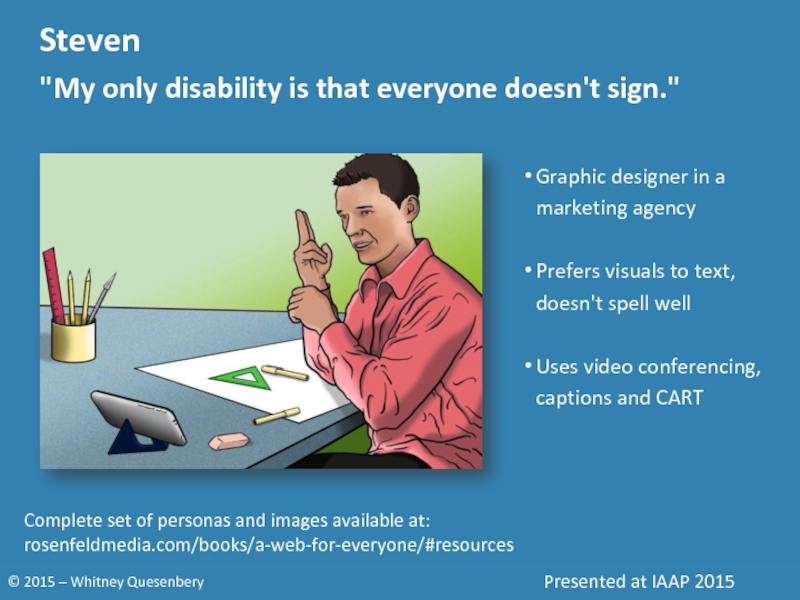
Слайд 26Steven
"My only disability is that everyone doesn't sign."
Graphic designer in a
Prefers visuals to text, doesn't spell well
Uses video conferencing, captions and CART
Complete set of personas and images available at:
rosenfeldmedia.com/books/a-web-for-everyone/#resources
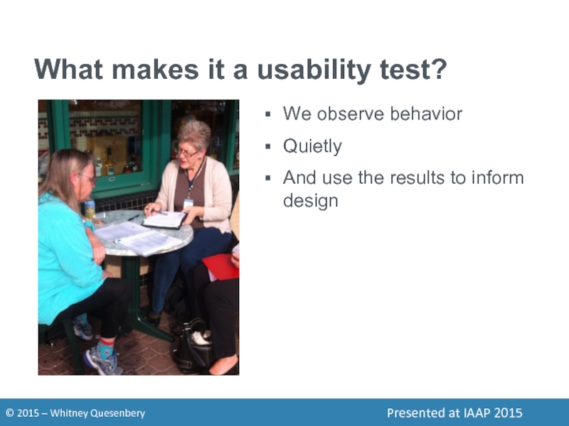
Слайд 30What makes it a usability test?
We observe behavior
Quietly
And use the results
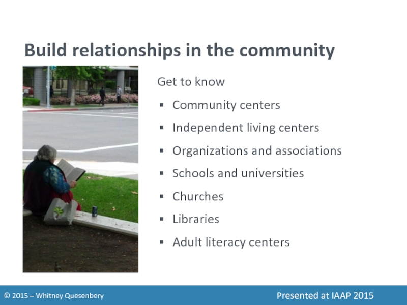
Слайд 31Build relationships in the community
Get to know
Community centers
Independent living centers
Organizations and
Schools and universities
Churches
Libraries
Adult literacy centers
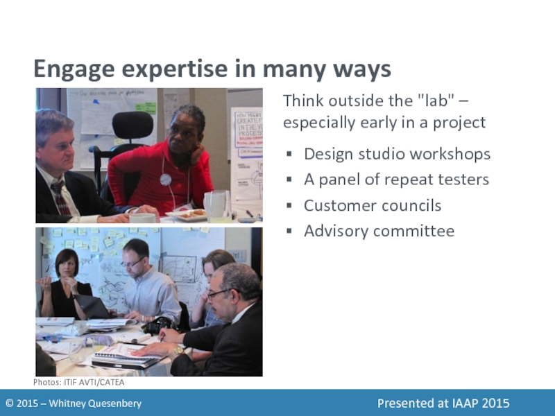
Слайд 32Engage expertise in many ways
Think outside the "lab" – especially early
Design studio workshops
A panel of repeat testers
Customer councils
Advisory committee
Photos: ITIF AVTI/CATEA
Слайд 33Aim for a rich view
Take time to:
Ask how they work now
Talk
Get them to show you the products they use (or even find delightful).
Explore what features are valuable, what barriers tolerable (or not)
Go back over interactions to see why and how they worked well (or not-so-well).
Слайд 34Expand your recruiting reach
Think about where to advertise
Identify transit options in
Use snowball methods
Ask for help reaching a new community
Be explicit about being inclusive
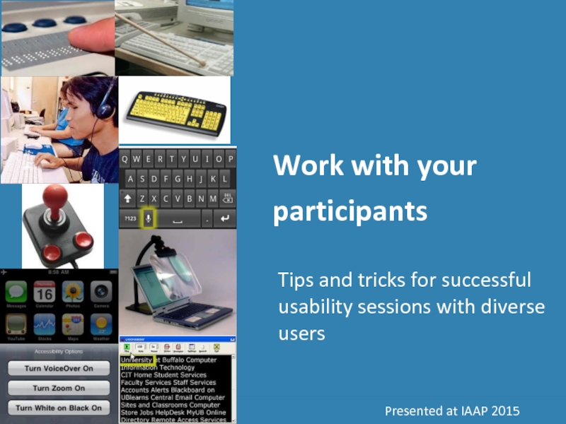
Слайд 35Work with your participants
Tips and tricks for successful usability sessions with
Слайд 36Think beyond the "task"
Are your research sessions flexible enough to adapt
Are you open to variations in how they complete tasks?
Are you flexible about the length of time for each session?
Can you adapt the session to react to unexpected barriers?
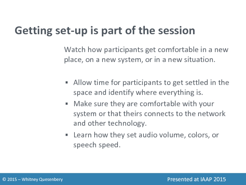
Слайд 37Getting set-up is part of the session
Watch how participants get comfortable
Allow time for participants to get settled in the space and identify where everything is.
Make sure they are comfortable with your system or that theirs connects to the network and other technology.
Learn how they set audio volume, colors, or speech speed.
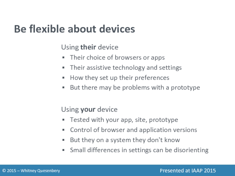
Слайд 38Be flexible about devices
Using their device
Their choice of browsers or apps
Their
How they set up their preferences
But there may be problems with a prototype
Using your device
Tested with your app, site, prototype
Control of browser and application versions
But they on a system they don't know
Small differences in settings can be disorienting
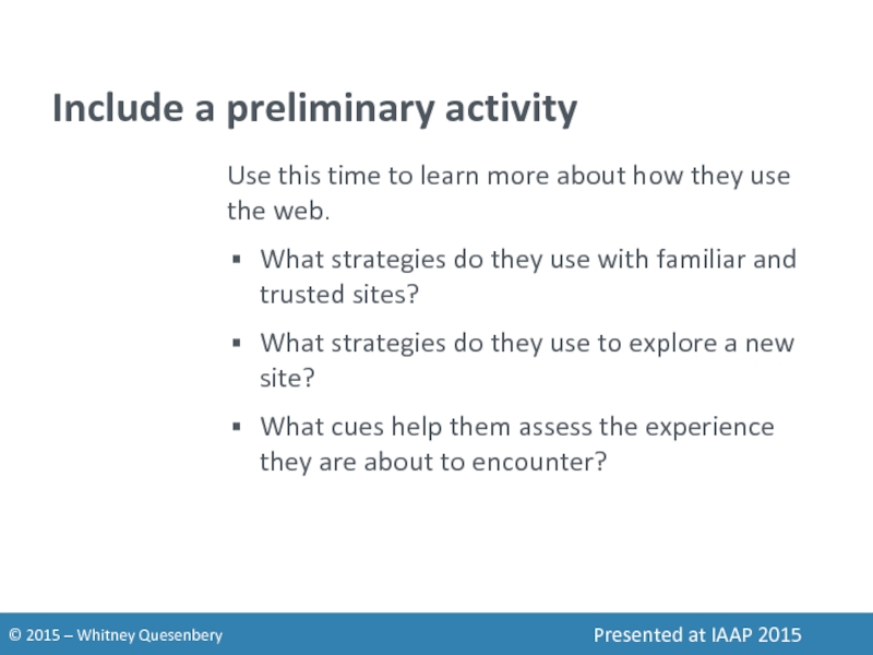
Слайд 39Include a preliminary activity
Use this time to learn more about how
What strategies do they use with familiar and trusted sites?
What strategies do they use to explore a new site?
What cues help them assess the experience they are about to encounter?
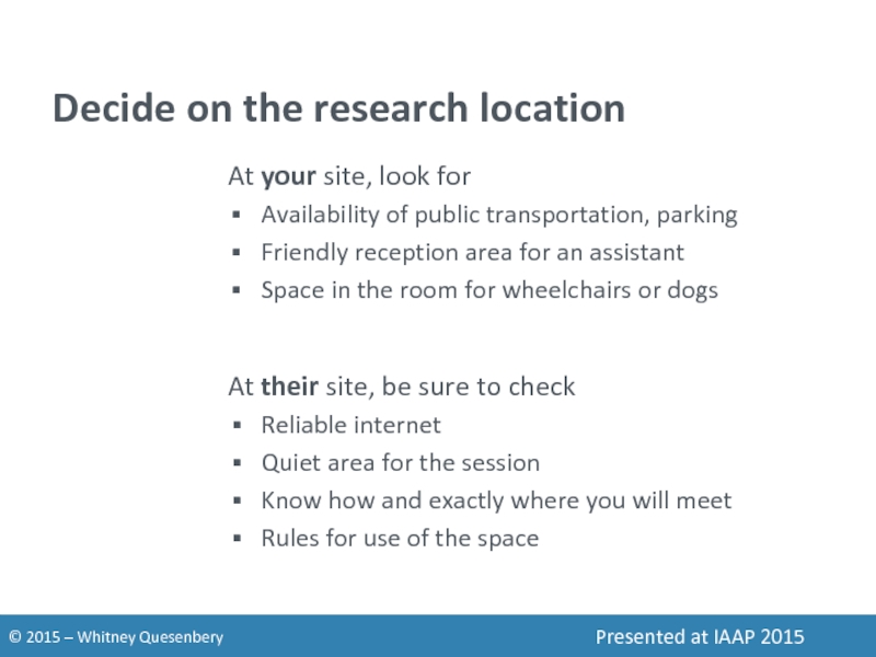
Слайд 40Decide on the research location
At your site, look for
Availability of
Friendly reception area for an assistant
Space in the room for wheelchairs or dogs
At their site, be sure to check
Reliable internet
Quiet area for the session
Know how and exactly where you will meet
Rules for use of the space
Слайд 41Consider your recording options
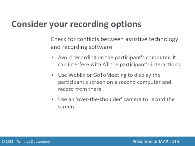
Check for conflicts between assistive technology and recording
Avoid recording on the participant's computer. It can interfere with AT the participant's interactions.
Use WebEx or GoToMeeting to display the participant's screen on a second computer and record from there.
Use an 'over-the-shoulder' camera to record the screen.
Слайд 42Recording setup with screen sharing
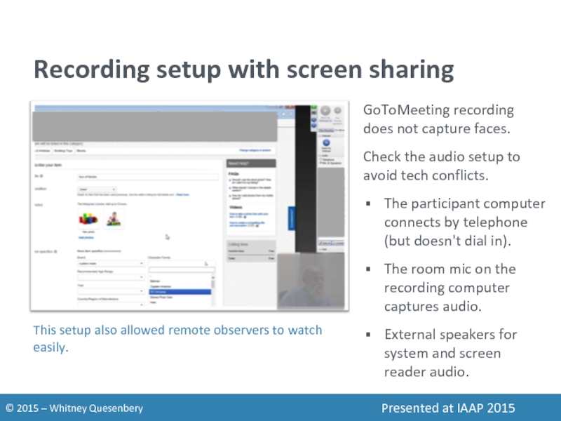
GoToMeeting recording does not capture faces.
Check the
The participant computer connects by telephone (but doesn't dial in).
The room mic on the recording computer captures audio.
External speakers for system and screen reader audio.
This setup also allowed remote observers to watch easily.
Слайд 43Recording setup with 2 cameras
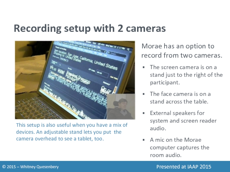
Morae has an option to record from
The screen camera is on a stand just to the right of the participant.
The face camera is on a stand across the table.
External speakers for system and screen reader audio.
A mic on the Morae computer captures the room audio.
This setup is also useful when you have a mix of devices. An adjustable stand lets you put the camera overhead to see a tablet, too.
Слайд 44Interacting with the participant
Don't distract
Give them time to get oriented on
Let them tell you if they are lost or stuck.
Use small retrospectives instead of talk-aloud.
Watch and listen
How do they navigated efficiently? Solve problems? Stay oriented?
Do they have any unexpected uses for the product?
What is novel or unexpectedly delightful for them?
And all the usual rules about staying neutral.
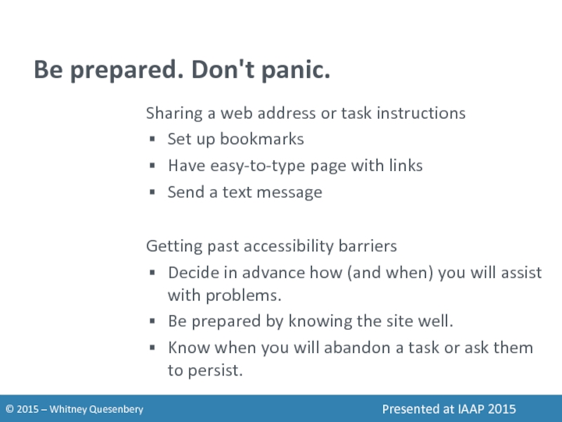
Слайд 45Be prepared. Don't panic.
Sharing a web address or task instructions
Set up
Have easy-to-type page with links
Send a text message
Getting past accessibility barriers
Decide in advance how (and when) you will assist with problems.
Be prepared by knowing the site well.
Know when you will abandon a task or ask them to persist.
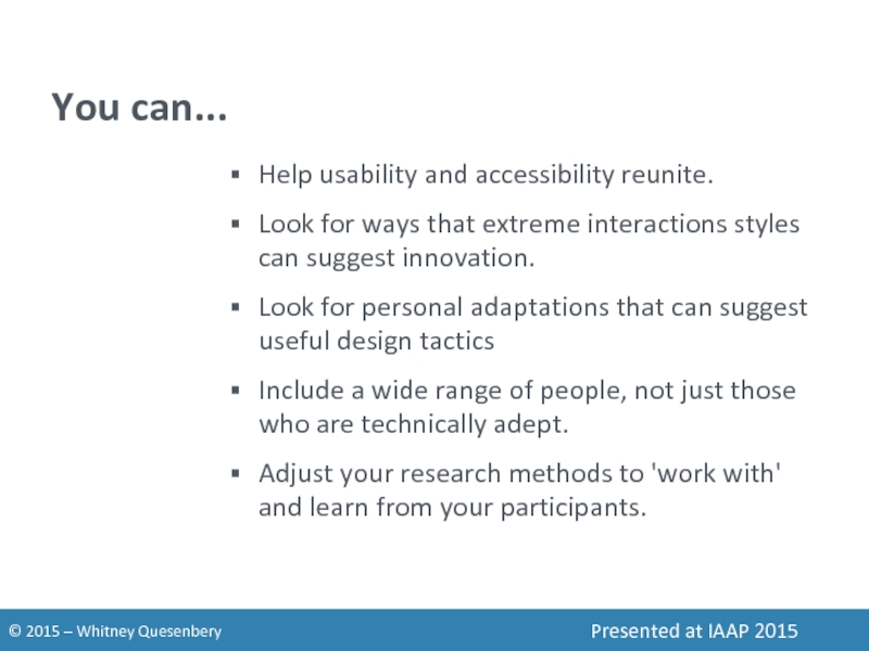
Слайд 47You can...
Help usability and accessibility reunite.
Look for ways that extreme interactions
Look for personal adaptations that can suggest useful design tactics
Include a wide range of people, not just those who are technically adept.
Adjust your research methods to 'work with' and learn from your participants.
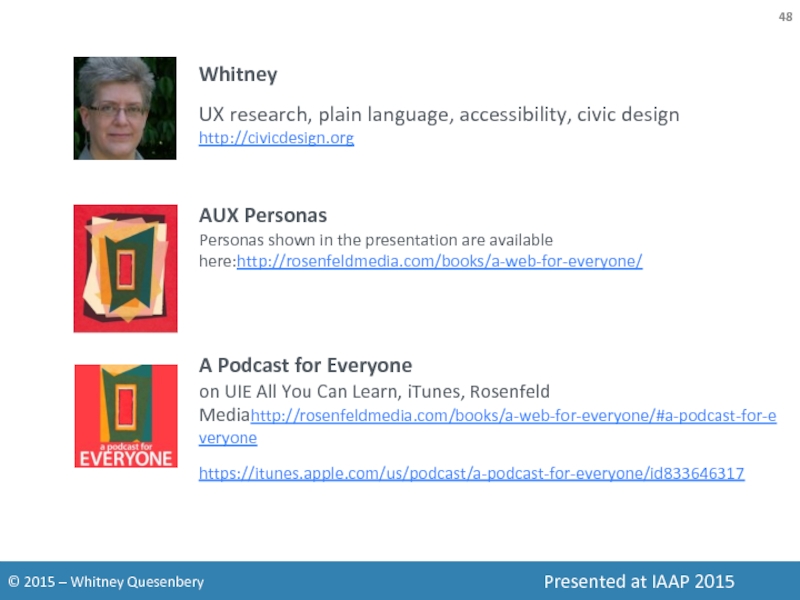
Слайд 48Whitney
UX research, plain language, accessibility, civic design
http://civicdesign.org
AUX Personas
Personas shown in the
A Podcast for Everyone on UIE All You Can Learn, iTunes, Rosenfeld Mediahttp://rosenfeldmedia.com/books/a-web-for-everyone/#a-podcast-for-everyone
https://itunes.apple.com/us/podcast/a-podcast-for-everyone/id833646317
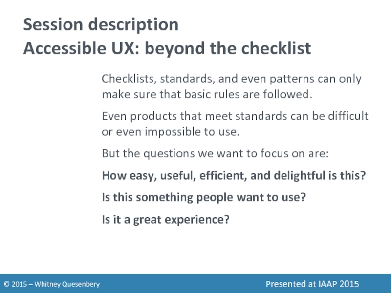
Слайд 49Session description
Accessible UX: beyond the checklist
Checklists, standards, and even patterns can
Even products that meet standards can be difficult or even impossible to use.
But the questions we want to focus on are:
How easy, useful, efficient, and delightful is this?
Is this something people want to use?
Is it a great experience?
