- Главная
- Разное
- Дизайн
- Бизнес и предпринимательство
- Аналитика
- Образование
- Развлечения
- Красота и здоровье
- Финансы
- Государство
- Путешествия
- Спорт
- Недвижимость
- Армия
- Графика
- Культурология
- Еда и кулинария
- Лингвистика
- Английский язык
- Астрономия
- Алгебра
- Биология
- География
- Детские презентации
- Информатика
- История
- Литература
- Маркетинг
- Математика
- Медицина
- Менеджмент
- Музыка
- МХК
- Немецкий язык
- ОБЖ
- Обществознание
- Окружающий мир
- Педагогика
- Русский язык
- Технология
- Физика
- Философия
- Химия
- Шаблоны, картинки для презентаций
- Экология
- Экономика
- Юриспруденция
Lab Coat Lessons Webinar Brian Massey Joel Harvey презентация
Содержание
- 1. Lab Coat Lessons Webinar Brian Massey Joel Harvey
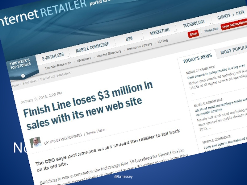
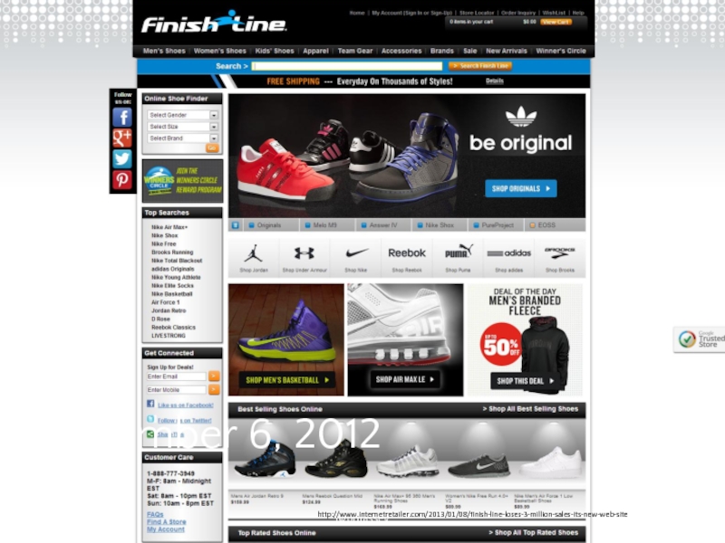
- 2. @bmassey November, 18 2012 http://www.internetretailer.com/2013/01/08/finish-line-loses-3-million-sales-its-new-web-site
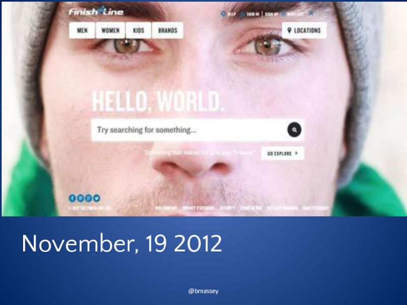
- 3. @bmassey November, 19 2012
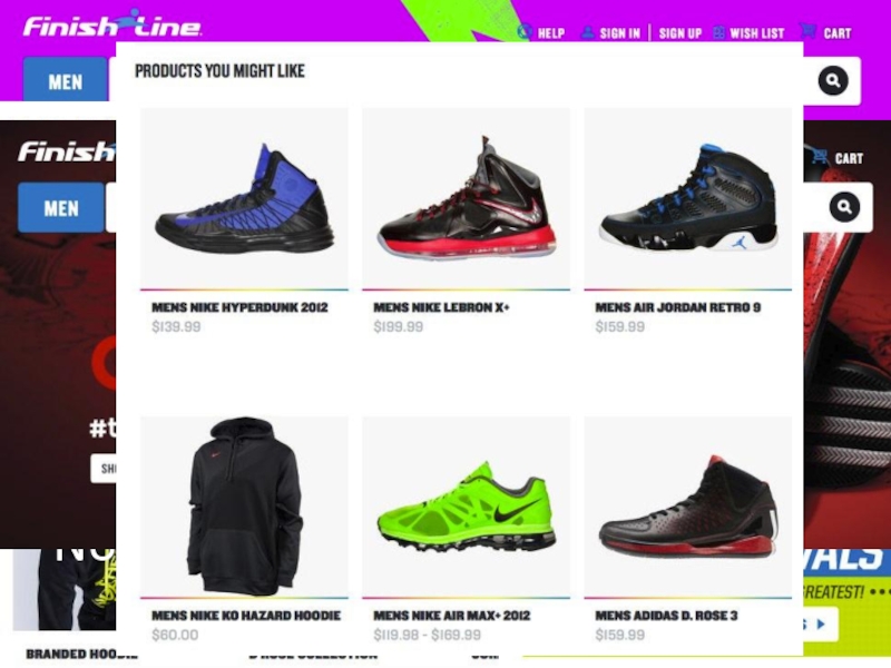
- 4. @bmassey November, 19 2012
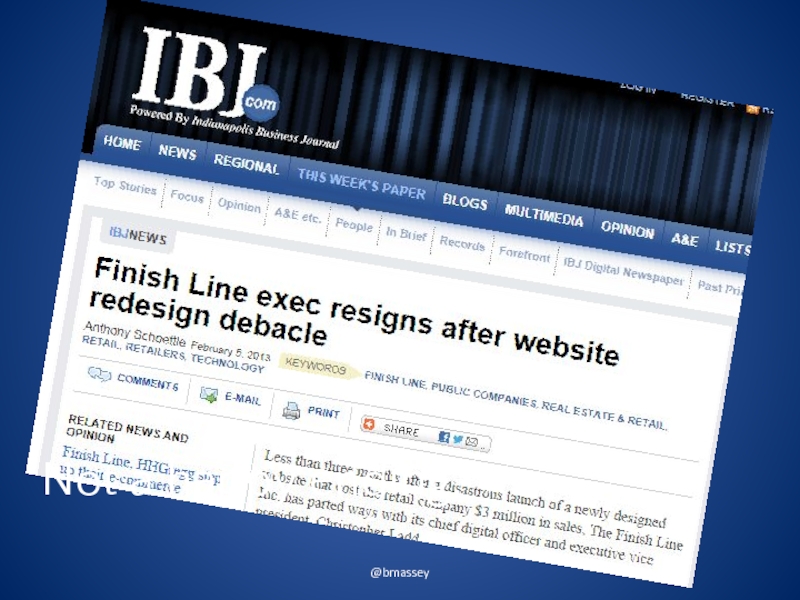
- 5. @bmassey Not a happy ending.
- 6. @bmassey Not a happy ending.
- 7. @bmassey Important Info Why redesigns fail
- 8. @bmassey Important Info Justifying the risk and effort of a redesign
- 9. @bmassey Important Info Use your existing site to reduce risks
- 10. @bmassey Important Info Apply a data-driven methods to avoid redesign pitfalls
- 11. Conversion Sciences A/B Testing Experts B2C and
- 12. @bmassey
- 13. What JJ Knows @bmassey
- 14. Know What to Keep and Know What to Create @bmassey
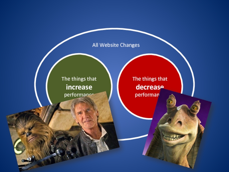
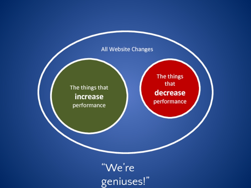
- 15. The things that decrease performance The things that increase performance All Website Changes
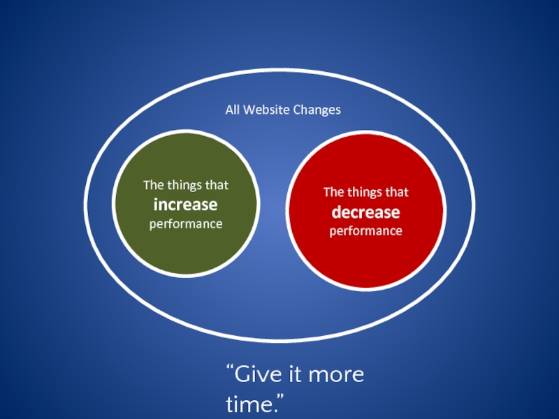
- 16. The things that decrease performance The
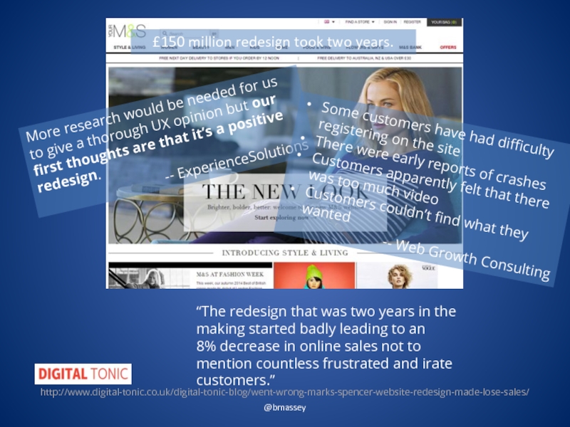
- 17. @bmassey “The redesign that was two years
- 18. The things that decrease performance The
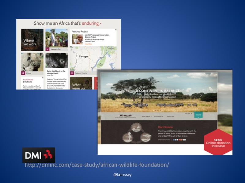
- 19. @bmassey http://dminc.com/case-study/african-wildlife-foundation/
- 20. WHY REDESIGNS FAIL @bmassey
- 21. Repeat Visitors are Shocked @bmassey
- 22. Designed for Wrong Segments @bmassey
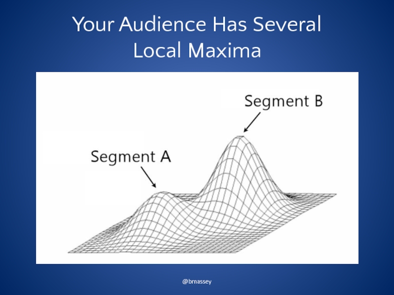
- 23. Your Audience Has Several Local Maxima @bmassey
- 24. Your Visitors Didn’t Go to the Same
- 25. Reliance on Best Practices @bmassey
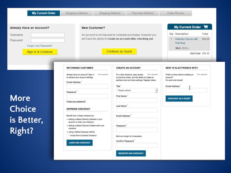
- 26. More Choice is Better, Right?
- 27. Too Much Emphasis on Look and Feel @bmassey
- 28. Making the Case for a Redesign Photo Credit: drinksmachine https://www.flickr.com/photos/95457978@N00/3732782275/ (cc)
- 29. TYPICAL REASONS TO REDESIGN @bmassey
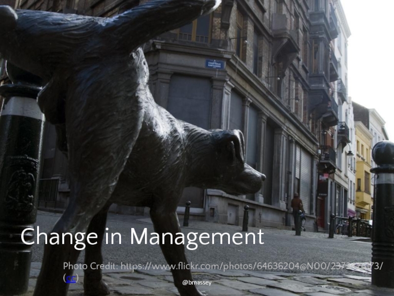
- 30. @bmassey Change in Management Photo Credit: https://www.flickr.com/photos/64636204@N00/2373428173/ (cc)
- 31. @bmassey Poor Performance Photo Credit: rkleine https://www.flickr.com/photos/47544801@N00/3566407243/ (cc)
- 32. @bmassey Improve Mobile Experience Photo Credit: the_steve_cox https://www.flickr.com/photos/35468147898@N01/6294412553/ (cc)
- 33. @bmassey Well, Just Look at It! Photo credit: https://www.flickr.com/photos/27904432@N00/6672288949/ (cc)
- 34. @bmassey We Need to be Unique * Photo Credit: https://www.flickr.com/photos/95572727@N00/2065282685/ (cc)
- 35. These sites will improve faster and more reliably with an optimization program. @bmassey
- 36. GOOD REASONS TO REDESIGN @bmassey
- 37. @bmassey Poor Content Management System Photo Credit: https://www.flickr.com/photos/108488366@N07/14359994013/ (cc)
- 38. @bmassey Rebranding or Repositioning *
- 39. STRATEGIES FOR REDESIGN @bmassey
- 40. @bmassey 1 Going All In Photo Credit: https://www.flickr.com/photos/39804614253@N01/1761955352/ (cc)
- 41. @bmassey There’s No Such Thing as a
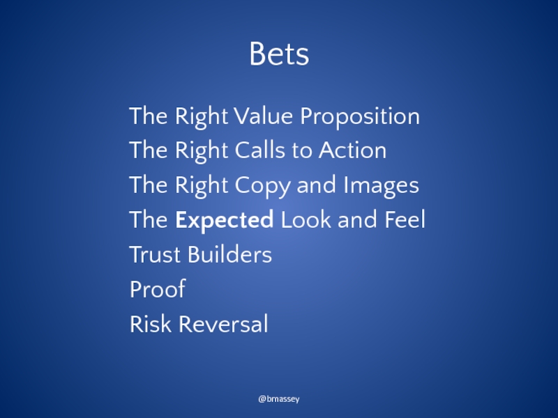
- 42. Bets The Right Value Proposition The Right
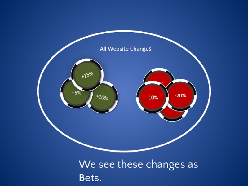
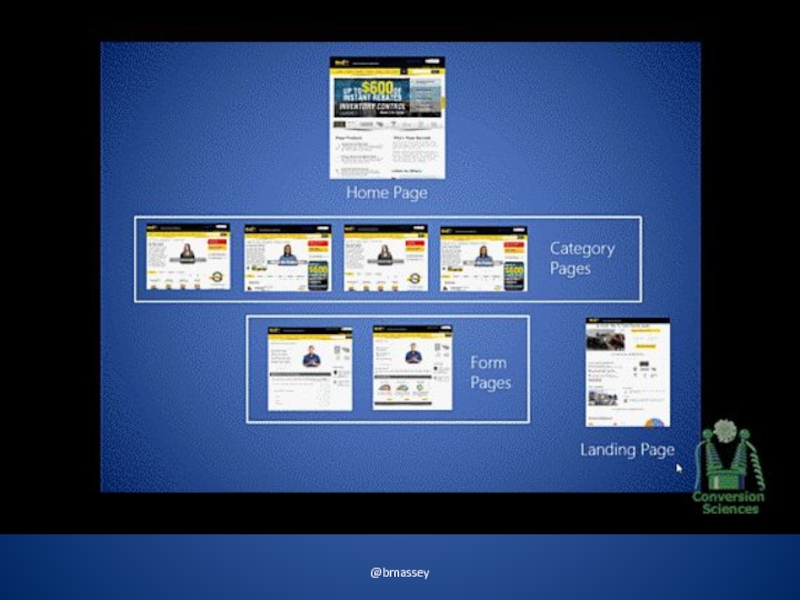
- 43. All Website Changes We see these changes as Bets.
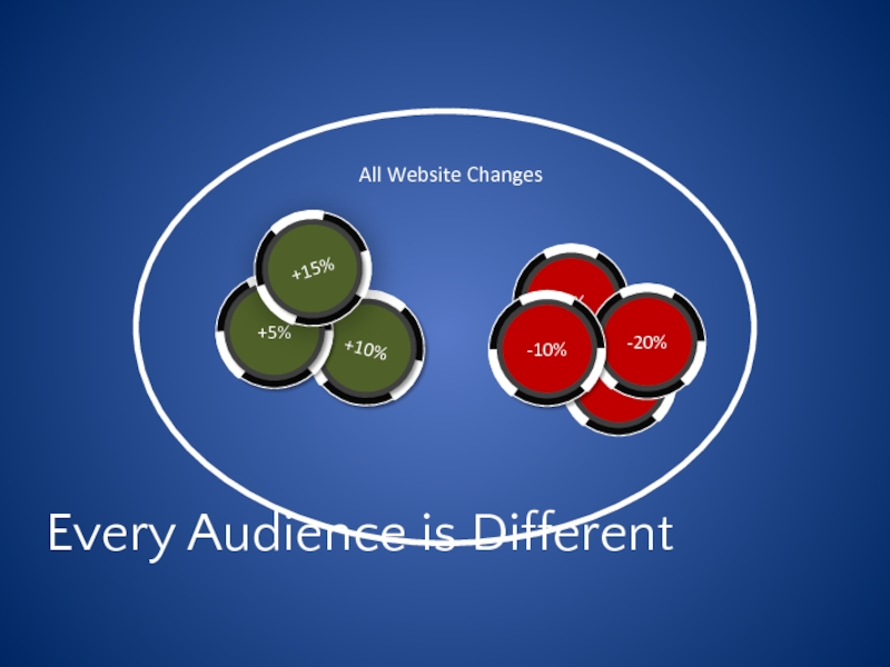
- 44. All Website Changes Every Audience is Different
- 45. WHAT TO WATCH Metrics that Matter in a Redesign @bmassey
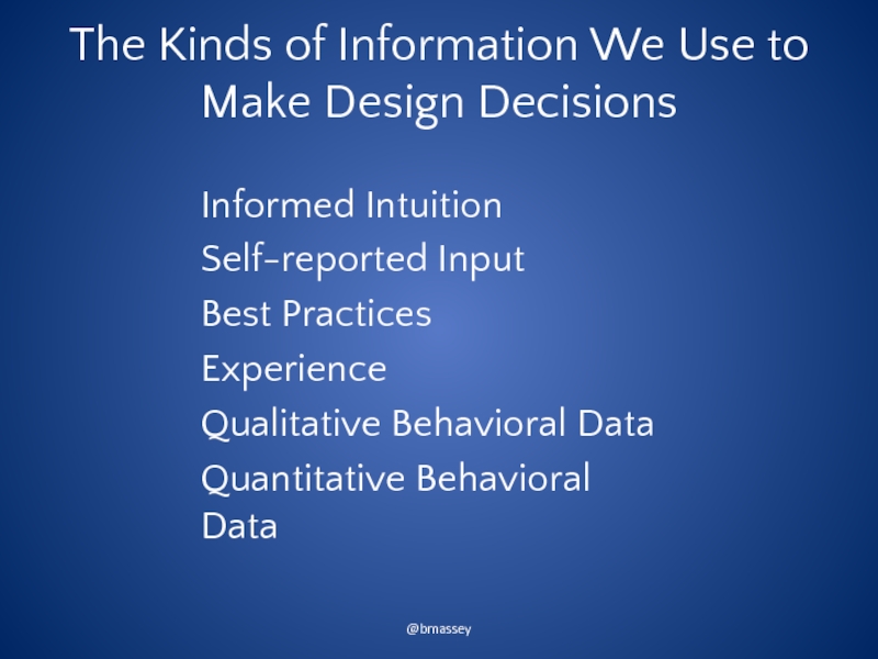
- 46. The Kinds of Information We Use to
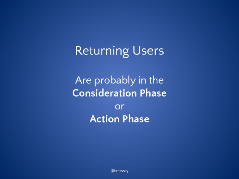
- 47. Returning Users Are probably in the
- 48. Lead Generation Did we make it harder for visitors to take action? @bmassey
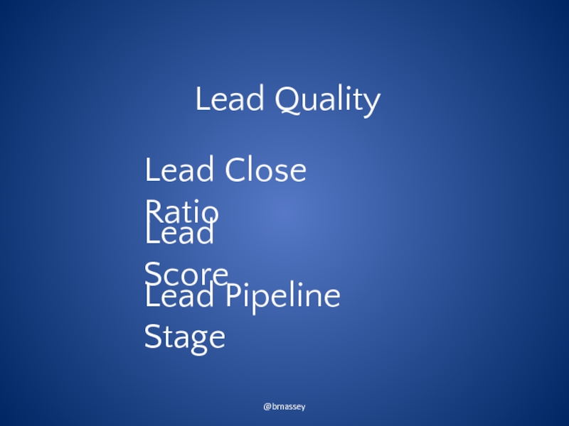
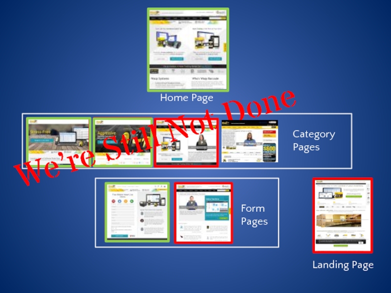
- 49. Lead Quality @bmassey Lead Score Lead Pipeline Stage Lead Close Ratio
- 50. Conversion Rate @bmassey
- 51. Average Order Value @bmassey
- 52. Lead Value @bmassey
- 53. Revenue per Visit @bmassey
- 54. Conversion by Traffic Source @bmassey
- 55. Compare Before and After Year-over-year @bmassey
- 56. @bmassey 2 Best Practices Bets
- 57. B2B Furniture Site @bmassey
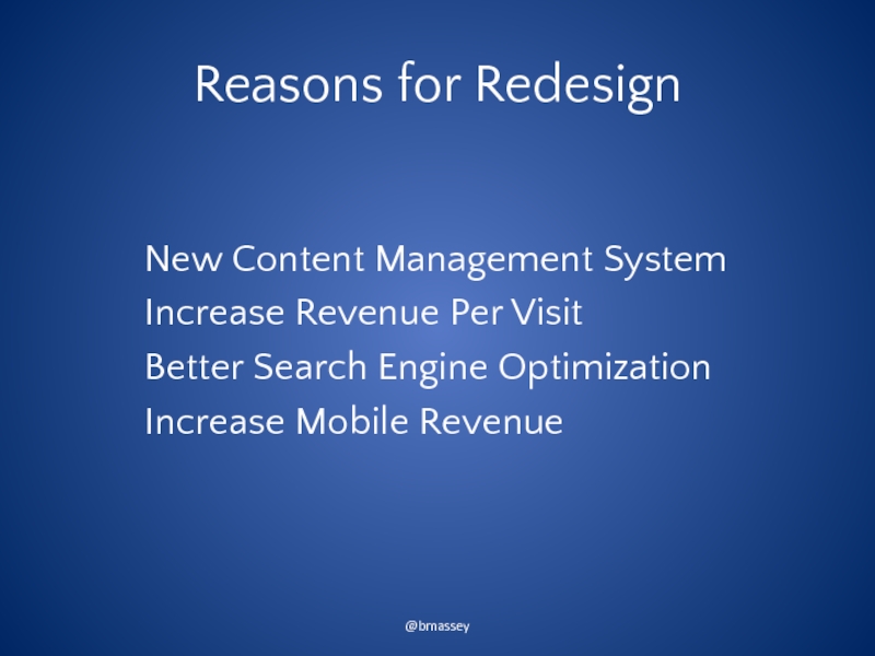
- 58. Reasons for Redesign New Content Management System
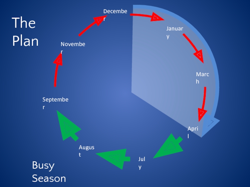
- 59. The Plan Busy Season
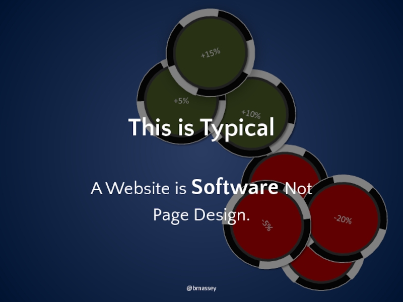
- 61. This is Typical A Website is Software Not Page Design. @bmassey
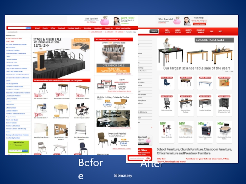
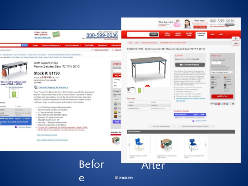
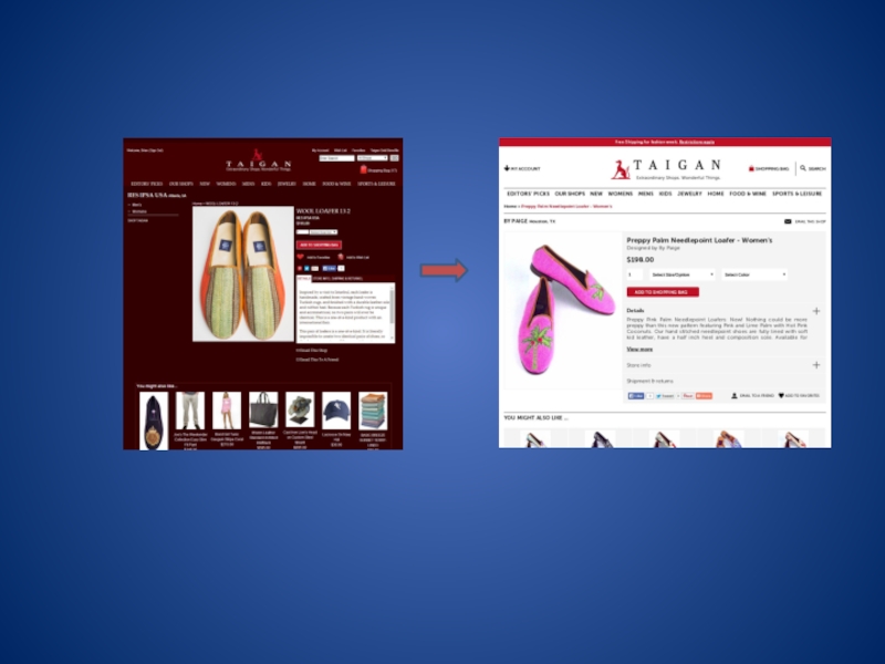
- 63. @bmassey Before After
- 64. @bmassey Before After
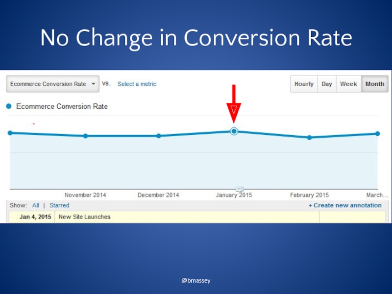
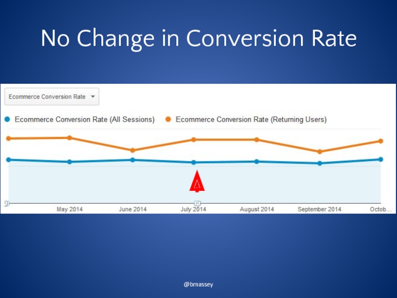
- 65. No Change in Conversion Rate @bmassey
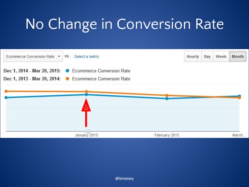
- 66. No Change in Conversion Rate @bmassey
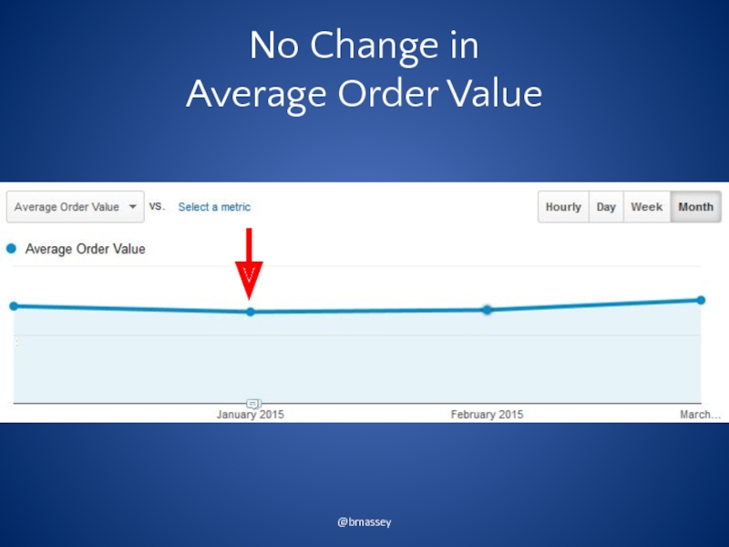
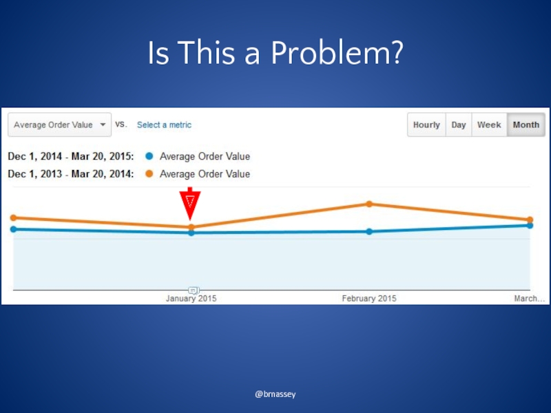
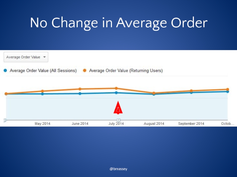
- 67. No Change in Average Order Value @bmassey
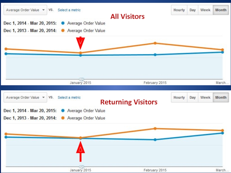
- 68. Is This a Problem? @bmassey
- 69. Returning Visitors @bmassey Returning Visitors All Visitors
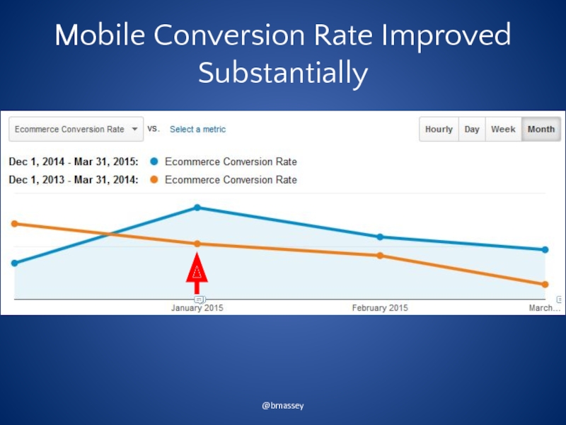
- 70. Mobile Conversion Rate Improved Substantially @bmassey
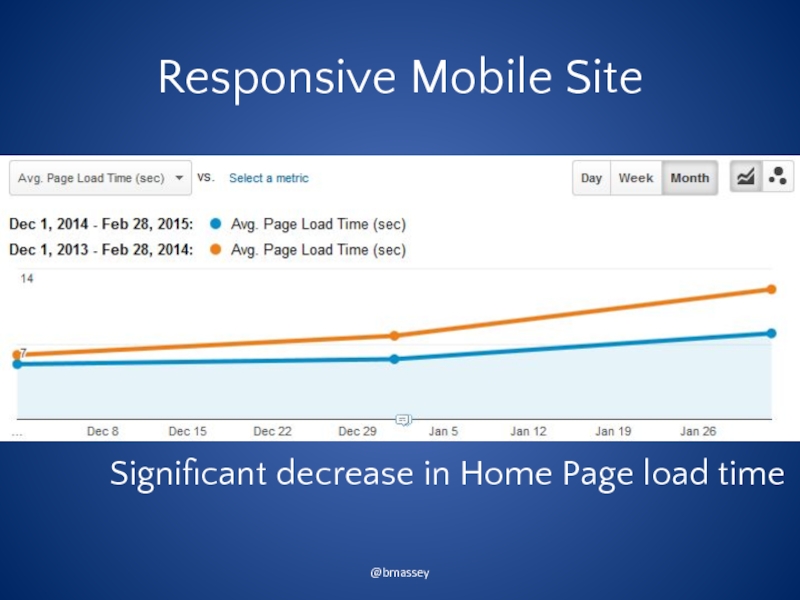
- 71. Responsive Mobile Site @bmassey Significant decrease in Home Page load time
- 72. Testing has begun to increase conversion rate. @bmassey
- 73. @bmassey 3 Test on Current Site
- 74. Reasons for Redesign Increase Revenue @bmassey
- 75. @bmassey January 1, 2014
- 78. Extreme Site AB Test Statistically identical
- 79. No Change in Conversion Rate @bmassey
- 80. No Change in Average Order @bmassey
- 81. Things You Should Test on Your Current
- 82. @bmassey 4 The Simultaneous Launch
- 83. Reasons for Redesign Increase Trials of Pro
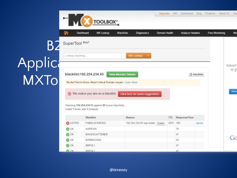
- 84. B2B Applications: MXToolbox @bmassey
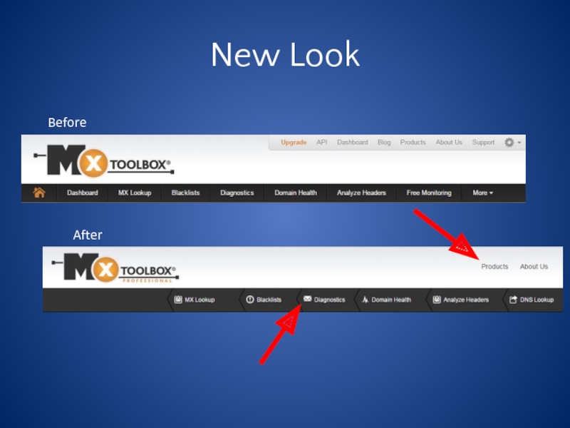
- 85. New Look Before After
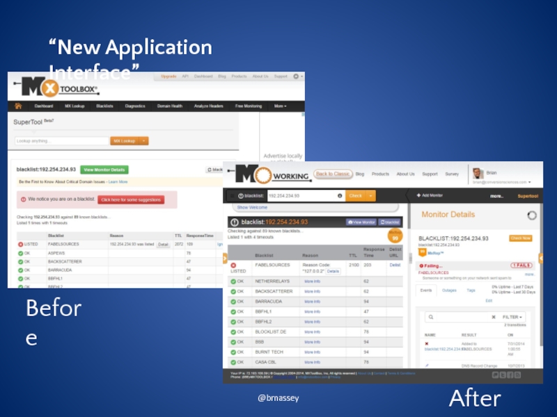
- 86. @bmassey “New Application Interface” Before After
- 87. Let the Visitor Tell You @bmassey
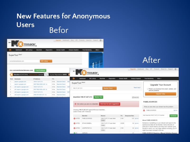
- 88. New Features for Anonymous Users Before
- 89. Results Positive Feedback From PRO Users
- 90. @bmassey 5 Stepwise Redesign
- 91. B2B Inventory and Asset Tracking Systems @bmassey
- 92. Reasons for Redesign Increase Live Demos Present a Better Brand Impression @bmassey
- 93. Test New Design and Calls to Action @bmassey +48.7% Before
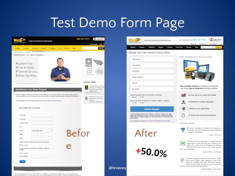
- 94. Test Demo Form Page @bmassey +50.0% Before
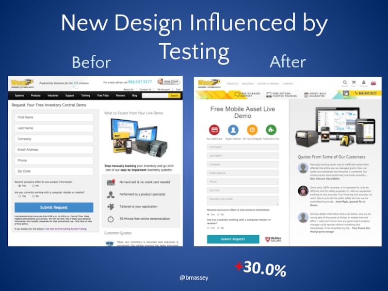
- 95. New Design Influenced by Testing @bmassey Before +30.0%
- 96. @bmassey
- 97. We’re Still Not Done
- 98. Why This Crazy Approach? @bmassey
- 99. Constant Feedback to Designers @bmassey
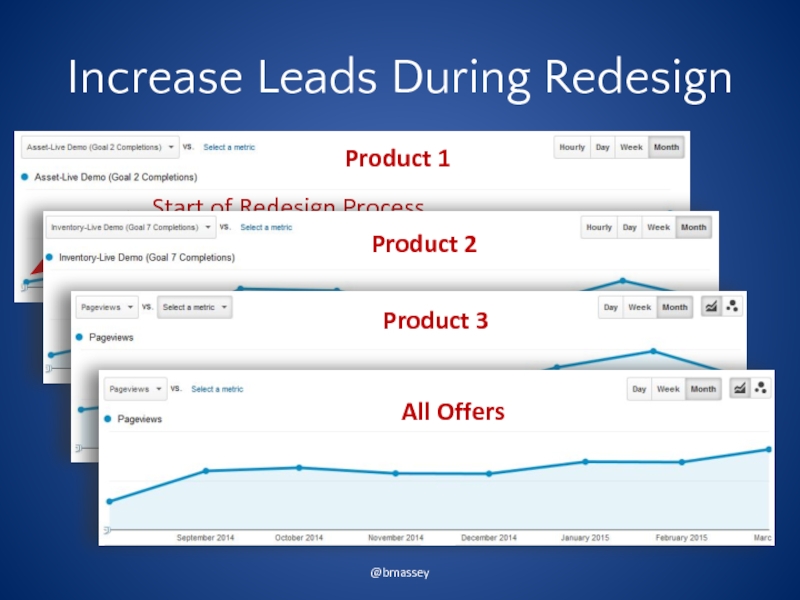
- 100. Increase Leads During Redesign @bmassey
- 101. The Result $ $ $ $ $ $ $ $ $ $ $ $
- 102. Caveats Wasp Barcode was an outlier. We
- 103. BE READY TO GO BACK @bmassey
- 104. "We made a strategic decision on December
- 105. @bmassey November, 18 2012 http://www.internetretailer.com/2013/01/08/finish-line-loses-3-million-sales-its-new-web-site
- 106. @bmassey November, 19 2012
- 107. @bmassey December 6, 2012 http://www.internetretailer.com/2013/01/08/finish-line-loses-3-million-sales-its-new-web-site
- 108. @bmassey June 2014
- 109. We often redesign for the wrong reasons. @bmassey
- 110. Without data, redesigns are risky. @bmassey
- 111. Going All In is the most risky (and most common!) @bmassey
- 112. Collecting test data on the current site mitigates the risk. @bmassey
- 113. Testing assumptions on the current site further reduces risk. @bmassey
- 114. A side-by-side approach allows you to back out poor performing features. @bmassey
- 115. A stepwise approach eliminates risk while increasing performance immediately. @bmassey
- 116. Do you need a redesign or an optimization program? @bmassey
- 117. Free Site Evaluations -First Three- Tweet something nice using #labcoatlessons @bmassey
Слайд 2@bmassey
November, 18 2012
http://www.internetretailer.com/2013/01/08/finish-line-loses-3-million-sales-its-new-web-site
Слайд 11Conversion Sciences
A/B Testing Experts
B2C and B2B Ecommerce
Lead Generation
SaaS
Brian Massey
@bmassey
bmassey@conversionsciences.com
www.ConversionScience.com
(512) 961-6604
Слайд 16The things that decrease performance
The things that increase performance
All Website Changes
“Give
Слайд 17@bmassey
“The redesign that was two years in the making started badly
http://www.digital-tonic.co.uk/digital-tonic-blog/went-wrong-marks-spencer-website-redesign-made-lose-sales/
More research would be needed for us to give a thorough UX opinion but our first thoughts are that it’s a positive redesign.
-- ExperienceSolutions
Some customers have had difficulty registering on the site
There were early reports of crashes
Customers apparently felt that there was too much video
Customers couldn’t find what they wanted
-- Web Growth Consulting
£150 million redesign took two years.
Слайд 18The things that decrease performance
The things that increase performance
All Website Changes
“We’re
Слайд 24Your Visitors Didn’t Go to the Same Design School. Half of your
@bmassey
Слайд 28Making the Case for a Redesign
Photo Credit: drinksmachine https://www.flickr.com/photos/95457978@N00/3732782275/ (cc)
Слайд 30@bmassey
Change in Management
Photo Credit: https://www.flickr.com/photos/64636204@N00/2373428173/ (cc)
Слайд 31@bmassey
Poor Performance
Photo Credit: rkleine https://www.flickr.com/photos/47544801@N00/3566407243/ (cc)
Слайд 32@bmassey
Improve Mobile Experience
Photo Credit: the_steve_cox https://www.flickr.com/photos/35468147898@N01/6294412553/ (cc)
Слайд 33@bmassey
Well, Just Look at It!
Photo credit: https://www.flickr.com/photos/27904432@N00/6672288949/ (cc)
Слайд 34@bmassey
We Need to be Unique
*
Photo Credit: https://www.flickr.com/photos/95572727@N00/2065282685/ (cc)
Слайд 37@bmassey
Poor Content Management System
Photo Credit: https://www.flickr.com/photos/108488366@N07/14359994013/ (cc)
Слайд 40@bmassey
1
Going All In
Photo Credit: https://www.flickr.com/photos/39804614253@N01/1761955352/ (cc)
Слайд 41@bmassey
There’s No Such Thing as a Best Practice, Only Best Bets.
*
Photo
Слайд 42Bets
The Right Value Proposition
The Right Calls to Action
The Right Copy and
The Expected Look and Feel
Trust Builders
Proof
Risk Reversal
@bmassey
Слайд 46The Kinds of Information We Use to Make Design Decisions
Informed Intuition
Self-reported
Best Practices
Experience
Qualitative Behavioral Data
Quantitative Behavioral Data
@bmassey
Слайд 58Reasons for Redesign
New Content Management System
Increase Revenue Per Visit
Better Search Engine
Increase Mobile Revenue
@bmassey
Слайд 62
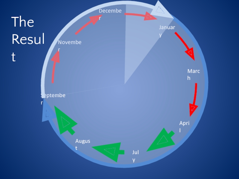
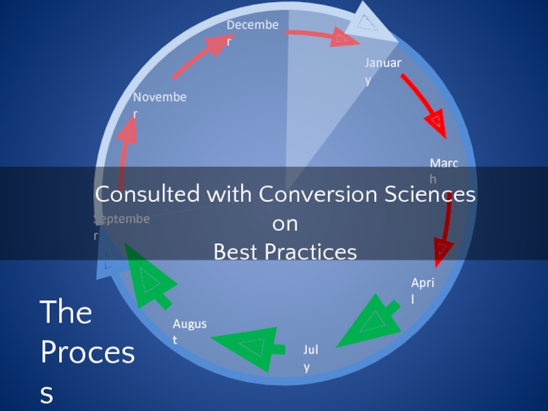
December
January
March
April
July
August
November
September
The
Process
Consulted with Conversion Sciences on
Best Practices
Слайд 81Things You Should Test on Your Current Site Before a Redesign
Value
Calls to Action
Risk Reversal
Trust Builders
Landing Pages
Form Length
@bmassey
Слайд 83Reasons for Redesign
Increase Trials of Pro Services
Increase Revenue
Get Users to Try
@bmassey
Слайд 89Results
Positive Feedback From PRO Users
Decision to hold off on new interface
@bmassey
Слайд 102Caveats
Wasp Barcode was an outlier. We don’t typically triple leads in
The intuition of the designers proved to be very good for this audience.
Слайд 104"We made a strategic decision on December 6 to transition back
@bmassey


