- Главная
- Разное
- Дизайн
- Бизнес и предпринимательство
- Аналитика
- Образование
- Развлечения
- Красота и здоровье
- Финансы
- Государство
- Путешествия
- Спорт
- Недвижимость
- Армия
- Графика
- Культурология
- Еда и кулинария
- Лингвистика
- Английский язык
- Астрономия
- Алгебра
- Биология
- География
- Детские презентации
- Информатика
- История
- Литература
- Маркетинг
- Математика
- Медицина
- Менеджмент
- Музыка
- МХК
- Немецкий язык
- ОБЖ
- Обществознание
- Окружающий мир
- Педагогика
- Русский язык
- Технология
- Физика
- Философия
- Химия
- Шаблоны, картинки для презентаций
- Экология
- Экономика
- Юриспруденция
Kristi McKinney Clockwork Active Media презентация
Содержание
- 1. Kristi McKinney Clockwork Active Media
- 2. THE SCENARIO
- 3. FEATURE EXPLOSION “I saw this [insert feature]
- 4. WE GET IDEAS FROM OTHERS When approaching
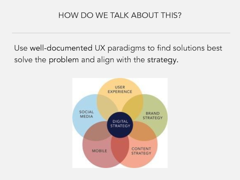
- 5. HOW DO WE TALK ABOUT THIS? Use
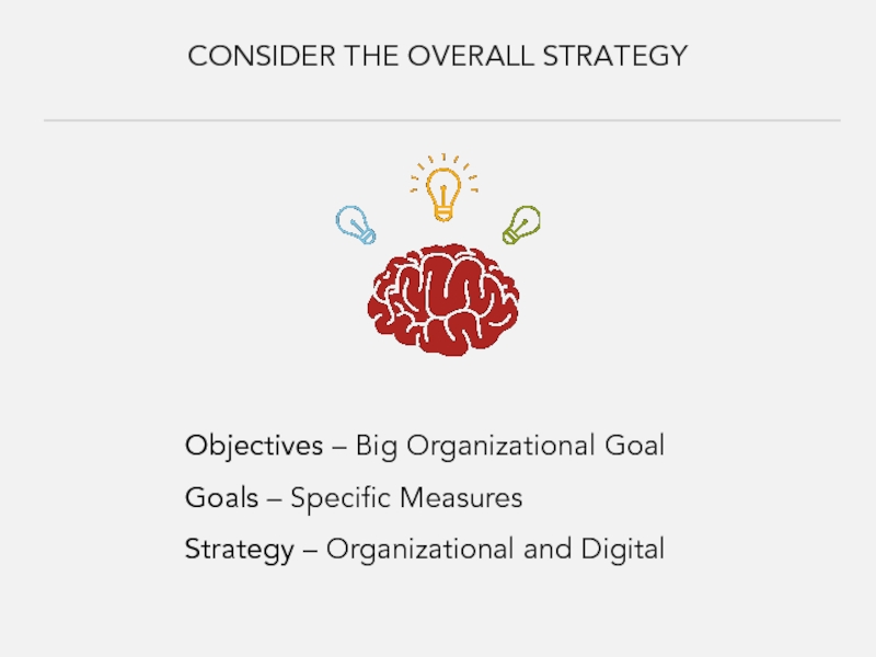
- 6. CONSIDER THE OVERALL STRATEGY Objectives – Big
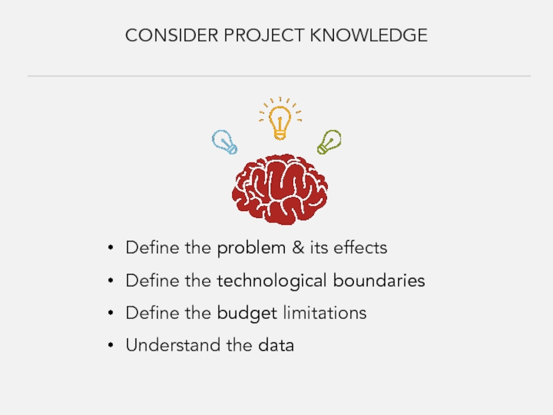
- 7. CONSIDER PROJECT KNOWLEDGE Define the problem &
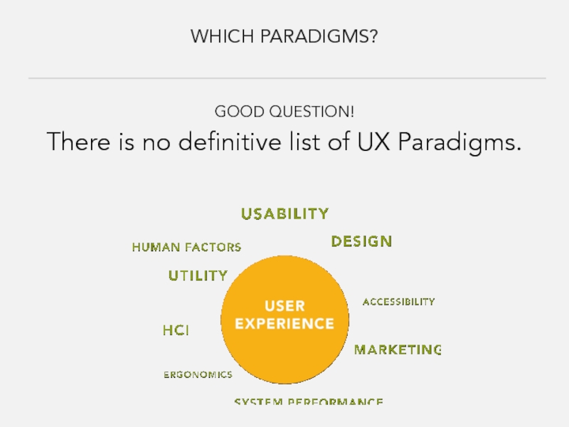
- 8. WHICH PARADIGMS? GOOD QUESTION! There is no definitive list of UX Paradigms.
- 9. APPLYING PARADIGMS EXAMPLES
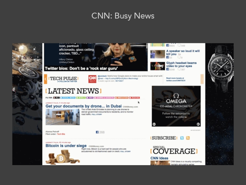
- 10. CNN: Busy News
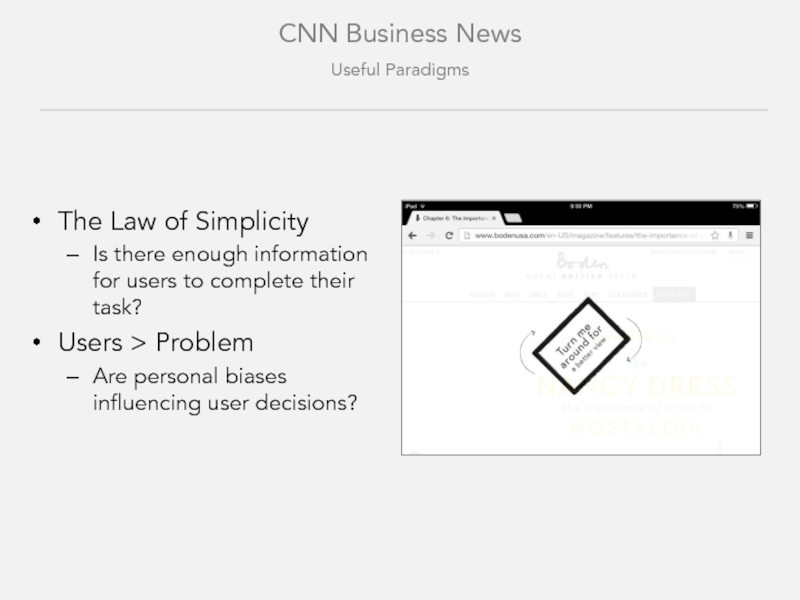
- 11. CNN Business News Useful Paradigms The Law
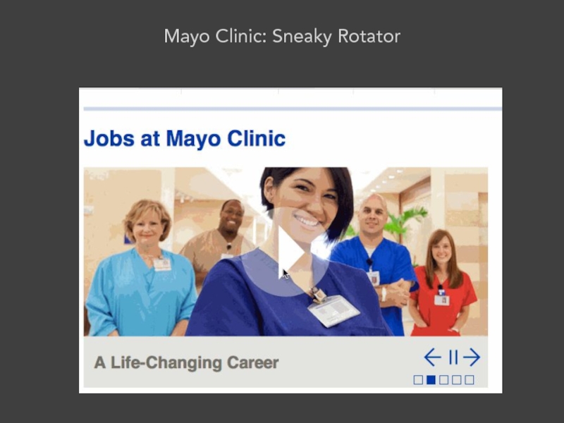
- 12. Mayo Clinic: Sneaky Rotator
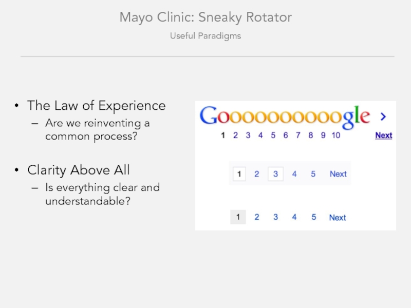
- 13. Mayo Clinic: Sneaky Rotator Useful Paradigms The
- 14. Mayo Clinic: Sneaky Rotator Useful Paradigms Fitts’
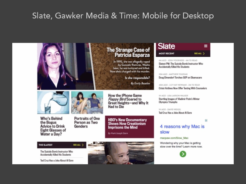
- 15. Slate, Gawker Media & Time: Mobile for Desktop
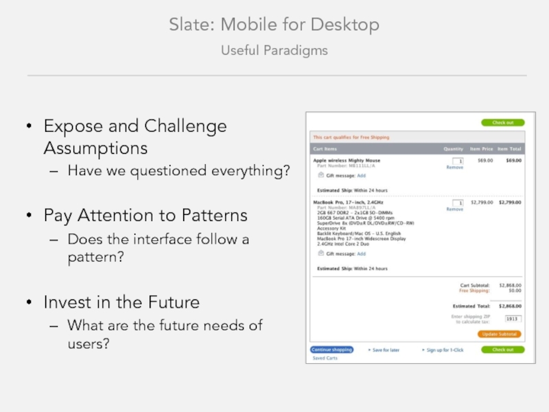
- 16. Slate: Mobile for Desktop Useful Paradigms Expose
- 17. Gawker Media Group: Mobile for Desktop
- 18. Gawker Media Group: Mobile for Desktop Useful
- 19. Time Magazine: Mobile for Desktop
- 20. Time Magazine: Mobile for Desktop Useful Paradigms
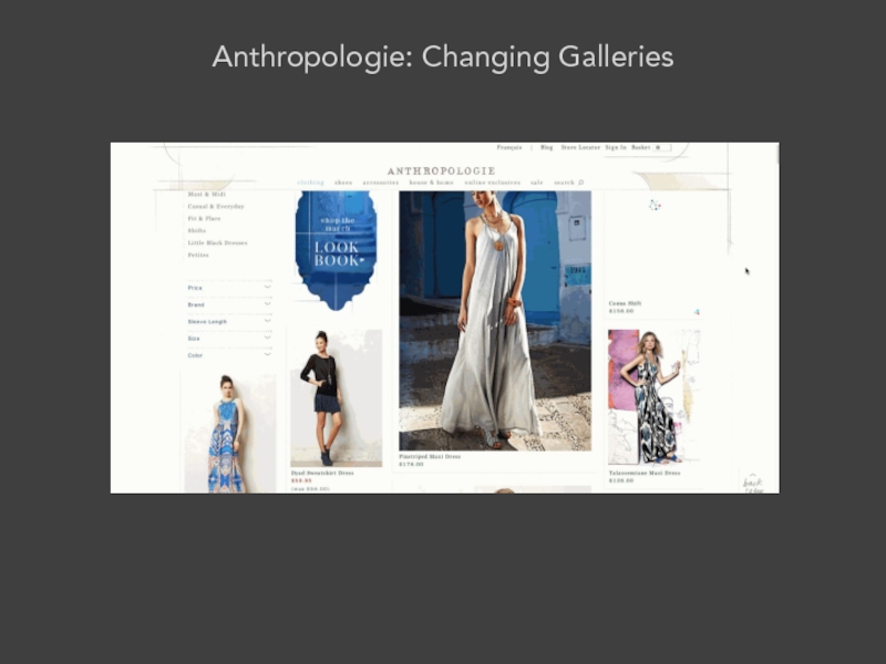
- 21. Anthropologie: Changing Galleries
- 22. Anthropologie: Changing Galleries Useful Paradigms Consistency Are
- 23. Details Always Matter Is there an over-reliance
- 24. IN REVIEW
- 25. FOCUS ON USERS “I saw this [insert
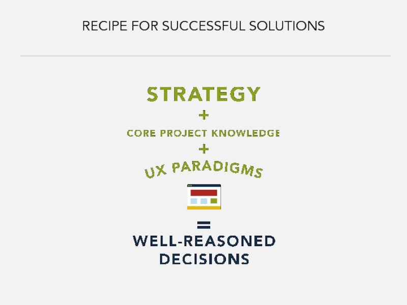
- 26. RECIPE FOR SUCCESSFUL SOLUTIONS
- 27. STRATEGY & PROJECT KNOWLEDGE Strategy focuses the
- 28. UX PARADIGMS – HELPFUL QUESTIONS Is there
- 29. UX PARADIGMS – HELPFUL QUESTIONS Can users
- 30. UX PARADIGMS – HELPFUL QUESTIONS Are
- 31. UX PARADIGMS – HELPFUL QUESTIONS Does the
- 32. WELL-REASONED DECISION “That [insert feature] on [insert
- 33. RESOURCES The Hipper Element - http://thehipperelement.com/ UX
- 34. Thank You. Follow me @kitalooclef MinneWebCon | April 14th 2014
Слайд 1Kristi McKinney
Clockwork Active Media
IT’S TOO FANCY!
Back to Basics User Experience
MinneWebCon
Слайд 3FEATURE EXPLOSION
“I saw this [insert feature] on [insert website] and I
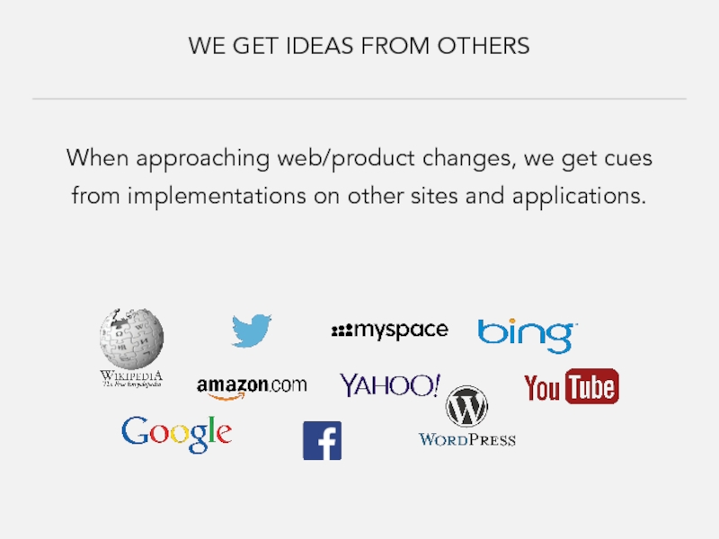
Слайд 4WE GET IDEAS FROM OTHERS
When approaching web/product changes, we get cues
Слайд 5HOW DO WE TALK ABOUT THIS?
Use well-documented UX paradigms to find
Слайд 6CONSIDER THE OVERALL STRATEGY
Objectives – Big Organizational Goal
Goals – Specific Measures
Strategy
Слайд 7CONSIDER PROJECT KNOWLEDGE
Define the problem & its effects
Define the technological boundaries
Define
Understand the data
Слайд 11CNN Business News
Useful Paradigms
The Law of Simplicity
Is there enough information for
Users > Problem
Are personal biases influencing user decisions?
Слайд 13Mayo Clinic: Sneaky Rotator
Useful Paradigms
The Law of Experience
Are we reinventing a
Clarity Above All
Is everything clear and understandable?
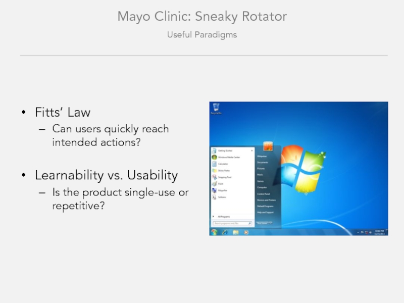
Слайд 14Mayo Clinic: Sneaky Rotator
Useful Paradigms
Fitts’ Law
Can users quickly reach intended actions?
Learnability
Is the product single-use or repetitive?
Слайд 16Slate: Mobile for Desktop
Useful Paradigms
Expose and Challenge Assumptions
Have we questioned everything?
Pay
Does the interface follow a pattern?
Invest in the Future
What are the future needs of users?
Слайд 18Gawker Media Group: Mobile for Desktop
Useful Paradigms
Words Aren’t the Enemy
Does iconography
Match the Tool to the Problem
Is the tool similar in scope to the original issue?
Слайд 20Time Magazine: Mobile for Desktop
Useful Paradigms
The Data Doesn’t Lie (usually)
What does
Hiding Complexity Increases It
Can users clearly find what they need?
Слайд 22Anthropologie: Changing Galleries
Useful Paradigms
Consistency
Are things grouped and behaving consistently?
Always Allow Undo
Can
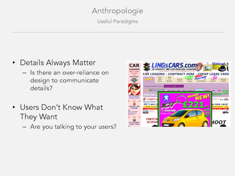
Слайд 23Details Always Matter
Is there an over-reliance on design to communicate details?
Users
Are you talking to your users?
Anthropologie
Useful Paradigms
Слайд 25FOCUS ON USERS
“I saw this [insert feature] on [insert website] and
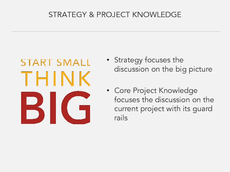
Слайд 27STRATEGY & PROJECT KNOWLEDGE
Strategy focuses the discussion on the big picture
Core
Слайд 28UX PARADIGMS – HELPFUL QUESTIONS
Is there enough information for users to
Are personal biases influencing user decisions?
Are we reinventing a common process?
Is everything clear and understandable?
Слайд 29UX PARADIGMS – HELPFUL QUESTIONS
Can users act quickly?
Is the product single-use
Have we questioned everything?
Does the interface follow a pattern?
What are the future needs of users?
Слайд 30UX PARADIGMS – HELPFUL QUESTIONS
Are things grouped consistently?
Can users easily
Are details communicated effectively?
Are you talking to your users?
Слайд 31UX PARADIGMS – HELPFUL QUESTIONS
Does the iconography translate?
Is the scope of
What does the data say?
Can users clearly find what they need?
Слайд 32WELL-REASONED DECISION
“That [insert feature] on [insert website] will work great for
Слайд 33RESOURCES
The Hipper Element - http://thehipperelement.com/
UX Greatness – http://commadot.com/ux-greatness-part-1-of-3/
52 Weeks of UX
Don’t Make Me Think – Steve Krug
UX Myths - http://uxmyths.com/
UI Patterns - http://ui-patterns.com/
UX Apprentice - http://www.uxapprentice.com/
UX Axioms - http://www.uxaxioms.com/
Principles of Interaction Design - http://asktog.com/atc/principles-of-interaction-design/
Communicating Design – Dan M. Brown
Undercover User Experience Design – Cennydd Bowles & James Box
Smashing Magazine – uxdesign.smashingmagazine.com/

![FEATURE EXPLOSION“I saw this [insert feature] on [insert website] and I think we should use](/img/tmb/2/161200/a520386ffd281df483c95ad638d58f44-800x.jpg)





![FOCUS ON USERS“I saw this [insert feature] on [insert website] and I think we should](/img/tmb/2/161200/76c97a28a9bc61b894594ca50d64bca9-800x.jpg)


![WELL-REASONED DECISION“That [insert feature] on [insert website] will work great for us because we can](/img/tmb/2/161200/8640d35a6034339447db9a62b796229a-800x.jpg)
