- Главная
- Разное
- Дизайн
- Бизнес и предпринимательство
- Аналитика
- Образование
- Развлечения
- Красота и здоровье
- Финансы
- Государство
- Путешествия
- Спорт
- Недвижимость
- Армия
- Графика
- Культурология
- Еда и кулинария
- Лингвистика
- Английский язык
- Астрономия
- Алгебра
- Биология
- География
- Детские презентации
- Информатика
- История
- Литература
- Маркетинг
- Математика
- Медицина
- Менеджмент
- Музыка
- МХК
- Немецкий язык
- ОБЖ
- Обществознание
- Окружающий мир
- Педагогика
- Русский язык
- Технология
- Физика
- Философия
- Химия
- Шаблоны, картинки для презентаций
- Экология
- Экономика
- Юриспруденция
Graph and Bar Chart Descriptions презентация
Содержание
- 1. Graph and Bar Chart Descriptions
- 2. Types line graphs pie charts bar charts tables processes diagrams maps
- 3. The diagram shows how greenhouse gases trap energy from the Sun:
- 4. IELTS Process Diagram Example
- 5. IELTS Map Example
- 6. Line Graph The Task You should
- 8. Line Graph Examples - Model Answer Let’s
- 9. Vocab позволяет сравнить количество (исч, неисч) измеряемый
- 10. The Language of Change
- 12. You should
- 13. Bar Chart Description The Task You
- 15. Bar Chart Exercise - Gap Fill Place
- 16. Bar Chart Exercise - Answer The bar chart
- 17. Comparative and Superlative Adjectives Comparatives are used
- 18. Transitions and Subordinating Conjunctions The Middle East
- 19. Other Structures Developing countries are more reliant on alternative
- 20. The bar chart shows the divorce rates


Слайд 6Line Graph
The Task
You should spend about 20 minutes on this
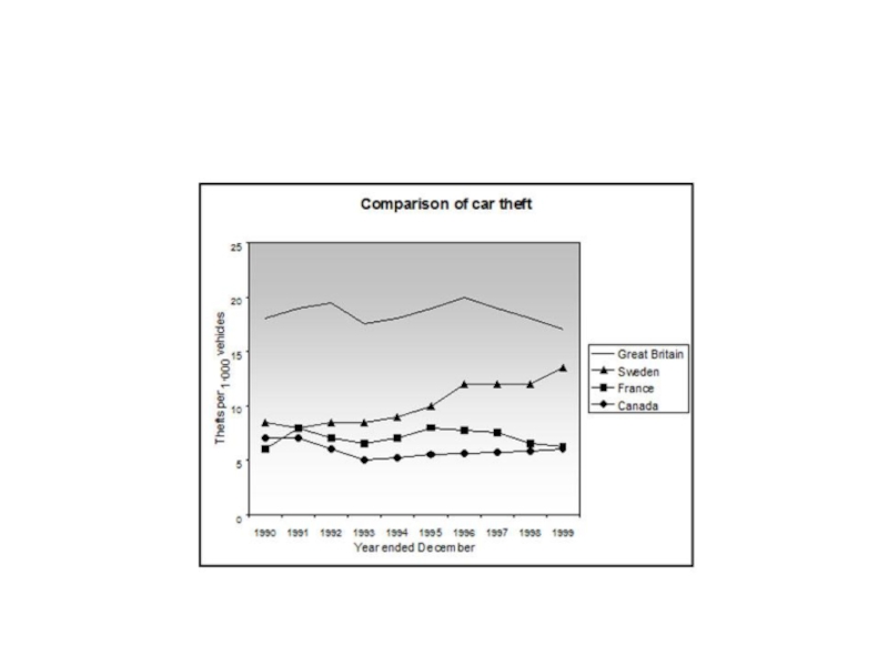
The line graph shows thefts per thousand vehicles in four countries between 1990 and 1999.
Summarize the information by selecting and reporting the main features and make comparisons where relevant.
Write at least 150 words.

Слайд 8Line Graph Examples - Model Answer Let’s think about: a) the structure;
The line graph compares the number of car thefts, measured in thousands, in four countries from 1990 to 1999. Overall, it can be seen that car thefts were far higher in Great Britain than in the other three counties throughout the whole time frame.
To begin, car thefts in Sweden, France and Canada followed a fairly similar pattern over the first five years, all remaining at between 5 and 10 per thousand. The general trend though for France and Canada was a decline in the number of vehicles stolen over the period, with both at around 6 in 1999. In contrast, Sweden experienced an upward trend, starting the period at approximately 8, and finishing at just under 15.
Interestingly, car thefts in Great Britain started at 18 per thousand, which far exceeded that of the other countries. It then fluctuated over the next nine years, reaching a peak of 20 thefts per 1000 in 1996, and ending the period slightly lower than where it began, at approximately 17 per thousand.
 the structure; b) useful vocab The")
Слайд 9Vocab
позволяет сравнить количество (исч, неисч)
измеряемый в тысячах
было гораздо выше в
в течение
были схожими
в течение первых пяти лет
оставаясь между 5 и 10 на тысячу
однако общая тенденция для
падение количества украденных машин
при этом оба приблизительно составляли
демонстрировала противоположную тенденцию\тенденцию к увеличению
в начале периода продемонстрировав
приблизительно 8
чуть меньше 15
что значительно превосходило другие страны
колебалось в течение следующих 6 лет
достигло максимума с отметкой
в конце периода было несколько меньше, чем в начале
измеряемый в тысячахбыло гораздо выше вв течение всего анализируемого периодабыли схожими")

Слайд 12
You should spend about 20 minutes on this task.
The line graph
Summarize the information by selecting and reporting the main features and make comparisons where relevant.
Write at least 150 words.

Слайд 13Bar Chart Description
The Task
You should spend about 20 minutes on
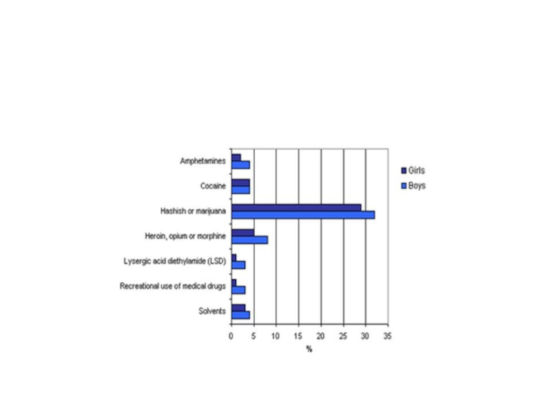
The chart shows the percentage of drugs taken by girls and boys in a school in New Zealand.
Summarize the information by selecting and reporting the main features and make comparisons where relevant.
Write at least 150 words.

Слайд 15Bar Chart Exercise - Gap Fill
Place the right word into the
at approximately 8% / the least /
school children / are similar / gender /
in percentages / more than / equal /
at the same level / percentages for /
at only 5% / around 33% / is exactly /
4% for / bar chart illustrates
The 1. information on the quantity of drugs 2. in New Zealand take, divided by 3. and measured 4. . Overall, it is immediately apparent that hashish or marijuana is used 5. any of the other drugs, whereas LSD and medical drugs are used 6. . At first glance we can see that boys take more drugs than girls for 6 out of 7 of the drugs listed, however an 7. number of boys and girls take cocaine.
To begin with, boys use more hashish or marijuana than girls at 8. and 29% respectively. Following this, boys take heroin, opium or morphine 9. but girls 10.
On the other hand, the 11. amphetamines and solvents 12. for both boys and girls at 2% and 3% for girls and 13. both drugs for boys. Next, the pattern for LSD and medical drugs 14. the same for both genders at 1% for girls and 3% for boys. Finally, boys and girls take cocaine 15. , 4%.

Слайд 16Bar Chart Exercise - Answer
The bar chart illustrates information on the quantity of
To begin with, boys use more hashish or marijuana than girls at around 33% and 29% respectively. Following this, boys take heroin, opium or morphine at approximately 8%, but girls at only 5%.
On the other hand, the percentages for amphetamines and solvents are similar for both boys and girls at 2% and 3% for girls and 4% for both drugs for boys. Next, the pattern for LSD and medical drugs is exactly the same for both genders at 1% for girls and 3% for boys. Finally, boys and girls take cocaine at the same level, 4%.

Слайд 17Comparative and Superlative Adjectives
Comparatives are used to compare two things:
Leopards are faster
Superlatives are used to compare one thing against a group of others:
The leopard is the largest of the four big cats.

Слайд 18Transitions and Subordinating Conjunctions
The Middle East produces high levels of oil; however,
The USA produces large amounts of natural gas. In contrast, South Korea produces none.
European countries make great use of solar power. On the other hand, most Asian countries us this method of power generation very little.
The Middle East produces high levels of oil, whereas / whileJapan produces none.
Whereas / While the Middle East produces high levels of oil, Japan produces none.
Although the Middle East produced 100 tons oil, Japan produced none.

Слайд 19Other Structures
Developing countries are more reliant on alternative energy production than developed countries.
Solar power accounts
Hydropower is not as efficient as wind power.
Like Japan, South Korea does not produce any natural gas.
The Middle East produces twice as much oil as Europe.
Western countries consume three times more oil than the Middle East.
Russia consumes slightly more oil than Germany.
The UAE produced the same amount of oil as Saudi Arabia.

Слайд 20The bar chart shows the divorce rates in two European countries